
When you start animating elements in CSS, it is very common to confuse animations with transitions or think that simply changing a property is enough for “something to animate.” In practice, CSS animations work in a very specific way: the browser interpolates values over time following a sequence that we define.
In my case, when I started working with animations, the biggest mental click was understanding that I wasn't just changing styles, but defining how those styles change over time. From there, everything starts to make sense.
In this CSS entry, we will take the first steps with CSS Animations; we will see how CSS @keyframes are fundamental for Animations, how to animate our elements in CSS, and some comparisons between Animations and CSS Transitions.
CSS Animations vs Transitions
Before diving in, it's worth clarifying a very common doubt.
CSS transitions are smooth changes between two states: an initial one and a final one. They require a trigger (hover, focus, a class added with JavaScript, etc.), and the browser handles the interpolation of the change.
For example, changing from a red background to a blue one in 4 seconds:
CSS animations, on the other hand, are not limited to two states. They function as a sequence of states distributed over time. Furthermore, they can start automatically without the user doing anything.
This was where I began to see the real difference: replicating an animation with several intermediate changes using only transitions usually becomes an unnecessary challenge. With animations, that control comes built-in.
We could easily change from one color to another with JavaScript by directly accessing the background property value and changing the color; but these are not Transitions since they are abrupt changes from one state to another.
What is a CSS Animation and how it actually works
A CSS animation is always composed of two blocks working together:
- The @keyframes rule, where the different states of the animation are defined.
- The animation properties, which indicate how that animation is executed.
Without one of these two elements, the animation does not exist.
Conceptually, the operation is as follows:
- We define a total duration.
- We mark key points within that time.
- The browser automatically calculates the intermediate values between one point and another.
In other words: we set the milestones, and the browser does the heavy lifting.
The role of @keyframes in CSS animations
The role of @keyframes in CSS animations
Two blocks compose CSS Animations:
The @keyframes are the heart of CSS animations. This is where you define what happens at each relevant moment of the animation.
A very simple example:
@keyframes cambiarColor {
  from { background: red; }
  to { background: blue; }
}
This code defines two states:
- from (equivalent to 0%)
- to (equivalent to 100%)
But the interesting part appears when we use percentages.
Without both components working together, it is not possible to perform a CSS Animation.
Just like CSS Transitions, Animations act directly on the properties of the HTML element in question within a specific time interval to change from one state to another; however, with Animations, we can have much more precise control over the change in the properties of HTML elements.
Getting started with CSS Animations
Let's look at a very simple Animation to start understanding them a bit; for now, we will only focus on the @keyframes that allow creating frames to define each of the animation states; although they alone cannot make an Animation work.
This Animation allows changing the background color (background) of an element; in this case, a container -div-:
@keyframes cambiarColorFondo {
	from { background: red;}
	to   { background: blue;}
}
Resulting in the following CSS Animation:
We would also get the same result in the Animation if we structure it as follows:
@keyframes cambiarColor {
     0%   { background-color: red;}
     100% { background-color: blue;}
  }
How percentages work in a CSS animation
This is where many people get lost at first, and also where I truly understood how animations work.
Percentages do not represent visual states, but portions of the total time.
If an animation lasts 8 seconds:
- 25% occupies the first 2 seconds
- 50% reaches up to second 4
- 75% up to second 6
For example:
@keyframes cambiarColor {
0% {
	background: #FF0000;
	width: 50%
}
25% {
	background: #FFAAAA;
	width: 80%;
}
50% {
	-webkit-box-shadow: inset 0px 0px 0px 10px #BB0000;
	-moz-box-shadow: inset 0px 0px 0px 10px #BB0000;
	box-shadow: inset 0px 0px 0px 10px #BB0000;
	border-radius: 200px
}
75% {
	width: 120px;
}
100% {
	background: #FF0000;
	width: 50%
}
}
The browser progressively interpolates the values between each percentage. There are no sudden jumps: everything happens fluidly within the assigned interval.
When you understand this, you start thinking of animations as a timeline, not just simple style changes.
Using percentages instead of the values from{} (for an initial offset of 0%) and to{} (for a final offset of 100%) makes it possible to further customize the frames given through these percentages, and this is one of the advantages that Animations bring compared to Transitions; if we have the following rules configured in the @keyframes:
Performing the equivalent of the example presented above in Transitions would be quite a challenge.
As you can see, being able to access constant time intervals to modify properties is quite useful; that is; based on the previous example, where the global time of the Animation is 8 seconds (Animation time is defined through properties in the next section ).
We see that the second value of the property is 25%, which indicates that the property values will be fully established in the range of 0 to 2 seconds progressively; that is, the background color and the width of the background container (width) will change in the time mentioned above; the same logic applies to the rest of the percentages:
Essential @keyframes for creating CSS Animations
@keyframes are nothing more than rules that indicate how the behavior of the different frames or boxes of the entire Animation will be and they are the heart of Animations; Mozilla Developer Network defines them as:
The @keyframes at-rule allows authors to control the intermediate steps in a CSS animation sequence by defining keyframes (or waypoints) along the animation sequence that must be reached by certain points during the animation.
CSS Animation Properties
We already have the Animation created; however, using only the previous rule is not enough to make the Animation work; we need to indicate the behavior and customization of the Animations, for this we use several properties which we will explain in the following table:
| animation-name | You must indicate the name of the Animation here; in other words, the @keyframes name. |
| animation-duration | As you can imagine, here you must indicate the duration the Animation will have in seconds (s) or milliseconds (ms). |
However, we have many more. Once the @keyframes are defined, we need to indicate how the animation is executed. For that, we use the animation properties.
The most important ones are:
- animation-name
- Indicates the name of the animation defined in @keyframes.
- animation-duration
- Defines how long a full cycle of the animation lasts (in seconds or milliseconds).
- animation-iteration-count
- Specifies how many times the animation repeats. It can be a number or infinite.
- animation-direction
- Controls the direction of the animation (normal, reverse, alternate, etc.).
- animation-delay
- Indicates the waiting time before the animation begins.
- animation-timing-function
- Defines the speed of the animation over time (for example, linear, ease, ease-in).
- In many cases, all these properties are grouped using the shorthand form: animation.
Example of Animations vs Transitions and more
We can see a comparison between Animations, Transitions, and without using Transitions or Animations; hover your cursor over any of the div containers:
Additionally, there are many other properties that allow for even further customization of the final behavior of CSS Animations which are and will be covered in future entries:
| animation-iteration-count | Specifies the number of times the Animation will run; possible values are:
|
| animation-direction | Specifies the direction of the Animation. |
| animation-delay | Specifies a given time in seconds to start the Animation. |
| animation-timing-function | Specifies the speed curve of the Animation. |
How to animate an element step by step
The mental process I usually follow is always the same:
- Decide what I want to animate (color, size, position…)
- Think about how it evolves over time
- Define the key states with @keyframes
- Adjust duration, repetitions, and rhythm
For example:
.element {
 width: 100px;
 height: 100px;
 background: grey;
 animation: change-color 5s infinite;
}
@keyframes change-color {
 from { background: red; }
 to { background: green; }
}
Here the animation starts automatically, lasts 5 seconds, and repeats without user intervention.
Why CSS animations offer more control than transitions
The great advantage of CSS animations is that they allow you to:
- Define multiple intermediate states
- Control exactly when each change occurs
- Repeat animations without external events
When you need something more than a simple hover effect, animations are almost always the best choice.
When to use CSS animations
CSS animations are ideal for:
- Visual indicators
- Decorative effects
- Automatic animations
- Small interactions without complex logic
If you need advanced logic or animations dependent on complex calculations, then JavaScript might be a better tool. But for most common cases, CSS is more than enough.
Frequently Asked Questions about CSS Animations
- Is JavaScript necessary to create CSS animations?
- No. CSS animations work natively without JavaScript.
- What is the difference between animations and transitions?
- Transitions only change between two states; animations allow for multiple intermediate states.
- What does using percentages in @keyframes mean?
- They represent specific moments in the total animation time.
- Can animations be repeated infinitely?
- Yes, using animation-iteration-count: infinite.
Conclusion
Animations in CSS work by defining what changes, when it changes, and for how long. The @keyframes mark the key points, and the browser handles interpolating the rest.
When you start thinking of animations as a timeline rather than simple style changes, everything becomes much clearer and more predictable.
Animating text and letters with animation-delay in CSS

As we have seen in many CSS posts, CSS serves us for practically everything we want to do. This example I bring you allows for animating text very easily with very little CSS, but the effect is quite polished and you will be surprised how simple it is; in this entry, we will see how to create the following effect for our letters:
Many times we overlook these small details that really make a difference. Entering a website and seeing that everything loads statically is somewhat boring, but if we see simple animations like the one shown above, it gives another perspective to the site we are developing. They are small animations that we can apply to our texts at the paragraph level or letter by letter as you wish, but here we bring you a basic idea to animate texts with a bit of CSS as we will see below.
Creating this animation is very simple; we only need a bit of CSS as we will see below and to know the great trick for animating our texts with CSS.
Delayed CSS animations with the animation-delay property, the great trick
As specified in the title, the animation-delay property is used to delay the movement of a group of letters, and with that, we achieve the displacement effect in the text we specify, as we see in the promotional image; said delay is achieved with the nth-child selector:
.words span:nth-child(2) { animation-delay: 0.4s; } .words span:nth-child(3) { animation-delay: 0.8s; } .words span:nth-child(4) { animation-delay: 1.3s; } The animation is very simple as we see in the following code, only a displacement is applied:
@keyframes move { 0% { transform: translate(-25%, 0); } 50% { text-shadow: 0 15px 40px rgba(0, 0, 0, 0.6); } 100% { transform: translate(33%, 0); } } Another very important point is the text-shadow which allows for the start and end of the displacement, and in this way, it can restart the effect when the letters are hidden, thus not damaging the flow of the animation.
As we can see, this is another effect based on animations that looks really good in applications and does not require much effort on our part, just a bit of ingenuity.
Text shadowing effect: CSS animation:
In this other animation, we see a warning-style text. As you might guess, the CSS text-shadow property is used in conjunction with the corresponding animation:
The HTML code simply indicates the text, as you can imagine:
<div class="area"> Text </div> The CSS is more fascinating, and as an important point for the effect to be similar to the one shown, you must set the text color equal to the background color, which in this case is white. Another important point is to define the text shadow several times in the animation with the aforementioned property, and this is so that the animation has a greater shadowing effect:
@import url(https://fonts.googleapis.com/css?family=Open+Sans);
body{
 background:url('http://subtlepatterns.subtlepatterns.netdna-cdn.com/patterns/noisy_net.png') repeat;
  font-family: "Open Sans",  Impact;
}
.area{
  text-align:center;
  font-size:6.5em;
  color:#fff;
  letter-spacing: -7px;
  font-weight:700;
  text-transform:uppercase;
  animation:blur 2s ease-out infinite;
  text-shadow:0px 0px 5px #fff,
      0px 0px 7px #ff0000;
}
@keyframes blur{
  from{
      text-shadow:0px 0px 10px #fff,
      0px 0px 10px #fff,
      0px 0px 25px #fff,
      0px 0px 25px #fff,
      0px 0px 25px #fff,
      0px 0px 25px #fff,
      0px 0px 25px #fff,
      0px 0px 25px #fff,
      0px 0px 50px #fff,
      0px 0px 50px #fff,
      0px 0px 50px #ff0099,
      0px 0px 150px #ff0099,
      0px 10px 100px #ff0099,
      0px 10px 100px #ff0099,
      0px 10px 100px #ff0099,
      0px 10px 100px #ff0099,
      0px -10px 100px #ff0099,
      0px -10px 100px #ff0099;
	  }
}
Conclusions on delayed CSS text animations
Nowadays, practically all browsers support CSS animations. With all the CSS properties that exist, the possibilities we have are infinite. Note that we only used a few, as seen in the previous section; imagine changing the text color, size, or opacity, which are the most common. As we saw here, the shadowing looks very good on text. Here the limit is your imagination. The engine for animations in browsers is very well-developed and we will have no problems performing animations on our texts and letters in general as we saw in the previous section.
Bézier curves in CSS animations: the Google Chrome case
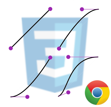
Bézier curves can be used in all types of Digital Image Processing programs such as GIMP, Photoshop, etc., for drawing layouts; however, Bézier curves are also used in different programs to create modeling and animations such as Blender.
Moving into the topic we are here to explain, which is the application of Bézier curves to describe the speed of a CSS Animation in each time phase through the value cubic-bezier(p1x, p1y, p2x, p2y) applicable to the transition-timing-function property in CSS.
Syntax of the Bézier curve in CSS
The cubic-bezier(p1x, p1y, p2x, p2y) value consists of four points that form the curve as we can see below:

More information about Bézier curves at: Bézier curve.
Although this post will not delve into the construction of Bézier curves, as there is abundant material on the Internet for that.
Predefined values vs. cubic-bezier in CSS
In this section, we will see some examples of Bézier curves and their equivalents with predefined values in the CSS API; let's take a look.
(ease) If the animation starts slowly, then goes fast, and then ends slowly: cubic-bezier(0.25,0.1,0.25,1):

(linear) If the animation is constant: cubic-bezier(0,0,1,1):

(ease-in) If the animation starts slowly: cubic-bezier(0.42,0,1,1):

(ease-out) If the animation ends slowly: cubic-bezier(0,0,0.58,1):

You can get more information at the following link: CSS3 transition-timing-function Property.
With Bézier curves, we have to establish values between zero and one, and by not using a predefined value as shown above, it can be a bit more complicated to customize the behavior of the animations; for these cases, the people at Google lend us a hand.
Google Chrome and Bézier curves in CSS animations
Google Chrome, like many browsers, offers a significant and useful amount of tools that allow web developers to test and try new things for their web applications; one of these tools can be found in the developer console.

By selecting our element from the console that has the transition-timing-function property applied, or in its shorthand form through the animation property (in our example, a span):

We will see an icon like the following in the style tab:
By clicking on it (depending on the established animation), we will see a panel like the following:

And by pressing on the nodes, we can alter the Bézier curve and thereby describe the speed of a CSS Animation in each time phase:

This is undoubtedly a great tool that allows you to "play" with different values and try various combinations to choose the Bézier curve that you like best or that best suits your needs.
Experiments and Examples of CSS Animations
Here are a series of experiments ready for practicing CSS animations, ordered by difficulty:
- CSS Ripple Effect
- Multiple Animated Backgrounds with CSS
- Animating Things with CSS: Creating Loaders
- Animating Things with CSS: Creating a Moon
- The :target Pseudo-Class in CSS to Highlight Linked Content
- How to Create a 3D Carousel or Slider with HTML5 and CSS?
- How to create a Web Loading Button (Button Loader Spinner) with CSS3 and JavaScript Animations
- Creating a diffused light container with CSS