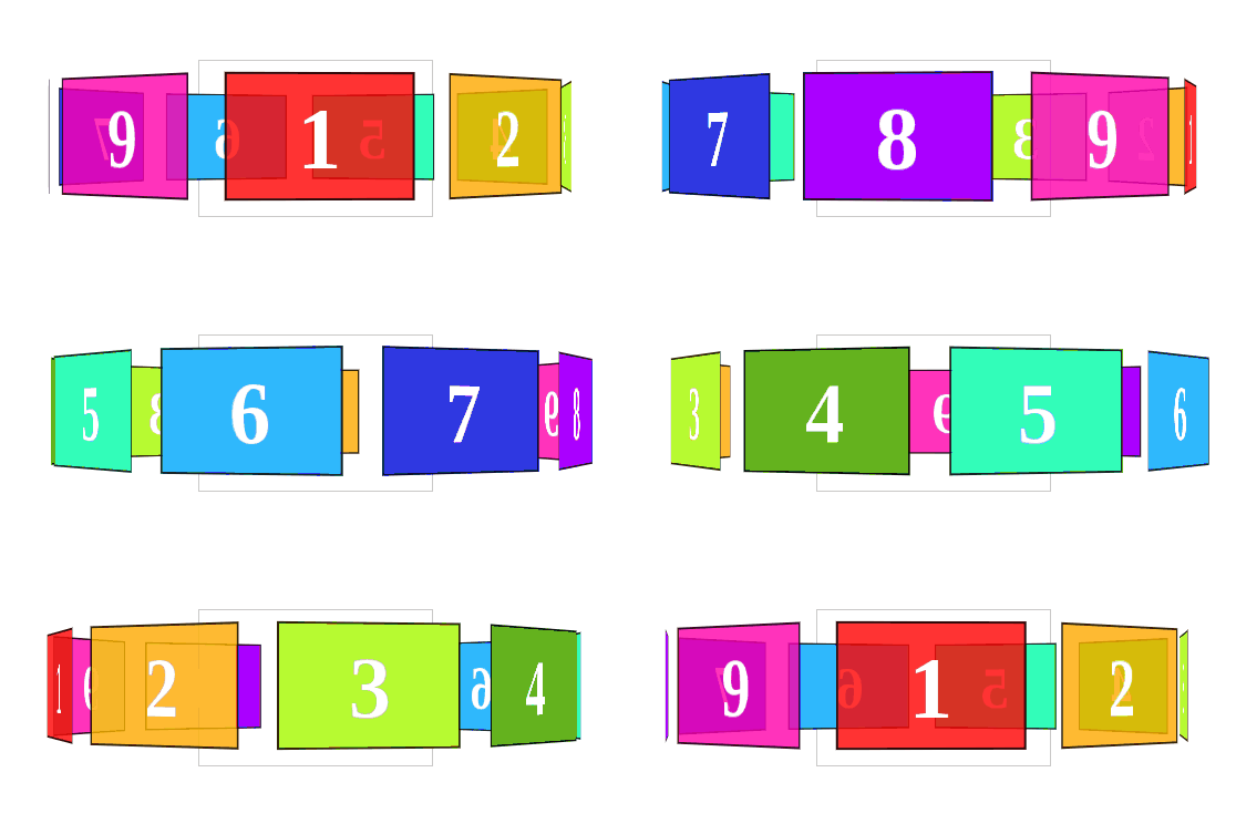
Carousels are very striking and useful elements for presenting many images; they are practically fundamental components when you want to show a large set of images or even another HTML structure in a minimal space. Moreover, they are the centerpiece of any website, and a good carousel never goes unnoticed. In this entry, we will see how to create a CSS-only carousel like the following:
It is a very unusual type of sliders, scrollers, or carousels; it has 3D components, rotates, and looks great. You can easily vary the speed, pause it, among other things.
We will see a couple more variations to exemplify the versatility of the presented code using CSS Animations and JavaScript.
Defining the perspective to see the carousel a bit larger
As we showed in a previous post: UNDERSTANDING THE PERSPECTIVE PROPERTY IN CSS, using this property allows you to vary the depth on the Z-axis; therefore, by placing a perspective with a value greater than 1000 pixels, we make the carousel look a bit larger.
<style>
        .container {
            perspective: 1100px;
        }
</style>
<section class="container">
     !-- Demás HTML para el carrusel -items 3D --
</section>
We define a bit more CSS to style the container, defining its position, size, and a border, which will serve to visualize the current carousel item, or the one directly in front at any given time:
    .container {
      width: 210px;
      height: 140px;
      position: relative;
      margin: 0 auto 40px;
      border: 1px solid #CCC;
      perspective: 1100px;
    }
Positioning carousel items in a 3D space
We will create another element inside our .container which allows its children (items) to be shown in a 3D space; for this, the transform-style property is used with the value preserve-3d.
    #carousel {
      width: 100%;
      height: 100%;
      position: absolute;
              transform: translateZ( -288px );
              transform-style: preserve-3d;
              transition: transform 1s;
} <section class="container">
<div id="carousel" style="transform: translateZ(-288px) rotateY(-360deg);">
<!-- Elementos hijos 3D -->
</div>
</section>To understand how this property influences the children to build a 3D scenario, let's see how the carousel would look if the transform-style property with the value preserve-3d was NOT applied:
As you can see, not pretty at all—everything overlapping and together, in short, a slider we cannot use; but don't worry, with a few lines of code, we will solve this easily.
HTML5: Defining the 3D carousel items
Now we can define each of the items that are part of our carousel; basic CSS, a large text size for what we want to do, covering almost the entire size of our parent container among other easy-to-understand CSS code. Here you can customize it as much as you like, although keep an eye on margins and paddings to prevent the cards or items from becoming misaligned or overlapping:
    #carousel figure {
      display: block;
      position: absolute;
      width: 80%;
      height: 80%;
      left: 10px;
      top: 10px;
      border: 2px solid rgba(   0, 0, 0, 0.8 );
      line-height: 116px;
      font-size: 80px;
      font-weight: bold;
      color: white;
      text-align: center;
      margin: 0;
    }
Each of our carousel items must be placed in such a way that they do not overlap by altering their position on the Y-axis across 360 degrees; you will have as many of these rules as items your carousel contains:
 #carousel figure:nth-child(1) {
              transform: rotateY( 0deg ) translateZ( 288px );
    }
    #carousel figure:nth-child(2) {
              transform: rotateY( 40deg ) translateZ( 288px );
    }
    #carousel figure:nth-child(3) {
              transform: rotateY( 80deg ) translateZ( 288px );
    }
    #carousel figure:nth-child(4) {
              transform: rotateY( 120deg ) translateZ( 288px );
    }
    #carousel figure:nth-child(5) {
              transform: rotateY( 160deg ) translateZ( 288px );
    }
    #carousel figure:nth-child(6) {
              transform: rotateY( 200deg ) translateZ( 288px );
    }
    #carousel figure:nth-child(7) {
              transform: rotateY( 240deg ) translateZ( 288px );
    }
    #carousel figure:nth-child(8) {
              transform: rotateY( 280deg ) translateZ( 288px );
    }
    #carousel figure:nth-child(9) {
              transform: rotateY( 320deg ) translateZ( 288px );
    }
Finally, the complete HTML for the carousel:
  <section class="container">
    <div id="carousel">
      <figure>1</figure>
      <figure>2</figure>
      <figure>3</figure>
      <figure>4</figure>
      <figure>5</figure>
      <figure>6</figure>
      <figure>7</figure>
      <figure>8</figure>
      <figure>9</figure>
    </div>
  </section>
HTML + CSS + JavaScript: Putting all the previous steps together and creating the rotating 3D carousel
By combining all the previous CSS and HTML, we get the following result:
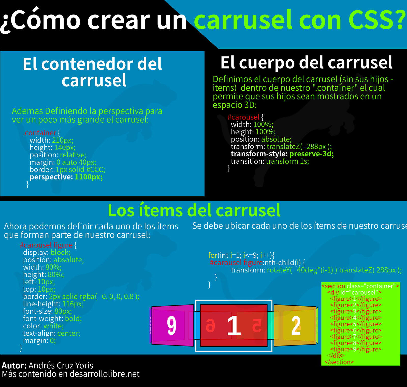
Infographic of the previous steps
You can see all the steps summarized in the following image:

Which obviously needs to be given some life, movement, or rotation, which we can easily achieve with CSS Animations.
Slider rotation: Animating the carousel with CSS
If we want it to rotate automatically with CSS Animations, we can use the following:
    #carousel {
        animation: rotateInY 10s infinite linear;
    }
    @keyframes rotateInY {
	0%   { transform: translateZ(-288px) rotateY(0deg);   }
	100% { transform: translateZ(-288px) rotateY(360deg);    }
}A variation of our carousel is altering each of the items so they are a bit longer and look like panels:
Moving the carousel manually with JavaScript
In this last experiment, we will see that with a bit of JavaScript associated with a couple of buttons, we can vary the position of the carousel and thus move through each of its items:
    var init = function() {
      var carousel = document.getElementById('carousel'),
          navButtons = document.querySelectorAll('#navigation button'),
          panelCount = carousel.children.length,

          theta = 0,
          onNavButtonClick = function( event ){
            var increment = parseInt( event.target.getAttribute('data-increment') );
            theta += ( 360 / panelCount ) * increment;
            carousel.style.transform = 'translateZ( -288px ) rotateY(' + theta + 'deg)';
		console.log("theta: ",theta)
          };
      for (var i=0; i < 2; i++) {
        navButtons[i].addEventListener( 'click', onNavButtonClick, false);
      }
    };
    init();
It simply rotates until it positions itself on one item at a time:
How to create a carousel with CSS #Infographic?
Infographic to create the carousel with CSS:

Creating an animated carousel with CSS

In this entry, we will see how to create a simple but attractive animation with a bit of CSS like the one shown at the beginning of this post.
As you can see, it can be used to show various elements such as images, text, etc.; let's also remember that this is not the first time we have worked with CSS carousels:
Without further ado, let's get to work!
We will make use of CSS 3D transformations, and that is why we will find elements like perspective which allows—redundancy aside—to specify the perspective of an object in pixels, and obviously transform to perform translations in different axes, although as you will see, for this experiment, transformation is only used on the Y-axis.
The HTML structure will be as follows:
<figure class="icon-cards">
	<div class="icon-cards__content">
		<div class="icon-cards__item"></div>
		<div class="icon-cards__item"></div>
		<div class="icon-cards__item"></div>
	</div>
</figure>
Now we define the CSS for the parent container icon-cards__content:
.icon-cards__content {
	position: absolute;
	width: 100%;
	height: 100%;
	transform-style: preserve-3d;
	animation: carousel 10s infinite cubic-bezier(1, 0.015, 0.295, 1.225) forwards;
}
As we see, we define the transform-style property with the value preserve-3d to indicate that our entire experiment, consisting of the animations and CSS transformations specified below, is visualized in 3D.
Now it's time to define the base CSS for our cards:
.icon-cards__item {
	position: absolute;
	top: 0;
	left: 0;
	width: 190px;
	height: 210px;
	border-radius: 6px;
}
.icon-cards__item:nth-child(1) {
	background: rgba(252, 192, 77, 0.9);
	transform: rotateY(0) translateZ(182px);
}
.icon-cards__item:nth-child(2) {
	background: rgba(49, 192, 204, 0.9);
	transform: rotateY(120deg) translateZ(182px);
}
.icon-cards__item:nth-child(3) {
	background: rgba(236, 233, 242, 0.9);
	transform: rotateY(240deg) translateZ(182px);
}
Nothing out of the ordinary, common CSS to define size among other things, and specific CSS using the nth-child selector with which we vary the color and position of each of the cards so they do not overlap.
Finally, we have the animation:
@-webkit-keyframes carousel {
	0%,  17.5% {
		transform: translateZ(-182px) rotateY(0);
	}
	27.5%, 45% {
		transform: translateZ(-182px) rotateY(-120deg);
	}
	55%, 72.5% {
		transform: translateZ(-182px) rotateY(-240deg);
	}
	82.5%, 100% {
		transform: translateZ(-182px) rotateY(-360deg);
	}
}
Where the configured cards simply move along the Y-axis.

