
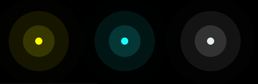
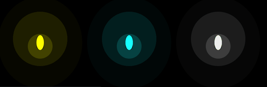
Let's learn how to create a ripple effect with pure CSS animations, which is nothing more than a pulsating, wave, or expanding effect using a shadow—very beautiful and useful for attracting attention.
To do this, we will create a circle (but it can be anything) that expands with a very striking transparent shadow.
Let's start with the HTML, which consists of some DIVs:
<div class="ripple"></div>
<div class="ripple" style="filter:hue-rotate(120deg)"></div>
<div class="ripple" style="filter:grayscale()"></div>
Followed by the CSS, which is simply expanding the shadow through box-shadow, and that is the trick:
.ripple {
  width: 1rem; /* control the size */
  background: #ff0; /* control the color here */
}
.ripple,
.ripple::before,
.ripple::after {
  content: "";
  display: grid;
  grid-area: 1/1;
  aspect-ratio: 1;
  border-radius: 50%;
  box-shadow: 0 0 0 0 #ff03; /* and here, 3 is the transparency */
  animation: r 3s linear infinite var(--s,0s);
}
.ripple::before {--s: 1s}
.ripple::after  {--s: 2s}
@keyframes r {
  to {box-shadow: 0 0 0 6rem #0000}
}
body {
  margin: 0;
  height: 100vh;
  display: flex;
  justify-content: center;
  align-items: center;
  gap: 11rem;
  background: #000;
}- With the gap, the separation between columns and rows is specified.
- With grid-area: 1/1, we are indicating that the 3 containers (.ripple, .ripple::before, .ripple::after) should align in the same place; you can comment it out and you will see 3 waves in different positions:
- With the before and after pseudo-elements, we define a kind of container through CSS, which in the end is each of the waves we see in the animation.
- Since we have two, then there are two containers that we create.
- The most interesting thing about this code is that it defines a custom property scoped to the before and after, with values of 1s and 2s respectively; this produces that ripple effect every second.
Ripple effect on buttons in CSS
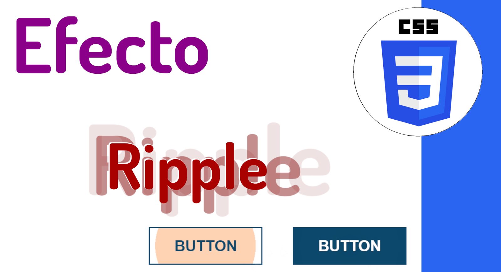
We are going to learn how to make a ripple effect for buttons in CSS; previously we saw how to apply the ripple effect to a container in CSS, now it's the buttons' turn:

We define the base style for a button:
button {
  border: 2px solid;
  padding: 15px 40px;
  font-size: 25px;
  text-transform: uppercase;
  font-weight: bold;
  cursor: pointer;
  background:
    radial-gradient(circle, #0000 1%, var(--c) 1%) 50%/0%
    var(--c);
  transition: background 0.6s;
}
And our buttons:
<button class="light">Button</button>
<button class="dark" style="--r: #f3738a;">Button</button>
The trick here is the hover effect, in which we grow enormously:
button:hover{ background-size: 15000%;}And the active pseudo-class is triggered on the click event, where we change the color and thus the ripple effect:
button:active {
  background-color: var(--r,#FA6900); /* color of the ripple effect*/
  background-size: 100%;
  transition: 0s;
}
.light {
  --c: #fff;
  color: #0B486B;
}
.dark {
  --c: #0B486B;
  color: #fff;
  border-color: var(--c);
}
body {
  margin:0;
  height:100vh;
  display:grid;
  grid-auto-flow:column;
  place-content:center;
  grid-gap:50px;
}
How to create a radar effect with CSS animations?

In this entry we will see how to create a simple radar effect with only CSS using multiple div tags, obtaining the following result:
For this, we will use CSS animations by defining the following keyframe:
@keyframes radar{
0%{
    width:75px;
    height:75px;
    border:40px
    solid #fff;
    opacity:0
}50%{
    opacity:.1
}
90%{
    width:750px;
    height:750px
}
90%,100%{
    border:2px
    solid #fff;
    opacity:0
}100%{
    width:1500px;
    height:1500px
}
And a bit more CSS to define its shape, color, initial size, and position in 2D space with the transform property:
.radar {
   position: absolute;
   top: 50%;
   left: 50%;
   border-radius: 50%;
   border: 10px solid #fff;
   width: 150px;
   height: 150px;
   transform: translate(-50%,-50%);
   animation: radar 2s infinite;
   opacity: 0;
}
Now we will define each of the waves; where one wave represents one div:
<div class="radar"></div>
<div class="radar"></div>
<div class="radar"></div>
<div class="radar"></div>
To prevent the waves from overlapping each other, we alter the start of the animations for two of them using the CSS animation-delay property:
.radar:nth-child(2) {
    animation-delay: .4s;
}
.radar:nth-child(3) {
    animation-delay: .9s;
}
.radar:nth-child(4) {
    animation-delay: .15s;
}
And this is the main thing you need to know; additionally, we will define a dark blue background to see the effect, leaving the CSS experiment as follows:
We can adapt the initial code to place an element such as an image or a button, obtaining an interesting effect that draws 100% attention to the central element:
The next experiment to check out is Multiple animated backgrounds with CSS