
In a previous edition of ANIMATING THINGS WITH CSS, we saw how to create some simple animations with a little CSS that could even be used as loaders.
In this post, we will see how to create a couple of simple, easy, and very attractive loaders.
Defining the structure of the loaders with CSS
The HTML is minimal, where each span will be a small animated circle:
<div id="loader-2">
  <span></span><span></span><span></span><span></span><span></span>
</div>
Defining the shape of the loaders with CSS
Once we have the structure (HTML), we apply a bit of styling to give it the desired shape (in our example, circles); the base CSS is as follows:
    span {
        display: inline-block;
        height: 15px;
        width: 15px;
        background: rgba(204, 0, 0, 0.8);
        border-radius: 500px;
    }
1. Loader
Recalling the first effect we want to achieve:
As mentioned previously, each circle corresponds to a span which we alter at the start of the animation by using the animation-delay property to delay it by a few seconds:
#loader-1 span:nth-child(1) {
    animation: scale 1s 0.1s infinite cubic-bezier(0.6, -0.28, 0.735, 0.045);
}
@keyframes scale{
    0%{ transform:scale(0.0);}
    25%{ transform:scale(0.9,0.9); background:rgba(204, 0, 0, 0.8); }
    50%{ transform:scale(1,1); margin:0 3px; background:rgba(204, 0, 0, 1); }
    100%{ transform:scale(0.0);}
}
You can see the full experiment at the following links:
2. Loader
For the second loader:
We use the following animation:
#loader-2 span:nth-child(1) {
    animation: push 1s 0.1s infinite cubic-bezier(0.005, 0.56, 0.58, 1.59);
}
@keyframes push{
	0%{ transform:translateX(0px) scale(0.9,0.6)background:rgba(204, 0, 0, 0.8);}
	50%{ transform:translateY(-30px) scale(0.5,1.1); background:rgba(204, 0, 0, 1);  }
	100%{ transform:translateX(0px) scale(0.9,0.6)background:rgba(204, 0, 0, 0.8);}
}
In the same way, you can see the full experiment at the following links:
As you may have noticed, we use the cubic-bezier value to customize the behavior of the animations; this topic was already covered in the previous shared entry.
Considerations regarding the previous CSS code
The trick here to achieve this effect without adding a large amount of CSS is to use the animation-delay property to delay it by a few seconds.
Many things can be done with a little CSS and some imagination; in this post, we will see some curious experiments with animations that can serve (for example) as an icon for "Page Loading" on our site.
3. Animation with CSS creating a loader
The first animation was taken from the following resource on CodePen:
The animation, which at first glance might seem somewhat confusing or perhaps complex to perform, is not at all; with the following CSS:
.ball:nth-child(1) {
    background: #ff005d;
    animation: right 1s infinite ease-in-out;
}
.ball:nth-child(2) {
    background: #35ff99;
    animation: left 1.1s infinite ease-in-out;
}
.ball:nth-child(3) {
    background: #008597;
    animation: right 1.05s infinite ease-in-out;
}
.ball:nth-child(4) {
    background: #ffcc00;
    animation: left 1.15s infinite ease-in-out;
}
.ball:nth-child(5) {
    background: #2d3443;
    animation: right 1.1s infinite ease-in-out;
}
.ball:nth-child(6) {
    background: #ff7c35;
    animation: left 1.05s infinite ease-in-out;
}
.ball:nth-child(7) {
    background: #4d407c;
    animation: right 1s infinite ease-in-out;
}
And the animation that simply allows moving the balls from side to side:
            @keyframes right {
                0%   { transform: translate(-15px);  }
            50%  { transform: translate(15px);   }
            100% { transform: translate(-15px);  }
            }
            @keyframes left {
                0%   { transform: translate(15px);   }
            50%  { transform: translate(-15px);  }
            100% { transform: translate(15px);   }
            }
As you will see, the trick in this animation consists of altering the times of all the balls in fractions of seconds to lengthen the animation and thus achieve that it varies over time.
4. Animation with CSS
Based on the first animation taken from CodePen , a couple more ideas occurred to me; the first of them (and second experiment with animations) is the following:
The tricks here are:
- Locate the four balls in the same place with
position: absolute. - Alter the position of the balls with
transform: translate(X,Y)both in the CSS established in the balls and in the animations.
Once this is done, we realize that we must perform one animation for each ball (four for this experiment) that, although similar, the order of their values varies or rather they are shifted to prevent the balls from overlapping.
With the above explained, it will be easy to understand the following CSS (including animations):
 @keyframes move1 {
        0%   { transform: translate(0,0);   }
    25%  { transform: translate(50px,0);    }
    50%  { transform: translate(50px,50px);    }
    75%  { transform: translate(0,50px);    }
    100% { transform: translate(0,0);   }
    }
    @keyframes move2 {
        0%  { transform: translate(50px,0);    }
    25%  { transform: translate(50px,50px);    }
    50%  { transform: translate(0,50px);    }
    75% { transform: translate(0,0);   }
    100%  { transform: translate(50px,0);    }
    }
    @keyframes move3 {
        0%  { transform: translate(50px,50px);    }
    25%  { transform: translate(0,50px);    }
    50% { transform: translate(0,0);   }
    75%  { transform: translate(50px,0);    }
    100%  { transform: translate(50px,50px);    }
    }
    @keyframes move4 {
        0%  { transform: translate(0,50px);    }
    25% { transform: translate(0,0);   }
    50%  { transform: translate(50px,0);    }
    75%  { transform: translate(50px,50px);    }
    100%  { transform: translate(0,50px);    }
}
For this second experiment with CSS animations, it is not necessary to alter the animation times.
5. Animation with CSS
Finally, we have the third animation which results in a modification of the third so that the balls/squares move towards the center and change their shape or appearance:
And this is achieved with the following CSS:
     @keyframes move1 {
                0%   { transform: translate(0,0);   }
            25%  { transform: translate(25px,25px);    }
            50%  { transform: translate(50px,0); border-radius: 0;   }
            75%  { transform: translate(25px,25px);    }
            100%   { transform: translate(0,0);   }
            }
            @keyframes move2 {
                0%  { transform: translate(50px,0);    }
            25%  { transform: translate(25px,25px);    }
            50%   { transform: translate(0,0);  border-radius: 0; }
            75%  { transform: translate(25px,25px);    }
            100%  { transform: translate(50px,0);    }
            }
            @keyframes move3 {
                0%   { transform: translate(50px,50px);   }
            25%  { transform: translate(25px,25px);    }
            50%  { transform: translate(0,50px);   border-radius: 0; }
            75%  { transform: translate(25px,25px);    }
            100%   { transform: translate(50px,50px);   }
            }
            @keyframes move4 {
                0%  { transform: translate(0,50px);    }
            25%  { transform: translate(25px,25px);    }
            50%   { transform: translate(50px,50px);  border-radius: 0; }
            75%  { transform: translate(25px,25px);    }
            100%  { transform: translate(0,50px);    }
            }
Another interesting change would be changing the color, size, rotating them, or all together!.
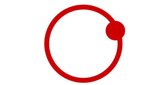
Creating an animated loader with only CSS
We will see how to perform a simple animation with only CSS like the one shown at the beginning of this post; it is a fairly simple animation to perform and its structure follows the same idea as others, that of having a container with a div and another with after.
That said, two parts are required to perform this structure; a simple div for the hollow circumference:
.circulo{
  width:70px;
  height:70px;
  border-radius:50%;
  border:5px solid rgb(204, 0, 0);
  margin: 0 auto;
}
And drawing the extra container in the following way:
.circulo:after{
	content:' ';
	width:20px;
	height:20px;
	background:rgb(204, 0, 0);
	display:block;
	border-radius:50%;
}
The use of display:block is important to show this extra container.
With this we have almost everything ready, now we need to create the animation and with this we will have our 100% functional CSS loader.
Creating the animation with keyframes
The CSS animation is very simple; by just indicating the rotation using the transform property we have the loader ready:
@keyframes rotar { 100% { transform: rotate(360deg); transform:rotate(360deg); } }Conclusions
The reason for this entry is based on achieving some inspiration when you want to animate elements in CSS and as you saw previously, with minimal CSS great results can be obtained.
The next recommended experiment is creating an animated Moon with CSS.