
One of the most interesting, powerful, and eye-catching aspects brought by CSS3 is the use of transitions, which are transitional steps from one state to another in a progressive and smooth manner; through this feature, we can achieve very striking effects with just a few lines of CSS code with which we can alter the size (width and/or height), spacing (margin and/or padding), color (color and/or background including gradients), borders, opacity (opacity), and in short, any property with its assigned value that applies a shape or style to an element or group of elements through hover or focus, as we will see in this post.
With the Transition property, we can create effects that allow an element to change gradually (over a set period of time) from one style to another; if you want to perform an animation such as increasing an element's size or changing its color, by applying certain CSS rules to that element, you will get an animation; let's see the basic principles:
That's all; by just establishing these simple steps, the browser, when interpreting our CSS rules, will do the rest—the hard work.
What CSS transitions are and why they improve the user experience
CSS transitions allow an element to change gradually from one style to another instead of doing it abruptly. By default, any property change in CSS occurs instantaneously, but by using transitions, we manage to interpolate that change over time.
In real projects, I have found that an interface with well-applied transitions:
- Is more intuitive
- Provides visual feedback to the user
- Is perceived as more "polished" and professional
And the best part is that JavaScript is not needed for most common cases: buttons, menus, cards, galleries, or interactive states.
How transitions work in CSS
A transition always needs two ingredients:
- A state change (for example, :hover, :focus, or an added class).
- A CSS property that can be interpolated between an initial and a final value.
The transition property and its shorthand form
The most common way to define a transition is using the shorthand property transition:
transition: property duration function delay;As already mentioned, with this property we specify the property to which the progressive change from one state to another will be applied; for example, if we want our change property to be width we must apply:
transition-property: width;If we want to specify more than one property, we just need to separate them with commas:
transition-property: width,height;
all instead of each property: transition-property: all;In this last case, both the width property and the height property were specified as change properties.
For example:
.box { background-color: #c0392b; transition: background-color 1s ease;}.box:hover { background-color: #3f51b5;}Here we indicate that the background color should change progressively over 1 second.
Individual transition properties
If you need more control, you can use the properties separately:
- transition-property
- transition-duration
- transition-timing-function
- transition-delay
.element { transition-property: width; transition-duration: 2s; transition-timing-function: ease-in-out; transition-delay: 0.5s;}The shorthand form is usually used for simple examples and individual properties when the behavior starts to get complicated.
Basic functioning of transition-duration
With this selector, we must specify the time the animation or transition from one state to another will last; and we can do this either in seconds (s) or milliseconds (ms); let's see an example:
transition-duration: 1000ms; In the previous example, we indicate that the transition would last 1000 milliseconds, or which is the same, one second:
transition-duration: 1s; Reduced or summarized transition property
As with practically all CSS properties, the transition property has a summarized or shortened property in which we can indicate each of the values we saw previously:
transition: property duration function delay;The delay is optional and allows delaying the transition effect in seconds or milliseconds; it also has a specific property transition-delay, for example, we can use the following rule:
transition: background 3s ease;Transition interval functions
Transition functions allow defining in an interval how we want the animation to flow, as explained in a post:
In which we talk about Bezier curves, which is a very common way in which we define how we want animations to behave (at a time level), although in this case transitions, which are an equivalent of this, but with some fundamental differences.
- Linear: the movement always goes at the same speed (constant); equivalent to
cubic-bezier(0.0, 0.0, 1.0, 1.0). - Ease: starts slow, accelerates, and ends fast; equivalent to
cubic-bezier(0.25, 0.1, 0.25, 1.0). - Ease-in: starts slow and gains a constant speed; equivalent to:
cubic-bezier(0.42, 0, 1.0, 1.0). - Ease-out: ends slowly; equivalent to:
cubic-bezier(0, 0, 0.58, 1.0). - Ease-in-out: starts slow and ends slow; equivalent to:
cubic-bezier(0.42, 0, 0.58, 1.0).
CSS properties that support transitions (and which to avoid)
Not all CSS properties behave the same when animated.
Recommended properties for smooth transitions
These are the ones that have given me the best results in production:
- transform
- opacity
- color
- background-color
- box-shadow
These are properties that are usually GPU-accelerated, which makes them smoother and more efficient.
Properties that can cause performance issues
Here you should be careful:
- width
- height
- top, left, bottom, right
If they are not implemented well, they can have erratic behaviors when animating positions or sizes, especially when the element moves with hover. In some cases, the cursor loses focus on the element and the transition is interrupted, with different results between Chrome and Firefox.
Whenever you can, it's better to simulate those movements using transform.
How CSS transitions are triggered: hover, focus, and more
Transitions run when an element changes state.
Transitions with pseudo-classes
The most common ones are:
- :hover
- :focus
- :active
- :checked
- :disabled / :enabled
.button { background: #444; transition: background 0.3s;}.button:hover { background: #000;}Transitions when adding or removing classes with JavaScript
In real projects, this is one of the most powerful ways to use transitions. By adding or removing a class with JavaScript, CSS takes care of the animation automatically.
.box { transform: translateX(600%); transition: transform 0.4s;}
.box.show { transform: translateX(0);}
An important detail I learned through trial and error: when the element is created dynamically, the transition does not run if the change occurs in the same "tick". The solution is usually to introduce a small delay with setTimeout.
Differences between entry and exit transitions
A point that often generates confusion is that the transition is not always applied the same way when entering as when exiting.
Applying transitions only when entering
.element:hover { transition: 1s;}Here the transition only runs when the cursor enters.
Applying transitions only when exiting
.element:not(:hover) { transition: 1s;}Using different durations with CSS cascade
.element { transition: 4s;}.element:hover { transition: 1s;}This pattern is very useful for creating fast entries and smoother exits.
Simple examples of transitions
In this first example, we will see how to increase the size of an element; and we do this by using transition-property: width,height:
In this other one, we will see how to change the color of an element and we do this by specifying transition-property: background:.
In this another one, we will see how to move or relocate an element using the transition-property on the left property; but the same will not happen with the background property which we DO NOT add in the transition-property.
This example is impractical, since for the transitions to be activated in all cases, the presence of the hover state is necessary, which means we must position the mouse cursor over the element (or group of elements) in question for the transition to work; however, since the rule indicates that the element moves from one position to another, focus is lost on it, resulting in some erratic behaviors as you can check yourself if you open the web, for example, in Google Chrome and/or in Firefox, where they run incorrectly and differ from each other.
Changing size, color, and opacity
.card {
 width: 200px;
 background: #ccc;
 transition: transform 0.3s, opacity 0.3s;
}
.card:hover {
 transform: scale(1.1);
 opacity: 0.8;
}
How to apply CSS transitions to elements created with JavaScript
By default, a transition does not run when creating a new element. To solve it:
setTimeout(() => { element.classList.add('show');}, 0);This small detail marks the difference between a transition that works and one that looks "broken".
Best practices: accessibility and performance in CSS transitions
Use of prefers-reduced-motion:
@media (prefers-reduced-motion: reduce) { * { transition: none; }}Not everyone tolerates animations well, and this detail improves accessibility.
Performance tips
- Prioritize transform and opacity
- Avoid animating layout (width, height)
- Use transitions only when they provide real value
When to use CSS transitions and when not to
- CSS transitions are ideal for:
- Buttons and links
- Dropdown menus
- Galleries
- Interactive states
- They are not the best option when you need:
- Complex sequences
- Full timeline control
- Synchronized animations
In those cases, @keyframes or JavaScript fit better.
The use of the step function in CSS animations and transitions

Animations and transitions are one of the great changes that CSS3 brings with it and are an ideal substitute for classic animations created through JavaScript; the steps() function allows controlling the movement of animations and transitions by indicating the number of "frames" or jumps we want a CSS animation or transitions to consist of.
In other words, it allows breaking animations or transitions into segments or pieces.
CSS transition with four frames
In this first example, we will see how to vary the transparency level of an element progressively (through CSS transitions) in one second in four parts; that is:
- 1ms: 1.00
- 250ms: 0.75
- 500ms: 0.50
- 750ms: 0.25
- 1000ms: 0
These will be the opacity levels that the background color will have over the course of one second in 4 "frames" in the transition:
Part of the CSS used is the following:
section .circle{
 background: rgba(200,200,200,1);
 transition: background 1s steps(4);
}
This other one shows how our example would look if we didn't use the steps() function or "classic" transitions:
As we can see in the previous CSS, the steps() function allows establishing the number of jumps in a given time; for the previous example, four steps were taken in 1000 milliseconds (1 second).
Animations with steps in CSS
It is even possible to use the steps() function in CSS animations, for example, if we wanted to rotate an image 360 degrees in 4 seconds in 4 steps; that is:
- 0s: 0 degrees
- 1s: 90 degrees
- 2s: 180 degrees
- 3s: 270 degrees
- 4s: 360 degrees
Part of the CSS used is the following:
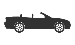
.car { animation: rotation-car 4s steps(4) infinite;}Creating a clock with CSS
In this part, we will see how to create a simple second hand clock using steps() to not execute continuous movements as would happen if steps() were not used:
Analog clock with CSS
Through the steps() value set to 60 jumps:
.circle-clock .second {
	transform-origin: 100% 50%;
	animation: circle-clock 60s steps(60) infinite;
}
The trick is to see that the animation must run in 60 seconds (until it repeats again) and must be done in 60 frames, or which is the same, one second per frame; with this, the "effect" of a traditional analog clock that only marks seconds is achieved.
What is being animated?
The clock hand rotates from 0 degrees to 360 in 60 seconds; finally the example:
CSS Transition on elements added dynamically via JavaScript
By default, when we create an HTML element and it has a transition assigned, the CSS transition does not run; for it to run, we can add a small delay; for example, taking this code snippet from our course and book on creative transitions and animations in CSS, we have a container:
.box {
    background: #5544AA;
    color: #FFF;
    display: flex;
    align-items: center;
    justify-content: center;
    width: 600px;
    height: 300px;
    margin-top: 10px;
    border-radius: 5px;
    transform: translateX(600%);
    transition: transform 0.4s;
}
.box.show{
    transform: translateX(0);
}
And so that we can add the transition in CSS once the HTML is created:
document.querySelector('.container').innerHTML += '<div class="box show"><h1>Content</h1></div>'We add a small delay; in this example, the last box is the one added with the previous script:
 setTimeout(function () {
        document.querySelectorAll('.container .box')[document.querySelectorAll('.container .box').length - 1].classList.add("show");
    }, 0)
Showing image background transitions with CSS

Showing smooth image transitions in the background of an HTML page is really simple; performing this type of transitions is a common practice on the web and in multiple applications like Flipboard for Android; in this post, we will see a simple way to perform these transitions.
The trick here is to use images slightly larger than the user's screen resolution (monitor, tablet, phone, etc.); as you might have thought...
It consists of using CSS media queries to select the image that best fits the user's resolution.
Why use images with higher resolution than the screen?
When placing an image as a background with higher resolution than the screen:

Part of it is not presented or is hidden, because the screen cannot show the entire image; even so, it is possible to show these hidden areas using the property:
background-position
This property can receive up to two values which allow shifting the image on the horizontal axes:
And vertical:
For this, we can use measurements such as pixels, percentages, or even non-numeric values such as:
left top
left center
left bottom
right top
right center
right bottom
center top
center center
center bottom
For example:
background-position: right bottom;
With this in mind, we can easily move an image from one side to another progressively through animations and mainly using the property seen above:
@keyframes transitionImage {
    0% {background-position: right bottom;background-image: url('tigre.jpg');opacity:1;}
    20% {background-position: 0 0;opacity:0.5;background-image: url('chita.jpg');}
    30% {}
    35% {opacity:1;}
    50% {background-position:left bottom; opacity:0.5;background-image: url('leon.jpg');}
    60% {}
    65% {opacity:1;}
    80% {background-position:right top; opacity:0.5;background-image: url('tigre.jpg');}
    90% {}
    100% {background-position: right bottom;opacity:1;}
}
To simplify the previous experiment, we will not use media queries, although they can be easily adapted to the CSS presented above; that is, it is enough to define the @keyframes within the media queries; a case similar to the one we applied in the post How to cover the entire background with an image with CSS? .
Frequently asked questions about transitions in HTML and CSS
- Why isn't my CSS transition working?
- Usually because there is no state change or the property is not animatable.
- What is the difference between transition and animation?
- transition goes from one state to another; animation allows multiple states.
- Can transitions be used without hover?
- Yes, using focus, checked, or dynamic classes.
- What properties cannot be animated?
- For example, font-family or values that do not have clear intermediate states.
Examples of CSS Transitions
On the blog, we have many other experiments with CSS transitions for smooth changes. Here are a few:
- CSS Radio Button Styles: How to Create Custom and Animated Radio Buttons Without JavaScript
- Styles for Custom Checkboxes in CSS
- Hover and Transition Effects in CSS for Images
- Interesting Effects You Can Achieve with Lists in CSS
- Designing Buttons with a Sliding Background in HTML and CSS
- How to Create an Animated Hamburger Button or Menu with CSS and a Little HTML
- Creating a simple progress bar with just CSS: interactive and without JavaScript
Conclusion
As we could see throughout the article, this property can be used when we want to make gradual transitions between different styles applied to an element at different moments in time without using a single line of JavaScript; it is perfect for applying it to image galleries , navigation menus with sub-menus, etc., as it significantly improves the experience the user may have.
There you will be able to see reversible effects, which are basically those that rotate the element on its axis either to simulate opening a door or showing markers; also how to create checkboxes with a transition when switching from active to inactive and another very interesting function that we have not addressed in this tutorial, which is the use of the step function to mark the number of steps necessary to complete the transition; all this with detailed examples.