
In the following posts, we will provide some experiments using the hover selector and Transitions in CSS and/or Animations in CSS to achieve some curious effects that might be useful for you to implement on your website.
For this first experiment, in addition to the hover selector, we will use other selectors like before and after, which together allow us to create the following effect:

Hover the cursor over it
The idea is...
Let's look at it in parts; first, we use a single div whose only child will be an image; the following HTML represents what was mentioned above:
<div class="cuerpo leon derecha"> <img src="leon.jpg" /> </div>Plus a little CSS to give the desired shape to our div and image:
.cuerpo {
   width: 200px;
   height: 200px;
margin:30px auto 0 auto;
}
.cuerpo img{
		width:inherit;
		height:inherit;
		border-radius:50%;
}
We obtain the following result:

Analyzing the CSS above…
- A fixed and proportional size, aligned.
- We specify the size of the images equal to that of the parent using the
inheritvalue. - In addition to applying rounding to the images and using the
object-fitproperty to change the aspect ratio, discussed in a previous post.
The before and after selectors
With the before and after selectors, it is possible to create other "containers" respectively:

before and after selectors are so versatile that they can even take different properties, just like divs.The CSS rendered via the before selector will be shown on top of the image, creating a translucent border effect on top of it; while the CSS rendered by the after selector will only be shown when the cursor is positioned over the div.
CSS for the before selector
For the rounded and blurred border specified in the CSS of the before selector, we use:
.cuerpo:before {
		display: block;
		border-radius: 50%;
		content: '';
		box-shadow: inset 0 0 0 10px rgba(255, 255, 255, 0.5);
         width: inherit;
         height: inherit;
		position: absolute;
}
Analyzing the CSS above…
- We use the
box-shadowproperty to create an internal border. - Again, the size of the "container" is specified to be the same as the div's size using the
inheritvalue.
inherit value, the parent's values are inherited.CSS for the after selector
Now we need to specify the CSS for the after selector, which will be displayed when the cursor is positioned over the div through a transition:
.cuerpo:after {
 		display: table-cell;
		border-radius: 50%;
		box-shadow: inset 0 0 0 10px rgba(255, 255, 255, 0.5);
                	width: inherit;
                	height: inherit;
		position: absolute;
		background: rgba(0, 0, 0, 0.8);
		transition: all 1s;
		opacity:0;
		content:"";
		color:#FFF;
		text-align:center;
  		font-family: Arial;
	    	font-size: 12px;
   		font-weight: bold;
		line-height: 50px;
}
Analyzing the CSS above…
opacityset to zero so that the "container" is not visible.- We specify the transition with the
transitionproperty.
We have almost everything ready; we just need to define the behavior (transition) that will occur when we position the cursor over the div and the CSS Transitions begin; for this, we use the following selectors combined with different angles:
.derecha:after {/*My CSS*/} For example, we define the following transformations, specifying all sides and laterals:
	.derecha:after {
		transform:translate(300px,-200px);
	}
	.izquierda:after {
		transform:translate(-300px,-200px);
	}
	.arriba:after {
		transform:translate(0,-500px);
	}
	.abajo:after {
		transform:translate(0,300px);
	}
	.lateral1:after {
		transform:translate(-300px,-300px);
	}
	.lateral2:after {
		transform:translate(300px,-300px);
	}
	.lateral3:after {
		transform:translate(300px,300px);
	}
	.lateral4:after {
		transform:translate(-300px,300px);
	}
            .derecha:hover:after {
		transform:translate(0px,-200px);
		opacity:1;
            }
            .izquierda:hover:after {
		transform:translate(0px,-200px);
		opacity:1;
            }
            .arriba:hover:after {
		transform:translate(0px,-200px);
		opacity:1;
            }
            .abajo:hover:after {
		transform:translate(0px,-200px);
		opacity:1;
            }
            .lateral1:hover:after {
		transform:translate(0px,-200px);
		opacity:1;
            }
            .lateral2:hover:after {
		transform:translate(0px,-200px);
		opacity:1;
            }
            .lateral3:hover:after {
		transform:translate(0px,-200px);
		opacity:1;
            }
            .lateral4:hover:after {
		transform:translate(0px,-200px);
		opacity:1;
            }
            .leon:after {
		content:"León";
            }
            .chita:after {
		content:"Chita";
            }
You can see the complete code and download the resources in the following links:
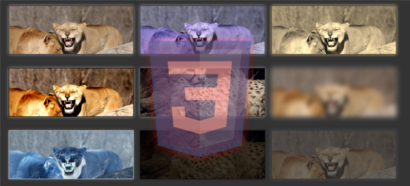
In the previous post Hover and transition effects in CSS (part 1) we saw how to create a curious overlay on our images; in this post, we will see how using CSS3 Filters together with transitions on images allows us to create very striking effects for the supported filters:
Creating our effect
As you may have noticed, the images have a filter applied by default, and when you position the cursor over them, the filter is progressively removed, resulting in an attractive effect through CSS Transitions.
CSS for the images (Filters and Transitions)
First, we will define the base CSS for the container and the images:
            .cuerpo {
                width: 30%;
                height: 200px;
                margin:30px 7px;
                float:left;
                transition:1s all;
            }
            .cuerpo img{
                width:100%;
                height:inherit;
                object-fit: cover;
                box-shadow: 0 0 20px #999;
                border:2px solid #333;
            }
            .grayscale{
                -webkit-filter: grayscale(100%);
            }
            .hue-rotate{
                -webkit-filter: hue-rotate(220deg);
            }
            .sepia{
                -webkit-filter: sepia(100%);
            }
            .contrast{
                -webkit-filter: contrast(190%);
            }
            .saturate{
                -webkit-filter: saturate(50%);
            }
            .blur{
                -webkit-filter: blur(10px);
            }
            .invert{
                -webkit-filter: invert(100%);
            }
            .brightness{
                -webkit-filter: brightness(0.25);
            }
            .opacity{
                -webkit-filter: opacity(34%);
            }
Again, we use the object-fit property to change the aspect ratio; this way we can easily work with images of different aspect ratios without distorting them.
CSS for the images (:hover)
And as we mentioned at the beginning of this post, the CSS for the :hover simply removes the CSS filters defined in the previous section:
             .hue-rotate:hover{
                -webkit-filter: hue-rotate(0deg);
            }
            .brightness:hover{
                -webkit-filter: brightness(1);
            }
            .sepia:hover{
                -webkit-filter: sepia(0);
            }
            .saturate:hover{
                -webkit-filter: saturate(1);
            }
            .opacity:hover{
                -webkit-filter: opacity(1);
            }
            .invert:hover{
                -webkit-filter: invert(0);
            }
            .grayscale:hover{
                -webkit-filter: grayscale(0);
            }
            .contrast:hover{
                -webkit-filter: contrast(100%);
            }
            .blur:hover{
                -webkit-filter: blur(0px);
            }
You can download the complete experiment in the following links:
Hover effects on images with CSS
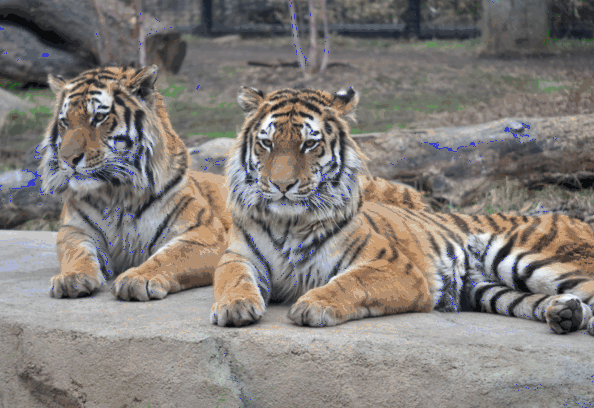
In this post, we will see how to create a simple hover effect on an image like the one shown in the header of this post using a bit of CSS, HTML, and JavaScript (jQuery).
For this, an image is placed as a background in a container, and multiple consecutive squares (divs) are placed, each a fraction of the background size, without a defined color so that they are invisible by default; to facilitate their insertion, we use a simple JavaScript that will create these containers; when positioning the cursor over the squares, a CSS Transition causes them to progressively acquire a semi-transparent color:
Move the cursor from one end of the image to the other.
The CSS for the document consists of an image that takes up the entire page; which would be a bit more complicated to do using an img tag:
    html {
        background: url(tigre.jpg) no-repeat center center fixed;
        background-size: cover;
    }
The CSS for the squares is as follows:
    .block {
        width: 6.25%;
        float: left;
        position: relative;
        transition: opacity 500ms ease;
        background-color: transparent;
        transition: all 3s linear;
    }
    .block:before {
        content: "";
        display: block;
        padding-top: 100%;
    }
    .block:hover {
        background-color: rgba(255, 255, 255, 0.25);
        transition: all 100ms linear;
    }
This is the JavaScript that allows building the squares on top of the image:
    var i = 0,
            newBlock = '<div class="block"></div>',
            $blockContainer = $(".blocks");
    for (i = 0; i > 150; i++) {
        $blockContainer.append(newBlock);
    }
And that's all, with this we get the effect shown above.
Based on this, we can change the effect a bit, and instead of having the opacity vary, we will make them appear by establishing some internal borders with a bit of CSS:
Move the cursor from one end of the image to the other.
The CSS is as follows:
    .block {
        width: 6%;
        float: left;
        position: relative;
        box-shadow: inset 0 0 0 0 rgba(255, 255, 255, 0.25);
        transition: all 1s ease;
    }
    .block:before {
        content: "";
        display: block;
        padding-top: 100%;
    }
    .block:hover {
        box-shadow: inset 0 0 0 100px rgba(255, 255, 255, 0.25);
    }
The next experiment on the list is about some interesting effects that can be achieved with lists in CSS.