Many times you want to adjust an image using CSS within a parent container; for example, you have a container at 1920x1080 and you want the image to occupy all that space without distortion; and you also want the image to adapt according to the screen resolution; well, this property called object-fit that CSS brings us is for you.
The object-fit CSS property specifies how the content of an element (such as an image) should be displayed when the width and height of this element varies with respect to its container (box) created by the element itself; the utility of this property lies in the fact that you can choose how you want the content to fit into an assigned space (created by the content itself) that varies in the aspect ratio of the image.
When you work with images in CSS, sooner or later you run into the same problem: you have a container with specific dimensions (for example, a hero section at 1920×1080) and you need the image to occupy all the space, adapt to different resolutions, and not be deformed. This constantly happened to me in responsive designs where the image had to scale according to the screen size without losing its proportion.
For this scenario, there is a property designed exactly for that: object-fit. In this article, I explain what it is, how it works, and, above all, when to use each value, with clear examples applicable to real projects.
As you can see, it is a very interesting property that works in a similar way to background-size: cover which is an older property that the different browsers implemented that allows you to cover the entire background of a container with an image without it being distorted, same solution, different scenarios; since the object-fit property acts on images and not on backgrounds.
Previously we saw how to use the perspective property to create a 3D environment with CSS.
What the object-fit CSS property is and what it is for
The object-fit property defines how the content of a replaced element should be adjusted within its own content box.
In CSS, objects are considered to be elements such as:
- Images (<img>)
- Videos (<video>)
- Iframes
- Embeds
These elements do not behave like a normal div, as they have their own intrinsic size. And this is where the problem usually appears: that size does not always fit the container we are using in the design.
With object-fit, we can decide how that content adapts when we force a specific width and height.
Object-fit vs background-size: when to use each one
If you have been using CSS for a while, you are probably familiar with background-size: cover. In fact, when I started facing these problems, that was the usual solution for backgrounds.
The key difference is this:
- background-size is used with background images (background-image)
- object-fit is applied directly to images and media inserted in HTML
Both properties solve similar problems, but in different scenarios. If the image is part of the content (for example, an <img> that must be accessible and responsive), object-fit is the correct option.
Aspect ratio and its impact on images
To fully understand object-fit, you must first be clear about a fundamental concept: the aspect ratio.
The aspect ratio is simply the proportion between the width and height of an image.
How to calculate the aspect ratio of an image
For example, an image of 1200×675 px:
- 1200 ÷ 16 = 75
- 675 ÷ 9 = 75
Since both values coincide, the image has a 16:9 ratio.
What happens when the container and the image do not match
Now imagine you place that image in a 400×100 px container. The container has a 4:1 proportion, completely different.
This is where the object-fit values come into play: they will decide whether the image is stretched, cropped, or leaves empty spaces to adapt to that new box.
Practice: How to adjust an image to its container using only CSS?
This is already a property that has good support in browsers, for a few years now the main browsers such as Chrome, Firefox, and Edge have implemented it, so you can use this property without fear to easily fit an image inside a div and make it self-adjusting for that reason.
Suppose we have an image with the following:
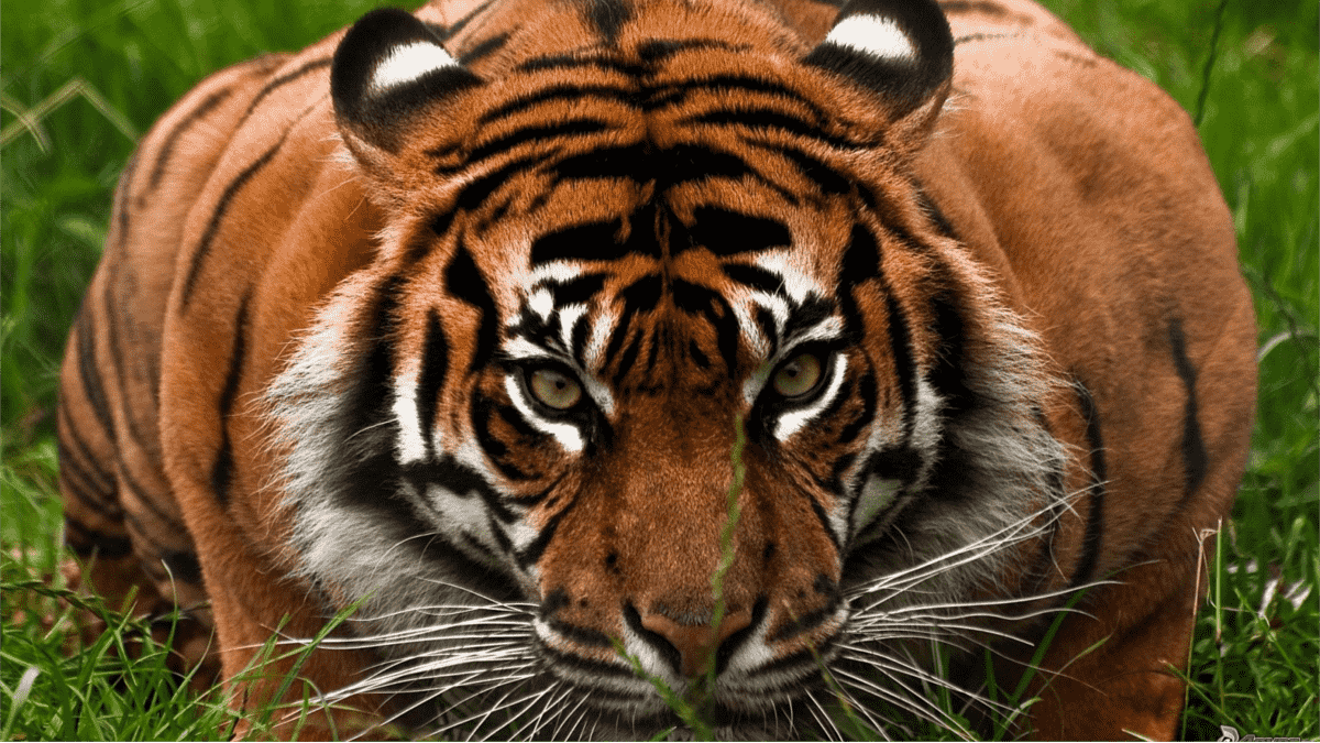
The previous image has an aspect ratio of 16/9 since it has X and Y dimensions of:
1200÷16 = 75675÷9 = 75Both values are equal, which indicates that the aspect ratio is 16/9.
What should we do to adjust the content to be displayed in the image if we want to present it in a rectangle of about 400x100 pixels? and where logically the aspect ratio is different from that of the image (4/1).
To answer the previous question, we must first know what the possible values for this property are and the meaning of each one:
Object-fit property values explained one by one
| fill | In this first case, the content is sized to completely fill the dimensions created by its box and therefore the aspect ratio is lost and there are no white spaces. |
| cotain | In this second case, the content is sized to fit in the best way; but unlike the previous value, the aspect ratio is maintained and therefore if the aspect ratios vary between the content and its box, there will be empty spaces in the box. |
| cover | The cover value has the same behavior as using the background-size property with the cover value; the content is sized to completely fill its box and the aspect ratio is maintained, but crops are made on the edges of the content to adjust it. |
| none | The content is not resized. |
| scale-down | The content is resized as if none or cotain were specified. |
To understand these assignable values for the object-fit property a little better, let's look at a series of examples with each of these values; we will use the following image:

Which has dimensions of 1200px by 675px and therefore an aspect ratio of 16/9:
When placing this image in a 400x100 pixel container with an aspect ratio different from that of the image and applying each of the values explained above.
We create as many <img> tags stored in a structure as values the object-fit property comprises.
		<div class="example1">
			<div>
				<img class="uno" src="tigre.png">
				<span>object-fit: fill;</span>
			</div>
			<div>
				<img class="dos" src="tigre.png">
				<span>object-fit: contain;</span>
			</div>
			<div>
				<img class="tres" src="tigre.png">
				<span>object-fit: cover;</span>
			</div>
			<div>
				<img class="cuatro" src="tigre.png">
				<span>object-fit: none;</span>
			</div>
			<div>
				<img class="cinco" src="tigre.png">
				<span>object-fit: scale-down;</span>
			</div>
		</div>
The defined CSS is mainly based on the creation of a 400px by 100px box with a border to facilitate the difference between the distinct values provided by the object-fit property set with different values for the images.
This way you will be able to appreciate how the image adjusts, enlarges, or reduces without distorting it, in other words; the image self-adjusts to the container perfectly:
.example1 img {
	width: 400px;
	height: 100px;
	border: 2px solid #fff;
}
.example1 img.uno {
	object-fit: fill;
}
.example1 img.dos {
	object-fit: contain;
}
.example1 img.tres{
	object-fit: cover;
}
.example1 img.cuatro{
	object-fit: none;
}
.example1 img.cinco{
	object-fit: scale-down;
}
We obtain the following results; here you can see how to adjust an image with the different values that object-fit allows us on images; we can fill the container completely by stretching the image or cropping it, or we can instruct it to occupy as much as it can without cropping or scaling it; in summary, those are the descriptions of the examples we will see below:
object-fit: fill
This is the default value. The image fills the entire container, even if it has to be deformed to do so.
It is useful only when proportion does not matter, as the aspect ratio is lost.
 object-fit: fill;
object-fit: contain
With contain, the image is resized while maintaining its original proportion.
- It does not deform
- It may leave empty spaces
It is ideal when you need to see the entire image, even if it does not cover the whole container.
 object-fit: contain;
object-fit: cover
This is the value I use the most in practice.
- Maintains the proportion
- Completely covers the container
- May crop parts of the image
It works very similarly to background-size: cover and is perfect for banners, cards, or visual headers.
 object-fit: cover;
object-fit: none
The image is not resized.
- Maintains its original size
- If it is larger than the container, it is cropped
It is rarely used, but it can be useful in very specific cases.
 object-fit: none;
object-fit: scale-down
This value behaves as a combination of none and contain.
- If the image is smaller than the container, it is not enlarged
- If it is larger, it is reduced while maintaining the proportion
It is an interesting option when you want to avoid unnecessary scaling.
 object-fit: scale-down;
How to adjust an image to its container using only CSS
Let's look at a practical summary example, similar to those I usually use in real projects.
<div class="example"> <img src="tigre.png" alt="Example image"></div>CSS for adapting images without distortion
.example img { width: 400px; height: 100px; object-fit: cover;}With this code, the image adapts to the container, covers the entire space, and maintains its proportion, even when the container size changes in responsive designs.
Browser compatibility and best practices
object-fit has broad support in modern browsers for years:
- Chrome
- Firefox
- Edge
- Opera
This means you can use it with complete confidence in current projects.
As a best practice:
- Always define width and height
- Combine it with object-position if you need to control the cropping
- Avoid using fill unless deformation is not a problem
When to use object-fit and common mistakes to avoid
Use object-fit when:
- You need responsive images without deformation
- You work with cards, galleries, or hero sections
- You want to precisely control cropping
Common mistakes:
- Forgetting to define dimensions
- Using background-size when the image should be an <img>
- Not taking into account the original aspect ratio
Conclusion
The object-fit CSS property is one of those tools that, once you understand it well, saves you many headaches. In my experience, it is the cleanest and most flexible solution for adjusting images to containers without sacrificing design or proportions.
If you work with modern and responsive layouts, mastering object-fit is not optional: it is essential.
Next step, learn how to set borders with CSS
