
Borders are fundamental properties in CSS that we can configure on all kinds of HTML elements at the top, bottom, or sides, varying the style, thickness, and other styles we will see in this guide. Remember that it depends on the use of the object-fit property in CSS to adjust images with CSS without deforming them.
With this property, it is possible to define the color, size, and style of each of the 4 borders that define an element's box; let's see each of the properties that make it up:
border-width
Defines the width the border will have; the width of the borders is defined with the following four properties:
border-top-widthborder-right-widthborder-bottom-widthborder-left-width
Each of the properties above is self-explanatory; their width is indicated using any unit of measurement supported by CSS.
If you want to simultaneously set the width of all borders, we can use the following property:
border-width
Where it receives from one to four values:
border-width:4px 5px 6px 7px- top border: 4px
- right border: 5px
- bottom border: 6px
- left border: 7px
border-width:4px 5px 6px- top border: 4px
- right and left border: 5px
- bottom border: 6px
border-width:4px 5px- top and bottom borders: 4px
- right and left borders: 5px
border-width:4px- All borders: 4px
Border-style
Defines the style of the borders:
soliddasheddotteddoublegrooveridgeinsetoutset
It is also possible to define them one by one (for each side of the border):
border-top-styleborder-right-styleborder-bottom-styleborder-left-style
Or all of them with a single property:
border-style
Its operation is exactly the same as border-width.
Border-color
Defines the color; it is given in RGB (#111111, #001122...) or the name of the color in English (red, blue...):
#border-color1{border-color:#F00000;}It is also possible to define them one by one (for each side of the border):
border-top-colorborder-right-colorborder-bottom-colorborder-left-color
Its operation is exactly the same as border-width.
Examples:
border-style and border-color:
border-style, border-color, and border-width:
It is also possible to define all properties in a single property with border:
In both cases we see the same result; the only thing that varies is the number of lines to obtain the result.
Multiple borders in a container with CSS
A very simple way to have several borders, or rather the effect of having several borders in a container or element, is using the box-shadow property; let's see:
Syntax of the box-shadow property
box-shadow: x y blur spread color inset;| Value | Description |
|---|---|
| x | Required. The position of the shadow on the horizontal axis. |
| y | Required. The position of the shadow on the vertical axis. |
| blur | Optional. Border blur. |
| spread | Optional. Size of the shadow. |
| color | Optional. Shadow color. |
| inset | Optional. If present, the border will appear inside the element. |
Creating borders with the box-shadow property
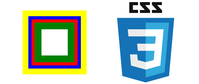
We will use the following attributes to achieve multiple borders with the box-shadow property:
box-shadow: x y blur spread color;With these simple steps we create a couple of 2px borders each; the first one green and the second one red:
box-shadow: 0 0 0 2px green, 0 0 0 4px red;We can have borders of different sizes:
box-shadow: 0 0 0 2px green, 0 0 0 6px red;Or as many borders as we want in a single container:
box-shadow: 0 0 0 2px green, 0 0 0 4px red, 0 0 0 6px blue, 0 0 0 8px yellow; General considerations
- The first three values of the
box-shadowproperty must be set to zero; this is so that the borders relative to the vertical and horizontal axes are centered and even with the container and that the border of the container is a solid color; in other words, that it does not blur. The first borders we define must be smaller than the next or subsequent ones defined; otherwise the internal ones overlap the external borders; let's see an example case:
box-shadow: 0 0 0 3px green, 0 0 0 3px red;We can see that the red border is overlapped by the first green border; and this is because they have the same size. We simply have to make each border larger than the previous one; this way we achieve the effect that there are multiple borders in the same container.
CSS Border Trick: Transparent borders
If you ever tried to put a “transparent” border in CSS and discovered that it looked gray or totally opaque, don't worry: it happened to all of us. The good news is that the trick to achieving truly transparent borders is simple… when you know what the secret ingredient is.
I had to learn it while designing a custom button, one of those where you want the interface to look modern without overloading it. That's when I discovered that border transparency doesn't just depend on rgba(), but on how the background behaves underneath.
In this guide, I'll tell you exactly how to do it, why it works, and how to apply useful variants in buttons, cards, and UI components.
What are transparent borders in CSS and what are they for?
In CSS, a transparent border is simply a border whose color includes an opacity value. This is achieved with rgba() or hsla().
The beauty of it is that the container “lets you see” what is underneath: it can be a color, an image, or a gradient.
They are useful for:
- Creating softer and more modern components.
- Buttons with a crystalline effect (I use them a lot in minimalist designs).
- Cards where you want a visible but discreet border.
- “Glassmorphism” style UI effects.
But for the border to actually look transparent —and not gray or dirty— you need to understand a detail of the box model…
We will see a small trick that allows the borders of the containers of our elements or HTML tags to look transparent.
The main method: RGBA + background-clip
This is the method that always works and the one used by the 3 competitors we analyzed.
.container {
   background-color: white;
   border: 20px solid rgba(0, 0, 0, 0.5);
   background-clip: padding-box;
}
Why the border looks opaque even if you use rgba
This happens because, by default, the background extends under the border.
When the background is white, for example, that white mixes with the transparency of the border and makes it look gray.
This is exactly what I discovered the first time I tried to add transparency to a button: instead of an elegant border, I got an ugly gray. I thought the rgba was wrong... but no: it was the background getting where it shouldn't.
How background-clip: padding-box works explained easily
The key property that solves all of this is:
background-clip: padding-box;In simple words:
- border-box (default value): the background touches the border → transparency ruined.
- padding-box: the background does not invade the border → the border looks as it should.
If you want transparent borders, always use background-clip: padding-box.
Practical examples of transparent borders
Basic transparent borders with rgba
.box {
   background-color: white;
   border: 15px solid rgba(0, 0, 0, 0.5);
   background-clip: padding-box;
   padding: 20px;
}
Semi-transparent borders with rounded corners
.round-box  {
   background-color: white;
   border: 10px solid rgba(255, 0, 0, 0.4);
   background-clip: padding-box;
   border-radius: 12px;
   padding: 15px;
}
The trick works the same with border-radius, regardless of the value.
Custom buttons with transparent border (my experience)
I usually use transparent borders on buttons when I want a “lighter” effect. For example:
.transparent-button {
   padding: 12px 20px;
   background-color: white;
   border: 2px solid rgba(0, 0, 0, 0.3);
   background-clip: padding-box;
   border-radius: 8px;
   font-weight: bold;
   cursor: pointer;
   transition: 0.3s;
}
.transparent-button:hover :hover {
  border-color: rgba(0, 0, 0, 0.6);
}
I use it a lot when I want a custom button without going for the classic “outline” style; transparency softens everything and makes it more elegant.
Alternative techniques to achieve borders with transparency
These variants allow for more advanced styles or animations.
1. Using box-shadow as if it were a border
.shadow-box {
   background: white;
   padding: 20px;
   box-shadow: 0 0 0 5px rgba(0,0,0,0.3);
}
Advantages:
- You can make softer borders.
- Ideal for glassmorphism effects.
2. Using border-image with gradients
.gradient-box {
   border: 6px solid transparent;
   border-image: linear-gradient(to right, transparent, rgba(0,0,0,0.4)) 1;
}
Perfect for “lit” or stylized borders.
3. Transparency + hover with animation
.hover-effect {
   border: 4px solid rgba(0,0,0,0.2);
   background-clip: padding-box;
   transition: border-color 0.3s ease;
}
.hover-effect:hover { border-color: rgba(0,0,0,0.6);}
I use it on buttons when I want the border to seem to “materialize” when hovering.
Transparent borders
This trick is really simple; if we want to have transparent borders like the following in our boxes:
This is a bunch of nonsense text meant to show how transparent borders look on a floating container. This is a bunch of nonsense text meant to show how transparent borders look on a floating container. This is a bunch of nonsense text meant to show how transparent borders look on a floating container. This is a bunch of nonsense text meant to show how transparent borders look on a floating container. This is a bunch of nonsense text meant to show how transparent borders look on a floating container. This is a bunch of nonsense text meant to show how transparent borders look on a floating container. This is a bunch of nonsense text meant to show how transparent borders look on a floating container.
We must do two things
- Select a color with transparency using an RGBA color instead of RGB or hexadecimals, which are perfect in these situations, as they allow easily varying the opacity of the color through the 4th parameter of the RGBA color.
- Apply the property
background-clipwith the valuepadding-box, this way the background color does not show behind the border; the use of thebackground-clipproperty is a topic we covered in the previous post.
Creating transparent borders
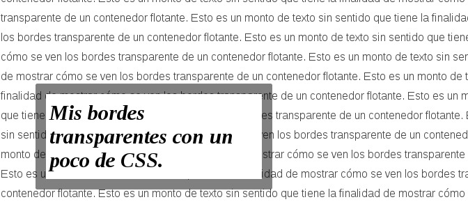
If we want to create a black border that has 50% transparency, we must apply the following RGBA color to our border:
rgba(0, 0, 0, 0.5);And for the background-clip property, we use this property precisely to prevent the background color from showing behind the border and ruining the effect:
background-clip: padding-box; Part of our CSS rule would be defined as:
border: 20px solid rgba(0, 0, 0, 0.5);
background-clip: padding-box;
Finally, we get the following effect:
This is a bunch of nonsense text meant to show how transparent borders look on a floating container. This is a bunch of nonsense text meant to show how transparent borders look on a floating container. This is a bunch of nonsense text meant to show how transparent borders look on a floating container. This is a bunch of nonsense text meant to show how transparent borders look on a floating container. This is a bunch of nonsense text meant to show how transparent borders look on a floating container.
Suppose we want a red color on the border:
border: 20px solid rgba(255, 0, 0, 0.5);And we get:
This is a bunch of nonsense text meant to show how transparent borders look on a floating container. This is a bunch of nonsense text meant to show how transparent borders look on a floating container. This is a bunch of nonsense text meant to show how transparent borders look on a floating container. This is a bunch of nonsense text meant to show how transparent borders look on a floating container.
And that would be all, as you can see, using the same border property we can vary the thickness or size of the border, which in these examples is 20px.
CSS Border Trick: Internal borders
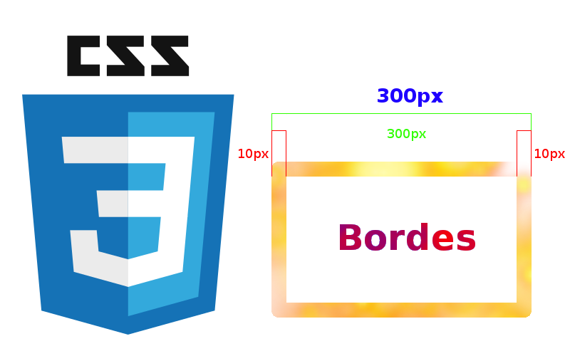
In this entry, we will see how to create borders that do not influence the size of the container; as you may know, when defining different properties like padding, margin, and/or border, these directly impact the size of the container; that is:
total_width = width + 2*border + 2*padding + 2*margin = 300px + 2*5px + 2*7px +2*5px = 334px;
total_height = height + 2*border + 2*padding + 2*margin = 150px + 2*5px + 2*7px +2*5px = 184px;
A visual aid of the above:

Internal borders in CSS?
When we refer to "internal borders", we mean they are a type of border that does not influence the size of the container and can be very useful as in the following example:
Try resizing your browser window.
As you noticed in the previous example, these three containers occupy 33% of the total width of the container; if the borders were traditional:
The third container could not be aligned in the same row.
Creating internal borders in CSS
By using the box-shadow property, it is very easy to create internal borders; also, we take the opportunity to explain a bit about how the box-shadow property works, which we will do next:
box-shadow: inset offset-x offset-y blur-radius spread-radius colorinset: This value indicates that the shadow will appear inside the container and not outside of it.offset-xandoffset-y: Indicate the displacement of the shadow on the horizontal and vertical axis respectively.blur-radius: Indicates the degree of blur, which for our example is zero in all cases.spread-radius: Allows increasing or reducing the size of the shadow.color: Determines the color of the shadow in its hexadecimal representation or any other supported by CSS.
Internal borders by sides in CSS
To create the top, bottom, right, and left borders we only need to set the width we want the border to have in the spread-radius parameter:
Top borders in CSS of 13 pixels:
box-shadow: inset 0 13px 0 0 #08B;Left borders in CSS of 13 pixels:
box-shadow: inset 13px 0 0 0 #08B;Right borders in CSS of 13 pixels:
box-shadow: inset -13px 0 0 #08B;Bottom borders in CSS of 13 pixels:
box-shadow: inset 0 -13px 0 #08B;Symmetrical internal borders in CSS
To create symmetrical internal borders in CSS we can do the following:
Symmetrical internal borders in CSS of 3 pixels:
box-shadow: inset 0 0 0 3px #08B;Symmetrical internal borders in CSS of 7 pixels:
box-shadow: inset 0 0 0 7px #08B; Symmetrical internal borders in CSS of 13 pixels:
box-shadow: inset 0 0 0 13px #08B;Diagonal borders in CSS
Diagonal borders in CSS of 13 pixels:
box-shadow: inset -13px -13px 0 0 #08B;Diagonal borders in CSS of 13 pixels:
Diagonal borders in CSS of 13 pixels:
box-shadow: inset 13px 13px 0 0 #08B;Diagonal borders in CSS of 13 pixels:
box-shadow: inset -13px -13px 0 0 #08B;Frequently Asked Questions (FAQs)
- Can I make borders totally invisible?
- Yes:
border: 10px solid transparent;- Useful for layout tricks and pseudo-elements.
- Does it work with background images?
- Yes, as long as you use background-clip: padding-box.
- Can I use hsla() instead of rgba()?
- Absolutely.
border: 10px solid hsla(0, 0%, 0%, 0.3);
Conclusion
Transparent borders in CSS are easy to create when you know the key trick: combining rgba() with background-clip: padding-box.
This allows you to build more modern interfaces, cleaner buttons (I use them a lot in my own developments), and visual effects that do not saturate the design.
If you want to take them further, try variants like box-shadow or border-image to achieve advanced styles without getting complicated.
The next very interesting property to know is how you can create reflections in your images using only CSS and webkit-box-reflect.