
Content Index
- Progress Indicators: Linear and Circular with Jetpack Compose
- 1. Circular Progress Indicator: Indeterminate Progress
- Circular Progress Indicator Legacy
- 2. Linear Progress Indicator: Determinate Progress
- CircularProgressIndicator and LinearProgressIndicator
- Customization and Visual Details
- Legacy Form (XML View System)
- Ways to use the ProgressBar
- 1. Determinate ProgressBar
- 2. Indeterminate ProgressBar
- Practical Case
In this post, we will talk about another method to indicate the loading progress of an operation that can replace the now deprecated ProgressDialog in newer versions of Android; this means that in future versions of Android, this software component will cease to exist.
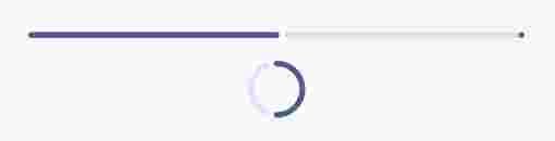
The UI element in question looks like this:

And it is known as ProgressBar; as you can see, it is a kind of animated side bar which has already been present on websites like YouTube or in the YouTube Android app itself among other applications, and in modern Android, we have several variants such as the Circular or Linear types.
We left off knowing how to use Dropdown option menus in Android Studio.
Progress Indicators: Linear and Circular with Jetpack Compose
With the arrival of Jetpack Compose, the way to build user interfaces in Android has changed to a declarative approach. Instead of XML, we now use Composable functions written in Kotlin.
In Compose, progress indicators are called CircularProgressIndicator (for the circle style) and LinearProgressIndicator (for the horizontal bar style).
1. Circular Progress Indicator: Indeterminate Progress
Used when the time an operation will take is unknown.
@Composable
fun MyLoadingScreen() {
    Box(
        contentAlignment = Alignment.Center,
        modifier = Modifier.fillMaxSize()
    ) {
        CircularProgressIndicator()
    }
}
Circular Progress Indicator Legacy
It works identically to the previous one, but with a circular shape. Although you can pass the value directly, using braces {} is recommended to optimize recompositions by using lambda functions.
CircularProgressIndicator(
   progress = { currentProgress }
)
CircularProgressIndicator(progress = currentProgress) // legacy
2. Linear Progress Indicator: Determinate Progress
This is the one that occupies the width of the screen. We can customize its size and thickness using a Modifier.
To show or hide it, you can use a simple condition in your Composable:
@Composable
fun MyLoadingScreen() {
    Box(
        contentAlignment = Alignment.Center,
        modifier = Modifier.fillMaxSize()
    ) {
        LinearProgressIndicator(progress = { animatedProgress },
            modifier = Modifier
                .fillMaxWidth()
                .padding(horizontal = 32.dp))
    }
}
It is used to show the progress of a task with a known percentage (from 0.0 to 1.0).
CircularProgressIndicator and LinearProgressIndicator
An example where you can see the functioning of both progress composables:
@Composable
fun MyDownloadProgress() {
    var progress by remember { mutableFloatStateOf(0.5f) }
    val animatedProgress by animateFloatAsState(
        targetValue = progress,
        animationSpec = ProgressIndicatorDefaults.ProgressAnimationSpec
    )

    Column(horizontalAlignment = Alignment.CenterHorizontally) {
        // Indicador lineal
        LinearProgressIndicator(progress = { animatedProgress },
            modifier = Modifier
                .fillMaxWidth()
                .padding(horizontal = 32.dp))

        Spacer(Modifier.height(16.dp))

        // Indicador circular
        CircularProgressIndicator(progress = { animatedProgress }) // Lambda
        // CircularProgressIndicator(progress =  animatedProgress ) // deprecated
    }
}
In this example, you would update the progress variable as your task advances.
Customization and Visual Details
By default, these components work with values between 0 and 1. For example, a value of 0.5 will fill the bar exactly halfway.
If you hover over the component and use Control + Click, you will see all the properties you can change:
- Color: The color of the active bar.
- Track Color: The background color of the bar (the track).
- Stroke Width: The thickness of the stroke.
An interesting detail is that, depending on whether you use the lambda version or the standard version, the visual finish may vary slightly (such as the rounding of the ends or the color of the gray track).
Legacy Form (XML View System)
This is the traditional way to add progress indicators in Android, using XML layout files.
Ways to use the ProgressBar
ProgressBar can be used to indicate the progress of a task in percentages (0% to 100%) or in an indeterminate way as shown in the previous image.
You simply need to set it to be visible during loading times and hide it (invisible) when the content is ready; as we can see, this UI element has the drawback that it does not allow blocking the entire activity or fragment that executes it to prevent the user from interacting with the interface, but as a best practice, such blocking should be done manually by hiding or disabling the interface elements we consider necessary.
Now let's see the options we have for using ProgressBar:
1. Determinate ProgressBar
To show the progress of the ProgressBar in terms of percentages, we can use the android:progress attribute; we can also vary the percentage levels to define a minimum and maximum boundary with the android:min and android:max attributes respectively:
 <ProgressBar
      android:id="@+id/determinateBar"
      style="@android:style/Widget.ProgressBar.Horizontal"
      android:layout_width="wrap_content"
      android:layout_height="wrap_content"
      android:progress="25"/ >
The code above shows how to create a ProgressBar with determinate progress and a default value set to 25%, which of course can be varied programmatically with the setProgress(int) method.
Of course, programmatic methods also exist to define the minimum and maximum boundaries:
setMax(int max) setMin(int min)2. Indeterminate ProgressBar
For the ProgressBar, we simply need to use it without the attributes seen above; that is, without android:progress, android:min, and android:max; the code results as follows:
<ProgressBar
      android:id="@+id/indeterminateBar"
      android:layout_width="wrap_content"
      android:layout_height="wrap_content"
      />
You can consult the full documentation at the following link: Android Developer ProgressBar.
Practical Case
In either of the two cases we explained, the idea is that upon finishing the processing, data retrieval, or any other process that requires showing a loading element, you hide the ProgressBar; the following practical example shows a case using the Retrofit library, which is a topic for a later post; in general, we show the ProgressBar when we are obtaining data from the server and hide it once the server gives us a response:
public class FeeActivity extends AppCompatActivity {
    private ActionBarDrawerToggle mDrawerToggle;
    private static final String TAG = FeeActivity.class.getSimpleName();
    private RecyclerView rvNotificaciones;
    private RelativeLayout rlSinFees;
    private ProgressBar progressBar;
    private ArrayList<Fee> fees;
    private int loanId;
    @Override
    protected void onCreate(Bundle savedInstanceState) {
        super.onCreate(savedInstanceState);
        setContentView(R.layout.activity_fee);
        loanId = getIntent().getExtras().getInt("loan_id");
        progressBar = (ProgressBar) findViewById(R.id.progressbar);
        rvNotificaciones = (RecyclerView) findViewById(R.id.rv_fees);
        rlSinFees = (RelativeLayout) findViewById(R.id.rl_sin_fees);
        init();
    }
    @Override
    protected void onResume() {
        super.onResume();
    }
    @Override
    protected void onPause() {
        super.onPause();
    }
    public void init() {
        fees = new ArrayList<>();
        generarGridLayout();
        cargarCuota();
    }
    public void generarGridLayout() {
        LinearLayoutManager llm = new LinearLayoutManager(this);
        rvNotificaciones.setLayoutManager(llm);
        rvNotificaciones.setNestedScrollingEnabled(false);
    }
    public void initAdapter(CuotaAdapter cuotaAdapter) {
        rvNotificaciones.setAdapter(cuotaAdapter);
    }
    public void cargarCuota() {
        RestApiAdapter restApiAdapter = new RestApiAdapter();
            Gson gson = restApiAdapter.convierteGsonDesearilizadorCuotas();
            EndpointsApi endpointsApi = restApiAdapter.establecerConexionRestApi(gson);
            Call<FeeResponse> responseCall = endpointsApi.getCuotasDia(UserPreferences.getUsuarioId(FeeActivity.this));
            responseCall.enqueue(new Callback<FeeResponse>() {
                @Override
                public void onResponse(Call<FeeResponse> call, Response<FeeResponse> response) {
                    FeeResponse feeResponse = response.body();
                    if (feeResponse != NULL) {
                        fees = feeResponse.getFees();
                    }
                    if (fees.size() == 0) {
                        rvNotificaciones.setVisibility(View.GONE);
                        rlSinFees.setVisibility(View.VISIBLE);
                    }
                    initAdapter(new CuotaAdapter(fees, FeeActivity.this));
                    progressBar.setVisibility(View.INVISIBLE);
                }
                @Override
                public void onFailure(Call<FeeResponse> call, Throwable t) {
                    Log.e("Error", t.toString());
                    Toast.makeText(FeeActivity.this, getResources().getString(R.string.error_login_local_titulo), Toast.LENGTH_LONG).show();
                    progressBar.setVisibility(View.INVISIBLE);
                }
            });
    }
}
You can consult the full documentation at the following links:
Next step, learn how to use MediaPlayer to play audio in Android.