This guide offers an introduction to Vue Native, which is deprecated and therefore purely for informational purposes.
What is Vue Native?
Vue Native is a framework that allows us to create cross-platform native mobile applications using JavaScript and we can say its main characteristics in 3 points
- Vue ecosystem goodness
- Build to react native
- React Native ecosystem integrity
Create native apps for Android and iOS using React
Vue Native combines the best parts of native development using elements that are typical of React Native; Vue Native uses the core of this to be able to translate all our Vue code to finally a native application that is running on an Android or iOS.
Written in JavaScript - rendered with native code
Elements that are native are rendered in the native platform UI, which means your app uses the same native platform APIs.
Native development for everyone
With Vue Native we can create native applications so as not to deteriorate the user experience with poor interfaces rendered with web technologies.
Provides a core set of platform-independent native components
How View, Text and Image, which map directly to the basic components of the platform's native UI; therefore, we can use them regardless of the operating system for which we want to create the application.
React Native components (which are used internally by Vue Native) wrap existing native code and interact with native APIs
Quick Update/Hot Reload
See your changes as soon as you save. With the power of JavaScript, Vue Native lets you iterate at lightning speed. No more waiting for native builds to finish. Save, watch, repeat.

Creating your first application with Vue Native Router
We are going to explain how we can create the routing scheme for our application in Vue Native; in such a way, this is an essential feature to create practically any type of application since in most cases we need to navigate between several screens:
And with this package, we can achieve it easily.
Here the first thing you have to keep in mind is that in Vue Native we DO NOT have a main.js or index.js or in short...
The file that is responsible for creating the Vue instance and loading components as we did with Vue Router; here our startup file is called App.vue, therefore here we define our navigation scheme.
Following the official documentation, we need to install some packages globally, for me in particular the global installation did NOT work and I also needed some additional react packages for it to work correctly, which I explained in another entry that mentioned the error that occurred to me Unable to resolve module 'react-native-screen'.
So, in my project:
npm install react-native-screens react-native-reanimated react-native-gesture-handler react-native-paper
npm install vue-native-router
With this, we can create our pages or screens to navigate: we are going to create a couple in a folder that we are going to call screens:
screens/IndexScreen.vue:
<template>
    <view>
        <text>Index</text>
    </view>
</template>
screens/DetailScreen.vue:
<template>
    <view>
        <text>Detail</text>
    </view>
</template>
And they look like this:
And our App.vue:
Here I leave you the complete Routing project in Vue Native:
<template>
  <app-navigator></app-navigator>
</template>
<script>
import {
  createAppContainer,
  createStackNavigator,
} from "vue-native-router";
import IndexScreen from "./screens/IndexScreen.vue";
import DetailScreen from "./screens/DetailScreen.vue";
const StackNavigator = createStackNavigator(
  {
    Index: IndexScreen,
    Detail: DetailScreen
  },
  {
    initialRouteName: 'Detail',
  }
);
const AppNavigator = createAppContainer(StackNavigator);
export default {
  components: { AppNavigator },
}
</script>
React native, used internally by Vue native
Vue native internally uses React native for each of its components, including navigation, which as you can see, is very similar to what we do with Vue Router, in which we have a component to reference the components and their routes (StackNavigator) and another to set at the app level (createAppContainer), both functions loaded from the react-native package
Image component in Vue Native

The image component in Vue Native features the variants you can expect; you can reference images from a URL:
<image class="image" :source="{uri:'https://cdn.pixabay.com/photo/2021/02/10/22/13/lake-6003727_960_720.jpg'}" />You can specify locally in the project:
<image :style="{width:200, height:150, marginTop:50}" :source="require('../assets/lake.webp')" />And you can indicate styles to customize its appearance using CSS; full example:
<template>
   <view class="container">
       <image class="image" :source="{uri:'https://cdn.pixabay.com/photo/2021/02/10/22/13/lake-6003727_960_720.jpg'}" />
       <image :style="{width:50, height:50}" :source="require('../assets/favicon.png')" />
       <image :style="{width:200, height:150, marginTop:50}" :source="require('../assets/lake.webp')" />
   </view>
</template>
<style>
.container {
   margin: 5px;
}
.image {
   width: 100%;
   height: 200px;
   margin-bottom: 10px;
   border-radius: 15px;
}
</style>
This code is part of my complete course on Vue Native that you can see from the courses section:
https://github.com/libredesarrollo/vue-native-componentes-02/blob/main/components/ImageComponent.vue
Creating a simple list with CRUD type options in Vue Native

We are going to learn how to generate a simple list in Vue Native, in which we are going to use two main components, the scrollview, so that our screen allows this functionality, and that of an item, which in this example, is a view.
It is important to note before starting that we do NOT need to use any add-ons or plugins to make any additional elements work, only the components that we have for free in Vue Native.
We'll use the scrollview component to place our list items; This container is excellent for placing content that may or may not have to be scrolled to be viewed; Its structure is simple, we define it to occupy the maximum size:
<scroll-view :style="{ minHeight: '100%' }">And from one of our elements or items that are included in a view with its text and our CRUD type options, that of deleting and editing (for example):
     <view v-for="c in cites" v-bind:key="c.id">
       <text :style="{ fontSize: 18 }"> {{ c.name }} {{ c.surname }} </text>
       <view :style="{ flexDirection: 'row-reverse' }">
         <touchable-opacity :on-press="() => remove(c)">
           <text> Eliminar </text>
         </touchable-opacity>
         <touchable-opacity :on-press="() => edit(c)">
           <text> Editar </text>
         </touchable-opacity>
       </view>
     </view>
Here we use two functions when triggering the click or on-press event to call remove the item or edit it.
Finally the complete code of the template:
<template>
 <view class="container">
  <FlashMessage position="top" />
   <scroll-view :style="{ minHeight: '100%' }">
     <view v-for="c in cites" v-bind:key="c.id">
       <text :style="{ fontSize: 18 }"> {{ c.name }} {{ c.surname }} </text>
       <view :style="{ flexDirection: 'row-reverse' }">
         <touchable-opacity :on-press="() => remove(c)">
           <text> Eliminar </text>
         </touchable-opacity>
         <touchable-opacity :on-press="() => edit(c)">
           <text> Editar </text>
         </touchable-opacity>
       </view>
     </view>
   </scroll-view>
   <FABExtended
     :style="style.fab_dowm"
     label="Crear"
     :callback="() => navigation.navigate('Form')"
   />
 </view>
</template>
In which as an extra, we use an extended type button that is customized by us and we talk about it in another entry.
And of course, our v-for, to iterate the elements or items.
As for the Script, typically, we load components, for example the style using JavaScrip and the floating type button and the CRUD type functions to delete and edit the records, which allow deleting an item under a confirmation dialog and sending to another component for editing, respectively:
<script>
import { Alert } from "react-native";
import FlashMessage from "react-native-flash-message";
import { showMessage } from "react-native-flash-message";
import {
 storeGetCites,
 storeSetCite,
 storeDeleteCite,
} from "../helpers/storage";
import { style } from "../helpers/styles";
import FABExtended from "../components/FABExtended";
export default {
 async mounted() {
   this.cites = await storeGetCites();
   // TEMPORAL
   if (this.cites.length == 0) {
     await storeSetCite({
       name: "Andres",
       surname: "Cruz",
       age: "30",
       description: "Hola Mundo",
       state: "Soltero",
       sex: true,
     });
     await storeSetCite({
       name: "Maria",
       surname: "Lopez",
       age: "22",
       description: "Hola Mundo 2",
       state: "Soltero",
       sex: false,
     });
     await storeSetCite({
       name: "Juan",
       surname: "Mendoza",
       age: "24",
       description: "Otro",
       state: "Soltero",
       sex: true,
     });
     this.cites = await storeGetCites();
   }
   // FINAL TEMP
   this.navigation.addListener("didFocus", async () => {
     //alert(this.navigation.state.params)
     // this.cites = []
     this.cites = await storeGetCites();
   });
 },
 data() {
   return {
     cites: [],
     style,
   };
 },
 components: {
   FABExtended,
   FlashMessage,
 },
 props: {
   navigation: {
     Object,
   },
 },
 methods: {
   edit(cite) {
     this.navigation.navigate("Form", cite);
     console.log(cite);
   },
   async remove(cite) {
     return Alert.alert(
       "Eliminar",
       "¿Seguro que desea eliminar la cita seleccionada?",
       [
         {
           text: "Si",
           onPress: async () => {
              await storeDeleteCite(cite);
             showMessage({
               message: "Cita eliminada exitosamente.",
               type: "danger",
             });
             this.cites = await storeGetCites();
           },
         },
         {
           text: "No"
         }
       ]
     );
   },
 },
};
</script>
<style>
.container {
 width: 90%;
 margin-top: 15px;
 margin-right: auto;
 margin-left: auto;
}
</style>
In addition to the above, we have a couple more components:
- The Alert component, to ask for confirmation on deletion
- The component called FlashMessage, which is a third-party component and therefore we install through Node externally, and allows us to display a flash-type message.
You can find the complete code for this example, in the following repository, which is part of my complete course on Vue Native.
Creating our first animation in Vue Native
To understand animations in Vue Native we have to be clear about some rules:
- We can only animate one component, the one called animated:view, we cannot animate buttons, texts... and other Vue Native or React Native components, only the one mentioned above.
Animations in Vue Native follow the same guidelines as in React Native, and this is logical, since by using Vue Native internally React Native, in the end we have a very similar use. - We animate properties, with their values, not components directly, to animate for example a size of a component, we have to use a property to vary numerical values, colors... among other accepted ones, and it is these that we establish for the animatable components .
- The animations are carried out using a simple function in which we specify the parameters to be animated, such as the duration, property to be animated among other characteristics:
timing(this.popiedadAAnimar, {
             toValue: 400,
             duration: 5000,
             easing: Easing.linear
             }
toValue: Allows us to indicate what value the property assigned to this animation will reach, the maximum or minimum limit.
duration: we indicate the duration of the animation in milliseconds, in this case 400 thousandths of a second.
easing: We specify the animation curve.
And we assign this to a component in our template:
<animated:view
     class="estatica"
     :style="{
       height: popiedadAAnimar,
       width: popiedadAAnimar,
       borderRadius: popiedadAAnimar,
     }"
   />
propertyAAnimate is the property that we are going to animate:
 data() {
   return {
     popiedadAAnimar: 0,
   };
 },
Which we initialize:
this.popiedadAAnimar = new Animated.Value(10)It is the equivalent of:
this.popiedadAAnimar =10But with the new Animated.Value it is the one we have to use for the animations.
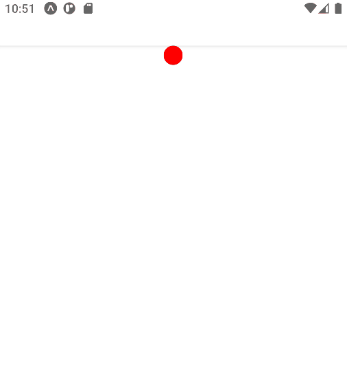
Going back to the beginning, we have the key function in all of this, which is what allows us to animate our component that looks like the following:
crecerAnimacion: function () {
     Animated.timing(
       this.popiedadAAnimar,
       {
         toValue: 400,
         duration: 5000,
         easing: Easing.linear,
       },
       {
         toValue: 400,
         friction: 1,
       }
     ).start(() => {
       this.popiedadAAnimar = new Animated.Value(10);
       this.crecerAnimacion();
     });
   },
The start function is executed when the animation ends, it is a callback, which we can take advantage of to create an infinite loop for the animations.
Complete code
The following code is part of my complete course on Vue Native that you can review from the courses section:
<template>
 <view class="center">
   <animated:view
     class="estatica"
     :style="{
       height: popiedadAAnimar,
       width: popiedadAAnimar,
       borderRadius: popiedadAAnimar,
     }"
   />
 </view>
</template>

<script>
import {Animated, Easing} from 'react-native'
export default {
 data() {
   return {
     popiedadAAnimar: 0,
   };
 },
 methods: {
     crecerAnimacion: function () {
     Animated.timing(
       this.popiedadAAnimar,
       {
         toValue: 400,
         duration: 5000,
         easing: Easing.linear,
       },
       {
         toValue: 400,
         friction: 1,
       }
     ).start(() => {
       this.popiedadAAnimar = new Animated.Value(10);
       this.crecerAnimacion();
     });
   },
 },
 created() {
     this.popiedadAAnimar = new Animated.Value(0)
 },
 mounted() {
     this.crecerAnimacion()
 },
};
</script>
<style>
.estatica {
 background-color: red;
 align-self: center;
}
.container {
 justify-content: center;
 flex: 1;
}
</style>
In the end, expect something like the following:
Of course, there is a lot more to see about animations in Vue Native:
- Interpolations
- Curves
- Animate colors
This with much more is part of my complete Vue Native course; You can also find more information in the official documentation.
You can see the introduction to the section of my course in which we cover animations in more detail:

Content Index
- What is Vue Native?
- Create native apps for Android and iOS using React
- Written in JavaScript - rendered with native code
- Native development for everyone
- Provides a core set of platform-independent native components
- Quick Update/Hot Reload
- Creating your first application with Vue Native Router
- Image component in Vue Native
- Creating a simple list with CRUD type options in Vue Native
- In addition to the above, we have a couple more components:
- Creating our first animation in Vue Native
- Complete code
- Floating FAB type buttons in Vue or Vue Native
- Component: HTML and JS
- Style
- ...And with NativeBase
- Can't resolve 'react-native-screen' module in Vue Native
- Responsive or adaptive buttons in Vue Native
- Validate the props
- The conditionals, the key factor
- Validate the props
- Global styling in Vue Native and React Native
- Method 1: Custom Components
- Method 2: global style sheet
- Method 3: Global style sheet
- Extra: Styling per component in Vue Native

Floating FAB type buttons in Vue or Vue Native
We are going to create a floating type button in Vue Native or Vue, the famous buttons called Float Action Button by their acronym in English FAB are components that are part of Material Design and that of course, we can replicate in our applications; I show you how you can create one in a basic way:
Component: HTML and JS
<template>
  <touchable-opacity :style="style.fab_extended_base" :on-press="callback">
    <text :style="{ color: '#FFF' }"> {{ label }} </text>
  </touchable-opacity>
</template>
<script>
import { style } from "../helpers/styles"
export default {
  data() {
    return {
      style
    }
  },
  props: {
    label: {
      type: String,
      requerid: true,
    },
    callback: {
      type: Function,
      requerid: true,
    },
  },
};
</script>
As you can see, we create a component, with any name, and we associate some props to customize them; you can pass as many as you need, for example, to vary the color, in this case it is for the callback or function that is executed when we click on it (you can also use an event) and the label.
It is important to note that you can use the previous code perfectly in a Vue project, of course the touchable-opacity will not exist, but in that case you replace it with any HTML element and the click event.

Style
For the style, you can define it directly in the component or you can place it globally in a help file so that it can be used in any component; these are some of the ways we have to define styles:
helpers/style.js
import { StyleSheet } from "react-native"
module.exports.style = StyleSheet.create({
    h1: {
        fontSize: 30,
        marginBottom: 8,
        textAlign: 'center',
        color: "#70227E"
    },
    container: {
        marginTop: 5,
        marginLeft: "auto",
        marginRight: "auto",
        width: "90%",
        minHeight : "100%"
    },
    hr: {
        backgroundColor: "#8f04a8",
        width: "80%",
        height: 2,
        marginLeft: "auto",
        marginRight: "auto",
        marginBottom: 5,
    }
})
...And with NativeBase
NativeBase is a library for mobile components for React native and web that helps us build a consistent user interface on Android, iOS and Web.
Also, there are packages that we can use to use this type of components, among many, NativeBase, allows us to easily use this type of components, and even defining it as an extended type, to display a tree of action buttons:
<nb-fab
          :active="false"
          direction="up"
          position="bottomRight"
          :style="{ backgroundColor: 'green' }"
        >
          <nb-icon-nb name="close"></nb-icon-nb>
        </nb-fab>
And extended:
<nb-fab
          :active="false"
          direction="up"
          position="bottomRight"
          :style="{ backgroundColor: 'green' }"
        >
          <nb-icon-nb name="close"></nb-icon-nb>
          <nb-button :style="{ elevation: 500, backgroundColor: 'green' }">
            <nb-icon-nb name="logo-twitter"></nb-icon-nb>
          </nb-button>
          <nb-button :style="{ elevation: 500, backgroundColor: 'blue' }">
            <nb-icon-nb name="logo-facebook"></nb-icon-nb>
          </nb-button>
          <nb-button
            :on-press="
              () => {
                console.log('google');
              }
            "
            :style="{
              elevation: 500,
              backgroundColor: 'red',
            }"
          >
            <nb-icon-nb name="logo-google"></nb-icon-nb>
          </nb-button>
        </nb-fab>
So, with this, you know two ways in which you can create a floating button for your apps in Vue Native, which is the most flexible and adaptable component that you can use in your web and Android apps; since remember that it would not be consistent to use Material Design elements for your apps on iOS.
Can't resolve 'react-native-screen' module in Vue Native

An error that can occur to you when developing your applications in Vue Native and trying to work with the routes, may be that you get an error like the following when installing vue-native-router or the routing scheme that Vue offers us Native:
El error: Unable to resolve module 'react-native-screen'
Although the official documentation tells us that some react packages must be installed globally:
npm install -g react-native-reanimated react-native-gesture-handler react-native-paperSome additional ones may be required - these are the packages you install for Vue Native Route to work properly:
npm install react-native-screens react-native-reanimated react-native-gesture-handler react-native-paper
npm install vue-native-router
As we mentioned in the entry that we created the Vue Native Router scheme
Responsive or adaptive buttons in Vue Native
In this post I wanted to talk to you about some interesting topics that you can apply to make adaptive or responsive elements, and it is using either classes or in this case the style directive that we saw previously; for that we are going to take as a case study an element of Vue Native, but you can perfectly apply it to basic Vue.
The Vue Native element is called touchable opacity, but it can be any element you want to make adaptive that works for basic Vue.
Validate the props
The interesting thing is that we are applying simple conditions with a prop, to indicate if we want it to occupy the entire screen or just a section:
 props: {
   type: {
     type: String,
     default: "sm",
     validator: function (value) {
       // El valor debe coincidir con una de estas cadenas de texto
       return ["sm", "normal", ].indexOf(value) !== -1;
     },
   },
 },
It is a prop that we are using to indicate the type, we place sm mode (following a bit the panorama offered by frameworks such as Bootstrap or Tailwind to indicate small elements that we place on small screens - or not, it all depends on our design-) or normal, to vary the style according to some rule that we want to define.
Here the props with fixed values is essential since we do not want our user to send us just anything, but rather specific values that we can carry out checks and vary our design at will.
The conditionals, the key factor
As you can guess, the use of conditionals is the key factor in all of this to indicate when you want to show one option to another; Let's suppose you have your interface consisting of a side menu and a list:
- If the screen is small (e.g. 640px or less), the side menu is hidden.
- If the screen is larger than these dimensions, they show it next to the list.
In our case, we go a little further back, and from this component, using a props, we define which design we show of the (for example) two allowed here (sm and normal) and we verify using conditions:
<template>
 <view :style="[type == 'sm' ? { alignSelf: 'center' } : {}]">
   <TouchableOpacity
     :style="[type == 'sm' ? { alignSelf: 'flex-start' } : {}]"
     :onPress="
       () => {
         console.log('Hola MUndo');
       }
     "
     class="buttonContainer"
   >
     <Text class="buttonText">asas sm</Text>
   </TouchableOpacity>
 </view>
</template>
Validate the props
The props, we can pass as many as we need, in this case as for the type, we are only going to accept that they are of two types; and we do this with the validator:
<script>
export default {
 props: {
   type: {
     type: String,
     default: "sm",
     validator: function (value) {
       // El valor debe coincidir con una de estas cadenas de texto
       return ["sm", "normal", ].indexOf(value) !== -1;
     },
   },
 },
};
</script>
For styles, you can adapt it as you need so that your design works as you need: for example, in our case some simple buttons with fixed styles.
You can make variations both at the class level and at the style props level:
<style scoped>
.buttonContainer {
 elevation: 8;
 background-color: blue;
 border-radius: 10;
 padding-vertical: 10;
 padding-horizontal: 12;
}
.buttonText {
 font-size: 18;
 color: #fff;
 color: #9105a7;
 letter-spacing: 1;
 font-weight: bold;
 align-self: center;
 text-transform: uppercase;
}
</style>
<ButtonModern  type="sm"/>
If you pass a value to the props that does not correspond, it will give you the following error:
<ButtonModern  type="otro"/>
[Vue warn]: Invalid prop: custom validator check failed for prop "type".
found in
Finally, our buttons look like this; for this couple of examples:
<ButtonModern />
<ButtonModern type="normal" :style="{marginTop:15}"/>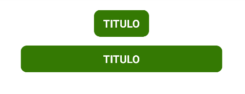

Global styling in Vue Native and React Native
If you have taken my course on Vue Native, or have developed on this or React platform, you know that we can only bind styles through JavaScript and NOT with CSS, in other words we cannot establish CSS or a style sheet.
For us developers this is somewhat annoying since we LOVE having our style sheet to have a clear structure of our site; What's more, we CANNOT use technologies such as Bootstrap or Tailwind CSS in React or Vue Native.
In this post, I will address the problem of implementing global styling in a React Native app.
Here are three ways to apply global styling to a React Native or Vue app:
Method 1: Custom Components
Since both Vue and React are component-based, the most intuitive way is to create custom components (e.g. custom text fields, custom buttons, etc.), define the styles within each component, and reuse these components throughout the application.
For example, to use a specific font color throughout the app:
import React from 'react';
import { Text, StyleSheet } from 'react-native';
const BlueText = props => {
 return(
   <Text style={{ ...styles.blueText, ...props.style }}>{props.children}</Text>
 );
};
const styles = StyleSheet.create({
 blueText: {
   color: 'blue'
 }
});
export default BlueText;
Method 2: global style sheet
We can create a GLOBAL help file for the app where we define the style:
// https://github.com/libredesarrollo/vue-native-estilo-03/blob/main/helpers/style.js:
import { StyleSheet } from "react-native";
module.exports.style = StyleSheet.create({
   container: {
       width: "80%",
       padding: 10,
       borderWidth: 1,
       borderColor: "gray",
       borderRadius: 15,
       marginLeft: "auto",
       marginRight: "auto",
       marginTop: 15,
   },
   h1: {
       fontSize: 30,
       marginBottom: 10,
   },
   h1: {
       fontSize: 30,
       marginBottom: 10
   },
   h2: {
       fontSize: 25,
   },
   h3: {
       fontSize: 18,
   },
});
Method 3: Global style sheet
Of course, you can combine multiple styles for ONE component:
<text :style="[style.h1, , { backgroundColor: bg }, {borderColor:'yellow'}, {borderWidth: 10 }]">Index</text>With this, we can have all kinds of styles and subtly customize them from one component to another.
Extra: Styling per component in Vue Native
We can also define a local style at the component level:
<style>
.image {
 width: 100%;
 height: 200px;
 border-radius: 5px;
 margin-bottom: 10px;
}
</style>
This is classic, if you use Vue, you can still use the 3 elements of template, script and style, the only difference is that the style is always LOCAL to the component.