
When we create a project in SwiftUI, Xcode generates a view called ContentView by default. It doesn't matter if you rename it later or not: the important thing is to understand that this file represents a screen of your app. It can be a login, a list, a detail, whatever.
Inside that view, there is a key property: body. That's where we define the interface… and where the first clash with SwiftUI usually occurs.
In my case, the first error was trying something as simple as putting two Text views one below the other. It seemed trivial, but SwiftUI didn't allow it. Why? Because SwiftUI only supports one root view. And that's exactly where stacks come into play.
Next step, learn how to use Text in SwiftUI.
Why does SwiftUI need stacks for layout?
SwiftUI is designed to describe interfaces declaratively. This implies a fundamental rule:
each view must return a single root view.
If you try to do this:
var body: some View {
  Text("Hello")
  Text("World")
}
It's not going to work as you expect. And this is one of those moments when many of us think we're doing something wrong, when in reality we're just missing the right container.
Stacks exist to solve exactly this problem: allowing us to group multiple views within a single root view.
ContentView and the single root view rule
It doesn't matter if you use Text, Image, Button, or any other component: SwiftUI needs everything to be wrapped in a main structure. Stacks (VStack, HStack, ZStack) fulfill that role and also define how the child views are visually organized.
What are stacks in SwiftUI?
Stacks in SwiftUI are layout containers. Their sole responsibility is to organize child views in a specific direction.
SwiftUI offers three basic stacks:
- VStack → stacks views from top to bottom
- HStack → stacks views from left to right
- ZStack → overlays views in depth
Individually they are simple, but combined they allow building surprisingly complex interfaces.
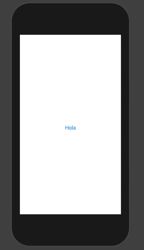
In this component, specifically in the struct that has the same name as the file, ContentView by default, there is a variable called body which defines the body of our view; in it, we have to define graphic interface elements, although there is a very important point, and that is that there can ONLY be one root element; for example, a text:
struct ContentView: View {

    var body: some View {
        Text("Hi")
            .foregroundColor(blue)
    }
} 
Now then, what happens if we want to place more content, which is surely what you will want to do in most cases:
struct ContentView: View {

    var body: some View {
        Text("Hello")
            .foregroundColor(blue)
        Text("Hello")
            .foregroundColor(blue)
    }
}
You will see that you won't be able to, or it won't work as expected; and this is where the layout components come in.
VStack, HStack, ZStack to stack or place multiple content
These are the main elements in SwiftUI, which are the layout components; they are components or boxes that allow us to group multiple elements for our User Interface (UI), they are the famous 3 layout components: VStack, HStack, and ZStack.
- VStack is a container that allows us to add multiple children, multiple elements stacked vertically.
- HStack is a container that allows us to add multiple children, multiple elements stacked horizontally.
- ZStack to place elements aligning on any of their axes, the interesting thing about this is that we can place or define them in any position, giving immense creativity to our interfaces.
VStack: stacking views vertically
VStack is probably the stack you will use the most. In fact, in many projects, it ends up being the base of the entire screen.
When to use VStack
Use VStack when you want to show elements:
- In the form of a column.
- One below the other.
- Following a natural vertical flow.
Lists, forms, texts, sections… almost everything starts with a VStack.
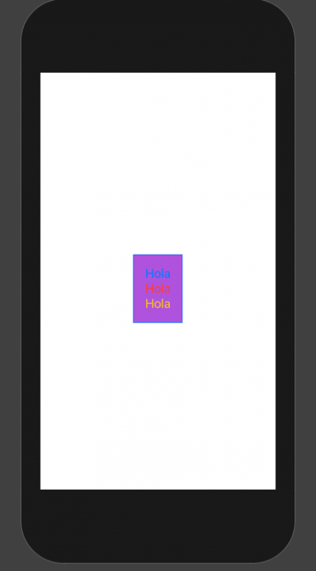
So in summary, with these layout components we can organize multiple content, as much as we need; so if we want to apply texts:
   var body: some View {
        VStack {
            Text("Hello")
                .foregroundColor(.blue)
            Text("Hello")
                .foregroundColor(.red)
            Text("Hello")
                .foregroundColor(.yellow)
        }
} 
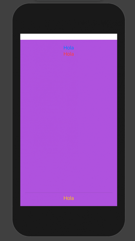
Common modifiers and correct order
And of course we can apply some styles to our content, such as changing the color as we did before or even changing the color of the container element:
     VStack {
            Text("Hello")
                .foregroundColor(.blue)
            Text("Hello")
                .foregroundColor(.red)
            Text("Hello")
                .foregroundColor(.yellow)
        }.background(Color.purple)
Some Padding:
        VStack {
            Text("Hello")
                .foregroundColor(.blue)
            Text("Hello")
                .foregroundColor(.red)
            Text("Hello")
                .foregroundColor(.yellow)
        }.padding().background(Color.purple)
For this, it is important to note that you have to apply the padding before the background color, since here in SwiftUI the order of the factors DOES alter the product.
Summary
- A VStack adds elements vertically, with our views or visual elements added from top to bottom.
- Adding Spacer() forces the view to use the maximum amount of vertical space.
- Adding a Divider() forces the view to use the maximum amount of horizontal space.
Spacer and Divider in vertical layouts
- Spacer() consumes all available space on the main axis.
- Divider() adds a dividing line occupying only the necessary space.
VStack { Text("Top") Spacer() Divider() Text("Bottom") }By default, the dividing line has no color. To set the color of the divider, we add the modifier/function .background (Color.black). Elements like background (Color.black), .padding() and .offests(…) are called ViewModifiers, or simply modifiers. Modifiers can be applied to views or other modifiers, producing variations.
Remember to define the ContentView_Previews to see a preview of the content you are building.
VStack {
   Text("Up")
   Spacer()
   Divider()
   Text("Down")
}
And now, we are going to present some more elements that go hand in hand; for example, what happens if you want your container, VStack, to occupy the ENTIRE screen, meaning it grows in length and width and with it all the available screen size, for that, we have to use the Spacer and Divider elements respectively:
struct ContentView: View {

    var body: some View {
        VStack {
            Text("Hello")
                .foregroundColor(.blue)
            Text("Hello")
                .foregroundColor(.red)
            Text("Hello")
                .foregroundColor(.yellow)
        }.padding().background(Color.purple)
    }
}

struct ContentView_Previews: PreviewProvider {
    static var previews: some View {
        ContentView()
    }
}
HStack: horizontal organization of the interface
HStack works the same as VStack, but horizontally.
Real differences between VStack and HStack
The logic is the same:
- VStack → vertical axis
- HStack → horizontal axis
The practical difference appears when you use Spacer and Divider, since these act according to the main axis of the stack.
Practical example with Spacer and Divider
Now, if you want to stack horizontally:
   var body: some View {
        VStack {
            Text("Hello")
                .foregroundColor(.blue)
            Text("Hello")
                .foregroundColor(.red)
            Spacer()
            Divider()
            Text("Hello")
                .foregroundColor(.yellow)

        }.padding().background(Color.purple)
    }
VStack stacks your content vertically, HStack stacks your content horizontally
In any case, you can also stack your content vertically, as if it were a row, although in most cases you will want to stack it in a column, you can also apply it vertically, for this, we have to use the VStack; otherwise, everything is exactly the same as the HStack.
Here the Spacer pushes the content towards the ends and the Divider occupies only the necessary height.
Common errors in horizontal layouts
A typical error is expecting Divider() to expand automatically. In an HStack, the divider does not grow vertically if you do not allow it with the parent layout. These are small details, but understanding them saves you a lot of time.
ZStack: overlap and depth in SwiftUI
ZStack is the most flexible stack… and also the easiest to use wrong if it's not well understood.
When to use ZStack and when not to
Use ZStack when you need to:
- Overlay views.
- Work with layers.
- Create depth effects.
Backgrounds with text on top, cards, custom overlays… that's where ZStack shines.
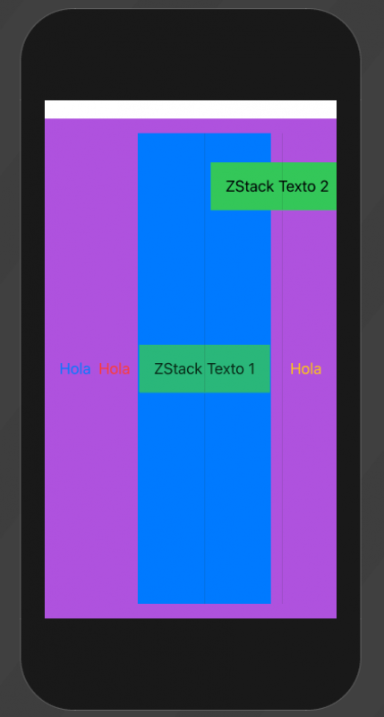
ZStack, put your elements anywhere; in many cases, you may be interested in placing overlapping elements or at least having more control to customize your elements in your interface, and this is what ZStack allows you to do, which with the offset function, allows you to indicate the position in the Cartesian axis by indicating a parameter for x and y:
struct ContentView: View {

    var body: some View {
        HStack {
            Text("Hello")
                .foregroundColor(.blue)
            Text("Hello")
                .foregroundColor(.red)

            ZStack{
                Text("ZStack Texto 1")
                    .padding()
                    .background(Color.green)
                    .opacity(0.8)
                Divider()
                Text("ZStack Texto 2")
                    .padding()
                    .background(Color.green)
                    .offset(x: 80, y: -200)
            }.background(Color.blue)

            Spacer()
            Divider()
            Text("Hello")
                .foregroundColor(.yellow)
        }.padding().background(Color.purple)
    }
} 
ZStack vs overlay and background
Something interesting that Apple explains is that many times you don't need a ZStack.
If you have a dominant view, overlay or background are usually better options:
Image("ProfilePicture")
   .overlay(Text("Name"), alignment: .bottom)
ZStack is ideal when the final size depends on the set of views, not just one.
Alignment and spacing in SwiftUI stacks
SwiftUI separates two key concepts:
- alignment
- spacing
alignment in VStack, HStack and ZStack
- VStack → controls horizontal alignment
- HStack → controls vertical alignment
- ZStack → controls both axes
Important: alignment does not move the stack, it moves the views inside the stack.
Spacer vs Divider: they are not the same
- Spacer expands and pushes
- Divider separates visually
Confusing them is very common at the beginning.
LazyVStack and LazyHStack: performance in large lists
So far we have talked about “normal” stacks. The problem is that they load all the views at once, whether they are on screen or not.
Differences between normal and lazy stacks
- VStack / HStack → load everything
- LazyVStack / LazyHStack → load on demand
When to use them within ScrollView
If you have long lists or dynamic content:
ScrollView {
   LazyVStack {
       ForEach(0..<1000) { index in
           Text("Row \(index)")
       }
   }
}
Here SwiftUI only creates the visible views, greatly improving performance and memory usage.
Best practices for designing layouts in SwiftUI
- Think first about the hierarchy, not about exact positions
- Divide complex layouts into small stacks
- Avoid frame and position unless it is essential
- Use lazy stacks for scrollable content
- Always review the order of modifiers
Frequently asked questions about VStack, HStack, and ZStack
- Why can't I put multiple Text views in body?
- Because SwiftUI only allows one root view. You need a container like VStack.
- Which stack should I use first?
- On most screens, VStack is usually the starting point.
- Does ZStack replace overlay?
- No. overlay is better when there is a dominant view; ZStack when the size depends on the set.
- When to use LazyVStack?
- When working with long lists or content inside a ScrollView.
- Does the order of modifiers matter?
- Yes. A lot. In SwiftUI, the order defines the visual result.
Conclusions
With this, you have the necessary elements to start creating your first interfaces and begin organizing your interfaces as you wish.
These container elements are fundamental for building the foundations of your app, to indicate the structure in which other elements such as images, texts, text fields, form elements, etc., will be contained.
Stacks are the basis of layout in SwiftUI. Understanding VStack, HStack, and ZStack is not just learning three components, but changing the way you think about the interface.
As soon as you assimilate the single root view rule and start using stacks as mental containers, everything fits together: errors disappear, the code is simplified, and layouts become more predictable.