Content Index
Another essential component for a SPA website is the progress bar. Unlike the custom pagination component we saw earlier, this bar already exists in Inertia and appears when performing an operation that requires calculation or time to complete. It's usually placed when making an internet request to obtain data or to navigate from one page to another.
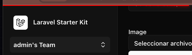
The progress bar is already configured by default in the Inertia project, and we can also customize it. You probably haven't seen it or noticed it yet because it appears when a page loads. Since we're working locally, all of this happens almost instantly, which is why it's not visible.
resources/js/app.ts
***
createInertiaApp({
    title: (title) => `${title} - ${appName}`,
    resolve: (name) => resolvePageComponent(`./pages/${name}.vue`, import.meta.glob<DefineComponent>('./pages/**/*.vue')),
    setup({ el, App, props, plugin }) {
        createApp({ render: () => h(App, props) })
            .use(plugin)
            .use(ZiggyVue)
            .mount(el);
    },
    progress: {
        color: '#4B5563',
    },
});
Load simulation
In which you can customize, for example, the color; when developing a project locally, it is difficult to see it; in order to do some tests, we are going to defer the loading of some page for a few seconds:
public function edit(Category $category)
    {
        sleep(3);
        return inertia("Dashboard/Category/Edit", compact('category'));
    }
From the list above, if we try to enter the editing of a category, we will see the progress bar.
We can customize it as follows:
resources/js/app.ts
createInertiaApp({
  progress: {
    // The delay after which the progress bar will appear
    // during navigation, in milliseconds.
    delay: 250,
    // The color of the progress bar.
    color: '#29d',
    // Whether to include the default NProgress styles.
    includeCSS: true,
    // Whether the NProgress spinner will be shown.
    showSpinner: false,
  },
  // ...
})
Progress Bar Options
In the same file, you can also set some progress bar options, for example:
- delay, to delay when the progress bar appears.
- color, to change the color of the progress bar and spinner if it is set.
- includeCSS, to indicate whether you want to use the CSS provided by default, or are going to include one own, if you set it to false and do not incorporate CSS, the bar will not appear.
- showSpinner, to display a loading icon in parallel.
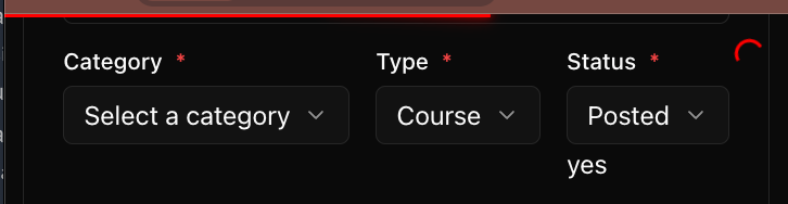
If we use the previous configuration, we will have:
The Loading Spinner
If we activate the option showSpinner, in addition to the line at the top, an indicator will appear circular. This is ideal for letting the user know that the page is actually processing the request and has not been remained "frozen".
Conclusion
In summary, the Inertia progress bar is easy to configure:
- By defining the color and spinner.
- By simulating slow loads for testing.
- It doesn't require complex configuration; simply adjust the options that Inertia already provides.