
Detecting screen resolution in JavaScript is one of those tasks that seems simple... until you realize that there are three distinct types of sizes: the actual screen, the browser, and the famous viewport. When I started working with overlays and dynamic layouts, I discovered that using the wrong property could break the entire interface. So, in this guide, I'm going to tell you step-by-step what I wish I had read from the beginning.
JavaScript is a fantastic technology that allows for many operations, including calculating the width and height of our screen—in other words, the screen resolution.
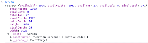
All this processing is done using the screen object, which allows you to obtain the screen resolution in addition to everything related to the screen:
There are various reasons why we might want to obtain the screen resolution: content arrangement, providing information to the user, using it in conjunction to create an overlay, etc. In this post, we will see how to get the screen resolution with native JavaScript.
What “Resolution” Means in JavaScript: Screen, Browser, and Viewport
Before writing a single line of code, you need to be clear about what the heck you're measuring, because JavaScript doesn't give a single answer. And yes, it also happened to me that I mixed up sizes and wondered why my calculations didn't add up.
In JavaScript, there are three “levels” of size:
- Actual Screen (screen): the total size of the device.
- Browser Window (window): what the window itself occupies.
- Viewport (innerWidth/innerHeight): the visible area where your website is rendered.
If you know how to distinguish them, you'll avoid 90% of errors when working with resolutions.
- Differences between screen, window, and viewport
- Type Properties What it measures When to use
- Screen screen.width / screen.height Total physical size Statistics, showing info to the user
- Browser outerWidth / outerHeight Window size Detecting browser resize
- Viewport innerWidth / innerHeight Actual visible area Responsive layout, overlays, UI
How to Get the Width and Height of a Screen (screen)
As we can see in the following figure, the screen object is composed of several methods and attributes.
But, in this article, our interest is to see how to get the screen resolution?
With the following lines of code:
screen.width;
screen.height;
This way we can obtain the resolution in pixels of the screen composed of the components screen.width and screen.height (width and height) of devices such as monitors, phones, tablets, among many others.
We obtain the resolution of the device's screen.
In addition to this, we have two other methods that allow us to obtain the device's resolution without counting other elements, or rather, interfaces such as the Windows taskbar, etc.; that is; the available space to display the web browser.
screen.availWidth; screen.availHeight;
Examples of How to Get Screen Resolution with JavaScript
document.getElementById("widthYheight").innerHTML = "My screen resolution is: "+screen.width + " px by "+screen.height;
document.getElementById("availwidthYavailheight").innerHTML = "The width and height of my screen available for my web browser is: "+screen.availWidth + " px by "+screen.availHeight;
Detecting Window Resize with JavaScript
Now that we are clear on how to get the screen resolution (the full resolution of our PC) using the screen object in JavaScript, another possible scenario you might face is how to know when our browser window is resized and what the resolution or width/height of the browser window is; for the former, the JavaScript API has the onresize event:
<body onresize="FuntionResize()">Which executes every time the browser is resized; to know how much space in pixels the browser window is occupying, we have the outerWidth and outerHeight properties provided by the window object:
function FuntionResize() {
    var widthBrowser = window.outerWidth;
    var heightBrowser = window.outerHeight; console.log("Browser window size: width=" + widthBrowser + ", height=" + heightBrowser);
}
How to Know the Available Browser Space (screen.availWidth and screen.availHeight)
These properties are great if you need to know the screen space not occupied by system elements. Many don't use them, but they can make a difference in desktop interfaces.
console.log(screen.availWidth, screen.availHeight);With this, you get the "usable" space to display a browser, without counting the taskbar, docks, etc.
Actual Browser Size: outerWidth, innerWidth, and Viewport
This is where it gets really useful for a modern website.
- Viewport: this is where your content lives.
- innerWidth and innerHeight: the actual dimensions of the visible area.
- outerWidth: the entire browser window (including frames).
console.log(window.innerWidth, window.innerHeight);These are the properties used 90% of the time. If you are designing something adaptable, this is your area.
Extra: Detecting Resolution Change with jQuery
jQuery is a library that gives us a plus when developing our applications; it is widely used, and it is possible that the site we develop uses this technology; to know how to detect the window size every time the browser is resized, we must:
$(window).resize(function() {
   var widthBrowser =$(window).height();
   var heightBrowser =$(window).width();
   console.log("Browser screen size: width= "+widthBrowser +" height="+heightBrowser );
});
Differences Between Mobile and Desktop
On mobile devices, the viewport changes even when the keyboard is displayed.
screen.height on mobile is misleading: it always measures the full screen.
innerHeight fluctuates; do not use it for permanent calculations if the keyboard is involved.
When I worked on a mobile project, I discovered that the virtual keyboard drastically changed the viewport. It took me a while to understand why the design was "dancing."
Frequently Asked Questions
- Which property should I use for responsive design?
- Always innerWidth / innerHeight.
- Can I detect DPI with JavaScript?
- Indirectly yes, but it is not reliable.
- How do I detect resolution in real time?
- Use the resize event.
✅ Conclusion
Detecting screen resolution in JavaScript isn't just about querying screen.width: it's about knowing what size you actually need. After making several mistakes using the wrong properties, I understood that the key is to differentiate between screen, browser, and viewport.
If you apply this approach, your layouts will stop breaking and your overlays will work as they should.