
The Scaffold is a child widget of MaterialApp, where everything begins, and it allows us to use Material Design elements/widgets. The Scaffold is our pillar upon which we can build more options like the floating button, the appbar, the drawer, and much more.
In a Flutter app, the root widget is a MaterialApp, followed by a Scaffold, where we mount EVERYTHING else; every screen with a Material design needs a Scaffold. It's like the "skeleton" that holds the rest of the interface. If you come from other technologies, think of it as the "master structure" that tells Flutter where to place the top bar, the body, the floating buttons, side menus, and more.
The Scaffold is the key piece in our developments to be able to make true multi-screen applications, as well as the Navigation and routing system in Flutter.
A Scaffold normally lives inside a MaterialApp, and I remember the first time I created an app with Flutter I saw it very clearly: the hierarchy always flowed MaterialApp → Scaffold → Widgets. Without that scaffolding, you simply can't work with the typical visual elements of Material Design.
- MaterialApp: defines the theme, general navigation, and global configuration.
- Scaffold: creates the visual template for each screen.
- Body and other widgets: present the actual content the user will see.
Main Components of the Scaffold and How They Actually Work
In practice, a Scaffold is not just a container: it is a complete system for structuring screens, that is, for our applications; let's look at the most important aspects:
- AppBar: header, actions, and customization
- The top bar where you place the title, buttons, menus, search, etc.
You can customize colors, shadows, action buttons, and scroll behavior.
- The top bar where you place the title, buttons, menus, search, etc.
- Body: the area where everything happens
- It is literally everything below the AppBar. This is where your columns, lists, forms go...
- Drawer and EndDrawer: side panels for navigation.
- Drawer: appears from the left.
- EndDrawer: appears from the right.
- FloatingActionButton and its available positions
- The star widget in Material Design. You can move it to the center, to the side, float it over a BottomBar, hide it when scrolling... Flutter offers more flexibility than it seems.
- BottomNavigationBar and navigation patterns
- Perfect for apps with main sections: Home, Profile, Settings, etc.
In your extended example, you combined it with the centered FAB and it resulted in a very functional design.
- Perfect for apps with main sections: Home, Profile, Settings, etc.
Scaffold Examples in Flutter
A Flutter app, when we create it, commonly looks like this:
@override
Widget build(BuildContext context) {
    return Scaffold(
        appBar: AppBar(
            title: Text(widget.title),
        ),
        body: Center(
            child: Column(
                mainAxisAlignment: MainAxisAlignment.center,
                children: <Widget>[
                    const Text(
                        'You have pushed the button this many times:',
                    ),
                    Text(
                        '$_counter',
                        style: Theme.of(context).textTheme.headline4,
                    ),
                ],
            ),
        ),
        floatingActionButton: FloatingActionButton(
            onPressed: _incrementCounter,
            tooltip: 'Increment',
            child: const Icon(Icons.add),
        ),
    );
}
This is what our app looks like, with basic elements such as:
- appBar
- body
- floatingActionButton
Remember that the body is the only required one, which is where the content goes.
Example 1: Basic Scaffold with AppBar and simple content
In this example, we define the AppBar, a text in the middle of the screen, and a floating button with a + icon:
Scaffold(
 appBar: AppBar(title: Text('Mi App')),
 body: Center(child: Text('Hola mundo')),
 floatingActionButton: FloatingActionButton(
   onPressed: () {},
   child: Icon(Icons.add),
 ),
);
Example 2: Scaffold, Drawer, and EndDrawer
The same example as before, but with a couple of side menus or Drawers:
Scaffold(
 bottomNavigationBar: BottomNavigationBar(
   items: [
     BottomNavigationBarItem(icon: Icon(Icons.home), label: 'Home'),
     BottomNavigationBarItem(icon: Icon(Icons.person), label: 'Perfil'),
   ],
 ),
);
Example 3: Scaffold with functional BottomNavigationBar
Ideal for apps with multiple screens:
Scaffold( bottomNavigationBar: BottomNavigationBar( items: [ BottomNavigationBarItem(icon: Icon(Icons.home), label: 'Home'), BottomNavigationBarItem(icon: Icon(Icons.person), label: 'Profile'), ], ), );Complete Example
This widget also contains some additional attributes. Let's look at the constructor declaration with named parameters to learn about them:
Scaffold({
  Key? key,
  PreferredSizeWidget? appBar,
  Widget? body,
  Widget? floatingActionButton,
  FloatingActionButtonLocation? floatingActionButtonLocation,
  FloatingActionButtonAnimator? floatingActionButtonAnimator,
  List<Widget>? persistentFooterButtons,
  Widget? drawer,
  void Function(bool)? onDrawerChanged,
  Widget? endDrawer,
  void Function(bool)? onEndDrawerChanged,
  Widget? bottomNavigationBar,
  Widget? bottomSheet,
  Color? backgroundColor,
  bool? resizeToAvoidBottomInset,
  bool primary = true,
  DragStartBehavior drawerDragStartBehavior = DragStartBehavior.start,
  bool extendBody = false,
  bool extendBodyBehindAppBar = false,
  Color? drawerScrimColor,
  double? drawerEdgeDragWidth,
  bool drawerEnableOpenDragGesture = true,
  bool endDrawerEnableOpenDragGesture = true,
  String? restorationId,
})
There are a lot of attributes you can use, but none of them are mandatory. Still, all Scaffold widgets use the body attribute to render the scaffold's body.
All these widgets are self-explanatory, and the declaration above states what they expect. Now let's change the Scaffold of our default application:
@override
Widget build(BuildContext context) {
return Scaffold(
bottomNavigationBar: BottomNavigationBar(
items: const <BottomNavigationBarItem>[
BottomNavigationBarItem(
icon: Icon(
Icons.home,
),
label: 'Home',
tooltip: 'Home',
),
BottomNavigationBarItem(
icon: Icon(
Icons.person,
),
label: 'Profile',
tooltip: 'Profile',
),
],
),
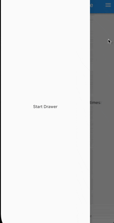
drawer: const Drawer(
child: Center(
child: Text(
"Start Drawer",
),
),
),
endDrawer: const Drawer(
child: Center(
child: Text(
"End Drawer",
),
),
),
backgroundColor: Colors.grey[200],
floatingActionButtonLocation: FloatingActionButtonLocation.centerDocked,
appBar: AppBar(
title: Text(widget.title),
),
body: Center(
child: Column(
mainAxisAlignment: MainAxisAlignment.center,
children: <Widget>[
const Text(
'You have pushed the button this many times:',
),
Text(
'$_counter',
style: Theme.of(context).textTheme.headline4,
),
],
),
),
floatingActionButton: FloatingActionButton(
onPressed: _incrementCounter,
tooltip: 'Increment',
child: const Icon(Icons.add),
),
);
}The code above creates a bottom navigation menu, a drawer at the start and end position of the screen, a bottom navigation bar, and replaces the floating action button position to the bottom center, overlapping the bottom navigation bar. It looks like this.
Best Practices and Common Errors When Working with Scaffold
- When should you NOT use a Scaffold?
- Loading screens
- Splash screens
- Fully customized screens without Material Design
- Avoiding conflicts between navigation, SnackBars, and AppBars
- If you use multiple nested Scaffolds, it can be difficult to control messages, bars, or states.
A professional technique is the use of IndexedStack, which you already applied in your more advanced example.
- If you use multiple nested Scaffolds, it can be difficult to control messages, bars, or states.
- Maintaining view state with IndexedStack
- It allows you to switch tabs without losing the previous state. It's the technique competitors mention, but it is better explained and applied here.
Frequently Asked Questions about Scaffold in Flutter (Updated FAQ)
- Is it mandatory to use Scaffold on every screen?
- No, only on screens that use Material Design.
- Can I use more than one FAB?
- Officially, one. Extra: you can use Stack for multiple FABs.
- How to change the theme only for one Scaffold?
- Wrap it in its own Theme() widget.
- How to hide AppBar or BottomNavigationBar when scrolling?
- With SliverAppBar or with scroll controller listeners.
- Can I nest Scaffolds?
- Not recommended except for very specific cases.
Conclusion
The Scaffold widget is more than a template. It is how Flutter organizes complete screens with consistency, Material design, and essential components.
In this article, you were able to see its main attributes, usage examples, and very common patterns that allow you to create modern, scalable, and professional interfaces.
Next step, learn how to use bottom sheet in Flutter.