
Building arrows in HTML is one of those tricks that seem simple, but hide much more depth than they appear. Over time, experimenting with CSS, I have verified that the vast majority of arrows we see on the web are not images: they are the result of playing with borders, pseudo-elements, and a bit of positioning.
In this guide, I will show you all the real ways to create arrows in HTML: from the simplest ones with HTML entities and ASCII code, to advanced arrows with pure CSS and SVG, explaining when to use each one.
Previously, we saw how to create geometric shapes with CSS, which is the perfect foundation for understanding the technique we will apply here.
What building arrows in HTML means
When we talk about building arrows in HTML, we do not only mean displaying the → symbol on the screen. In practice, arrows are used to:
- Indicate navigation directions
- Guide the user within the interface
- Complement containers such as tooltips or speech bubbles
- Create next/previous buttons in carousels or galleries
- Reinforce visual hierarchy in menus and lists
The most common mistake is thinking that all arrows must be icons or images, when in reality HTML and CSS offer lighter, more flexible, and easier-to-maintain solutions.
What exactly do we mean when we talk about arrows on containers? Well, a picture is worth a thousand words:
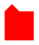
It is a pointer that is added to a container; perfect for pop-up menus or for building speech bubbles —text boxes. In short: placing arrows on a container with CSS, pointing right, left, down, or up, without needing images.
Ways to create arrows in HTML (overview)
Before diving into detail, here are all the available options:
- HTML Entities / Unicode → simple and fast for inserting an arrow directly into text
- Pure CSS → arrows without images using the
borderproperty - CSS arrows on containers → tooltips and speech bubbles with
::before/::after - SVG → complex or animated arrows with total vector control
- HTML + CSS + JavaScript → interactive and dynamic navigation
The key is to choose the correct method depending on the context, not to always use the most complex one.
Arrows using HTML entities and ASCII code (the simplest option)
HTML entities are the fastest way to add an arrow directly into text. They work just like other well-known entities such as © or π: the browser interprets them and renders the corresponding character without needing any image or extra stylesheet.
These are the basic arrows —left, right, up, and down— most commonly used:
- Right arrow:
→→ - Left arrow:
←← - Up arrow:
↑↑ - Down arrow:
↓↓ - Double right arrow:
⇒⇒
You can also use their equivalent in decimal or hexadecimal Unicode code. For example, → is identical to → and produces the exact same result: →. Both forms are valid and have universal support in all modern browsers.
If what you need is the right arrow ASCII code to copy and paste, here is the quick reference:
- Right arrow →:
→/→/ UnicodeU+2192 - Left arrow ←:
←/←/ UnicodeU+2190 - Up arrow ↑:
↑/↑/ UnicodeU+2191 - Down arrow ↓:
↓/↓/ UnicodeU+2193
Example of use in HTML:
<p>Move to the right → next step</p>This approach is ideal when you only need to indicate direction within text, without special styles or interaction.
When to use HTML entities and when not to?
Use them if:
- The arrow is part of the text flow
- You do not need custom styles or animations
- You are looking for maximum compatibility with minimal code
Avoid them if:
- You need to change size or color dynamically
- The arrow is part of a visual design or UI component
- It is integrated inside buttons, containers, or tooltips
That is where CSS begins to shine.
Building arrows with CSS using borders
Here we enter the most interesting territory. When I started experimenting with arrows in CSS, I understood that I wasn't drawing arrows as such, but playing with invisible borders until one takes center stage and forms the desired triangle.
The trick of border-width and transparent colors
The foundation is always the same: an element with width: 0 and height: 0, with no own content, whose shape is defined entirely by its borders. Having no real dimensions, all four borders meet at the center of the element and, by giving them different sizes and colors, they form a triangle:
.flecha {
 width: 0;
 height: 0;
 border-style: solid;
}
From there you decide:
- Which border is visible (the one defining the arrow's direction)
- Which ones are
transparent(those that visually disappear) - The size of each border, which determines the arrow's proportions
Example: CSS arrow pointing to the right:
.flecha-derecha {
 border-top: 10px solid transparent;
 border-bottom: 10px solid transparent;
 border-left: 15px solid black;
}<div class="flecha-derecha"></div>In this case, border-top and border-bottom are transparent, forming the sides of the triangle, while border-left with color defines the visible tip of the arrow. The reason why the left border creates an arrow pointing to the right is unintuitive at first: the visible border acts as the base of the triangle, so the tip always points in the opposite direction.
CSS arrows in all four directions
By changing the visible border, you can create a arrow css in any direction. The logic is counterintuitive at first, but it makes sense: the border you see is opposite to where the arrow points.
- Right arrow →
border-leftwith color - Left arrow →
border-rightwith color - Up arrow →
border-bottomwith color - Down arrow →
border-topwith color
This pattern is the foundation for most CSS arrows you will find in real production projects.
Common mistakes when creating arrows with CSS
From experience, these are the most frequent mistakes when implementing this technique:
- Forgetting to set
width: 0andheight: 0on the element — without this, the triangle will not form correctly - Not declaring the other borders as
transparent, causing squares to appear instead of triangles - Using
position: relativeincorrectly when combining the arrow with a parent container - Not properly calculating
border-widthsizes, which distorts the proportions of the triangle
CSS arrows on containers and speech bubbles
For this CSS trick, we will use a property we already saw in the previous post: Geometric shapes with CSS (part 2). In that post, we reviewed through three examples the versatility of the border-width property combined with the ::before and ::after pseudo-selectors.
The trick here, as in the cited post, is to use the selectores ::before and/or ::after to create "another container" near the original container, give it the desired shape using border-width, and position it using the top, left, and bottom properties.
The key is that these pseudo-elements must have content: "" (empty string) and position: absolute; the parent container, in turn, needs position: relative for absolute positioning to work correctly. Without that parent-child relationship in the positioning flow, the arrow will appear displaced or out of place.
Let's look in detail at how to create these arrows on containers.
Arrow on container: top and left
.arriba-izquierda:before {
    content: "";
    position: absolute;
    top: -25px;
    left: 0;
    width: 0;
    height: 0;
    border-width: 0 25px 25px;
    border-style: solid;
    border-color: transparent transparent red;
}
The pattern for each variant always follows the same structure:
- Pseudo-element
::beforeor::after position: absoluteand the parent withposition: relative- Borders to create the triangular shape
Position adjustment with top, left, and bottom
If you analyze several examples, you will see that the only thing that really changes is the position and the active border. In practice, moving an arrow is usually a matter of adjusting a few pixels in top, left, or bottom until it visually fits the container.
Arrow on container: top and right
.arriba-derecha:before {
    content: "";
    position: absolute;
    top: -25px;
    left: 50px;
    width: 0;
    height: 0;
    border-width: 0 25px 25px;
    border-style: solid;
    border-color: transparent transparent red;
}
Arrow on container: right side and bottom
.lado-derecha-abajo:before {
      content: "";
      position: absolute;
      top: 50px;
      left: 100px;
      width: 0;
      height: 0;
      border-width: 25px;
      border-style: solid;
      border-color:  transparent transparent transparent red;
}
Arrow on container: right side and top
.lado-derecha-arriba:before {
      content: "";
      position: absolute;
      top: 0;
      left: 100px;
      width: 0;
      height: 0;
      border-width: 25px;
      border-style: solid;
      border-color:  transparent transparent transparent red;
}
Arrow on container: left side and bottom
.lado-izquierda-abajo:before {
    content: "";
    position: absolute;
    top: 50px;
    left: -50px;
    width: 0;
    height: 0;
    border-width: 25px;
    border-style: solid;
    border-color: transparent red transparent transparent;
}
Arrow on container: bottom and left
.abajo-izquierda:before {
    content: "";
    position: absolute;
    bottom: -25px;
    left: 0;
    width: 0;
    height: 0;
    border-width: 25px 25px 0;
    border-style: solid;
    border-color: red transparent transparent;
}
Arrow on container: bottom and right
.abajo-derecha:before {
    content: "";
    position: absolute;
    bottom: -25px;
    left: 50px;
    width: 0;
    height: 0;
    border-width: 25px 25px 0;
    border-style: solid;
    border-color: red transparent transparent;
}If you review the previous CSS calmly, you will notice that the only thing varying between each variant is the position of the pseudo-element —defined with top, bottom, and left— and the side to which color is applied in border-color. That color is what "draws" the arrow; the other three sides remain transparent. This is how border-width and border-color work together to generate the desired shape.
We can also create arrows independent of containers, somewhat more visually appealing: more arrows and fewer simple triangles. They can be used in isolation, as if they were small CSS arrow icons, without needing any external library:
The HTML consists of two nested blocks: a parent container with the class triangulo and the direction, plus an empty inner div that will act as the "peak" of the arrow:
<div class="triangulo abajo">
	<div></div>
</div>
The complete CSS is as follows:
.triangulo {
    border-style: solid;
    border-width: 18px;
    width: 0;
    height: 0;
}
.triangulo>div {
    border-style: solid;
    border-width: 10px;
    width: 0;
    height: 0;
    position:relative;
}
.triangulo.derecha{
    border-color: transparent transparent transparent black;
}
.triangulo.derecha>div {
    border-color: transparent transparent transparent white;
    top:-10px;
    left:-21px;
}
.triangulo.izquierda{
    border-color: transparent black transparent transparent;
}
.triangulo.izquierda>div {
    border-color: transparent white transparent transparent;
    top:-10px;
    left:1px;
}
.triangulo.arriba{
    border-color: black transparent transparent transparent;
}
.triangulo.arriba>div {
    border-color: white transparent transparent transparent;
    top:-21px;
    left:-10px;
}
.triangulo.abajo{
    border-color: transparent transparent black transparent;
}
.triangulo.abajo>div {
    border-color: transparent transparent white transparent;
    top:1px;
    left:-10px;
}
How it works is simple: the parent container (.triangulo) only has a border —no width or height—, defined solely with border-width. This turns it into a basic CSS triangle.
Then, the inner div —direct child of .triangulo— defines another smaller border-width and a strategic border-color. That color can have up to four values, one for each side, corresponding to each possible arrow direction (right, left, up, or down):
border-color: transparent black transparent transparent;In the previous case, we only defined color on the second value, which corresponds to border-right, creating the arrow pointing to the left. It is also possible to define more than one color per side to build larger arrows or arrows with different proportions.
Finally, to create that characteristic peak at the tail of the arrow —thus turning a simple triangle into a recognizable arrow—, the inner container is positioned at the center of the shape with:
top: -10px; left: 1px;Creating more realistic arrows: from triangles to arrows
A triangle works, but many times it looks too flat. When I tried combining two overlapping triangles, the result was much closer to a real arrow and visually more polished. The "double triangle" technique is especially useful when the arrow must be recognizable even at small sizes.
CSS arrows with double container:
<div class="triangulo derecha">
 <div></div>
</div>
CSS (summary):
.triangulo {
 border-style: solid;
 border-width: 18px;
 width: 0;
 height: 0;
}
.triangulo > div {
 border-style: solid;
 border-width: 10px;
 width: 0;
 height: 0;
 position: relative;
}
How to simulate the "peak" of an arrow
The second triangle, smaller and offset using top and left, creates that central notch that transforms a simple triangle into a visually appealing arrow. This approach is ideal when you need CSS icons without relying on external libraries like Font Awesome or similar.
Arrows with SVG: when it's worth using them
SVG makes sense when you need something that pure CSS cannot easily offer:
- Complex animations or curved paths
- Vector precision at any scale without loss of quality
- Reusability as a symbol in a
<defs>with<use>
A minimal example of an SVG arrow pointing right:
<svg xmlns="http://www.w3.org/2000/svg" width="24" height="24" viewBox="0 0 24 24">
  <path d="M5 12h14M13 6l6 6-6 6" stroke="black" stroke-width="2" fill="none"/>
</svg>
For static or UI arrows, CSS is usually sufficient and more efficient. SVG becomes relevant when visual complexity or animation justifies it.
HTML arrows for navigation and interaction
Arrows are commonly used as next and previous buttons in carousels, sliders, or paginations. For these cases, using <button> instead of a <div> is a good accessibility practice: it allows keyboard navigation and is properly recognized by screen readers.
Arrow as an accessible button:
<button aria-label="Previous" class="btn-flecha"></button>Basic usage with JavaScript to handle interaction:
document.getElementById("btn-siguiente").addEventListener("click", () => {
 console.log("Next");
});
Here, the arrow is solely the visual part; the logic and behavior are provided by JavaScript. The aria-label attribute is essential to describe the button's action when there is no visible text, ensuring accessibility for users with assistive technologies.
Which method to choose to build HTML arrows
In summary, here is the quick guide to choosing the right approach according to the use case:
- Simple text → HTML entities (
→,←…) - Lightweight design without images → CSS with
border - Tooltips, speech bubbles, and containers → pseudo-elements
::before/::after - Animations or complex graphics → SVG
- Interactive navigation → HTML + CSS + JavaScript with
<button>
There is no single correct solution, but rather the most suitable one for each context of use.
Frequently asked questions about arrows in HTML and CSS
- Can arrows be created without images?
- Yes, and in fact it is most recommended. With pure CSS or HTML entities you get scalable, lightweight, and easy-to-customize arrows without loading any external file.
- Which is better, CSS or SVG for arrows?
- CSS for simple UI arrows: buttons, tooltips, indicators. SVG for complex graphics, animated arrows, or when you need total vector precision.
- Do CSS arrows affect page performance?
- Not significantly. They are extremely lightweight compared to images or external library icons, as they generate no additional HTTP requests.
- Can I add a
css arrow with border(arrow with outer border)?- Yes. The technique consists of overlaying two pseudo-elements (
::beforeand::after) slightly offset and with different colors: the first creates the border and the second, smaller, simulates the inner fill of the arrow.
- Yes. The technique consists of overlaying two pseudo-elements (
- What is the right arrow ASCII code?
- The Unicode character for the right arrow is
U+2192(→). In HTML you can write it as→or its decimal equivalent→. If you are looking for the symbol to copy and paste directly, here it is: →
- The Unicode character for the right arrow is
- What is the difference between
→and→?- None in visual output: both produce the same symbol →. The named entity (
→) is more readable in the source code; the decimal numeric reference (→) is more portable in contexts where named entities are not supported, such as some strict XML parsers.
- None in visual output: both produce the same symbol →. The named entity (
Conclusion
Building arrows in HTML is an excellent example of how well-applied HTML and CSS can replace images and external icons. With just a few borders, pseudo-elements, and some practice, you can create flexible, scalable, and perfectly integrated CSS arrows in any web design, without depending on external libraries or adding unnecessary weight to the page.
The CSS triangle technique with border, combined with ::before and ::after, is one of those tools that, once mastered, appears in dozens of different situations: tooltips, dropdown menus, position indicators, navigation buttons, and much more.
Next step: learn how to create a blurred lightbox with CSS.