
With CSS and a bit of HTML (and, above all, some curiosity), you can create truly interesting things without the need for images. One of the most useful and entertaining is the creation of geometric shapes with CSS, a technique I have used many times to avoid rigid graphic resources and gain flexibility in design.
In my case, I started by creating very simple shapes (squares and circles), but as the project demanded it, I explored borders, pseudo-elements, clip-path, and even SVG.
In this guide, I'll take you through that same path: from the most basic to modern techniques, explaining not only the "how" but also the "when it's appropriate."
Previously, we saw how to create a simple cloud with CSS.
What are geometric shapes with CSS and when to use them
Geometric shapes with CSS are figures created solely with code: properties like width, height, border, border-radius, clip-path, or pseudo-elements like ::before and ::after.
Advantages over traditional images
Using CSS instead of images has clear advantages:
- They adapt better to size changes and responsive design
- They reduce HTTP requests
- They are easier to modify
- They allow animations without external libraries
In real projects, I have opted for CSS shapes especially for decorative elements, simple icons, or reusable components.
Real limitations of CSS shapes
Not everything is perfect. Some techniques:
- Are difficult to maintain if the code is not well explained
- Can depend on “magic numbers” if variables are not used
- Are not always the best option compared to SVG for very complex shapes
That is why it is important to know which technique to choose in each case.
Square with CSS
The base of almost all figures. A square is nothing more than an element with the same width and height:
CSS Code:
.Cuadrado { width: 100px; height: 100px; background: #08B;}HTML Code:
<div class="Cuadrado"></div>Result:
By definition, a square has four equal sides; therefore, the width must be equal to the height.
If we change one of those dimensions, we get a rectangle. In practice, I usually define these values with CSS variables to keep the code scalable.
Rectangle with CSS
The rectangle is another geometric shape that is quite easy to create; let's see:
CSS Code:
.Rectangulo { width: 100px; height: 200px; background: #08B;}HTML Code:
<div class="Rectangulo"></div>Result:
Changing the width or height to vary the shape of the rectangle.
Triangle with CSS
The triangle is not as obvious as the previous cases; however, it is very easy to create:
CSS Code:
.Triangulo { width: 0; border-left: 50px solid transparent; border-right: 50px solid transparent; border-bottom: 100px solid #08B;}HTML Code:
<div class="Triangulo"></div>Result:
How does the previous CSS rule work? Border-left and Border-right indicate the dimensions of the left and right borders respectively; the trick here is to set the border color to transparent so that said border is not shown, thus giving the div a triangle shape.
Triangle variants and derived figures
If we want the triangle to point downwards, we will use Border-top instead of Border-bottom:
CSS Code:
.Triangulo_2 { width: 0; border-left: 50px solid transparent; border-right: 50px solid transparent; border-top: 100px solid #08B;}HTML Code:
<div class="Triangulo_2"></div>Result:
We can obtain various triangle shapes by changing the values of Border-left and Border-right; if for example we want to obtain a right triangle, we could do the following:
CSS Code:
.Triangulo_rectangulo { width: 0; border-right: 100px solid transparent; border-bottom: 100px solid #08B;}HTML Code:
<div class="Triangulo_rectangulo"></div>Result:
We have removed the left border to create a right triangle.
Inverted and right triangles
By changing which border has color and which is transparent, you can orient the triangle up, down, or to the sides. You can also create right triangles by removing one of the side borders.
In practice, this approach is fast but lacks flexibility as the design grows.
Trapezoids and parallelograms
A trapezoid is obtained by combining width with transparent side borders. It is a natural extension of the triangle and is useful for banners or visual separators.
Complex shapes with pseudo-elements
When a single box is not enough, ::before and ::after come into play.
Pentagon with ::before
The pentagon is built by combining a main block with an additional “tip.” This approach was key for me when I needed non-standard figures without resorting to SVG.
Hexagon with ::before and ::after
Here two pseudo-elements are used: one for the top part and another for the bottom part. Visually it is easier to understand if you think of the figure “in pieces.”
Octagon and border adjustments
The octagon follows the same idea, but adjusting widths to eliminate the peaks. This type of figure works well for badges or decorative buttons.
Modern shapes with clip-path and polygon()
Over time, clip-path has become one of my favorite tools.
When to use clip-path instead of borders
I use clip-path when:
- I need background images or gradients
- I want to animate the shape
- I seek greater flexibility
Example of a modern triangle:
.triangle { width: 300px; height: 300px; background: linear-gradient(indigo, hotpink); clip-path: polygon(50% 0, 100% 100%, 0 100%);}Triangles and polygons with backgrounds and images
Unlike CSS borders, here you can use images, GIFs, or gradients. In one of my experiments, I even combined clip-path with SVG to create a triangle with an animated background, something impossible with the classic method.
Circle and oval using border-radius
We can easily create circles with CSS using the border-radius property and assigning it a value of 50%:
CSS Code:
.Circulo { border-radius:50%; width: 100px; height: 100px; background: #08B;}HTML Code:
<div class="Circulo"></div>Result:
Oval with CSS
As in the case of rectangles; to create an oval we only need to vary the width or height; that is, the width must be different from the height:
CSS Code:
.Ovalo { border-radius:50%; width: 200px; height: 100px; background: #08B;}HTML Code:
<div class="Ovalo"></div>Result:
Trapezoid with CSS
The trapezoid is very similar to how we create triangles, but the difference is that here the width is non-zero:
CSS Code:
.Trapecio { width: 80px; border-left: 50px solid transparent; border-right: 50px solid transparent; border-bottom: 100px solid #08B;}HTML Code:
<div class="Trapecio"></div>Result:
Now we will see how to create some more geometric figures:
In general, to create any figure we will see below, it is enough to "play" with its borders in conjunction with the :before and :after selectors; in such a way that the container is "stretched" to adapt it to what is needed; let's see this in practice.
Creating a pentagon with CSS
The first figure we will deal with is the pentagon; which is composed of the following CSS code:
#pentagon {position: relative;width: 54px;border-width: 50px 23px 0;border-style: solid;border-color: red transparent;}#pentagon:before {content: "";position: absolute;height: 0;width: 0;top: -90px;left: -24px;border-width: 0 50px 40px;border-style: solid;border-color: transparent transparent red;}The trick here is to establish the border for top, right, left, and bottom with the border-width property and with the rest of the CSS, the explanation of which is not necessary:
#pentagon {position: relative;width: 54px;border-width: 50px 23px 0;border-style: solid;border-color: red transparent;}We obtain the following figure:
Which is obviously not a pentagon as it is missing one of its points; to create this point we will use the :before selector:
#pentagon:before {content: "";position: absolute;height: 0;width: 0;top: -90px;left: -24px;border-width: 0 50px 40px;border-style: solid;border-color: transparent transparent red;}As you can notice; with the :before selector and the border-width property, what is sought is to create a point that looks like this:
And align this point on top of the previous container; with top and left we locate the point wherever we want, but for the purpose of this experiment we are interested in locating it on top of the container, resulting in the following:
Creating a hexagon with CSS
The hexagon is a case similar to the pentagon but this time the :before and :after selectors are used instead of just :before; by cutting the hexagon into three pieces you can more easily see how it is formed:
For the top point:
#hexagon {width: 100px;height: 55px;background: red;position: relative;}For the body:
#hexagon:before {content: "";position: absolute;top: -25px;left: 0;width: 0;height: 0;border-width: 0 50px 25px;border-style: solid;border-color: transparent transparent red;}For the bottom point:
#hexagon:after {content: "";position: absolute;bottom: -25px;left: 0;width: 0;height: 0;border-width: 25px 50px 0;border-style: solid;border-color: red transparent transparent;}The following figure is obtained:
Creating an octagon with CSS
Finally let's see how to create an octagon whose CSS design is very similar to its predecessor (the hexagon) except that the upper part is square (it doesn't have a point) and this is achieved by defining a width in the :before and :after selectors.
For the body:
#octagono {width: 100px;height: 100px;background: red;position: relative;}For the top point:
#octagono:before {content: "";position: absolute;top: 0;left: 0;border-width: 0 29px 29px;border-style: solid;border-color: #FFF #FFF red;width: 42px;height: 0;}For the bottom point:
#octagono:after {content: "";position: absolute;bottom: 0;left: 0;border-width: 29px 29px 0;border-style: solid;border-color: red #FFF #FFF;width: 42px;height: 0;}We obtain the following figure:
Triangle with animated background using CSS
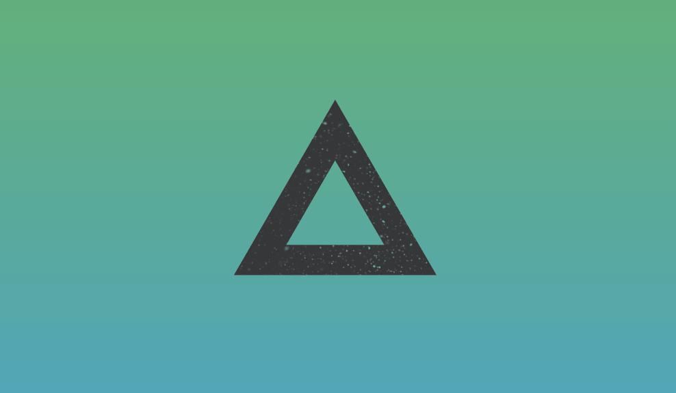
In this entry we will see how to create a triangle with an animated background, in reality the experiment is quite obvious and simple and the effect obtained looks quite good; in general we only need a bit of CSS, vector HTML, and an image.
First we will draw a vectorized triangle with HTML using svg path tags:
<svg width='0' height='0'> <defs><clipPath id="cp" clipPathUnits="objectBoundingBox"> <path d="M0.500, 0.945 L0.994, 0.090 L0.006, 0.090 L0.500, 0.945 L0.500, 0.650 L0.262, 0.238 L0.738, 0.237 L0.500, 0.650z"></path></clipPath> </defs></svg>Previously we talked about the clip-path property in CSS to select regions to show in elements and we presented the various values that can be set: circles, ellipses, squares, polygons, etc.; with the clip-path property from CSS; defining paths from HTML is also possible and for that the <path> tag is used with nodes which build the figure we want (more information in: clip-pathPaths ).
Now we indicate the tag where we render the previous path:
<div class="triangle"></div>And with the following CSS the experiment is completed:
.triangle {
	clip-path: url(#cp);
	width: 300px;
	height: 300px;
	background-size: cover;
	background-blend-mode: screen;
	position: absolute;
	top: 50%;
	left: 50%;
	background-color: #333;
	background-image: url("fondo.gif");
	transform: translateX(-65%) translateY(-50%) rotate(60deg);
}
With the clip-path property we reference the identifier of the tag that contains the clip-path, that is, the triangle.
With this last CSS we rotate the triangle and turn it into a fixed position and include the background, which as you can see is a gif, meaning it is an animated background.
The rest of the code can be found for download and viewing at the beginning and end of this entry.
Which technique to choose according to the project
After trying many options, I usually follow this rule of thumb:
- CSS Borders → simple arrows, quick triangles
- Pseudo-elements → medium shapes without images
- clip-path → modern designs, backgrounds, animations
- SVG → maximum precision or complexity
There is no single correct answer: it depends on the context.
SVG and animations applied to CSS shapes
- clip-path with SVG
- SVG allows defining complex routes with <path>. By referencing them from CSS, you can apply very precise clippings. I use this technique when the design demands accuracy or complex animations.
- Animated backgrounds and transformations
- By combining clip-path, transform, and animated backgrounds, very visual effects can be achieved without heavy JavaScript. However, it is advisable to test performance on modest devices.
Frequently asked questions about geometric shapes with CSS
- Can shapes be created with just CSS?
- Yes, from basic figures to complex polygons.
- Is CSS or SVG better?
- It depends on the case. CSS is ideal for decoration; SVG for extreme precision.
- Does clip-path affect performance?
- In general no, but it's worth testing animations on real devices.
- Can I animate these shapes?
- Yes, especially with transform, clip-path, and gradients.
Conclusions and practical recommendations
As we saw in this tutorial, it is really easy to create geometric shapes, thus avoiding the use of images; if we want to create geometric shapes like these or any other, we must remember that the JavaScript console is a great ally for performing this task and many others.
Creating geometric shapes with CSS is much more than a visual trick. When used well, they reduce dependencies, improve performance, and make the design more flexible.
My recommendation is to start with the basics, understand how borders and pseudo-elements work, and then make the jump to clip-path and SVG when the project asks for it. CSS has evolved a lot, and today it offers clean and powerful tools for these types of tasks.
The next step, learn how to use and create arrows with CSS and HTML .