
In this post I wanted to talk to you about some interesting topics that you can apply to make adaptive or responsive elements, and it is using either classes or in this case the style directive that we saw previously; for that we are going to take as a case study an element of Vue Native, but you can perfectly apply it to basic Vue.
The Vue Native element is called touchable opacity, but it can be any element you want to make adaptive that works for basic Vue.
Validate the props
The interesting thing is that we are applying simple conditions with a prop, to indicate if we want it to occupy the entire screen or just a section:
 props: {
   type: {
     type: String,
     default: "sm",
     validator: function (value) {
       // El valor debe coincidir con una de estas cadenas de texto
       return ["sm", "normal", ].indexOf(value) !== -1;
     },
   },
 },
It is a prop that we are using to indicate the type, we place sm mode (following a bit the panorama offered by frameworks such as Bootstrap or Tailwind to indicate small elements that we place on small screens - or not, it all depends on our design-) or normal, to vary the style according to some rule that we want to define.
Here the props with fixed values is essential since we do not want our user to send us just anything, but rather specific values that we can carry out checks and vary our design at will.
The conditionals, the key factor
As you can guess, the use of conditionals is the key factor in all of this to indicate when you want to show one option to another; Let's suppose you have your interface consisting of a side menu and a list:
- If the screen is small (e.g. 640px or less), the side menu is hidden.
- If the screen is larger than these dimensions, they show it next to the list.
In our case, we go a little further back, and from this component, using a props, we define which design we show of the (for example) two allowed here (sm and normal) and we verify using conditions:
<template>
 <view :style="[type == 'sm' ? { alignSelf: 'center' } : {}]">
   <TouchableOpacity
     :style="[type == 'sm' ? { alignSelf: 'flex-start' } : {}]"
     :onPress="
       () => {
         console.log('Hola MUndo');
       }
     "
     class="buttonContainer"
   >
     <Text class="buttonText">asas sm</Text>
   </TouchableOpacity>
 </view>
</template>
Validate the props
The props, we can pass as many as we need, in this case as for the type, we are only going to accept that they are of two types; and we do this with the validator:
<script>
export default {
 props: {
   type: {
     type: String,
     default: "sm",
     validator: function (value) {
       // El valor debe coincidir con una de estas cadenas de texto
       return ["sm", "normal", ].indexOf(value) !== -1;
     },
   },
 },
};
</script>
For styles, you can adapt it as you need so that your design works as you need: for example, in our case some simple buttons with fixed styles.
You can make variations both at the class level and at the style props level:
<style scoped>
.buttonContainer {
 elevation: 8;
 background-color: blue;
 border-radius: 10;
 padding-vertical: 10;
 padding-horizontal: 12;
}
.buttonText {
 font-size: 18;
 color: #fff;
 color: #9105a7;
 letter-spacing: 1;
 font-weight: bold;
 align-self: center;
 text-transform: uppercase;
}
</style>
<ButtonModern  type="sm"/>
If you pass a value to the props that does not correspond, it will give you the following error:
<ButtonModern  type="otro"/>
[Vue warn]: Invalid prop: custom validator check failed for prop "type".
found in
Finally, our buttons look like this; for this couple of examples:
<ButtonModern />
<ButtonModern type="normal" :style="{marginTop:15}"/>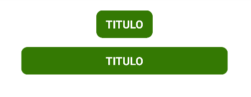
I agree to receive announcements of interest about this Blog.
I show you how you can create responsive buttons based on props in Vue Native, the same rules can be used for any other element.