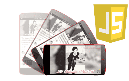
If you work with mobile-dependent sites or apps—as I do almost daily—DeviceOrientationEvent is one of those life-saving APIs. Thanks to the device's gyroscope and accelerometer, you can know how the user is holding it and react in real-time: rotate elements, move objects, change the layout, etc.
In my case, I often need to display content in one format or another depending on the orientation, so this API is perfect for that.
With this API, we can obtain information about the orientation of a device like a phone and/or tablet. Specifically, this API provides us with an event with which we report data that indicates the orientation of the device or cell phone; we can use this information to rotate elements on our website.
What is DeviceOrientationEvent and What is it Used For
DeviceOrientationEvent is a JavaScript event that allows you to read the physical orientation of the device: tilt, spin, and rotation about the X, Y, and Z axes.
When I first implemented it, what impressed me most was seeing real-time values just by moving the phone.
Difference between DeviceOrientation and DeviceMotion
- DeviceOrientationEvent → device orientation (alpha, beta, gamma).
- DeviceMotionEvent → acceleration, gravity force, angular velocity.
- With Orientation, you react to the phone's pose; with Motion, you react to movement.
Clear Explanation of the Axes: alpha, beta, and gamma
- alpha (Z) → spin like a compass (0°–360°).
- beta (X) → tilt forward/backward (–180° to 180°).
- gamma (Y) → tilt side-to-side (–90° to 90°).
When I first used this, I discovered it's not always intuitive: each axis controls a different type of movement, and that influences how you transform elements.
Requirements: HTTPS, Sensors, and Compatibility
For it to work:
- HTTPS is mandatory.
- On iOS, you must explicitly ask for permission to access the sensor.
- Not all devices include a gyroscope (my old first Android never worked).
How to Detect Device Orientation with JavaScript
Browser Support Verification
I always start with this because I've encountered devices that simply don't support it.
if (!window.DeviceOrientationEvent) {
   alert("DeviceOrientation is not available in this browser");
}
Adding the deviceorientation event listener:
window.addEventListener("deviceorientation", handleOrientation, true);Reading the values in real-time:
function handleOrientation(event) {
 const { alpha, beta, gamma } = event;
 console.log(alpha, beta, gamma);
}
Rotate Elements in the Interface using Mobile Orientation
Relationship between Axes and CSS Transformations
- rotateX → related to beta (X)
- rotateY → related to alpha (Z)
- rotateZ → related to gamma (Y)
Although it may seem strange, it doesn't always match what you'd expect, and more than once I've had to adjust the rotations until they "felt right."
Practical Example: Image Rotation
function handleOrientation(event) {
 const { alpha, beta, gamma } = event;
 const img = document.querySelector("img");
 img.style.transform = `
   rotateX(${beta}deg)
   rotateY(${alpha}deg)
   rotateZ(${gamma}deg)
 `;
}
Axis Locking and UI Control
Something useful I implemented is the ability to lock axes using checkboxes. Sometimes you don't want the UI to rotate in all directions.
Requesting Permissions on iOS and Modern Browsers
On iOS, if you don't ask for permission, it simply doesn't work. This happened to me the first time and it took several minutes to understand why no values were coming through.
How to use requestPermission()
async function requestAccess() {
 if (window.DeviceOrientationEvent?.requestPermission) {
   const perm = await window.DeviceOrientationEvent.requestPermission();
   if (perm !== "granted") {
     alert("Permiso denegado");
   }
 }
}
The addEventListener() Event
First things first; it is necessary to define the event that will detect the device orientation (deviceorientation):
window.addEventListener("deviceorientation", handleOrientation, true);The parameters are as follows:
- The name of the event to "listen" for; in this case deviceorientation.
- The name of the event handler; that is, the function that will periodically receive the data about the device's orientation.
- A boolean that indicates whether we wish (true) or not (false) to capture the event.
Obtaining Data According to Device Orientation
The next step (after registering the handler called handleOrientation()) is to develop handleOrientation(); which will periodically obtain data about the device's orientation:
- DeviceOrientationEvent.alpha: This value represents the rotation around the Z-axis given in degrees in a range of 0 to 360.
Rotation on the Z-axis

- DeviceOrientationEvent.beta: This value represents the rotation around the X-axis given in degrees in a range of -180 to 180; rotating the device from top to bottom as we see in the following figure.
Rotation on the X-axis

- DeviceOrientationEvent.gamma: This value represents the rotation around the Y-axis given in degrees in a range of -90 to 90; moving the device from right to left (side-to-side).
Rotation on the Y-axis

The event object provides us with this data; that is, the gamma, beta, and alpha degrees of rotation.
function handleOrientation(event) {
  var absolute = event.absolute;
  var alpha    = event.alpha;
  var beta     = event.beta;
  var gamma    = event.gamma;
  // rest of the code, elements will be rotated or another operation here
  }
Examples: Using DeviceOrientation
Let's look at several examples to understand how it works.
Rotate Image
Small example where an image will be rotated and the information about the device's orientation will be displayed.
General Considerations
- rotateZ: To simulate rotation on the Y-axis (with rotate we would get the same result).
- rotateX: To simulate rotation on the X-axis.
- rotateY: To simulate rotation on the Z-axis.
1. Check Compatibility
We check for browser compatibility.
if (!window.DeviceOrientationEvent)
    alert("Device Orientation not supported by your browser");
2. Listen to the Device Orientation Event
window.addEventListener("deviceorientation", handleOrientation, true);3. Get the DOM Elements
- We get the data.
- We get the image to rotate according to the device's position.
- We get the headings where the degrees will be placed.
- Finally, the checkboxes that allow locking the X, Y, and Z axes.
	var beta = event.beta; //X
	var gamma = event.gamma;//Y
	var alpha = event.alpha; //Z

	var img = document.querySelector('img');

	var alphaTag = document.getElementById('alpha');
	var betaTag = document.getElementById('beta');
	var gammaTag = document.getElementById('gamma');

	var blockAlpha = document.getElementById('blockAlpha');
	var blockBeta = document.getElementById('blockBeta');
	var blockGamma = document.getElementById('blockGamma');
4. Rotate the Image
Finally, we apply the rotation to the image.
		// we rotate if
		if (!blockBeta.checked) {
			img.style.webkitTransform = "rotateX(" + beta + "deg)";
			betaTag.innerHTML = beta;
		}
		if (!blockGamma.checked) {
			img.style.webkitTransform = "rotateZ(" + gamma + "deg)";
			gammaTag.innerHTML = gamma;
		}
		if (!blockAlpha.checked) {
			img.style.webkitTransform = "rotateY(" + alpha + "deg)";
			alphaTag.innerHTML = alpha;
		}
5. HTML
The HTML for the example:
<img src="/public/images/example/html/html5-logo.png"/>
<h1>Alpha: <span id="alpha"></span> <input id="blockAlpha" type="checkbox" /></h1>
<h1>Beta: <span id="beta"></span> <input id="blockBeta" type="checkbox" /></h1>
<h1>Gamma: <span id="gamma"></span> <input id="blockGamma" type="checkbox" /></h1>
Complete Example
You can test the complete example by clicking here (remember to test the example from a mobile, tablet, or any other device with a gyroscope).
See the value of alpha, beta, and gamma
We define an HTML element for each of the values:
<img id="logo" src="logo.png" />

<h1>Alpha: <span id="alpha"></span></h1>
<h1>Beta: <span id="beta"></span></h1>
<h1>Gamma: <span id="gamma"></span></h1>
The CSS:
img { width: 150px; transition: transform 0.1s linear; }The script that is responsible for updating the previous HTML with the values of the screen position:
window.addEventListener("deviceorientation", handleOrientation, true);

function handleOrientation(event) {
  const { alpha, beta, gamma } = event;

  document.getElementById("alpha").textContent = alpha;
  document.getElementById("beta").textContent = beta;
  document.getElementById("gamma").textContent = gamma;

  const img = document.getElementById("logo");

  img.style.transform = `
    rotateX(${beta}deg)
    rotateY(${alpha}deg)
    rotateZ(${gamma}deg)
  `;
}
Detecting Screen Orientation with CSS
We can also detect whether the orientation is vertical or horizontal with CSS; for this, we use the media queries provided starting from CSS3:
@media all and (orientation: portrait) { ... } @media all and (orientation: landscape) { ... }Real Uses of DeviceOrientation in Projects
- Adapt content based on orientation
- This is where I use it most:
- depending on how the user holds the device, I show the content in one format or another.
- This greatly improves the "native app" feeling.
Games, PWAs, AR, and Interactive Experiences
- Control a ball in a maze.
- Make a tilt meter.
- Simulate a compass.
- Adjust 3D elements.
Frequent Problems (and how I avoid them)
- Noisy values → apply filters or "smoothing".
- Differences between Android/iOS → normalization.
- Sensors disabled → detect and notify the user.
Additional Considerations and Best Practices
- Sensor Limitations
- Not all mobiles report all three axes with precision. In some, you'll only get noise.
- Smoothing and Normalization
- A low-pass filter helps a lot:
let smoothBeta = 0; smoothBeta = smoothBeta * 0.8 + event.beta * 0.2;
- Useful Alternatives
- ScreenOrientation API → only portrait/landscape orientation.
- Gyroscope API and Accelerometer API → more modern Sensor API.
Frequently Asked Questions
- Why doesn't DeviceOrientation work on my mobile?
- It may lack a sensor, you are not on HTTPS, or you didn't grant permissions (especially on iOS).
- Can I use this on a desktop?
- On most PCs, no, because they don't have a gyroscope.
- Does it consume a lot of battery?
- Continuously listening to events does consume some, especially in animations.
Conclusion
DeviceOrientation is one of the most interesting JavaScript APIs because it allows our websites to react just like a native app, which is great as the gap between native application and web features is gradually being broken.
Using it to decide the screen format or move elements based on tilt makes the interface feel much more alive.
Introduction to the Screen Orientation API in JavaScript

When we are using a mobile device with Android and/or IOS (among other mobile operating systems), we will notice that when we rotate the device, the image projected on the screen "rotates" or adapts to the position in which the device is placed; in other words; the screen changes its orientation as the system detects that the device's viewing angle changed either in a horizontal (landscape) or vertical (portrait) position.
The Screen Orientation API in JavaScript is natively accessible through the JavaScript Screen object which provides the necessary primitives to detect the position of the device, lock and unlock specific positions; That is, use the same characteristics that applications have in mobile operating systems but we will have all this in a web application that with this we can better adapt to mobile using HTML.
In this entry we will see an introduction to this Screen Orientation API in JavaScript that can be essential when creating a web application so that it is correctly displayed on mobile devices since with this we can detect the orientation of the device and act accordingly; we will also see a small extra that allows us to show how to rotate the HTML content but with CSS.
Screen API properties and methods and events
As you have seen throughout this entry, the Screen orientation API extends the Screen object and has a couple of methods that complement each other:
1.0 The Screen.lockOrientation() method: To lock the screen
The screen.lockOrientation() method also accessible as window.screen.lockOrientation() allows you to lock (landscape and/or portrait) the screen given a specific orientation:
window.screen.lockOrientation(orientation);The orientation parameter represents a specific orientation which can be:
- portrait-primary This first screen orientation is in portrait mode and is the "normal" or "default" position of the device where the action buttons are in the background.
- portrait-secondary This other orientation of the screen like the previous orientation is in portrait mode and is the "normal" or "default" position of the device but rotated 180 degrees where the action buttons are at the top.
- landscape-primary This other orientation of the screen is in landscape mode and is the "normal" or "default" position of the device but rotated 90 degrees clockwise where the action buttons are on the right.
- landscape-secondary Lastly, this screen orientation is in landscape mode and is the "normal" or "default" position of the device but rotated 270 degrees clockwise or 90 degrees counterclockwise where the action buttons are located on the left.
The orientation parameter is then used in the window.screen.lockOrientation(orientation) method through a String or String array to lock the screen according to the given orientations:
window.screen.lockOrientation('portrait'); window.screen.lockOrientation('portrait-primary', 'landscape-primary');2.0 The Screen.unlock Orientation() method: To unlock the screen
If the first method we tried locked the screen based on the specified position, the Screen.unlockOrientation() method unlocks or releases the screen based on the screen orientation specified with the previous method.
The onorientationchange event
Finally, the Screen Orientation API also has an event that indicates when the screen has been rotated called onorientationchange, very useful when a device rotation occurs and the graphical interface must be updated.
Screen Orientation API Use Case
The experiment presented below was taken from: Introducing the Screen Orientation API where you can also find information regarding the Screen Orientation API; next we proceed to explain some code sections of the experiment:
The prefixes
Since JavaScript is native and not a framework like jQuery, it is necessary to verify browser support through prefixes. For this, the following lines of code are used:
            var prefix = 'orientation' in screen ? '' :
                    'mozOrientation' in screen ? 'moz' :
                    'webkitOrientation' in screen ? 'webkit' :
                    'msOrientation' in screen ? 'ms' :
                    NULL;
It may be the case that the browser simply does not support the Screen Orientation API, in which case a message such as "API not supported" will be displayed.
FullScreen Mode
To use the Screen Orientation API in JavaScript it is necessary that the page occupies the entire screen -full screen- therefore the full screen mode is activated and deactivated every time the selected device orientation is changed through the following functions respectively:
                function launchFullscreen(element) {
                    if (element.requestFullscreen) {
                        element.requestFullscreen();
                    }...
                }

                // desactiva el FullScreen
                function exitFullscreen() {
                    if (document.exitFullscreen) {
                        document.exitFullscreen();
                    }...
                }
Activate LockOrientation and unlockOrientation method
If the API is available, each time one of the buttons in the example is pressed, the screen will be unlocked/locked according to the selected mode:
                // bloquea la pantalla y activa el FullScreen
                document.getElementById('lock-button').addEventListener('click', function(event) {
                    event.preventDefault();
                    launchFullscreen(document.documentElement);

                    setTimeout(function() {
                        screen[prefix + (prefix === '' ? 'l' : 'L') + 'ockOrientation'](select.value);
                    }, 1);
                });

                // desbloquea la pantalla y desactiva el FullScreen
                document.getElementById('unlock-button').addEventListener('click', function() {
                    exitFullscreen();
                    screen[prefix + (prefix === '' ? 'u' : 'U') + 'nlockOrientation']();
                });
The event the LockOrientation and unlockOrientation method
A function is simply linked to the onorientationchange event that, remember, is activated every time the device is rotated:
                function orientationHandler() {
                    var orientationProperty = prefix + (prefix === '' ? 'o' : 'O') + 'rientation';
                    document.getElementById('orientation').textContent = screen[orientationProperty];
                }

                // activa el evento manejador
screen.addEventListener(prefix + 'orientationchange', orientationHandler);Lock landscape/portrait with CCS
We are going to see a small plus or extra in which we show how we can rotate the HTML content of a website but this time using CSS to make everything even simpler; to do this, we present the following code that allows you to block the website in landscape and keep it as portrait:
#contenido { display:block; }

@media only screen and (orientation:portrait){
    #contenido {
        -webkit-transform: rotate(90deg);
        -moz-transform: rotate(90deg);
        -o-transform: rotate(90deg);
        -ms-transform: rotate(90deg);
        transform: rotate(90deg);

    }
}

@media only screen and (orientation:landscape){

    #contenido {
        -webkit-transform: rotate(0deg);
        -moz-transform: rotate(0deg);
        -o-transform: rotate(0deg);
        -ms-transform: rotate(0deg);
        transform: rotate(0deg);
    }
}
The next step is to learn how to use the Fullscreen API in JavaScript.
