
Animations are a key part of any modern interface. When I started working with animations beyond simple CSS transitions, I quickly hit a clear limitation: when behavior depends on logic, state, or dynamic data, CSS falls short. That's where anime.js comes in, a lightweight yet surprisingly powerful JavaScript library for creating complex animations with very little code.
In this post, we'll see how to use the JavaScript animation library called anime.js. Overall, it's a very easy-to-use library that will remind us a lot of how CSS animations and CSS transitions work, but with a flexibility that CSS simply cannot offer on its own.
The great advantage we have is the ability to create dynamic animations that can depend on multiple scenarios: user events, API responses, application state, page scroll… we handle all of that easily with JavaScript, without needing to constantly add and remove classes to vary the behavior of any animatable element. Furthermore, the library is much more extensible, which opens up a truly broad range of possibilities.
What is anime.js and why use it for JavaScript animations?
anime.js is a JavaScript-based animation library that allows you to animate virtually anything that exists in the DOM or in a JavaScript object. Specifically, you can animate:
CSSproperties (such asopacity,background-color,border-radius…)- Transforms (
translate,scale,rotate…) - SVG attributes (such as
stroke-dashoffsetordin paths) - DOM attributes (such as
valuein aninput) - Pure JavaScript object properties (for data logic or calculations)
What caught my attention most when I first tried it is that its API strongly resembles CSS animations, but with the total flexibility of JavaScript. You don't need jQuery or additional frameworks, and you can control every detail of timing, sequence, and animation behavior with a single configuration object.
In real-world projects, this makes all the difference when:
- Animations depend on conditions (for example, whether the user is logged in or not)
- They are triggered on demand (when clicking a button or receiving data from an API)
- They change in real time (animating a number counter, for instance)
- You need to avoid constantly adding and removing classes, which clutters the code
Advantages of anime.js over pure CSS animations
CSS is perfect for simple, low-cost animations: hovers, entrance transitions, loaders… But as soon as the project grows and animations become conditional or data-dependent, problems arise. In my experience, anime.js stands out because:
- It enables dynamic animations controlled directly by JavaScript without helper classes
- It avoids complex
CSSclass management (adding.is-active, removing.is-hidden, etc.) - It facilitates on-demand animations from event handlers
- It controls sequences,
delays, andloops from a single configuration object - It makes creating complex effects very simple with very few lines of code
When an animation depends on multiple scenarios (scroll, DOM events, application states, external data…), anime.js is a real, much more maintainable alternative to pure CSS.
Installing and downloading anime.js
You can download the animation library directly from its repository at: anime.js on Github. To include it in your project in the simplest way, just add the following script tag to your HTML, right before the closing </body> tag:
<script src="anime.min.js"></script>That is the minified and production-optimized version. If you prefer the uncompressed version (easier to debug during development), use:
<script src="anime.js"></script>If your workflow includes a bundler like webpack, Vite, or Parcel, you can install it directly from npm:
$ npm install animejsAnd then import it into your JavaScript module with:
import anime from 'animejs';For the full official documentation and more interactive examples, you can check: anime.js official website.
Creating your first animation with anime.js
First example: basic animation with a single element
Let's go with a simple example to understand the core API. Suppose you have a div with the class .box:
<div class="box"></div>The animation would be as simple as this call to anime():
anime({
  targets: '.box',
  translateX: 250,
  duration: 800,
  easing: 'easeInOutQuad'
});
With this, the .box element moves 250 pixels along the X-axis with a smooth transition. Here we already see the base pattern: a call to anime() that receives a configuration object where targets indicates which element to animate (it accepts CSS selectors, DOM nodes, node arrays… even JavaScript objects), and the rest of the properties define what gets animated and how.
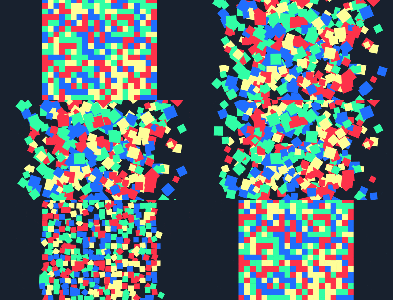
You can find many more advanced experiments in this collection of anime.js experiments on CodePen. To illustrate the library's versatility in this post, we will work with our own version inspired by the famous anime.js stress test by its author, Julian Garnier. It is a seemingly simple example with a very attractive visual outcome, perfect for understanding how the library works in practice.
The experiment consists of three distinct parts that we will look at next:
CSS of the animated experiment
The first step is to define the CSS of the main container that will hold all the colored squares. We create a section element with fixed dimensions of 400×400 pixels:
section {
  width: 400px;
  height: 400px;
}
And the styling for each of the small colored squares that will be contained inside the section. We define them as inline-block so they arrange in a row, with a size of 20×20 pixels:
div {
  display: inline-block;
  width: 20px;
  height: 20px;
}
Generating HTML dynamically with JavaScript
Now it's time to create as many divs as possible inside the section. Doing the math, we see that we need exactly:
(400 * 400) / (20 * 20) = 400We need 400 small squares (divs) to completely fill our section. Creating them by hand would be ridiculous, so we generate them dynamically with JavaScript. Notice how we use anime.random(), a utility method included in the library itself, to assign a random color to each square:
var maxElements = 400;
var colors = ['#FF324A', '#31FFA6', '#206EFF', '#FFFF99'];
var createElements = (function() {
  var sectionEl = document.createElement('section');
  for (var i = 0; i < maxElements; i++) {
    var el = document.createElement('div');
    el.style.background = colors[anime.random(0, 3)];
    sectionEl.appendChild(el);
  }
  document.body.appendChild(sectionEl);
})();
Dynamic animations with random values
One of my favorite features of anime.js —and one that has no direct equivalent in CSS— is that you can pass functions instead of fixed values for any property. Each function runs once per animated element, allowing every square to have its own unique behavior. This opens the door to very striking dynamic animations with almost no effort.
Now it's time for the magic. We apply the animation to all the divs with the following code:
anime({
  targets: 'div',
  translateX: function() { return anime.random(-6, 6) + 'rem'; },
  translateY: function() { return anime.random(-6, 6) + 'rem'; },
  scale: function() { return anime.random(10, 20) / 10; },
  rotate: function() { return anime.random(-360, 360); },
  delay: function() { return 400 + anime.random(0, 500); },
  duration: function() { return anime.random(1000, 2000); },
  direction: 'alternate',
  loop: true
});
We define a series of parameters composed of random numbers within ranges that we can customize to our liking. Let's see what each one does:
translateXandtranslateY: move each element randomly along the X and Y axes, up to 6remin any direction.scale: randomly scales each square between 1x and 2x its original size.rotate: rotates each element up to 360 degrees in either direction.delay: introduces a different delay for each element, generating that staggered movement effect.duration: each square takes between 1 and 2 seconds to complete its animation.direction: 'alternate': upon finishing the animation, it automatically reverses it back to the initial state. This is key to making the effect continuous and fluid.loop: true: makes the animation repeat indefinitely.
With this, we obtain:
3D Transformations with anime.js
Animations are a fundamental element in any type of application today: we see them in Android and iOS apps, product websites, dashboards… and web development cannot lag behind. In this section, we will see how to take anime.js a step further by applying real 3D transforms. Previously, we saw how to create the following 2D animation with colored squares:
anime.js has complete control over the sequence and order in which each animation executes. The library is supported across all modern browsers (you can check on the official site), and because it internally uses requestAnimationFrame, performance remains smooth even when animating hundreds of elements simultaneously.
Defining grid animations with anime.js
Now we will see how to build the animation from the promo image of this section. The experiment is inspired by the official CodePen page. You'll see how easy it is to build something visually striking with anime.js:
Defining the base HTML and CSS
The HTML foundation is a single section element with a class wrapper that will act as the container for all animated grids:
<section class="wrapper"></section>The CSS for .wrapper makes it span the full screen and configures the necessary 3D perspective so that translateZ, rotateX, and rotateY produce a visual depth effect. The CSS3 property perspective defines how far the user's "eye" is from the screen plane; without it, 3D transformations are not perceived:
.wrapper {
  overflow: hidden;
  position: absolute;
  left: 0;
  top: 0;
  display: flex;
  justify-content: center;
  align-items: center;
  flex-wrap: wrap;
  perspective: 800px;
  transform-style: preserve-3d;
  width: 100%;
  height: 100%;
}
And the CSS for each individual grid cell. We use relative units (vw and vh) so that the grid automatically adapts to the browser window size:
div {
  width: 10vw;
  height: 10vh;
}
Using anime.js: defining the JavaScript
In this section, we dive straight into JavaScript. First we create the DOM elements we want to animate, and then we apply the animation with anime.js, which offers a wide range of options as we'll see below.
Creating the grid with pure JavaScript
Just like in the previous example, we use JavaScript to dynamically build the container's components. You don't need jQuery for this; the native DOM API is more than enough. We create the element with document.createElement(), add a class to it with classList.add(), and inject it into .wrapper using appendChild(). We repeat this 60 times to have enough grid cells:
function createEl(className) {
  var el = document.createElement('div');
  el.classList.add(className);
  wrapperEl.appendChild(el);
}
for (var i = 0; i < numberOfThings; i++) {
  createEl('red');
  createEl('blue');
  createEl('green');
  createEl('yellow');
}
Animating the 3D grid with anime.js
And finally, the function that triggers the 3D animation on all the divs:
anime({
  targets: 'div',
  translateZ: 720,
  rotateX: 180,
  rotateY: 180,
  delay: function(el, i) {
    return i * 5;
  },
  loop: true,
  direction: 'alternate',
  easing: 'easeOutQuad',
});
The most interesting point here is translateZ: 720. This property moves each grid cell 720 pixels toward the viewer along the Z-axis, creating the impression that elements are "moving forward" or "growing" in size. Combined with 180-degree rotations on the X (rotateX) and Y (rotateY) axes, the result is a very attractive depth effect that can be used, for example, as an item selection transition in an interface.
Another important detail: the delay property here receives a function with two arguments: the element itself el and its index i within the set of animated elements. Multiplying the index by 5 means each element starts its animation 5 milliseconds after the previous one, producing that wave or staggered cascade effect seen in the final result.
The easing: 'easeOutQuad' softens the deceleration at the end of the animation, giving it a more natural and less mechanical feel.
Massive animations: generating hundreds of elements with JavaScript
Another real-world case where anime.js shines is when you need to animate hundreds of elements simultaneously. To do this, we first generate the nodes dynamically in the DOM using an immediately invoked function expression (IIFE), and then anime.js takes care of animating them all at once:
var maxElements = 400;
var colors = ['#FF324A', '#31FFA6', '#206EFF', '#FFFF99'];
(function() {
  var sectionEl = document.createElement('section');
  for (var i = 0; i < maxElements; i++) {
    var el = document.createElement('div');
    el.style.background = colors[anime.random(0, 3)];
    sectionEl.appendChild(el);
  }
  document.body.appendChild(sectionEl);
})();
This approach demonstrates something important: anime.js scales very well. Even when animating 400 elements simultaneously, performance remains smooth thanks to using requestAnimationFrame under the hood. It's not something you can take for granted with every animation solution.
2D Transformations with anime.js
2D transformations are the most common in day-to-day work, and anime.js handles them very naturally. The available properties are:
translateX: horizontal displacementtranslateY: vertical displacementscale: scaling (alsoscaleXandscaleYseparately)rotate: rotation (in degrees by default, or inturns andrad)
Combined example that moves an element to the right, scales it, and rotates it one full turn:
anime({
  targets: '.square',
  translateX: window.innerWidth * 0.8,
  scale: 0.8,
  rotate: '1turn'
});
Using '1turn' (one full turn = 360 degrees) is one of those API conveniences that are greatly appreciated when working with rotations. You can also use '90deg', '1.5turn', or radians with '3.14rad'. It's much more intuitive than calculating degrees manually.
3D Animations with anime.js
anime.js also supports 3D transformations as long as the parent element has perspective configured in CSS (with the perspective property and transform-style: preserve-3d). In one of my experiments, I used translateZ, rotateX, and rotateY to create an animated grid with real depth:
anime({
  targets: 'div',
  translateZ: 720,
  rotateX: 180,
  rotateY: 180,
  delay: (el, i) => i * 5,
  loop: true,
  direction: 'alternate',
  easing: 'easeOutQuad'
});
Using translateZ generates a very interesting sense of depth. The higher the value, the "closer" the element will appear to the viewer. Ideal for interactive interfaces, hero screens, or visual effects designed to make an impact.
Total control of flow: duration, delay, loop, and direction
One of the strong points of anime.js is its granular control over animation flow. These four properties are the ones you'll use most every day:
duration: animation duration in milliseconds. Defaults to1000(1 second).delay: waiting time before the animation starts. It can be a fixed number or a function receiving the element and its index.loop:truefor infinite repetition, or a number to limit repetitions (for example,loop: 3).direction:'normal'(standard direction),'reverse'(from end to start), or'alternate'(goes back and forth).
The value direction: 'alternate' is especially useful in practice, as it plays the animation and then automatically reverses it, creating smooth back-and-forth or pulsing effects without writing a single additional line of code.
Real-world use cases for anime.js in web projects
In practice, anime.js is ideal for a wide variety of situations. These are the use cases where I've gotten the most out of it in real projects:
- Element entrance and exit animations (with
opacityandtranslateY) - Transitions between views or sections in an SPA
- Animated counters in dashboards (animating a property of a JavaScript object)
- Visual effects on landing pages and hero sections
- Interfaces with dynamic states that change in response to data or events
- SVG animations (like paths progressively drawing themselves with
stroke-dashoffset) - Micro-interactions (visual feedback when clicking a button, completing a form, etc.)
In projects where animation directly responds to events, external data, or user interaction, anime.js greatly simplifies the work while keeping code clean and readable.
Compatibility, performance, and best practices
anime.js is supported across all modern browsers (including IE10+ for basic functionality). Internally it uses requestAnimationFrame, which ensures animations sync with the monitor's refresh rate and don't block the main browser thread, resulting in smooth performance.
That said, here are a few best practices to keep in mind to get the most out of it without compromising performance:
- Always prioritize
transformandopacity: these are the properties the browser can animate most efficiently since they don't trigger layout recalculations. - Avoid animating properties that trigger a layout reflow (
width,height,top,left,margin): every change to these forces the browser to recalculate the layout of the entire page. - When many elements are animating at once, keep animations simple and avoid combining too many properties in a single object.
- If you need to pause or control the animation externally, save the instance returned by
anime():const anim = anime({...}); anim.pause(); anim.play();
FAQs about anime.js
- Is
anime.jsbetter thanCSSfor animations?- It depends on the case. For simple, static animations,
CSSis sufficient and more efficient. For dynamic animations controlled by logic, state, or data,anime.jsis clearly superior.
- It depends on the case. For simple, static animations,
- Can
anime.jsbe used withoutjQuery?- Yes, and it's the recommended way. It's designed for vanilla JavaScript and has zero external dependencies.
- Does
anime.jssupport 3D animations?- Yes, as long as the parent container has
CSS3perspective configured withperspectiveandtransform-style: preserve-3d.
- Yes, as long as the parent container has
- Does it work well with
SVG?- Perfectly. It's one of its strongest features. You can animate SVG presentation attributes like
stroke-dashoffset,fill, or even path coordinates.
- Perfectly. It's one of its strongest features. You can animate SVG presentation attributes like
- Can I control the animation from JavaScript?
- Yes. The
anime()function returns an object with methods like.play(),.pause(),.restart(), and.seek(), allowing you to control the animation state from anywhere in your code.
- Yes. The
Conclusions
In this post, we've seen how to create basic and complex animations with anime.js, from a simple displacement to 3D grids with hundreds of elements animated simultaneously. What I find most valuable about this library isn't just the visual result, but how clean and maintainable the code remains compared to solutions based on adding and removing CSS classes.
With anime.js, you can animate virtually any property: width, height, color, background-color, border-radius… and achieve animations that would be very complicated to implement in pure CSS, especially when you need to trigger the effect on demand or in response to dynamic data. With anime.js, that's trivial.
With anime.js we can animate many other CSS properties such as width, height, and color and make those animations that with CSS would make our lives very complicated, especially when we must perform an animation or effect on demand; with anime.js this is very easy to do.
After working with anime.js on several projects, my conclusion is clear:
- If you need simple animations → CSS is fine
- If you need dynamic, complex, or on-demand animations → anime.js is an excellent choice
It is a lightweight library, easy to learn and very powerful. With few parameters you can create attractive and professional visual effects, without complicating your life or depending on heavy frameworks.