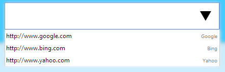
The <datalist> element introduced in HTML5 allows you to define a set of suggested options for an <input> element. In other words, <datalist> offers a list of predefined values through <option> elements, which the browser displays as an autocomplete dropdown while the user types, without forcing them to pick exclusively from that list.
Has it ever happened to you that you need a free text field, but you also want to offer suggestions… without using a rigid <select>? If so, the <datalist> element in HTML5 is exactly what you were looking for. I always use it whenever I need quick autocomplete without resorting to JavaScript, and honestly, it has saved me time more than once.
In this guide, I explain what it is, how it works, when to use it, and I share real examples that I have applied in my own projects.
Previously, we saw how to use the <area> and <map> elements.
❓ What is the <datalist> element in HTML5 and what is it used for?
The <datalist> element serves to define a list of suggested values associated with an <input>. The user can type freely in the field, but also has a dropdown menu that helps them complete the value faster. Unlike other autocomplete mechanisms, this functionality is 100% native to the browser: no libraries, no JavaScript.
In one of my previous articles, for example, I showed how to create a <datalist> with web browsers for a text field. That structure is still one of my favorites for explaining how it works because it is clear and visually immediate.
Difference between <datalist> and <select>
Although they may seem similar at first glance, they serve very different functions:
<select>strictly limits the user to the options in the list; they cannot type a different value.<datalist>only suggests options, but allows typing any other value freely.
This is ideal when you want to guide the user without restricting them. It came in very handy for me when I needed to allow custom URLs, but wanted to offer common links as a quick reference.
How the <input> + list attribute relationship works
The mechanism is simple and relies on two steps:
- The
<datalist>must have a uniqueidattribute. - The
<input>must reference that identifier using thelist="idOfDatalist"attribute.
With that connection, the browser knows which list of suggestions to show when the field is activated.
How to use <datalist> together with inputs - Examples
To use <datalist> together with inputs, you must set an identifier on the <datalist> element through the id attribute. Inside it, you define the possible options using <option> elements:
     <datalist id="browsers">
     <option value="Internet Explorer">
     <option value="Firefox">
     <option value="Chrome">
     <option value="Opera">
     <option value="Safari">
     </datalist>
Using the value of the identifier above, you link it to the <input> through the list attribute:
<input list="browsers" type="text">You can also add a label attribute to the <option> elements to display a more descriptive alternative text next to the value:
<datalist id="urls">
	<option value="http://www.google.com" label="Google">
	<option value="http://www.bing.com" label="Bing">
	<option value="http://www.yahoo.com" label="Yahoo">
</datalist>
️ Example with value + label
Combining the value attribute with label is an excellent practice when the internal data (the URL, a code, an ID) differs from the name the user should see. The browser displays the label as descriptive text in the dropdown, but upon selecting the option, the field receives the actual value:
<datalist id="urls">
 <option value="http://www.google.com" label="Google">
 <option value="http://www.bing.com" label="Bing">
 <option value="http://www.yahoo.com" label="Yahoo">
</datalist>
<label>Search Engines:</label>
<input list="urls">I usually apply it in technical fields where the user sees a friendly name, but the value sent to the server is completely different.
Practical case: extensive lists and automatic filtering
When you have dozens or even hundreds of options, the <datalist> really shines: the browser filters suggestions in real time as the user types, narrowing down the list to relevant results without a single line of JavaScript.
It is an ultra-lightweight solution. It requires no external dependencies and works surprisingly well for medium-sized lists, roughly between 20 and 200 items. For very large datasets or complex filtering logic, it is better to consider JavaScript alternatives.
️ <input> types compatible with <datalist>
Although many people assume that <datalist> only works with text fields, it actually supports quite a few more <input> types.
✏️ Text, search, email, URL, and number
These are the most common types and the behavior is identical across all of them: the browser displays suggestions from the list as the user types, but allows them to enter any value freely. You already saw the type="text" and type="url" examples in previous sections.
Dates and times (date, month, time, datetime-local)
Here is where many people are surprised: <datalist> does work with date and time inputs, although support varies by browser. In Chrome, for instance, suggested options appear as tick marks or items within the native picker.
You can suggest frequent schedules, as in this example:
<input type="time" list="popularHours">
<datalist id="popularHours">
 <option value="12:00">
 <option value="13:00">
 <option value="14:00">
</datalist>
️ Advanced usage: range and tick marks
This is one of the lesser-known and most striking combinations: by associating a <datalist> with an <input type="range">, the values of the options become visible reference tick marks on the slider. It is an elegant way to guide the user toward key values without restricting control movement:
<label for="tick">Tip amount:</label>
<input type="range" list="tickmarks" min="0" max="100" id="tick">
<datalist id="tickmarks">
 <option value="0" label="0%">
 <option value="10" label="Minimum">
 <option value="20" label="Standard">
 <option value="30" label="Generous">
</datalist>Color inputs with suggestions
Combined with type="color", <datalist> allows showing a predefined color palette inside the browser's native picker. It is ideal for when you want to suggest certain brand shades without completely blocking the user:
<input type="color" list="redColors">
<datalist id="redColors">
 <option value="#800000">
 <option value="#A52A2A">
 <option value="#DC143C">
</datalist>
Compatibility, limitations, and important warnings
I want to be completely honest here: <datalist> is not perfect and has rough edges that are worth knowing before using it in production.
Browser differences
The behavior of <datalist> is not uniform across browsers:
- Some browsers show only the
valuein the dropdown. - Others display both the
labeland thevaluetogether.
In Firefox, for instance, the behavior can differ significantly from Chrome or Safari, both in visual presentation and in interaction with <input> types like date or range. Before using it in a project, it is advisable to test it in the browsers your users use.
CSS Styles: what you CANNOT customize
One of the most frustrating aspects of <datalist> is that the suggestions dropdown menu is entirely controlled by the browser. You cannot modify its appearance with CSS: not colors, typography, nor spacing. You can only style the <input> to which it is associated. If a custom design is a requirement, you will need to turn to a JavaScript solution.
Common issues and how to solve them
These are the issues I have encountered most frequently:
- At high zoom levels, the option text does not scale properly in some browsers.
- Certain screen readers do not announce the options in the
<datalist>, making it a barrier for visually impaired users. - On mobile devices, the experience can be inconsistent: in some cases, the virtual keyboard interferes with the suggestions menu or it fails to show up altogether.
♿ Accessibility of the <datalist> element
Accessibility is the Achilles' heel of <datalist>:
- Some screen readers do not read the dropdown suggestions.
- The list does not always respect the accessible font size configured by the user.
- There is no specific
ARIArole for the element, making it hard to describe its behavior to assistive technologies.
Personal recommendation: when accessibility is a real priority, it is better to opt for a traditional <select> or implement a JavaScript autocomplete properly tagged with aria-* attributes.
When should you use <datalist> and when should you avoid it?
Ideal scenarios
- Simple forms where suggestions are guidance, not restrictive.
- Medium-sized lists (roughly between 20 and 200 items).
- When you need to allow free entries that are not in the predefined list.
- When you want to autocomplete without loading additional JavaScript libraries.
Personally, I use it quite a bit in internal dashboards and technical forms, where the audience understands the domain and suggestions speed up data entry.
When to avoid it
- When you need a custom design for the dropdown (colors, fonts, icons, etc.).
- When strict accessibility is a project requirement.
- When the list is dynamic and depends on filters or complex API queries.
- When mobile users are your main audience, given the inconsistent support on those devices.
Complete examples (HTML + optional JS)
Below is a series of examples that complement what was explained in the previous sections.
<datalist> HTML only
The most basic and common case: a text field with a list of browsers as suggestions.
<label for="browser">Choose a browser:</label>
<input list="browsers" id="browser">
<datalist id="browsers">
 <option value="Chrome">
 <option value="Firefox">
 <option value="Safari">
 <option value="Opera">
</datalist>⚙️ <datalist> with JavaScript to display selection
Although <datalist> does not require JavaScript, you can easily combine it to react to the selected value. In this example, a button reads the current value of the <input> and displays it on screen using document.getElementById():
<form>
 <label>Your Car's Name:</label>
 <input list="cars" id="carsInput">
 <datalist id="cars">
   <option value="BMW">
   <option value="Bentley">
   <option value="Mercedes">
   <option value="Audi">
   <option value="Volkswagen">
 </datalist>
  <button type="button" onclick="datalistcall()">Click Here</button>
</form>

<p id="output"></p>

<script>
function datalistcall() {
 const value = document.getElementById("carsInput").value;
 document.getElementById("output").textContent =
   "You selected: " + value;
}
</script>Complete form example with multiple types
This example combines an <input type="email"> with email suggestions and an <input type="color"> with a predefined palette, showing how <datalist> adapts to different field types within the same form:
<form>
 <label>Suggested email:</label>
 <input type="email" list="emails">
 <datalist id="emails">
   <option value="contacto@empresa.com">
   <option value="info@empresa.com">
   <option value="soporte@empresa.com">
 </datalist>
 <label>Preferred color:</label>
 <input type="color" list="colors">
 <datalist id="colors">
   <option value="#FF0000">
   <option value="#00FF00">
   <option value="#0000FF">
 </datalist>
</form>❓ Frequently asked questions about <datalist> in HTML5
- Can the user enter values that are not in the list?
- Yes.
<datalist>only suggests; the field remains an open<input>.
- Yes.
- Can I style the dropdown options?
- No. You can only apply styles to the associated
<input>; the menu is controlled by the browser.
- No. You can only apply styles to the associated
- Does it work across all modern browsers?
- Yes, although with noticeable variations in visual behavior and in
<input>types such asdate,range, orcolor.
- Yes, although with noticeable variations in visual behavior and in
- Is it an alternative to
<select>?- Not exactly. They are different elements:
<select>restricts selection to the list;<datalist>suggests it without forcing.
- Not exactly. They are different elements:
- Do I need JavaScript for it to work?
- No.
<datalist>works entirely without JS; it is native HTML5 functionality.
- No.
Next step, learn to natively embed videos and audio in HTML.