
Scrolling with the typical scrollbar is fundamental in any app, and although Flutter makes many things simple, the Scrollbar widget can be complicated or difficult to use if not well understood.
One of the fundamental elements when developing any type of application, especially mobile ones due to limited space, is the scroll or the scrollbar.
To add a scrollbar to a ScrollView, wrap the scroll view widget in a Scrollbar widget. Using this widget we can scroll through a widget.
The scrollbar allows the user to jump or scroll to a part of the interface when it cannot be fully displayed on the screen at once.
Here I tell you everything you need to master it (including a couple of real-world lessons I learned while creating course and book listings in my own app).
Flutter provides an immense number of widgets that help us in the creation of applications in a modular way, like it were Lego pieces. The central idea is that you build your user interface from widgets. Widgets describe what the view or screen of your application should look like according to their organization and properties.
Remember that the widget we saw earlier allowed us to learn how to detect movements using gestures with the Swipe effect in Flutter.
What the Scrollbar in Flutter is and what it's for
The Scrollbar is a widget that wraps around any scrollable component (ListView, GridView, SingleChildScrollView...) and displays a visual bar that indicates the position within the content.
In apps with a lot of content—as happened in my academy app—users can get lost among so many elements. The bar gives them an immediate visual reference.
When to use it in a real app
- Long lists (courses, products, news).
- Educational content or catalogs (like my book list).
- App where vertical navigation must be clear.
- Any view where users need to see “where they are”.
Scrollbar main attributes (explained with examples)
The Scrollbar has several attributes that define its behavior and appearance.
- controller and isAlwaysShown
- controller: allows manual position control.
In my case it was essential: the Scrollbar didn't appear until I used a ScrollController. - isAlwaysShown: forces the Scrollbar to remain visible.
- controller: allows manual position control.
- thickness, hoverThickness, and radius
- thickness: width of the thumb (the little bar).
- hoverThickness: thickness when hovering (very useful on web or desktop).
Here I discovered something key: by adjusting hoverThickness the bar began to be much more intuitive for my users. - radius: rounds the edges of the thumb.
- showTrackOnHover and interactive
- showTrackOnHover: shows the scroll track on hover.
- interactive: allows dragging the bar.
- Visual customization of the thumb and the track
Since Flutter 3+ you can customize even colors, decorations, and animations using ScrollbarTheme.
How to implement Scrollbar with ListView, GridView, and SingleChildScrollView
Basic step-by-step example
Scrollbar(
 child: ListView.builder(
   itemCount: 20,
   itemBuilder: (context, index) => Text('Item $index'),
 ),
);
Example with ScrollController (for when the Scrollbar doesn't appear)
This is the most recommended pattern:
final controller = ScrollController();
Scrollbar(
 controller: controller,
 child: ListView.builder(
   controller: controller,
   itemCount: 30,
   itemBuilder: (_, i) => ListTile(title: Text('Curso $i')),
 ),
);
In this code snippet, we use a Listview widget and wrap it in the scrollbar. In this, isAlwaysShown is a bool that indicates that the scrollbar should be visible, even when scrolling is not underway, and showTrackOnHover controls whether the bar will be shown when scrolling or will be always hidden.
But remember that you can use any type of widget that you know won't fit on the screen.
Expanded(
          child: Scrollbar(
            isAlwaysShown: _isAlwaysShown,
            showTrackOnHover: _showTrackOnHover,
            child: ListView.builder(
              itemCount: 20,
              itemBuilder: (context, index) => MyItem(index),
            ),
          ),
        ),
We will add the listview.builder() method which will allow us to demonstrably create some elements so they don't fit on the screen and the scrollbar appears.
Finally, the entire code:
import 'package:flutter/material.dart';
class HomePage extends StatefulWidget {
@override
_HomePageState createState() => _HomePageState();
}
class _HomePageState extends State<HomePage> {
bool _isAlwaysShown = true;
bool _showTrackOnHover = false;
@override
Widget build(BuildContext context) {
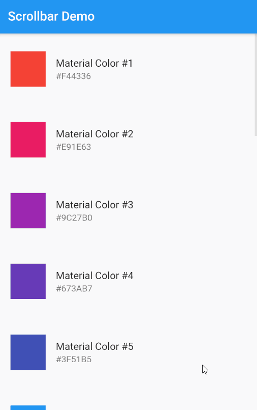
return Scaffold(
appBar: AppBar(
title: Text('Scrollbar Demo'),
),
body: Column(
crossAxisAlignment: CrossAxisAlignment.start,
children: [
Expanded(
child: Scrollbar(
isAlwaysShown: _isAlwaysShown,
showTrackOnHover: _showTrackOnHover,
hoverThickness: 30.0,
child: ListView.builder(
itemCount: 20,
itemBuilder: (context, index) => MyItem(index),
),
),
),
Divider(height: 1),
],
),
);
}
}
class MyItem extends StatelessWidget {
final int index;
const MyItem(this.index);
@override
Widget build(BuildContext context) {
final color = Colors.primaries[index % Colors.primaries.length];
final hexRgb = color.shade500.toString().substring(10, 16).toUpperCase();
return ListTile(
contentPadding: EdgeInsets.symmetric(horizontal: 20, vertical: 20),
leading: AspectRatio(
aspectRatio: 1,
child: Container(
color: color,
)),
title: Text('Material Color #${index + 1}'),
subtitle: Text('#$hexRgb'),
);
}
}
Advanced example with customization
Scrollbar(
 controller: controller,
 thumbVisibility: true,
 thickness: 8,
 radius: Radius.circular(12),
 hoverThickness: 14,
 child: ListView.builder(
   controller: controller,
   itemCount: 50,
   itemBuilder: (_, i) => ListTile(title: Text('Libro $i')),
 ),
);- thumbVisibility: true,
- Makes the scroll bar "pull" always visible, even when not scrolling. By default, it only appears when scrolling.
- thickness: 8,
- Defines the thickness of the scroll bar (the thumb).
- radius: Radius.circular(12),
- Applies a 12-pixel border radius to the thumb, with rounded corners.
- hoverThickness: 14,
- Specifies the thickness of the scroll bar when the user hovers over it, making it wider (14) than its normal thickness (8).
Common mistakes and how to fix them
The Scrollbar doesn't appear
Typical causes:
- You didn't share the same ScrollController in the Scrollbar and the ListView.
- The content doesn't exceed the screen (no scrolling needed).
- You used multiple nested scrolls without control.
Solution:
final controller = ScrollController();
Scrollbar(controller: controller, child: ListView(controller: controller));
Problems when combining Scrollbar inside Column or Expanded
If the Scrollbar is inside a Column, you need an Expanded:
Expanded(
 child: Scrollbar(
   child: ListView(...),
 ),
);
Nested scrolls
Avoid ScrollView inside ScrollView. Use:
- CustomScrollView, or
- PrimaryScrollController.
Frequently asked questions about Scrollbar in Flutter
- Why doesn't the Scrollbar appear?
- Generally because you are not using a shared ScrollController.
- How to make it always visible?
- Use thumbVisibility: true (or isAlwaysShown in older versions).
- How to customize the thickness?
- thickness and hoverThickness.
- Does it work with GridView?
- Yes, as long as you pass the controller to both widgets.
Learn how to implement pinch-to-zoom in Flutter.