
Adaptar nuestra aplicación a tamaños distintos de pantalla, es una tarea común cuando estamos desarrollando sobre todo para dispositivos Android y sobre todo cuando estamos creando juegos móviles con Flame y Forge2D en Flutter, que tenemos una inmensa cantidad de tamaños de pantalla y resoluciones distintas, aunque en los últimos años, en iOS también tenemos múltiples tamaños de pantalla, y eso sin introducir las tabletas, que son aún más grande y por lo tanto tenemos más espacios para mostrar nuestro contenido; en esta lección, vamos a ver un mecanismo básico que debemos de conocer al momento de empezar a crear estas adaptaciones de nuestra interfaz gráfica en Flutter.
Los MediaQuery en Flutter son una forma de adaptar la interfaz de usuario a diferentes dispositivos y tamaños de pantalla. Con los MediaQuery, puedes consultar las características del dispositivo en el que se está ejecutando la aplicación, como la orientación, el tamaño de pantalla, la densidad de píxeles, etc., y ajustar la presentación en consecuencia.
Por ejemplo, si quieres mostrar un diseño diferente para dispositivos móviles y tabletas, puedes utilizar MediaQuery para consultar la anchura del dispositivo y, en consecuencia, ajustar la disposición de los elementos. Esto puede ser especialmente útil para asegurarse de que la aplicación se vea bien en una amplia variedad de dispositivos diferentes.
Además, la clase MediaQuery en Flutter también proporciona algunos métodos útiles para convertir valores de píxeles en unidades lógicas, lo que facilita la creación de interfaces de usuario adaptables que se ven bien en todo tipo de dispositivos.
Responsive layouts en Flutter: guía práctica completa con ejemplos reales
Crear interfaces responsivas en Flutter no es solo “redimensionar widgets”: es entender cómo tu app debe adaptarse a móviles, tablets, escritorio, pantallas divididas y orientación cambiante. A mí me pasó: cuando construí una app de chat real, descubrí que el mismo layout no sirve para todos los tamaños. Tuve que combinar MediaQuery, LayoutBuilder, vistas divididas, breakpoints dinámicos e incluso callbacks para mantener el contexto entre pantallas.
Responsive vs Adaptive UI (y cuándo usar cada uno)
Responsive UI → el layout fluye, se reajusta y escala según el espacio disponible.
Adaptive UI → cambia el patrón de diseño completo según el tipo de pantalla (móvil, tablet, escritorio).
En Flutter normalmente hacemos ambos:
- Responsive → ajustar tamaños, espacios, tipografías.
- Adaptive → cambiar estructura: navegación inferior → menú lateral, vista apilada → vista dividida.
Cuando construí mi app de chat, por ejemplo, la versión móvil usaba BottomNavigationBar, mientras que en pantallas grandes cambiaba a una vista dividida con un menú lateral fijo.
Los MediaQuery como elemento fundamental para el diseño adaptativo o Responsive
En Flutter, tenemos una clase que nos permite dar rápidamente información sobre el equipo que está renderizando nuestra aplicación, datos como la orientación y el tamaño total de pantalla y con esto hacer nuestros cálculos.
La clase de MediaQuery tiene un comportamiento o idea similar al que tenemos en CSS con cuentan con el mismo nombre de esta tecnología, adaptar la aplicación en base a reglas que definimos sea por la orientación o el tamaño de pantalla:
@media (max-width: 600px) {
  .facet_sidebar {
    display: none;
  }
}

@media (min-width: 700px) and (orientation: landscape) { ... }
Fundamentos del diseño responsivo en Flutter
MediaQuery: cuándo conviene usarlo (con ejemplos prácticos)
MediaQuery es la forma más directa de saber el tamaño, orientación, padding y densidad del dispositivo.
final Size size = MediaQuery.of(context).size;
final Orientation orientation = MediaQuery.of(context).orientation;
En un caso, aplicaba size.width para calcular un GridView, pero en pantallas divididas (split-screen) los resultados eran incorrectos. Ahí descubrí que necesitaba…
Orientación de pantalla
Para obtener la orientación de pantalla que puedes ser o landscape o portrait, tenemos
final Orientation orientation = MediaQuery.of(context).orientation;Obtener el tamaño
Para obtener el tamaño de la pantalla, tenemos la propiedad si se que nos da una tulla de dos valores que corresponden al ancho y alto respectivamente:
final Size size = MediaQuery.of(context).size;Lógica para indicar la cantidad de elementos, vamos a emplear una variable o mejor dicho, propiedad normalita:
int countItem = 2;Y con esto, podemos indicar algunas. Reglas según sea lo que sea que estemos mostrando en nuestra aplicación; puedes tomar el tamaño del dispositivo para crear tu árbol de condicionales y o la orientación:
double space = size.width;
int countItem = 2;
if (orientation == Orientation.landscape) {
countItem = 3;
//space = size.height;
}
if (space > 700.0) {
countItem = 4;
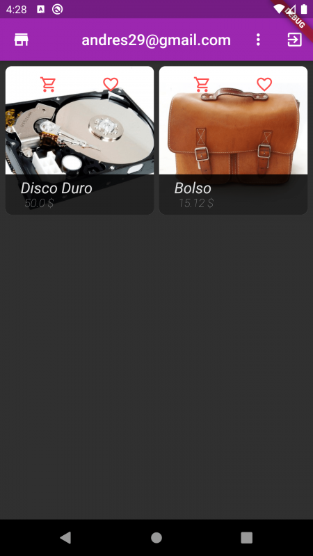
}Boceto del GridView
Vamos a implementar un recurso que forma parte de mi curso de Flutter: la creación de una grilla (GridView) para mostrar elementos en filas.
- Factores de Diseño: Puedes emplear ambos factores (orientación y tamaño) o solo uno, aunque es más común definir las reglas de visualización basándose en el tamaño de la pantalla para lograr un diseño responsivo.
- Flexibilidad: La solución que mostramos aquí es solo una idea; puedes plasmar tu desarrollo y la presentación de datos como mejor se adapte a tu proyecto.
GridView.builder(
                          padding: EdgeInsets.all(7),
                          gridDelegate:
                              SliverGridDelegateWithFixedCrossAxisCount(
                                  crossAxisCount: countItem,
                                  crossAxisSpacing: 7,
                                  mainAxisSpacing: 4),
                          itemCount: products.length,
                          itemBuilder: (context, i) {
                            return GestureDetector(
                              onTap: () {
                                Navigator.pushNamed(context, DetailPage.ROUTE,
                                    arguments: products[i]);
                              },
                              child: ClipRRect(
                                borderRadius: BorderRadius.circular(8.0),
                                child: GridTile(
                                  child: Image.network(
                                    products[i].image,
                                    fit: BoxFit.cover,
                                  ),
                                  header: GridTileBar(
                                      title: Row(
                                    mainAxisAlignment:
                                        MainAxisAlignment.spaceAround,
                                    children: [
                                      Icon(
                                          products[i].inCart
                                              ? Icons.shopping_cart
                                              : Icons.shopping_cart_outlined,
                                          color: Theme.of(context).accentColor),
                                      Icon(
                                          products[i].favorite
                                              ? Icons.favorite
                                              : Icons.favorite_border_outlined,
                                          color: Theme.of(context).accentColor),
                                    ],
                                  )),
                                  footer: Container(
                                      padding: EdgeInsets.symmetric(
                                          horizontal: 20.0, vertical: 6.0),
                                      color: Colors.black87,
                                      child: Column(
                                        crossAxisAlignment:
                                            CrossAxisAlignment.start,
                                        children: [
                                          Text(
                                            products[i].name,
                                            style: TextStyle(fontSize: 20.0),
                                          ),
                                          Padding(
                                            padding: EdgeInsets.only(left: 5.0),
                                            child: Text(
                                              "${products[i].price.toString()} \$",
                                              style: TextStyle(
                                                  color: Colors.grey,
                                                  fontSize: 15.0,
                                                  fontWeight: FontWeight.w100),
                                            ),
                                          )
                                        ],
                                      )),
                                ),
                              ),
                            );
                          }),
Como puedes ver, estamos empleando la propiedad countItem con el valor que calculamos anteriormente para mostrar la cantidad de elementos; recuerda que puedes seguir agregando así condiciones o inclusive crear una fórmula en la cual calculan de manera automática la cantidad de elementos en base al tamaño de la pantalla.
Código completo
@override
  Widget build(BuildContext context) {
    final Orientation orientation = MediaQuery.of(context).orientation;
    final Size size = MediaQuery.of(context).size;

    int countItem = 2;
    double space = size.width;

    if (orientation == Orientation.landscape) {
      countItem = 3;
    }

    if (space > 800.0) {
      countItem = 4;
    }

    return StoreConnector<AppState, AppState>(
        converter: (store) => store.state,
        builder: (context, state) {
          return Scaffold(
            appBar: AppBar(
              leading: Icon(Icons.store),
              centerTitle: true,
              title: state.user == NULL
                  ? Text("Products")
                  : Text(state.user.email),
              actions: [
                state.user == NULL
                    ? Text('')
                    : IconButton(
                        icon: Icon(Icons.exit_to_app), onPressed: () {})
              ],
            ),
            body: Container(
              child: StoreConnector<AppState, AppState>(
                converter: (store) => store.state,
                builder: (_, state) {
                  return GridView.builder(
                    padding: EdgeInsets.all(8),
                    itemCount: state.products.length,
                    gridDelegate: SliverGridDelegateWithFixedCrossAxisCount(
                        crossAxisCount: countItem,
                        crossAxisSpacing: 8.0,
                        mainAxisSpacing: 8.0),
                    itemBuilder: (_, i) {
                      return GestureDetector(
                        onTap: () {
                          Navigator.pushNamed(context, DetailPage.ROUTE,arguments: state.products[i]);
                        },
                        child: ClipRRect(
                          borderRadius: BorderRadius.circular(6),
                          child: GridTile(
                            header: GridTileBar(
                              title: Row(
                                children: [
                                  Icon(
                                    Icons.shopping_cart_outlined,
                                    color: Theme.of(context).accentColor,
                                  ),
                                  Icon(
                                    state.products[i].favorite ? Icons.favorite :  Icons.favorite_border_outlined,
                                    color: Theme.of(context).accentColor,
                                  )
                                ],
                                mainAxisAlignment:
                                    MainAxisAlignment.spaceAround,
                              ),
                            ),
                            footer: Container(
                                color: Colors.black87,
                                padding: EdgeInsets.symmetric(
                                    horizontal: 20.0, vertical: 10.0),
                                child: Column(
                                  crossAxisAlignment: CrossAxisAlignment.start,
                                  children: [
                                    Text(
                                      state.products[i].name,
                                      style: TextStyle(fontSize: 20.0),
                                    ),
                                    Padding(
                                      padding: const EdgeInsets.only(left: 5.0),
                                      child: Text(
                                        "${state.products[i].price.toString()} \$",
                                        style: TextStyle(
                                            fontSize: 15.0,
                                            fontWeight: FontWeight.w100,
                                            color: Colors.grey),
                                      ),
                                    ),
                                  ],
                                )),
                            child: Image.network(
                              state.products[i].image,
                              fit: BoxFit.cover,
                            ),
                          ),
                        ),
                      );
                    },
                  );
                },
              ),
            ),
          );
        });
  }
LayoutBuilder: la herramienta más precisa para breakpoints
LayoutBuilder te da el ancho real disponible para el widget, no el de toda la pantalla. Es más consistente en multi-window, tablets y escritorio.
LayoutBuilder(
 builder: (context, constraints) {
   if (constraints.maxWidth < 600) {
     return HomeViewSmall();
   } else {
     return HomeViewLarge();
   }
 },
);
Justo así resolví el cambio entre la vista compacta y la vista dividida de mi app. Si dependía de MediaQuery, el comportamiento era menos preciso, especialmente cuando el usuario ajustaba el tamaño de la ventana.
OrientationBuilder: layouts que reaccionan a la orientación
Con estos breakpoint distinto dependiendo de si el usuario estaba en portrait o landscape, podemos personalizar la experiencia y reubicar los widgets:
OrientationBuilder(
 builder: (context, orientation) {
   final breakpoint = orientation == Orientation.portrait ? 600 : 800;
   ...
 },
);
Expanded y Flexible: distribución dinámica del espacio
Muchas veces necesitamos que se expanda el contenido, para esto, tenemos el widget de Expanded; el cual ocupa todo el contenido del padre; así que, lo colocamos dentro del container, que por cuestiones de ser más visible el ejemplo, le colocamos un color al Container para evidenciar que ahora los Container ocupan todo el espacio del padre:
Por defecto, cada Expanded ocupa una misma proporción de tamaño sobre el tamaño total, lo que significa, que cada Expanded tiene el mismo tamaño; pero, podemos personalizar este comportamiento; en nuestro caso, no nos interesa que cada Expanded tenga el mismo tamaño, ya que, queremos que el apartado para el calendario tenga un cuarto del tamaño total; para eso, tenemos que usar la propiedad de flex, en la cual el valor entero positivo es el factor tomado para indicar qué proporción va a ocupar cada Expanded.
Así que, si queremos que tenga un cuarto del tamaño, significa que existen 4 espacios, de los cuales, uno es asignado al Expanded del calendario y los otros 3 para el Expanded del listado:
Como se mencionó, el flex es un factor, por lo tanto, si colocamos valores de 2 y 6, o de 3 y 9, daría exactamente el mismo comportamiento.
class _Content extends StatelessWidget {
  const _Content({Key? key}) : super(key: key);
  @override
  Widget build(BuildContext context) {
    return Row(
      children: [
        Expanded(
            flex: 1,
            child: Container(
              color: Colors.red,
            )),
        Expanded(
            flex: 3,
            child: Container(
              color: Colors.yellow,
            )),
      ],
    );
  }
}
Y tendremos:

Al crear vistas divididas, el comportamiento del espacio es clave. Flutter lo resuelve con:
- Expanded: ocupa todo el espacio posible.
- Flexible: puede crecer o encogerse sin forzar la expansión.
FractionallySizedBox y AspectRatio para control proporcional
Cuando necesitaba mostrar elementos con proporciones exactas, como tarjetas que mantuvieran relación 16:9, AspectRatio fue perfecto:
AspectRatio(
 aspectRatio: 16 / 9,
 child: YourWidget(),
);
Y cuando necesitaba que un widget ocupara solo una fracción del contenedor:
FractionallySizedBox(widthFactor: 0.6);Esto lo usé para crear una serie de bloques demostrativos que variaban su ancho del 40% al 100%.
Patrones responsivos que sí funcionan en proyectos reales
Patrón de layout por breakpoints (small / medium / large)
Flutter no define breakpoints oficiales, pero los más usados son:
- < 600 px → móvil
- 600–840 px → tablet vertical
- > 840 px → escritorio o tablet horizontal
Patrón split view (dos paneles)
Si quieres la típica configuración en una pantalla grande de el menú a un lado y el contenido del otro:
- Panel lateral → menú
- Panel principal → contenido dinámico
Bastó con un Row + Expanded:
Row(
 children: [
   Expanded(flex: 2, child: MenuWidget()),
   Expanded(flex: 3, child: DestinationView()),
 ],
);
Yo adopté <600px para usar HomeViewSmall y el resto para HomeViewLarge.
Patrón stacked → side-by-side (caso práctico de chat)
En móviles, el chat se apila verticalmente:
- AppBar
- ChatList
- SendWidget
En pantallas grandes:
- PeopleView a la izquierda
- ChatList + SendWidget a la derecha
Este salto se lograba combinando OrientationBuilder + LayoutBuilder.
GridView responsivo basado en tamaño real disponible
Una de las partes más útiles fue crear un GridView cuya cantidad de columnas dependiera del ancho y orientación:
int countItem = 2;
if (orientation == Orientation.landscape) countItem = 3;
if (size.width > 800) countItem = 4;
Esto permite que un grid de productos se adapte perfectamente a móviles, tablets y pantallas grandes.
Corregir 'MediaQueryData.fromWindow' is deprecated and shouldn't be used en Flutter
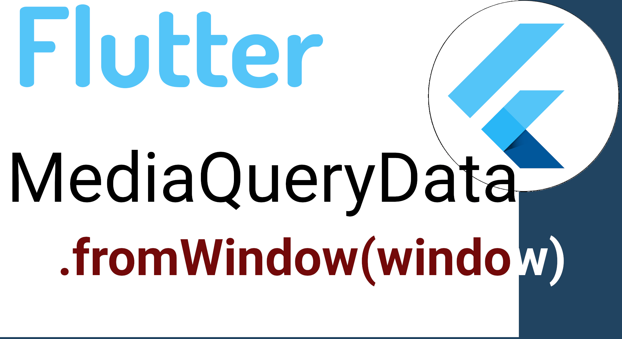
Veremos como corregir el error de:
'MediaQueryData.fromWindow' is deprecated and shouldn't be usedMediaQueryData.fromWindow es una función de Flutter que se utiliza para obtener información sobre la ventana en la cual se está ejecutando la aplicación, esta ventana puede ser un dispositivo móvil, un navegador o una aplicación de escritorio, realmente cualquier dispositivo soportado por Flutter. usualmente se emplea para obtener el tamaño de la ventana mediante:
MediaQueryData.fromWindow(window)Pero, en versiones recientes de Flutter se desaconseja su uso ya que está deprecated; es importante mencionar que lo que esta deprecated es el constructor más no la clase o API; ahora, si quieres obtener el equivalente de la función anterior, debes de usar:
MediaQueryData.fromView(View.of(context));Por ejemplo:
screenWidth = MediaQueryData.fromView(View.of(context)).size.width;
screenHeight = MediaQueryData.fromView(View.of(context)).size.height;
Preguntas frecuentes (FAQ)
- ¿MediaQuery o LayoutBuilder?
- MediaQuery → información del dispositivo completo.
LayoutBuilder → el tamaño real del widget.
Para breakpoints: LayoutBuilder gana.
- MediaQuery → información del dispositivo completo.
- ¿Cómo crear una vista dividida en Flutter?
- Con un Row + dos Expanded con flex diferente.
- ¿Cuántos breakpoints usar?
- Con 2 o 3 es suficiente: <600, 600-840, >840.
- ¿Cómo hacer un GridView responsivo?
- Calculando columnas en función de orientación + ancho.
Conclusión
Flutter ofrece todo lo necesario para crear interfaces realmente responsivas, desde widgets básicos como Row y Expanded hasta herramientas avanzadas como LayoutBuilder u OrientationBuilder. Cuando construí mi propia app, entendí que lo importante no es “hacer que se vea igual en todos lados”, sino construir layouts inteligentes que se adapten al espacio disponible.
Haz esto bien, y tu app se sentirá nativa en cualquier dispositivo; muchas veces quieres tipificar -por ejemplo- por tipos de dispositivos, si es un teléfono, una tableta, tv, web… para ello, puedes emplear los tipos enumerados en Dart y Flutter.