
The Card widget in Flutter is a visual component used to display information on a card; it is generally a white grid with rounded corners and a shadow. This card can be customized with different elements to highlight content such as images, text, buttons, and forms, among others. The Card widget is commonly used in mobile and web applications to present information in a clear and organized manner.
Cards in Flutter are another fundamental component in any application that works with Material Design, and this is no exception; Card Views have been a fundamental component in Android since its beginnings, adopting Material Design as a design rule, and of course, we can use it in Flutter as just another widget.
Cards in Flutter are one of those widgets that you start using "because you have to"... and end up using on all your screens. If you come from Android, as happened to me, you immediately recognize that style with rounded corners, subtle shadows, and a container ready to display clean and organized information. And although they seem simple, they have enormous potential when you know how to combine them well.
Cards are used to display information on a card, it's that simple; they are simply container components with rounded corners and shading; that simple, we can add texts, images or any other container widget like columns to add multiple elements or simply add only one widget; we can also use the Center widget, as well as any widgets in general, but these could be their most common configurations.
In this guide, I'll teach you what they are, how they work, how to customize them, and how to use them with real examples, including small tricks I learned through trial and error (like that moment when I discovered that a Card only accepts one child and I had to completely rethink my design ).
Previously we saw how to use button-type widgets such as the Floating Action Button, Flat Button, Material Button among others; now let's look at this widget.
What is a Card in Flutter and what is it used for
A Card is a Material Design container intended to display grouped information inside a card with:
- Slightly rounded corners
- Shadow or elevation
- Uniform background
- A clear touch area
The most useful thing is that it allows you to build clean, hierarchical, and "airy" interfaces, avoiding screens where everything seems clustered together.
Relationship with Material Design
The design of the Card in Flutter follows the official Material Design guidelines:
- Elevation to indicate importance
- Shadow to separate it from the background
- Rounded corners to soften the look
- New variants in Material 3 (elevated, filled, outlined)
Behavior, elevation, and rounded corners
The elevation property creates the shadow and gives the sensation of depth. In my tests, elevating a Card too much (above 10–12) makes it seem like it's floating more than necessary. I usually use between 4 and 8, unless I want to highlight a specific component.
The borders, meanwhile, are controlled with:
shape: RoundedRectangleBorder(
 borderRadius: BorderRadius.circular(20),
)
A Card is never too much in our apps; in all types of technologies, we have the famous box with rounded borders and shading to place our content.
Main properties of the Card widget
The Card has several properties that you should know if you want to understand it in order to adapt it to your needs.
- color, elevation, and shadowColor
- color: custom background of the Card.
- elevation: how much shadow it projects.
- shadowColor: color of the shadow (default, black).
These are other properties:
- shape and border customization
- Here you decide if you want:
- Square corners
- Circular borders
- Super rounded "pill" type borders
If you come from Android (like I originally did), you'll see that it's almost identical to CardView.
- margin, padding, and clipBehavior
- margin: space around the Card
- padding: space inside the Card
- clipBehavior: controls whether internal elements can overflow
- In my case, more than once an image stuck out of the Card and the solution was as simple as adding:
- clipBehavior: Clip.antiAlias,
child and how to organize multiple widgets inside a Card
Usually inside the Card, we will want to define several widgets. The solution is to use one of these widgets inside the Card:
- A Column
- A Row
- A ListTile
- A Container
That is, a widget that can contain several children.
A Card only accepts one child.
How to build a basic Card step by step
To create a Card in Flutter, nothing is easier, we simply have to add the following lines:
Card()But with this, as you might suppose, we have practically nothing, we need more elements, more widgets with which we can take advantage of Flutter's Card.
A more complete example:
Card(
 child: Center(
   child: Text("Hola Card"),
 ),
)
Add Column or Row for multiple elements
When you need to place an image, text, and a button (which is the most common), a Column is your best friend. I use it almost always:
Card(
 child: Column(
   children: [
     Image.asset('assets/codeigniter.png'),
     Text("Curso en CodeIgniter"),
     IconButton(
       icon: Icon(Icons.access_alarms),
       onPressed: () {},
     )
   ],
 ),
)
Common mistakes when working with Cards
- Creating an empty Card and thinking that "it doesn't work".
- It happened to me: without content, you won't see anything.
- Using too much elevation.
- It looks artificial.
- Not using padding inside the Card.
- The content is stuck together and looks unprofessional.
- Inserting widgets that exceed the borders without clipBehavior.
Defining images in our Card widget
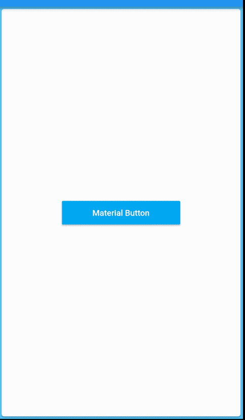
Although this gives us practically nothing, since an empty container is useless to us; we can add all the elements we want, or any other widget using the child property, but we can ONLY add ONE WIDGET, and nothing more:
Card(
  child: Center(
	child: MaterialButton(
  	minWidth: 200.0,
  	height: 40.0,
  	onPressed: () {},
  	color: Colors.lightBlue,
  	child: Text('Material Button',
      	style: TextStyle(color: Colors.white)),
	),
  ),
),
As you can see, here we have several important properties, to indicate the size using width and height, in addition to adding a button with text just like we saw in the previous post about Button widgets in Flutter: Raised, Flat, Material, Icon, and Floating Action
Although we can add any type of widget, there are some that are really great when working with Card in Flutter.
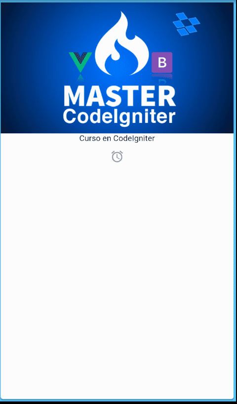
As you can see, something quite boring and poor, but of course we can use any other widget and there are widgets that will help us in this task, for example a column type with which we can add many other widgets:
body: Card(
  child: Center(
	child: Column(
  	children: <Widget>[
    	Image.asset('assets/codeigniter.png'),
    	Text("Curso en CodeIgniter"),
    	IconButton(
      	icon: Icon(Icons.access_alarms),
      	tooltip: "Mensaje",
    	),
  	],
	),
  ),
),
Remember that if you don't know how to use images in Flutter, you can check the previous post where we explain how to do it.
As you can see in this example, the ideal is to combine widgets; take the characteristics of one widget and in this way add them together; as we indicated before, Cards in Flutter can only contain one widget; therefore it is almost mandatory to use another widget like Column which allows us to add the elements we want.
https://kodestat.gitbook.io/flutter/37-flutter-using-cards
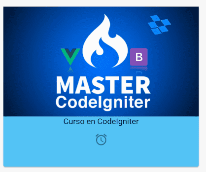
Padding and margins in Flutter Cards
Of course, like any container or layout that we use in our applications, it needs a margin; there are also properties for this reason, for that we can use the padding property as shown below:
Container(
 padding: new EdgeInsets.all(32.0),
 height: 350,
 child: Card(
   color: Color.fromRGBO(84, 197, 248, 1),
   child: Center(
     child: Column(
       children: <Widget>[
         Image.asset('assets/codeigniter.png'),
         Text("Curso en CodeIgniter"),
         IconButton(
           icon: Icon(Icons.access_alarms),
           tooltip: "Mensaje",
         ),
       ],
     ),
   ),
 ),
)
Here in this opportunity we varied some things; first we defined another type of layout, which is the container that as you can guess from its name, allows it to contain one element through its child attribute; among those elements we placed our Card; and not only that, in this same container we defined our internal spacing using the padding property; we also took advantage and defined the height so that it doesn't occupy the entire screen:
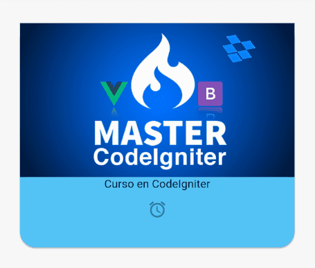
Rounded corners for Cards
If you come from native Android development, you will know that one of the main characteristic elements of CardView is precisely that they have rounded borders by default; here we can also create our rounded borders on our Cards using the shape property:
Container(
 padding: new EdgeInsets.all(32.0),
 height: 350,
 child: Card(
   shape: RoundedRectangleBorder(
   borderRadius: BorderRadius.circular(20.0),
 ),
   color: Color.fromRGBO(84, 197, 248, 1),
   child: Center(
     child: Column(
       children: <Widget>[
         Image.asset('assets/codeigniter.png'),
         Text("Curso en CodeIgniter"),
         IconButton(
           icon: Icon(Icons.access_alarms),
           tooltip: "Mensaje",
         ),
       ],
     ),
   ),
 ),
),
Finally, here is the complete code for our application as well as the link to the official documentation:
import 'package:flutter/material.dart';
void main() => runApp(MyApp());
class MyApp extends StatelessWidget {
 @override
 Widget build(BuildContext context) {
   // TODO: implement build
   return MaterialApp(
     home: Scaffold(
       //  backgroundColor: Color.fromRGBO(84, 197, 248, 1),
       appBar: AppBar(
         title: Text('Card'),
       ),
       body: Container(
         padding: new EdgeInsets.all(32.0),
         height: 350,
         child: Card(
           shape: RoundedRectangleBorder(
           borderRadius: BorderRadius.circular(20.0),
         ),
           color: Color.fromRGBO(84, 197, 248, 1),
           child: Center(
             child: Column(
               children: <Widget>[
                 Image.asset('assets/codeigniter.png'),
                 Text("Curso en CodeIgniter"),
                 IconButton(
                   icon: Icon(Icons.access_alarms),
                   tooltip: "Mensaje",
                 ),
               ],
             ),
           ),
         ),
       ),
     ),
   );
 }
}
Create our first card or Card in Flutter
The Cards in Flutter, which you can translate something like cards, are a fundamental element in Material Design and allow us to create applications with a very good style, Cards are one of the most striking elements in Material Design and their use is very simple, it allows you to adapt or place any type of Widgets within it and in this post we will give you several examples of how we can use it.
We want to make a classic card, an image, a block of text, and an image; the typical one we use for Material Design:
Nothing unusual at the moment; We are going to start little by little and we go from the most basic until we reach what we want to achieve; to achieve this goal we have to use a type of widget known as Card and the first thing we need is a card for that the widget class in Flutter called Card:
Card()But just like that it won't work for us, we need to define a property called child that, as it happens with many other types of container widgets, we must indicate the content; so for now I want a card with a text, it's that simple:
return Card(child: Text("Hola Mundo"));We obtain:

Adding Text and Images on the Widget Card
But how to see now we can't add our promotional image, because the child property only accepts one and only one Widget; in these cases we have to apply another type of container that accepts a list of widgets; the Colunm is perfect for us in this work, we also touched on said widget in previous entries; now our code is as follows; in such a way that now we can add our image:
Card(
       child: Column(
     children: <Widget>[
       Image.asset('assets/curso.png'),
       Text("Hola Mundo"),
     ],
   ));
We obtain:
And for this reason I told you before, that within the Card or card we can add whatever we want, since it is a simple container with a predefined design.
Ok we are doing much better, now adding a couple more widgets, a container where we place a list of widgets and we pass our image that is saved in the assets folder and a text, we achieve the previous presentation; but we can still get more juice out of our card; as you can see, our text is too close to the container and it doesn't look quite right; and now our container lost the rounded corners:
Card(
       child: Column(
     children: <Widget>[
       Image.asset('assets/curso.png'),
       Container(
         padding: EdgeInsets.all(10),
         child: Text("Hola Mundo"),
       )
     ],
   ));
Change Card borders in Flutter
Already with this we achieve that our text has more space in the text; for that we use a container widget and later we apply an internal margin or padding, now we are going to solve the problem of the sharp corners; basically we have to use clipBehavior: Clip.antiAlias, on our card, in such a way that we are setting our card to remove everything that protrudes from it:
   return Card(
       clipBehavior: Clip.antiAlias,
       child: Column(
         children: <Widget>[
           Image.asset('assets/curso.png'),
           Container(
             padding: EdgeInsets.all(10),
             child: Text("Hola Mundo"),
           )
         ],
       ));
To vary the roundness of the corners, you can do the following:
Card(
       clipBehavior: Clip.antiAlias,
       shape: RoundedRectangleBorder(borderRadius: BorderRadius.circular(20.0)),
       child: Column(
         children: <Widget>[
           Image.asset('assets/curso.png'),
           Container(
             padding: EdgeInsets.all(10),
             child: Text("Hola Mundo"),
           )
         ],
       ));
Card with buttons
For this we already treated a previous entry.
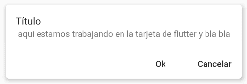
Although we are also going to show you here what you can do; for this example we use a few more widgets like the ListTile that allows us to create a list item, ideal for displaying information with the style presented for this image; besides that we use the elevation to vary the shadow; In short, the important thing, to place buttons, we use the Rows to place buttons one next to the other and all this in a column, to show all the content or other widgets in a column:
Card(
     elevation: 5,
     shape: RoundedRectangleBorder(borderRadius: BorderRadius.circular(5.0)),
     child: Column(
       children: <Widget>[
         ListTile(
          // leading: Icon(Icons.photo_album, color: Colors.blue),
           title: Text("Título"),
           subtitle: Text(
               " aqui estamos trabajando en la tarjeta de flutter y bla bla"),
         ),
         Row(
           mainAxisAlignment: MainAxisAlignment.end,
           children: <Widget>[
             FlatButton(
                 child: Text("Ok"),
                 onPressed: () {
                   Text("Ok");
                 }),
             FlatButton(
                 child: Text("Cancelar"),
                 onPressed: () {
                   Text("Cancelar");
                 })
           ],
         )
       ],
     ),
   );
Card with image, text, and button
A typical design for an article, profile, or product:
Card(
 elevation: 8,
 shadowColor: Colors.black54,
 child: Padding(
   padding: EdgeInsets.all(16),
   child: Column(
     children: [
       Image.asset('assets/card-sample.png'),
       SizedBox(height: 12),
       Text("Ejemplo de Card Completo"),
       ElevatedButton(
         onPressed: () {},
         child: Text("Acción"),
       )
     ],
   ),
 ),
)
ListTile type Card (Material.io style)
Practical for notifications, settings, or lists:
Card(
 child: ListTile(
   leading: Icon(Icons.info),
   title: Text("Título del Card"),
   subtitle: Text("Texto secundario"),
 ),
)
Touchable Cards: InkWell and actions on press
For catalog or navigation screens:
Card(
 child: InkWell(
   onTap: () {},
   child: Padding(
     padding: EdgeInsets.all(16),
     child: Text("Tócame"),
   ),
 ),
)
Current Card variants in Material 3
Ideal for content blocks with a solid background.
Card.filled(
 child: Padding(
   padding: EdgeInsets.all(16),
   child: Text("Filled Card"),
 ),
)
Outlined Card
Perfect for minimalist cards without shadow.
Card.outlined(
 child: Padding(
   padding: EdgeInsets.all(16),
   child: Text("Outlined Card"),
 ),
)
Good practices for designing clean and professional cards
Content organization
A good hierarchy for our content:
Image → Title → Description → Action.
Visual hierarchy
- Use soft shadows.
- Don't mix too many text styles.
- Generous spacing: minimum 16px of internal padding.
Shadow, contrast, and accessibility
- Check the contrast between text and background.
- Avoid very dense shadows.
- Use consistent rounded corners.
Frequently Asked Questions about Cards in Flutter
- ❓ How do I add multiple widgets inside a Card?
- With a Column, Row, ListTile, or Container.
- ❓ How do I make a Card tappable?
- Wrap it with InkWell or GestureDetector.
- ❓ What is the difference between Card, Card.filled, and Card.outlined?
- The shadow and visual style: elevated, filled, or outlined.
- ❓ How do I change the shape of the Card?
- With shape: RoundedRectangleBorder(...).
Conclusion
The Card in Flutter is an extremely versatile widget: you can use it for lists, forms, products, profiles, settings, and practically any content block. By simply mastering its properties (color, shape, elevation, clipBehavior) and combining it with columns, images, and buttons, you can build clean and professional interfaces.
And the best part: its behavior is consistent on Android, iOS, and the web.
All you need is to know how to organize the content and take advantage of its Material 3 variants to achieve more modern designs.
Next widget, the Slider widget for defining ranges in Flutter.