
One of the most common problems when using HTML5 validation with CSS is that mandatory fields appear as invalid from the first render, even before the user has interacted with the form.
In real-world forms, this is not only confusing but also creates a poor user experience.
In this article, I'll explain why this happens, how :invalid actually works in HTML5, and above all, how to show visual errors in inputs only after submitting, using modern CSS and, if necessary, a small JavaScript fallback.
What actually happens when an input is :invalid in HTML5?
Form validation in HTML5 works through the constraint validation system. The browser evaluates each field according to its attributes (required, type, pattern, etc.) and decides whether it is valid or not.
When :invalid is triggered and why it appears when the page loads
A key point that usually comes as a surprise is this:
An <input required> that is empty is already invalid from the moment the page loads.
That is why this CSS:
input:invalid { border: 2px solid red; }Causes fields to appear in red even before typing anything.
In my case, this was the first real problem I encountered: the validation worked, but the timing was terrible.
The browser doesn't know if the user "hasn't started yet" or if they "already made a mistake." To the browser, the field simply doesn't meet the rules.
Visual validation of form fields with CSS
With HTML5, we can use the required attribute to tell the browser that this field is mandatory; based on this, we can take advantage of the presence of said attribute in the element and make the validations friendlier for the end user with the help of CSS; let's see some examples.
<form>
  <input required />
  <input type="submit" />
</form>
If the field is empty and we try to submit the form, the browser will cancel the submission and show the following message:
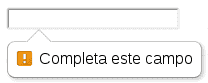
Try submitting the empty form and you will see the message.
Now, if we want to customize form fields that have the required attribute (showing a yellow border - warning - for example), we could use a CSS rule like this:
/* We will show required fields in yellow */
form input:required
{
  border:2px solid yellow;
  /* other properties */
}
Difference between :valid and :invalid
We can go one step further:
input:valid {
 border: 2px solid green;
}
input:focus:invalid {
 border: 2px solid red;
}
Here an important idea appears: conditioning :invalid to the focus.
Now the field would only be marked in red while the user was typing.
But there was still a problem…
The UX problem: visible errors before interacting
Although :focus:invalid avoids showing errors when the page loads, it doesn't cover the submit case.
Typical scenario:
- The user doesn't touch any field
- Clicks "Submit"
- The browser blocks the submission
- But visually… nothing happens
From the user's point of view, the form "doesn't work."
This is where I understood that the problem wasn't the validation, but when to show the visual feedback.
Why marking empty inputs as invalid is a bad experience
Errors should appear when:
- The user tries to submit
- Or when they have already interacted with a field
Never before.
Showing red borders on empty inputs conveys a sense of constant error, even when the user hasn't done anything wrong yet.
Visual validation of form fields with CSS
We can use pseudo-classes to do really interesting things; for example, we can assign a color to the input the user is editing at a given moment; red if the value they are entering is not valid and green if the value the user is entering is valid; for that, we need the following CSS rule:
/* If the value the user types is valid, it will get a green color */
form input[type="email"]:required:valid{
 border:2px solid green;
}

form input[type="email"]:focus:required:invalid{
 border:2px solid red;
}
And we will use the following form:
<form>
  <input required  type="email" />
  <input type="submit" />
</form>
We use the focus pseudo-class preceding the invalid pseudo-class because when the page is loaded, the field is empty by default; and therefore has the invalid state by default. When applying the previous style to the following form.
Visual validation of form fields with CSS
Finally; a slightly more complete example which will request personal information.
Using :focus:invalid
It's an improvement, but limited:
/* We will show required fields in yellow */
    form input:required {
       border:2px solid yellow;
    }
    form input:valid{
        border:2px solid green;
    }
    form input:focus:invalid{
        border:2px solid red;
    }
And we will use the following form:
<form>
    <input required type="text" name="nombre" placeholder="Primer nombre"/>
	<input type="text" name="nombre2" placeholder="Segundo nombre"/>
	<input required type="email" name="email" placeholder="Su correo electronico"/>
	<input required type="tel" name="tel" placeholder="Su teléfono"/>
	<input type="url" name="url" placeholder="Su pagina web" />
</form>
As we can see, there are fields that are mandatory (first name - email - phone) and others that are not mandatory (middle name - website); the former (mandatory fields) will have a yellow border and will have the same behavior as the form in example 2.
Using :user-invalid (the correct solution)
The :user-invalid pseudo-class was created exactly for this case.
input:user-invalid {
 border: 2px solid red;
}
user-invalid is only triggered when:
- The user has interacted with the field or
- Has attempted to submit the form
This avoids the classic problem of red inputs when loading the page.
When I discovered this pseudo-class, it was the turning point: the behavior matched exactly what I expected as a user.
:user-invalid is the best way to show errors only after submission using pure CSS.
It is a modern pseudo-class, compatible with current browsers, but not with very old versions.
Compatibility and alternatives when :user-invalid is not available
If you need full compatibility or more control, there is a very simple and effective fallback.
Fallback with JavaScript and the .submitted class
JavaScript:
document.querySelector("form").addEventListener("submit", function () {
 this.classList.add("submitted");
});
CSS:
form.submitted input:invalid {
 border: 2px solid red;
}
input:invalid {
 border: 1px solid #ccc;
}
This approach is very robust:
- Before submit: neutral styles
- After submit: visible errors
In real projects, when I need to ensure compatibility, I still use this pattern because it is clear, predictable, and easy to maintain.
Best practices for visual validation in forms
- When to use CSS only
- Simple forms
- Basic validation (required, email, pattern)
- Modern browsers
- Clear UX without custom messages
- When you need JavaScript
- Custom error messages
- Complex validations
- Legacy compatibility
- Conditional logic between fields
- A good approach is always:
- HTML first
- CSS for visual feedback
- JavaScript only as an improvement
Frequently asked questions about form validation with CSS
- Why is :invalid triggered when the page loads?
- Because an empty required field already fails validation according to HTML5.
- What is the difference between :invalid and :user-invalid?
- :invalid depends only on the rules.
- :user-invalid depends on user interaction.
- Can visual validation be done without JavaScript?
- Yes, completely, using CSS pseudo-classes. JavaScript is only necessary as a fallback or to customize messages.
- Is it recommended to hide errors until submit?
- Yes. In my experience, it greatly improves the perception of the form and reduces frustration.
Conclusion
The real challenge of form validation is not validating, but when to show the error.
Using :invalid without context usually results in a poor experience. Instead:
- :focus:invalid improves real-time feedback
- :user-invalid offers the ideal behavior after submit
- A small JavaScript fallback guarantees full compatibility
If you control the timing of visual feedback, your forms will not only work better, they will feel better.
Learn how to perform form validations using only HTML and without JavaScript.