
Content Index
- Modern Approach: HorizontalPager in Jetpack Compose
- State and Reactivity
- TabRow Structure (The tab bar)
- Tab Iteration
- Dynamic Content: HorizontalPager
- Rendering by category
- Visualization with LazyColumn and ListItem
- Tabs with Scroll: PrimaryScrollableTabRow and SecondaryScrollableTabRow
- Remove swipe
- Legacy Approach: ViewPager in XML (AndroidX)
- Remove swipe
We are going to learn how to create a Tabs system, similar to the one you see here. If you're wondering about the name, years ago in traditional Android development, TabLayout with ViewPager and XML was used; nowadays, in Compose, the logic is much more powerful and simple.
As you can guess, this is a component that, like dialogs, Drawers, or Bottom Sheets, includes animations. Since there are motion transitions, it is mandatory to use Coroutines to manage state changes asynchronously.
Today, Android development has evolved towards Jetpack Compose. Here we no longer need complex XMLs or heavy Adapters; everything is defined using Composable functions, although at the end of the article I will leave you the Legacy implementation with XML.
Previously we saw how to use the side menus or Navigation Drawer with Android Studio.
Modern Approach: HorizontalPager in Jetpack Compose
To achieve the same swipe effect with tabs in Compose, we use HorizontalPager and a TabRow:
// Example of ViewPager in Compose
@Composable
fun MyPagerScreen() {
    val tabs = listOf("Wines", "Beers", "Gourmet")
    val pagerState = rememberPagerState(pageCount = { tabs.size })
    val scope = rememberCoroutineScope()
    Column(modifier = Modifier.fillMaxSize()) {
        // The equivalent of TabLayout
        TabRow(selectedTabIndex = pagerState.currentPage) {
            tabs.forEachIndexed { index, title ->
                Tab(
                    selected = pagerState.currentPage == index,
                    onClick = {
                        scope.launch { pagerState.animateScrollToPage(index) }
                    },
                    text = { Text(title) },
                    icon = { Icon(Icons.Default.Star, contentDescription = null) }
                )
            }
        }
        // The equivalent of ViewPager
        HorizontalPager(
            state = pagerState,
            modifier = Modifier.fillMaxSize()
        ) { page ->
            // We simply call the view of the fragment/screen
            ContentScreen(tabs[page])
        }
    }
}
State and Reactivity
Let's remember a golden rule in Compose: all reactive variables (the state) must be declared inside a @Composable and not directly in the onCreate method.
For the tabs, we require a special state: PagerState.
- rememberPagerState: We initialize it by indicating the pageCount (the number of tabs our system will have). This allows the component to know how many elements to render.
- Coroutines: As I mentioned, since there are animations to move from one tab to another, we need a coroutine scope to trigger the page changes.
val tabs = listOf("Wines", "Beers", "Gourmet")
val pagerState = rememberPagerState(pageCount = { tabs.size })
val scope = rememberCoroutineScope()
TabRow Structure (The tab bar)
We will use a Column that contains the equivalent of the traditional TabLayout. In the most recent versions of Material Design 3, it is recommended to use PrimaryTabRow or SecondaryTabRow.
Tab Iteration
Instead of writing each tab by hand, the ideal is to iterate through a list of categories (Wine, Beer, Gourmet):
// The equivalent of TabLayout
TabRow (selectedTabIndex = pagerState.currentPage) {
    tabs.forEachIndexed { index, title ->
        Tab(
            selected = pagerState.currentPage == index,
            onClick = {
                scope.launch { pagerState.animateScrollToPage(index) }
            },
            text = { Text(title) },
            icon = { Icon(Icons.Default.Star, contentDescription = null) }
        )
    }
}
The TabRow is deprecated, so you can use PrimaryScrollableTabRow or SecondaryScrollableTabRow instead:
PrimaryScrollableTabRow (selectedTabIndex = pagerState.currentPage) {The TabRow component has fixed parameters like selected, onClick, text, and icon. If you want something more complex, you could pass a Data Class with custom icons for each category.
Dynamic Content: HorizontalPager
Once the top bar is defined, we need the component that displays the content: the HorizontalPager. The interesting thing is that both the TabRow and the HorizontalPager share the same state variable (pagerState). This means that if you slide the content with your finger (swipe effect), the tab above will move automatically, and vice versa:
// The equivalent of ViewPager
HorizontalPager(
    state = pagerState,
    modifier = Modifier.fillMaxSize()
) { page ->
    // We simply call the view of the fragment/screen
    ContentScreen(tabs[page])
}
Rendering by category
Inside the HorizontalPager, we evaluate the current page to load the corresponding content. We can use a when block (the equivalent of a switch) to decide which list of data to display:
- If it's Wine, we load the list of wines.
- If it's Beer, the list of beers.
- By default, the Gourmet list.
Visualization with LazyColumn and ListItem
To display the items, we use a LazyColumn (the evolution of the RecyclerView). Inside each cell, we use the ListItem component (which in Flutter would be the ListTile). This component is very versatile and allows us to define:
- HeadlineContent: The main title.
- SupportingContent: The description or subtitle.
- LeadingContent: The icon or image on the left.
@Composable
fun ContentScreen(category: String) {
    // Here you could load real data according to the category
    val items = remember(category) {
        when (category) {
            "Wines" -> listOf("Cabernet", "Merlot", "Malbec")
            "Beers" -> listOf("Ipa", "Stout", "Lager")
            else -> listOf("Cheeses", "Hams", "Oils")
        }
    }
    // View structure
    Box(
        modifier = Modifier
            .fillMaxSize()
            .padding(16.dp),
        contentAlignment = Alignment.TopStart
    ) {
        Column {
            Text(
                text = "Catalog of $category",
                style = MaterialTheme.typography.headlineMedium,
                color = MaterialTheme.colorScheme.primary
            )
            Spacer(modifier = Modifier.height(16.dp))
            LazyColumn(
                verticalArrangement = Arrangement.spacedBy(8.dp)
            ) {
                items(items) { product ->
                    Card(
                        modifier = Modifier.fillMaxWidth(),
                        elevation = CardDefaults.cardElevation(defaultElevation = 2.dp)
                    ) {
                        ListItem(
                            headlineContent = { Text(product) },
                            supportingContent = { Text("Brief description of the product...") },
                            leadingContent = {
                                Icon(Icons.Default.Info, contentDescription = null)
                            }
                        )
                    }
                }
            }
        }
    }
}
Tabs with Scroll: PrimaryScrollableTabRow and SecondaryScrollableTabRow
If your application has many tabs (for example, 10 or more) and they do not fit in the width of the screen, the design will look crowded. To solve this, Jetpack Compose offers us the ScrollableTabRow. This allows the user to slide the tab bar horizontally, maintaining a clean and functional navigation.
@Composable
fun MyPagerScreen() {
    val tabs = listOf("Wines", "Beers", "Gourmet", "Wines", "Beers", "Gourmet", "Wines", "Beers", "Gourmet")
    val pagerState = rememberPagerState(pageCount = { tabs.size })
    val scope = rememberCoroutineScope()
    Column(modifier = Modifier.fillMaxSize()) {
        // The equivalent of TabLayout
        PrimaryScrollableTabRow(selectedTabIndex = pagerState.currentPage) {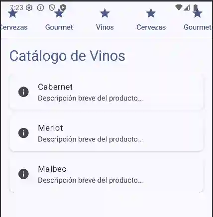
Remove swipe
If in the Legacy approach we had to create a CustomViewPager to remove the lateral movement, in Compose it is as simple as setting a parameter:
HorizontalPager(
    state = pagerState,
    userScrollEnabled = false // This disables the "terrible" swipe effect
) { page ->
    // ...
}
Legacy Approach: ViewPager in XML (AndroidX)
In this section we will see how to use the ViewPager2 (the evolution of the old support ViewPagers), which allow you to conveniently handle the characteristic lateral movement (right/left) or swipe natively.
ViewPagers are frequently used in conjunction with fragments. In current versions of Android Studio, it is recommended to use the androidx libraries instead of the old android.support ones.
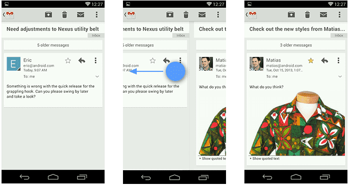
The viewPagers are a type of view that are becoming more and more common in applications like the Google Play and allow us to move between different screens through a side menu:
Use of the ViewPager in Android.

Use of the ViewPager in Android.
As you can see, you can place it wherever you want, up or down like any other view in Android.
A strong point of the ViewPager is that they allow you to natively use the swipe, which is the characteristic lateral movement to move between screens:
To practice with XML:
From our Android Studio we create a layout like the following, using the modern ViewPager2 component:
<LinearLayout xmlns:android="http://schemas.android.com/apk/res/android"
    xmlns:app="http://schemas.android.com/apk/res-auto"
    android:layout_width="match_parent"
    android:layout_height="match_parent"
    android:orientation="vertical">
    <com.google.android.material.tabs.TabLayout
        android:id="@+id/appbartabs"
        android:layout_width="match_parent"
        android:layout_height="wrap_content"
        app:tabMode="fixed"
        app:tabGravity="fill"/>
    <androidx.viewpager2.widget.ViewPager2
        android:id="@+id/viewpager"
        android:layout_width="match_parent"
        android:layout_height="match_parent" />
</LinearLayout>
Now we must define an adapter that inherits from FragmentStateAdapter to handle our fragments:
public class MyFragmentPagerAdapter extends FragmentStateAdapter {
    private final List<String> tags;
    public MyFragmentPagerAdapter(@NonNull FragmentActivity fragmentActivity, List<String> tags) {
        super(fragmentActivity);
        this.tags = tags;
    }
    @NonNull
    @Override
    public Fragment createFragment(int position) {
        switch(position) {
            case 0: return new Fragment1();
            case 1: return new Fragment2();
            default: return new Fragment1();
        }
    }
    @Override
    public int getItemCount() {
        return tags.size();
    }
}
To link the TabLayout with the ViewPager2, it is no longer mandatory to do it manually icon by icon, but we use TabLayoutMediator:
ViewPager2 viewPager = findViewById(R.id.viewpager);
TabLayout tabLayout = findViewById(R.id.appbartabs);
viewPager.setAdapter(new MyFragmentPagerAdapter(this, tags));
new TabLayoutMediator(tabLayout, viewPager, (tab, position) -> {
    tab.setText(tags.get(position));
    tab.setIcon(ICONS[position]);
}).attach();
With this we are ready and we have an application like the following:

Remove swipe
If for some reason the swipe bothers you, you can get rid of it by defining our own ViewPager that we will call, of course, CustomViewPager:
public class CustomViewPager extends ViewPager {
   private boolean enabled;
   public CustomViewPager(Context context, AttributeSet attrs) {
       super(context, attrs);
       this.enabled = true;
   }   @Override
   public boolean onTouchEvent(MotionEvent event) {
       if (this.enabled) {
           return super.onTouchEvent(event);
       }       return false;
   }   @Override
   public boolean onInterceptTouchEvent(MotionEvent event) {
       if (this.enabled) {
           return super.onInterceptTouchEvent(event);
       }       return false;
   }   public void setPagingEnabled(boolean enabled) {
       this.enabled = enabled;
   }
}
From our activity we do not have to do anything out of the ordinary, just place CustomViewPager instead of ViewPager:
ViewPager viewPager = (CustomViewPager) findViewById(R.id.viewpager);And invoke the method:
viewPager.setPagingEnabled(false);With this you can get rid of the "terrible" swipe effect.
The next step is to learn how to use menus in Android Studio.