
Content Index
- What is the Snackbar?
- Introduction to the Snackbar in Compose
- Snackbar State
- ️ The Scaffold: Our Structural Canvas
- States and Coroutines
- Why do we need Coroutines?
- Implementation
- The result of the action
- Summary of the structure
- Why move the Scaffold to a Composable?
- Example of FloatingActionButton and Snackbar
- The Snackbar (Legacy Approach)
- How to use the Snackbar in an Android application (Legacy Approach)?
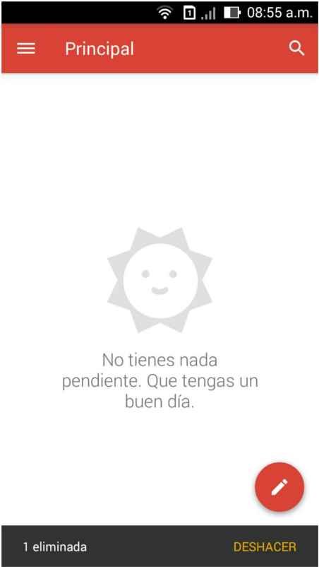
The Snackbar is that small bar that you have surely seen many times. For example, when you send an email and a message appears at the bottom asking if you want to undo the action or simply confirming that the operation was carried out correctly.
It is a kind of confirmation dialog, but much lighter:
- A simple bar that appears at the bottom of the screen for a few seconds to confirm an action or allow it to be reverted.
What is the Snackbar?
Continuing to talk a bit about personal experiences, I first saw this new element called Snackbar in the latest published versions of Gmail which were gradually establishing Material Design features:
Introduction to the Snackbar in Compose
Its implementation in modern Android (Compose) is a bit "tricky" and not as direct as it seems. The first thing we must understand is that it is divided into two main blocks: the Host (where it is housed and displayed) and the State (the logic that activates it).
Snackbar State
Something similar to what we saw with dialogs happens here.
- We have a state variable called SnackbarHostState, which is a "pre-cooked" structure provided to us by Compose.
- This variable is created using remember, which allows us to preserve its state between recompositions.
- This state is then passed as a parameter to the Scaffold, specifically in the snackbarHost property.
Finally, its use through a coroutine to show the snackbar:
scope.launch {
   val result = snackbarHostState.showSnackbar(
       message = "Elemento eliminado",
       actionLabel = "Deshacer"
   )
   when (result) {
       SnackbarResult.ActionPerformed -> { /* Lógica para restaurar el cambio */ }
       SnackbarResult.Dismissed -> { /* Lógica cuando desaparece solo */ }
   }
}
️ The Scaffold: Our Structural Canvas
To show the Snackbar, we need the Scaffold. I like this component a lot because it inherits Flutter's philosophy: it is a "pre-cooked canvas" that defines the fundamental structure of our application.
If we check the Scaffold definition, we will see that it already has reserved spaces for:
- TopBar: The top bar.
- BottomBar: The bottom navigation bar.
- FloatingActionButton: The floating button.
- SnackbarHost: The specific place where our Snackbar will appear.
@Composable
fun Scaffold(
    modifier: Modifier = Modifier,
    topBar: @Composable () -> Unit = {},
    bottomBar: @Composable () -> Unit = {},
    snackbarHost: @Composable () -> Unit = {},
    floatingActionButton: @Composable () -> Unit = {},
    floatingActionButtonPosition: FabPosition = FabPosition.End,
    containerColor: Color = MaterialTheme.colorScheme.background,
    contentColor: Color = contentColorFor(containerColor),
    contentWindowInsets: WindowInsets = ScaffoldDefaults.contentWindowInsets,
    content: @Composable (PaddingValues) -> Unit,
)
We used to define the Scaffold directly in onCreate, but now we move it to its own @Composable function to be able to handle reactivity and states, allowing the interface to react when we want to show or hide the bar.
States and Coroutines
For the Snackbar to work, we need to declare state variables inside our Composable. We use remember so that the state persists during recompositions:
- SnackbarHostState: It is the structure that references the host inside the Scaffold.
- CoroutineScope: This is where the asynchronous part comes in.
val snackbarHostState = remember { SnackbarHostState() }
val scope = rememberCoroutineScope()
These variables must be declared inside a composable function to be valid; that is, you CANNOT place them, for example, inside onCreate:
Functions which invoke @Composable functions must be marked with the @Composable annotation
Functions which invoke @Composable functions must be marked with the @Composable annotation
class MainActivity : ComponentActivity() {
override fun onCreate(savedInstanceState: Bundle?) {
val snackbarHostState = remember { SnackbarHostState() }
val scope = rememberCoroutineScope()
super.onCreate(savedInstanceState)Why do we need Coroutines?
Showing a Snackbar is a suspend (asynchronous) operation. It is equivalent to async/await functions in JavaScript or Python. Since the bar must be displayed for a set time (3 or 4 seconds) and then disappear, we cannot run it on the main thread because it would freeze the application, ruining the user experience.
The compiler will give you an error if you try to show a Snackbar outside of a coroutine scope (scope.launch). By launching it in a coroutine, the process runs in the background without blocking the interface.
scope.launch {
   val result = snackbarHostState.showSnackbar(
       message = "Elemento eliminado",
       actionLabel = "Deshacer"
   )
   when (result) {
       SnackbarResult.ActionPerformed -> { /* Lógica para restaurar el cambio */ }
       SnackbarResult.Dismissed -> { /* Lógica cuando desaparece solo */ }
   }
}
Implementation
Inside our button (for example, when deleting an item from a list), we launch the coroutine to show the Snackbar:
package com.example.myproyectandroid

import android.os.Bundle
import android.util.Log
import androidx.activity.ComponentActivity
import androidx.activity.compose.setContent
import androidx.activity.enableEdgeToEdge
import androidx.compose.foundation.layout.Box
import androidx.compose.foundation.layout.Column
import androidx.compose.foundation.layout.fillMaxSize
import androidx.compose.foundation.layout.padding
import androidx.compose.material3.Button

import androidx.compose.material3.Scaffold
import androidx.compose.material3.SnackbarDuration
import androidx.compose.material3.SnackbarHost
import androidx.compose.material3.SnackbarHostState
import androidx.compose.material3.SnackbarResult
import androidx.compose.material3.Text

import androidx.compose.runtime.Composable
import androidx.compose.runtime.remember
import androidx.compose.runtime.rememberCoroutineScope
import androidx.compose.ui.Alignment
import androidx.compose.ui.Modifier
import androidx.compose.ui.tooling.preview.Preview
import com.example.myproyectandroid.ui.theme.MyProyectAndroidTheme
import kotlinx.coroutines.launch

import com.example.myproyectandroid.CardActivity

class MainActivity : ComponentActivity() {
    override fun onCreate(savedInstanceState: Bundle?) {

        super.onCreate(savedInstanceState)
        enableEdgeToEdge()
        setContent {
            MyProyectAndroidTheme {
                PantallaPrincipal()
            }
        }
    }
}

@Composable
fun PantallaPrincipal() {
    // 1. Las variables de ESTADO se colocan AQUÍ (dentro del Composable)

    val snackbarHostState = remember { SnackbarHostState() }
    val scope = rememberCoroutineScope()

    // 2. El Scaffold organiza la estructura visual
    Scaffold(
        snackbarHost = {
            // El Host es el "escenario" donde aparecerá el Snackbar
            SnackbarHost(hostState = snackbarHostState)
        }
    ) { paddingValues ->
        // 3. El contenido principal
        // Usamos paddingValues para que el contenido no quede debajo de la TopBar o Snackbar

        Box(
            modifier = Modifier
                .padding(paddingValues)
                .fillMaxSize(),
            contentAlignment = Alignment.Center
        ) {
            Button(onClick = {
                // 4. Lanzamos la corrutina (el "hilo" asíncrono)
                scope.launch {
                    val result = snackbarHostState.showSnackbar(
                        message = "Elemento eliminado",
                        actionLabel = "Deshacer",
                        duration = SnackbarDuration.Short
                    )

                    // Opcional: Manejar la acción del botón "Deshacer"
                   when (result) {
                        SnackbarResult.ActionPerformed -> {
                            /* Aquí pondrías la lógica para restaurar el item */
                            print("ActionPerformed")
                            Log.d("MI_APP", "ActionPerformed")
                        }
                        SnackbarResult.Dismissed -> { /* Se cerró solo */
                            print("Dismissed")
                            Log.d("MI_APP", "Dismissed")
                        }
                    }
                }
            }) {
                Text("Mostrar Snackbar")
            }

        }
        CardBonito()
    }
}

@Preview(showBackground = true)
@Composable
fun Preview() {
    MyProyectAndroidTheme {
        PantallaPrincipal()
    }
}
The result of the action
Being an asynchronous function, we can capture the result. If the user clicks "Undo" (ActionPerformed), we execute the corresponding logic; if it is simply ignored and disappears (Dismissed), the process ends.
To verify this, you can use Log.d (the Logcat tag with Android Studio | Jetpack Compose) to see the messages in the console when the user interacts with the bar:
scope.launch {
   val result = snackbarHostState.showSnackbar(
       message = "Elemento eliminado",
       actionLabel = "Deshacer"
   )
   when (result) {
       SnackbarResult.ActionPerformed -> {
          Log.d("MI_APP", "ActionPerformed")
       }
       SnackbarResult.Dismissed -> {
       	 Log.d("MI_APP", "Dismissed")
       }
   }
}
Summary of the structure
In summary, we have:
- The SnackbarHost, which is the place where it will be rendered.
- The state (SnackbarHostState), which controls when it is shown.
- A coroutine, which is responsible for executing the asynchronous function to show the Snackbar.
Why move the Scaffold to a Composable?
To close, the main reason we moved the Scaffold is that it needs to be inside a Composable.
When it was defined directly in the activity lifecycle, we could not handle states or coroutines correctly.
By moving it to a Composable, we can now work with reactive state, coroutines, and all the modern logic of Jetpack Compose.
And with that, we already have our Snackbar implementation working correctly.
Example of FloatingActionButton and Snackbar
We can also use a FAB defined in the Scaffold:
fun PantallaPrincipal() {
  val scope = rememberCoroutineScope()
  val snackbarHostState = remember { SnackbarHostState() }
  Scaffold(
    snackbarHost = {
        SnackbarHost(hostState = snackbarHostState)
    },
    floatingActionButton = {
        ExtendedFloatingActionButton(
            text = { Text("Show snackbar") },
            icon = { Icon(Icons.Filled.Image, contentDescription = "") },
            onClick = {
                scope.launch {
                    snackbarHostState.showSnackbar("Snackbar")
                }
            }
        )
    }
  ) { contentPadding ->
    // Screen content
  }
}
The Snackbar (Legacy Approach)
This section focuses on the implementation of Material Design elements in Android using the Legacy approach (based on the Support Library and the traditional View system). Although Material Design concepts have evolved and are implemented natively in Jetpack Compose (the modern Composable approach), it is fundamental to understand how they were addressed in the view system. Below, we will explore how to integrate components like the Snackbar in this context.
In the Legacy approach, the Snackbar is an evolution of the well-known Toast for displaying messages. Both elements have been present since the early days of Android, with the Toast being a simple message and the Snackbar offering more interactivity.

Both the Toast and the Snackbar present great similarities in their appearance and behavior. However, in the Legacy approach, the Snackbar is distinguished by allowing actions (such as an "Undo" button) associated with an OnClickListener event, allowing the user to revert actions. This interactivity is key and Google employs it in applications like Gmail.
In the Composable approach of Jetpack Compose, the Toast still exists with a similar purpose (short and non-interactive messages), while the Snackbar is managed through SnackbarHost and SnackbarHostState, offering the same interactive functionality but in a declarative way and more integrated into the Compose UI hierarchy.
How to use the Snackbar in an Android application (Legacy Approach)?
To use the Snackbar in the Legacy approach (based on Views), the com.google.android.material.snackbar.Snackbar class is used. We build it through the static make() method which consists of the following parameters: make(View view, int resId, int duration).
The view parameter is the parent view of our application, which the Snackbar will use to find the appropriate place to show itself.
The duration duration has a series of constants established that control how long the Snackbar remains visible:
Duration Constants (com.google.android.material.snackbar.Snackbar) | |||||||||||
|---|---|---|---|---|---|---|---|---|---|---|---|
| int | LENGTH_INDEFINITE | Shows the Snackbar indefinitely until it is manually closed. | |||||||||
| int | LENGTH_LONG | Shows the Snackbar for a long period of time. | |||||||||
| int | LENGTH_SHORT | Shows the Snackbar for a short period of time. | |||||||||
The resId parameter is the resource of a text or a direct String for the message.
It also has a method setAction(CharSequence text, android.view.View.OnClickListener listener) in which the text and behavior (Listener) of the action button are specified.
Finally, to show the Snackbar, the show() method is invoked. Let's see the complete example code for the Legacy approach:
com.google.android.material.snackbar.Snackbar .make(layout,"Audio deleted", com.google.android.material.snackbar.Snackbar.LENGTH_LONG) .setAction("Undo", snackbarClickListener) .show();We define the button's Listener event:
    View.OnClickListener snackbarClickListener = new View.OnClickListener() {
        @Override
        public void onClick(View v) {
            // el usuario presiono el boton, revirtio el proceso
            Log.i("Snackbar","Botón presionado");
        }
    };
If our layout (in the Legacy approach) included a FloatingActionButton, its XML definition would be similar to the following. It is important to note the change from the android.support.design.widget package to com.google.android.material.floatingactionbutton in modern View implementations.
<RelativeLayout xmlns:app="http://schemas.android.com/apk/res-auto"
   xmlns:tools="http://schemas.android.com/tools"
   android:layout_width="match_parent"
   android:layout_height="match_parent"
   tools:context=".MainActivity">
   <com.google.android.material.floatingactionbutton.FloatingActionButton
       android:id="@+id/record_fab"
       style="@style/FloatingActionButtonStyle"
       android:src="@mipmap/ic_av_mic"
       app:backgroundTint="@color/color_primary"
       app:layout_anchor="@id/audio_rv"
       app:layout_anchorGravity="bottom|right|end" />
</RelativeLayout>
In the Composable approach (Jetpack Compose), a FloatingActionButton would be implemented using the androidx.compose.material.FloatingActionButton Composable, often inside a Scaffold, which simplifies its positioning and behavior in the UI.
It is essential to remember Google's Material Design guidelines, which specify how elements should interact and position themselves in the UI to offer a consistent and pleasant user experience. For example, avoiding the overlap of a Snackbar with a FloatingActionButton without a proper transition is one of these rules, applicable in both the Legacy and Composable approach to maintain visual coherence. Exploring these advanced transitions and behaviors will be the subject of future discussions.