Content Index
- Animations with Jetpack Compose (the "Composable" approach)
- 1. Opacity Animation (animateFloatAsState)
- 2. Dynamic Visibility (AnimatedVisibility)
- 3. Color Animation (animateColorAsState)
- 4. Complex Animations (updateTransition)
- Animations with XML (Legacy way)
- Types of animations in Android: Animations using ObjectAnimator
- Animating with opacity with PropertyValuesHolder
- Animating with rotations with PropertyValuesHolder
- Animating with translations with PropertyValuesHolder:
- Hide Bottom animation
- Hide Top animation
- Hide sideways (right-left) animation
- Multiple properties to perform a more complex animation in Android
- Animations in Java and methods/properties for time
- Listener to control the states of the animations
- Types of animations in Android: Animations using Drawable
- View or resource animations (tween animation)
- Conclusion
Animations are a fundamental aspect today to provide presence when loading data, images, transitioning between screens, etc. For "Android developers," animations are key to creating attractive interfaces.
Traditionally, this was achieved with techniques like ObjectAnimator and Drawable animations (which we will explore in this article as "Legacy" methods). However, with the arrival of Jetpack Compose, the creation of animations has evolved towards a more declarative and "composable" approach.
Previously, we discussed how to use Google Maps in Android Studio | Jetpack Compose.
Animations with Jetpack Compose (the "Composable" approach)
With the introduction of Jetpack Compose, the way animations are created in Android has evolved significantly. Compose offers a declarative and "composable" approach to animations, which simplifies their implementation and integrates them more smoothly with the rest of the UI built with Compose.
Unlike ObjectAnimator or XML-based Drawable animations, in Jetpack Compose, animations are defined directly in Kotlin code using specific composable functions for animation. This allows for greater flexibility and a more concise syntax.
For example, to create a simple opacity animation in Compose, we could use animateFloatAsState:
@Composable
fun AnimatedVisibilityExample() {
    var visible by remember { mutableStateOf(true) }
    val alpha: Float by animateFloatAsState(
        targetValue = if (visible) 1f else 0f,
        animationSpec = tween(durationMillis = 1000)
    )
    Column {
        Button(onClick = { visible = !visible }) {
            Text("Toggle Visibility")
        }
        Box(
            modifier = Modifier
                .size(100.dp)
                .graphicsLayer(alpha = alpha)
                .background(Color.Blue)
        )
    }
}
In this example, animateFloatAsState creates an animated state for the opacity (alpha). When the value of visible changes, the opacity animates smoothly between 0f and 1f over 1000 milliseconds. This is just a basic example; Jetpack Compose offers a rich API for more complex animations, including size, color, position transitions, and list animations.
This "composable" approach is the recommended way for new developments in Android, as it aligns with the modern philosophy of UI construction and improves code readability and maintainability.
In this section, we will give a quick overview of animations. We will evaluate four practical cases to understand how they work.
To organize the examples, we will use a Scaffold with a scrollable column (verticalScroll). Before you start, remember that you must install the Compose Animation package in your configuration file, although the IDE will suggest it automatically when you write the code.
class MainActivity : ComponentActivity() {
    override fun onCreate(savedInstanceState: Bundle?) {
        super.onCreate(savedInstanceState)
        enableEdgeToEdge()
        setContent {
            MyProyectAndroidTheme {
                Scaffold(modifier = Modifier.fillMaxSize()) { innerPadding ->
                    ScrollableColumnExample(innerPadding)
                }
            }
        }
    }
}
1. Opacity Animation (animateFloatAsState)
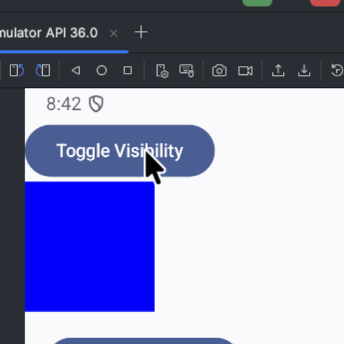
The first exercise is AnimatedVisibleExample. Here we have a button and a blue box (Box) where the Alpha (opacity) is the animatable property.
- Key concept: We use animateFloatAsState. It is similar to Flutter, where there are implicit and explicit animations. In Compose, if we want to animate a floating-point number (like opacity), we use this function to maintain the state during recomposition.
- Logic: We define a visible variable with mutableStateOf and remember. If visible is true, the alpha is 1 (visible); if not, it is 0 (invisible).
- Result: Since it is a change in alpha and not size, the space occupied by the component is maintained, but its visibility changes smoothly from 0 to 1.
@Composable
fun AnimatedVisibilityExample() {
    var visible by remember { mutableStateOf(true) }
    val alpha: Float by animateFloatAsState(
        targetValue = if (visible) 1f else 0f,
        animationSpec = tween(durationMillis = 1000)
    )
    Column {
        Button(onClick = { visible = !visible }) {
            Text("Toggle Visibility")
        }
        Box(
            modifier = Modifier
                .size(100.dp)
                .graphicsLayer(alpha = alpha)
                .background(Color.Blue)
        )
    }
}
@Composable
fun ScrollableColumnExample(innerPadding: PaddingValues) {
    // 1. We create the scroll state
    val scrollState = rememberScrollState()
    Column(
        modifier = Modifier
            .fillMaxSize()
            .padding(innerPadding)
            // 2. We apply the verticalScroll modifier
            .verticalScroll(scrollState)
    ) {
        AnimatedVisibilityExample()
        VisibilityExpansionExample()
        ColorTransitionExample()
        ComplexStateAnimation()
    }
}
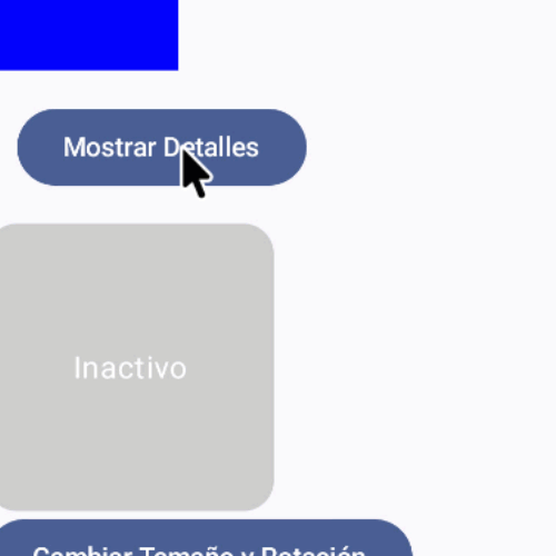
2. Dynamic Visibility (AnimatedVisibility)
The second exercise allows showing or hiding details by scrolling the content. Unlike the previous one, here the element does disappear from the layout, allowing other components to scroll.
- Use of Containers: We use the AnimatedVisibility component. This works similarly to Flutter's AnimatedContainer.
- Chaining effects: The interesting thing here is that you can chain functions. In this case, we use fadeIn + slideInVertically for the entrance, and fadeOut + slideOutVertically for the exit.
- Result: The text not only appears gradually but also slides up or down. If you remove the concatenation, the effect becomes abrupt.
@Composable
fun VisibilityExpansionExample() {
    var isExpanded by remember { mutableStateOf(false) }
    Column(modifier = Modifier.padding(16.dp)) {
        Button(onClick = { isExpanded = !isExpanded }) {
            Text(if (isExpanded) "Hide Details" else "Show Details")
        }
        // AnimatedVisibility handles the fade and slide for you
        AnimatedVisibility(
            visible = isExpanded,
            enter = slideInVertically() + fadeIn(),
            exit = slideOutVertically() + fadeOut()
        ) {
            Text(
                "Surprise! This text appears with a smooth slide and fade.",
                modifier = Modifier.padding(top = 8.dp)
            )
        }
    }
}
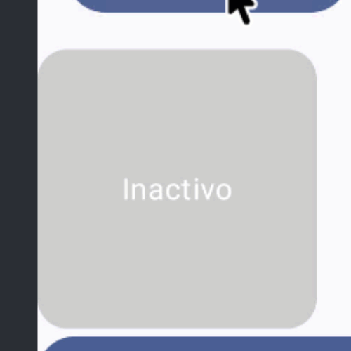
3. Color Animation (animateColorAsState)
In this exercise, we activate the animation directly by clicking on the box.
- Color change: We use animateColorAsState. As with floats, this function handles the smooth transition between two colors (for example, from gray to blue).
- Customization: We can use the tween property to indicate the duration of the animation in milliseconds (e.g., 500ms for half a second).
- Interactivity: We apply the clickable modifier to the box to toggle the state and change both the color and the text reactively.
@Composable
fun ColorTransitionExample() {
    var isSelected by remember { mutableStateOf(false) }
    // The color will change smoothly from Gray to Green in 500ms
    val backgroundColor by animateColorAsState(
        targetValue = if (isSelected) Color(0xFF4CAF50) else Color.LightGray,
        animationSpec = tween(durationMillis = 500)
    )
    Box(
        modifier = Modifier
            .size(150.dp)
            .background(backgroundColor, shape = RoundedCornerShape(16.dp))
            .clickable { isSelected = !isSelected },
        contentAlignment = Alignment.Center
    ) {
        Text(if (isSelected) "Active" else "Inactive", color = Color.White)
    }
}
4. Complex Animations (updateTransition)
For more advanced cases where we want to animate multiple properties at once (dimensions, rotation, shape), we use Transitions.
- updateTransition: We create a transition instance that tracks a state (in this case, an enum with Small and Large values).
- Multiple properties: We define the size and rotation within the same transition using animateDp and animateFloat.
- State logic: If the state is Small, we define small values; if it is Large, larger values.
- Result: When the button is pressed, the box changes size and rotates simultaneously. This is the "crown jewel" for creating complex visual effects in a synchronized and clean way.
@Composable
fun ComplexStateAnimation() {
    var currentState by remember { mutableStateOf(BoxState.Small) }
    val transition = updateTransition(targetState = currentState, label = "BoxTransition")
    // We define how several properties change at the same time
    val size by transition.animateDp(label = "Size") { state ->
        if (state == BoxState.Small) 100.dp else 200.dp
    }
    val rotation by transition.animateFloat(label = "Rotation") { state ->
        if (state == BoxState.Small) 0f else 45f
    }
    Column(horizontalAlignment = Alignment.CenterHorizontally) {
        Button(onClick = {
            currentState = if (currentState == BoxState.Small) BoxState.Large else BoxState.Small
        }) {
            Text("Change Size and Rotation")
        }
        Spacer(modifier = Modifier.height(20.dp))
        Box(
            modifier = Modifier
                .size(size)
                .graphicsLayer(rotationZ = rotation)
                .background(Color.Magenta, RoundedCornerShape(8.dp))
        )
    }
}
enum class BoxState { Small, Large }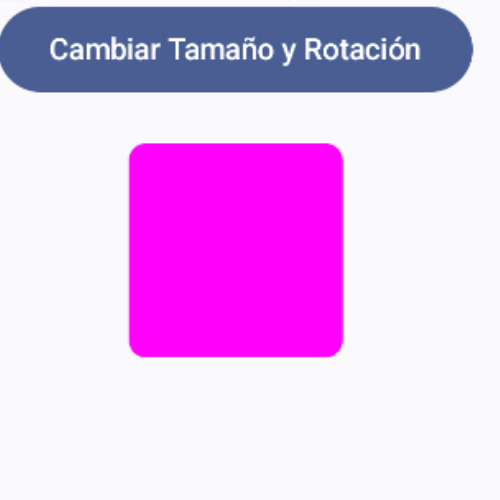
Animations with XML (Legacy way)
Next, we will explore the "Legacy" ways of creating animations in Android, such as the following, in which we vary the translation on the Y-axis and the opacity from zero to one:

Or this one in which we only vary the translation on the X-axis:
Or this one in which we only vary the opacity:

It's really easy and we can even run them in parallel on the same element or resource of a view.
One of the great principles of Material Design is the use of animations as a fundamental element to interact with the user through the UI depending on the user's interactivity with the application.
For animations in Android, which are ultimately simple transitions between one state and another, we will use ObjectAnimator which provides functionalities to animate views through a target that is defined with PropertyValuesHolder, which is the way we indicate the property and the values we want to animate...
For example, the property we want to animate could be the opacity and the value from zero as the initial value and one to make it completely visible; so we go from a state in which the view is invisible to completely visible (of course, it can be the other way around or stay in a middle point and be semi-visible, etc).
Types of animations in Android: Animations using ObjectAnimator
Now that the theoretical framework is clear, which in summary is to define the property and the associated values, we will now see what types of animations we can do, that is, what we can animate and what their values could be.
Animating with opacity with PropertyValuesHolder
We can define if we want the animations to affect the opacity; for example, if we wanted to indicate that the view goes from completely hidden to visible, we must use the ALPHA property with floating values between zero and one; the code in Kotlin would be:
PropertyValuesHolder.ofFloat(View.ALPHA, 0f, 1f))Or if we want the transition to be from visible to hidden:
PropertyValuesHolder.ofFloat(View.ALPHA, 1f, 0f))Animating with rotations with PropertyValuesHolder
To rotate the views we can do it on the X and/or Y axes using the ROTATION_X and ROTATION_Y properties respectively; to rotate 45 degrees on the X-axis the code in Kotlin would be:
PropertyValuesHolder.ofFloat(View.ROTATION_X, 0f, 45f))To rotate 45 degrees on the Y-axis:
PropertyValuesHolder.ofFloat(View.ROTATION_Y, 0f, 45f))In the previous examples, we indicate that we want to rotate from zero degrees to 45 degrees (it goes from 0 to 360 degrees).
In general, rotations in views would not be very useful unless you want to do something very specific.
Animating with scaling with PropertyValuesHolder
Another way to perform animations is with the scaling of the views on one of the X and Y axes whose values go from zero for completely hidden and one for the original size, to scale on the X-axis the code in Kotlin is as follows:
ObjectAnimator.ofPropertyValuesHolder(bottomLay,
       PropertyValuesHolder.ofFloat(View.SCALE_X,
               0f, 1f))
For the Y-axis, we use the SCALE_Y property.
Animating with translations with PropertyValuesHolder:
This view is very useful when we want to create an entrance or exit effect like the one in the image we showed at the beginning; for this, it is recommended that when it is an exit or entrance, to use the total size of the view, that is, if the animation we want to develop is the exit on the Y-axis, then it means that the view is being shown (there is no translation, or the translation on the Y-axis is zero) and the next state is the total hiding of the view; for this, we must translate the view to the background using the total size of the view to hide it downwards:
Hide Bottom animation
Based on what was explained above, we have:
PropertyValuesHolder.ofFloat(View.TRANSLATION_Y, 0f, hi.toFloat())Hide Top animation
We can play with the signs (positive and negative) to vary the translation from bottom to top or top to bottom:
PropertyValuesHolder.ofFloat(View.TRANSLATION_Y, 0f, -hi.toFloat())Hide sideways (right-left) animation
Continuing with translations in Android, to hide/show sideways, that is from right to left or left to right, we must use the View.TRANSLATION_X property instead of View.TRANSLATION_Y and instead of using the height of the view, we use the width:
val wi = view.width
val iconAnim = ObjectAnimator.ofPropertyValuesHolder(view,
       PropertyValuesHolder.ofFloat(View.TRANSLATION_X, 0f, wi.toFloat()),
Finally, a base example code that we can adapt to any of the examples we saw earlier would look like this with Kotlin:
val hi = view.height
view.visibility = View.VISIBLE
val iconAnim = ObjectAnimator.ofPropertyValuesHolder(view,
        PropertyValuesHolder.ofFloat(View.TRANSLATION_Y, hi.toFloat(), 0f))
iconAnim.duration = VIEW_ANIMATION
iconAnim.start()
Multiple properties to perform a more complex animation in Android
A very important point is that we can use one or more properties to perform the animations, that is, we can use one, two, or three properties for opacity, or one opacity and one translation, or however we want to configure it; for this, the following Kotlin code shows how to perform a translation on the Y-axis along with opacity:
val hi = view.height
view.visibility = View.VISIBLE
val iconAnim = ObjectAnimator.ofPropertyValuesHolder(view,
        PropertyValuesHolder.ofFloat(View.TRANSLATION_Y, hi.toFloat(), 0f),
        PropertyValuesHolder.ofFloat(View.ALPHA, 0f, 1f))
iconAnim.duration = VIEW_ANIMATION
iconAnim.start()
The code in Java would be as follows:
view.setVisibility(View.VISIBLE);
Animator iconAnim = ObjectAnimator.ofPropertyValuesHolder(view,
            PropertyValuesHolder.ofFloat(View.TRANSLATION_Y, 0f, -
view.getHeight()),
            PropertyValuesHolder.ofFloat(View.ALPHA, 1f, 0f));
iconAnim.setDuration(VIEW_ANIMATION);
iconAnim.start();
Animations in Java and methods/properties for time
With Java, there is not much more to say, we see that it is a little more code, some methods are used instead of properties, but otherwise, it is the same operation and the same logic; and this is because both programming languages are very similar; in the end, we have the setDuration() method in Java or the duration property in Kotlin, which allows defining the time in milliseconds that the animation will last:
val VIEW_ANIMATION: Long = 300And finally the start() method to start the animation; there is a startDelay method in Kotlin and in Java the setStartDelay() method to indicate the delay of the animation, this is very useful if we perform several animations at the same time.
Listener to control the states of the animations
With listeners, we can know when an animation starts, when it ends, if it is repeated or canceled, and perform some action accordingly; for example, in the case of translations to hide the view by displacing or moving it either on the X or Y axis, it is a good idea to hide the view View.GONE once the animation is finished; for that, we can use the onAnimationEnd method, likewise, for when the animation begins and the view is hidden, we can indicate in the onAnimationStart method that the view be visible again to start the animation View.VISIBLE; finally, the code in Kotlin would be:
iconAnim.addListener(object : Animator.AnimatorListener {
   override fun onAnimationStart(animation: Animator) {
   }
   override fun onAnimationEnd(animation: Animator) {
   }
   override fun onAnimationCancel(animation: Animator) {
   }
   override fun onAnimationRepeat(animation: Animator) {
   }
});
And in Java we have:
iconAnim.addListener(new Animator.AnimatorListener() {
    @Override
    public void onAnimationStart(Animator animation) {
          bottomLay.setVisibility(View.VISIBLE);
    }
    @Override
    public void onAnimationEnd(Animator animation) {
    }
    @Override
    public void onAnimationCancel(Animator animation) {
    }
    @Override
    public void onAnimationRepeat(Animator animation) {
    }
});
Where iconAnim is an instance of the ObjectAnimator class that we saw in the previous examples.
Types of animations in Android: Animations using Drawable
Another type of very common transition or animation effects are those used through Drawable resources, which in the end define an XML with attributes and tags and are later attached to an element of the view to define the behavior of the animation.
View or resource animations (tween animation)
This type of animation allows varying the position, size, rotation, and opacity/transparency of an element of a view; they are ideal to execute at the beginning of a screen or when the user performs some interaction on the content of the view, such as a click or something similar; they are also ideal for changing the status of elements of the views after finishing some process.
We can modify the following:
- Duration How long the animation will last.
- Delay
- Time interpolation Properties that will be changed over time.
Among some other properties, but these are the most important; finally, to obtain an animation like the one we see at the end of this section, we have to know the following information and in this way understand how it works.
We use the following resource that we have registered in:
res/anim/animacion.xml
The name animacion.xml is the name of the resource, you can put whatever you want but it must be contained within res/anim/.
<set>: Parent container of the animation
A container that contains the elements to be animated (<alpha>, <scale>, <translate>, and <rotate>) which contains the following attributes:
- android:interpolator: It is the interpolation that we are going to apply in the animation.
- android:shareInterpolator: If it is
true, the same interpolation will be applied to all the children of the element.
<alpha>: Property for the opacity of the animations
This is a property that allows defining the opacity value of the element in the animation, for that we have a couple of attributes:
android:fromAlpha: is a floating value that goes from 0.0 for completely invisible to 1.0 which is completely visible; the middle value is transparent to a greater or lesser degree.android:toAlpha: is a floating value that goes from 0.0 for completely visible to 1.0 which is completely invisible; the middle value is transparent to a greater or lesser degree.
<scale>: Property for the scale of the animations
This powerful property allows resizing of the elements in the animation; for that, it uses a pair of pivots so that you can specify from where the rescaling of the image will begin pivotX and pivotY; for example, if the value taken by these pivots is 0, 0 respectively (top left of the element to be animated) the animation will start from the top right to rescale; it has the following attributes:
android:fromXScale: 1.0 means that it will not be rescaled on the X-axis, another value indicates that the image is resized; it is the value at which rescaling will begin.android:toXScale: 1.0 means that it will not be rescaled on the X-axis, another value indicates that the image is resized; it is the value at which rescaling will end.android:fromYScale: 1.0 means that it will not be rescaled on the Y-axis, another value indicates that the image is resized; it is the value at which rescaling will begin.android:toYScale: 1.0 means that it will not be rescaled on the Y-axis, another value indicates that the image is resized; it is the value at which rescaling will end.android:pivotX: Allows you to specify the X coordinate from where rescaling will begin.android:pivotY: Allows you to specify the Y coordinate from where rescaling will begin.
<translate>: Property of the translations of the animations
This property is also very useful, and allows translations between the X and Y axes, its operation is very similar to that of scaling, but with the focus on translations; the values range from -100 to 100 percent (that is, they are percentages relative to the same element to be animated if the value is "%" and if the value is "%p" it indicates that the relative value is to the parent or container element of the element to be animated); its attributes are:
android:fromXDelta: Value relative to the element to be animated ("%") or to the parent element ("%p") indicates in percentages the initial translation on the X-axis.android:toXDelta: Value relative to the element to be animated ("%") or to the parent element ("%p") indicates in percentages the final translation on the X-axis.android:fromYDelta: Value relative to the element to be animated ("%") or to the parent element ("%p") indicates in percentages the initial translation on the Y-axis.android:toYDelta: Value relative to the element to be animated ("%") or to the parent element ("%p") indicates in percentages the final translation on the Y-axis.
<rotate> Property for the rotations of the animations
Allows rotations; its attributes are:
android:fromDegrees: Floating value that indicates the starting position in degrees.android:toDegrees: Floating value that indicates the final rotation in degrees.android:pivotX: As with scaling, this value indicates the X position from where the rotation will be executed; it can be relative to the element to be animated ("%") or to its parent ("%p").android:pivotY: As with scaling, this value indicates the Y position where the rotation will be executed; it can be relative to the element to be animated ("%") or to its parent ("%p").
Finally, with this clear, we present the following animation:

The resource we use is:
<set xmlns:android="http://schemas.android.com/apk/res/android">
    <scale
        android:duration="2000"
        android:fromXScale="3.0"
        android:fromYScale="2.0"
        android:toXScale="1.0"
        android:toYScale="1.0" />
    <rotate
        android:startOffset="2000"
        android:duration="2000"
        android:fromDegrees="0"
        android:toDegrees="360"
        android:pivotX="50%"
        android:pivotY="50%"/>
    <translate
        android:startOffset="4000"
        android:duration="2000"
        android:fromXDelta="0"
        android:fromYDelta="0"
        android:toXDelta="60"
        android:toYDelta="100" />
    <alpha
        android:startOffset="4000"
        android:duration="2000"
        android:fromAlpha="1"
        android:toAlpha="0" />
</set>
Then the code in Kotlin would be:
AnimationUtils.loadAnimation(this, R.anim.animacion).also {
	hyperspaceJumpAnimation ->
	findViewById<TextView>(R.id.text_view).startAnimation(hyperspaceJumpAnimation)
}
And in Java it would be:
ImageView spaceshipImage = (ImageView) findViewById(R.id.spaceshipImage);
Animation hyperspaceJumpAnimation = AnimationUtils.loadAnimation(this, R.anim.hyperspace_jump);
spaceshipImage.startAnimation(hyperspaceJumpAnimation);
Of course, you must replace the type of element and its name with the one you want to animate.
Conclusion
In this post, we saw how to make simple transitions or animations that are ideal for showing or hiding elements on a screen, but this goes much further. We still need to talk about how to make transitions between screens (when you click a button, the button's conversion is shown on the new screen), how to animate lists or RecyclerViews, among many other things that we will see in future installments.