
Content Index
- Modern Approach: TabRow and HorizontalPager in Jetpack Compose
- State and Reactivity: PagerState and Coroutines
- TabRow Structure: The Tab Bar
- Tab Iteration
- Dynamic Content: HorizontalPager
- Rendering by Category
- Display with LazyColumn and ListItem
- Scrollable Tabs: PrimaryScrollableTabRow and SecondaryScrollableTabRow
- How to Disable Swiping in HorizontalPager
- Legacy Approach: TabLayout and ViewPager2 in XML (AndroidX)
- How to Disable Swiping in ViewPager (Legacy)
We are going to learn how to create a Tab system in Android using Jetpack Compose, similar to the one shown in the video. If you are wondering about the name, years ago in traditional Android development, TabLayout was used alongside ViewPager and XML; nowadays, in Compose, the logic is much more powerful and, at the same time, simpler to implement.
As you might expect, this is a component that, like dialogs, Drawers, or Bottom Sheets, includes animations. Since there are movement transitions between tabs, the use of Coroutines is mandatory to manage state changes asynchronously without blocking the main thread.
Today, Android development has evolved toward Jetpack Compose. Here, we no longer need complex XMLs or heavy Adapters; everything is defined using @Composable functions, resulting in cleaner, reactive, and easier-to-maintain code. At the end of the article, I also leave you the Legacy implementation with XML in case you need it for reference.
Previously, we saw how to use side menus or Navigation Drawers in Android Studio. If you haven't seen it yet, I recommend taking a look before continuing.
Modern Approach: TabRow and HorizontalPager in Jetpack Compose
To achieve the swipe effect with tabs in Compose, the perfect combination is HorizontalPager together with TabRow. Unlike the Legacy approach, here we don't need an Adapter or a Mediator; both components share the same state object and synchronize automatically.
Below is the complete component layout:
// Example of Tabs with HorizontalPager in Compose
@Composable
fun MyPagerScreen() {
    val tabs = listOf("Wines", "Beers", "Gourmet")
    val pagerState = rememberPagerState(pageCount = { tabs.size })
    val scope = rememberCoroutineScope()
    Column(modifier = Modifier.fillMaxSize()) {
        // The equivalent of TabLayout
        TabRow(selectedTabIndex = pagerState.currentPage) {
            tabs.forEachIndexed { index, title ->
                Tab(
                    selected = pagerState.currentPage == index,
                    onClick = {
                        scope.launch { pagerState.animateScrollToPage(index) }
                    },
                    text = { Text(title) },
                    icon = { Icon(Icons.Default.Star, contentDescription = null) }
                )
            }
        }
        // The equivalent of ViewPager
        HorizontalPager(
            state = pagerState,
            modifier = Modifier.fillMaxSize()
        ) { page ->
            ContentScreen(tabs[page])
        }
    }
}
State and Reactivity: PagerState and Coroutines
Let's remember a golden rule in Compose: all reactive variables (the state) must be declared inside a @Composable function, never directly in the onCreate method of the Activity. Otherwise, you will lose UI reactivity.
For the tab system, we need two key state elements:
rememberPagerState: Initialized by specifying thepageCount(the number of tabs in the system). This object is the heart of the implementation: it knows which page the user is on at all times and exposes properties likecurrentPageandcurrentPageOffsetFractionfor more advanced animations.rememberCoroutineScope: Since there are animations when switching from one tab to another, we need a coroutine scope to safely trigger theanimateScrollToPageanimation from anonClickcallback, which is not a suspendable context on its own.
val tabs = listOf("Wines", "Beers", "Gourmet")
val pagerState = rememberPagerState(pageCount = { tabs.size })
val scope = rememberCoroutineScope()
TabRow Structure: The Tab Bar
We use a Column as the main container, which will host both the tab bar and the pager. The TabRow is the equivalent of the traditional XML TabLayout; it receives the active tab index through the selectedTabIndex parameter and is responsible for drawing the animated indicator below the selected tab.
In the most recent versions of Material Design 3, it is recommended to migrate from TabRow to PrimaryTabRow or SecondaryTabRow, which follow Google's new design specifications.
Tab Iteration
Instead of writing each tab by hand, the ideal approach is to iterate over a list of categories. With forEachIndexed, we obtain both the index and the title of each tab, allowing us to manage selection precisely:
// The equivalent of TabLayout
TabRow(selectedTabIndex = pagerState.currentPage) {
    tabs.forEachIndexed { index, title ->
        Tab(
            selected = pagerState.currentPage == index,
            onClick = {
                scope.launch { pagerState.animateScrollToPage(index) }
            },
            text = { Text(title) },
            icon = { Icon(Icons.Default.Star, contentDescription = null) }
        )
    }
}
Important: The TabRow component is marked as deprecated in the latest versions of Material3. Instead, you can use PrimaryScrollableTabRow or SecondaryScrollableTabRow:
PrimaryScrollableTabRow(selectedTabIndex = pagerState.currentPage) { ... }The Tab component accepts parameters such as selected, onClick, text, and icon. If you need something more elaborate—for instance, custom icons per category—you can define a data class that encapsulates the icon and title for each tab and pass it as an item in your list.
Dynamic Content: HorizontalPager
Once the top bar is defined, we need the component that displays the content of each screen: the HorizontalPager. The most elegant aspect of this architecture is that both the TabRow and the HorizontalPager share the same pagerState object. This creates automatic two-way synchronization: if the user swipes the content with their finger, the active tab updates automatically, and if they tap a tab, the pager animates navigation to the corresponding page:
// The equivalent of ViewPager
HorizontalPager(
    state = pagerState,
    modifier = Modifier.fillMaxSize()
) { page ->
    ContentScreen(tabs[page])
}
Rendering by Category
Inside the HorizontalPager, we evaluate the category of the current page to load the corresponding content. The most idiomatic way in Kotlin is using a when block (the equivalent of Java's switch) to decide which dataset to display based on the active tab:
- If the category is
"Wines", we load the list of wines. - If the category is
"Beers", the list of beers. - In the
elseblock, the default Gourmet catalog.
Display with LazyColumn and ListItem
To display the items for each tab, we use a LazyColumn (the evolution of RecyclerView in Compose). Inside each cell, we employ the ListItem component—which in Flutter would be ListTile. It is very versatile and allows us to define the three classic areas of a list item:
headlineContent: The main title of the item.supportingContent: The description or subtitle.leadingContent: The icon or image on the left of the item.
@Composable
fun ContentScreen(category: String) {
    val items = remember(category) {
        when (category) {
            "Wines" -> listOf("Cabernet", "Merlot", "Malbec")
            "Beers" -> listOf("Ipa", "Stout", "Lager")
            else -> listOf("Cheeses", "Hams", "Oils")
        }
    }
    Box(
        modifier = Modifier
            .fillMaxSize()
            .padding(16.dp),
        contentAlignment = Alignment.TopStart
    ) {
        Column {
            Text(
                text = "$category Catalog",
                style = MaterialTheme.typography.headlineMedium,
                color = MaterialTheme.colorScheme.primary
            )
            Spacer(modifier = Modifier.height(16.dp))
            LazyColumn(
                verticalArrangement = Arrangement.spacedBy(8.dp)
            ) {
                items(items) { product ->
                    Card(
                        modifier = Modifier.fillMaxWidth(),
                        elevation = CardDefaults.cardElevation(defaultElevation = 2.dp)
                    ) {
                        ListItem(
                            headlineContent = { Text(product) },
                            supportingContent = { Text("Brief product description...") },
                            leadingContent = {
                                Icon(Icons.Default.Info, contentDescription = null)
                            }
                        )
                    }
                }
            }
        }
    }
}
Scrollable Tabs: PrimaryScrollableTabRow and SecondaryScrollableTabRow
If your application has many tabs—for example, 10 or more—and they do not fit within the screen width, the layout will look squeezed and hard to use. To solve this, Jetpack Compose offers us PrimaryScrollableTabRow and SecondaryScrollableTabRow. These components allow the user to scroll the tab bar horizontally, keeping navigation clean and functional regardless of how many categories you have.
The difference between the two is purely visual and semantic, following the Material Design 3 specification: PrimaryScrollableTabRow is for top-level navigation, while SecondaryScrollableTabRow is used for sub-categories within a screen.
@Composable
fun MyPagerScreen() {
    val tabs = listOf("Wines", "Beers", "Gourmet","Wines", "Beers", "Gourmet","Wines", "Beers", "Gourmet")
    val pagerState = rememberPagerState(pageCount = { tabs.size })
    val scope = rememberCoroutineScope()
    Column(modifier = Modifier.fillMaxSize()) {
        // We use PrimaryScrollableTabRow to support many tabs
        PrimaryScrollableTabRow(selectedTabIndex = pagerState.currentPage) {
How to Disable Swiping in HorizontalPager
In some cases, swiping might not be the desired behavior—for example, if you want the user to navigate solely by tapping the tabs. While in the Legacy approach we had to create an entire CustomViewPager to remove lateral movement, in Compose it is as simple as adding a single parameter to the HorizontalPager:
HorizontalPager(
    state = pagerState,
    userScrollEnabled = false // Completely disables the swipe effect
) { page ->
    // ...
}
Legacy Approach: TabLayout and ViewPager2 in XML (AndroidX)
In this section, we will see how to implement the same tab system using the traditional approach with ViewPager2—the evolution of the former support ViewPager—alongside Material Components' TabLayout. Although it is no longer the recommended approach for new projects, it is very useful if you maintain an existing project or work in a mixed codebase.
ViewPager2 is frequently used together with Fragments. In current versions of Android Studio, it is recommended to use androidx libraries instead of the old android.support ones, which were deprecated several years ago.
ViewPager2 components allow users to scroll between different screens using a swipe gesture, very similar to how the Google Play app or Gmail works:
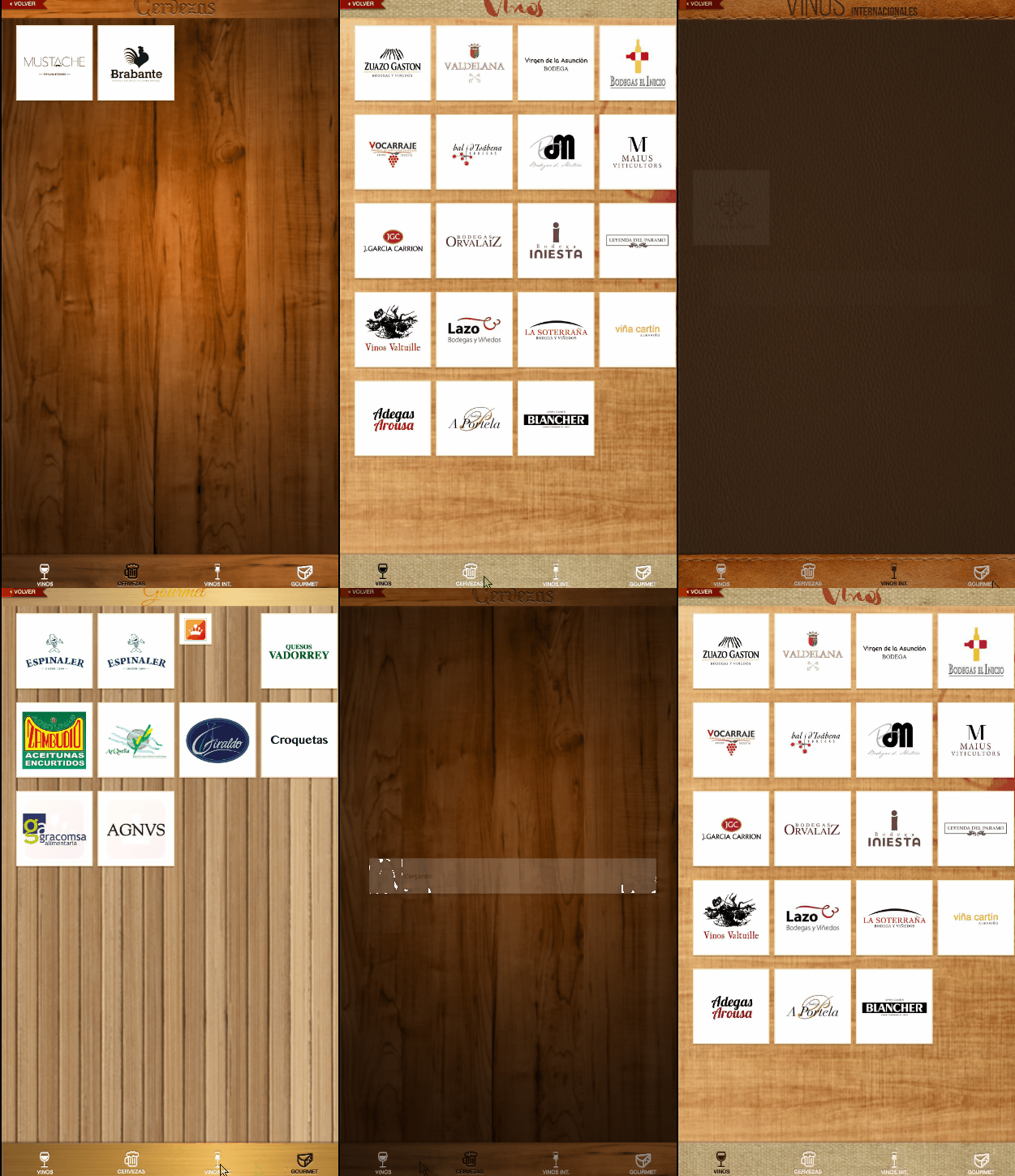
Example of ViewPager in an Android app.

The same pattern in the Google Play app.
As you can see, you can place the TabLayout at either the top or the bottom of the screen, just like any other Android view.
A strong point of ViewPager2 is that it natively supports swiping, allowing the user to navigate between screens with a side gesture without additional configuration:
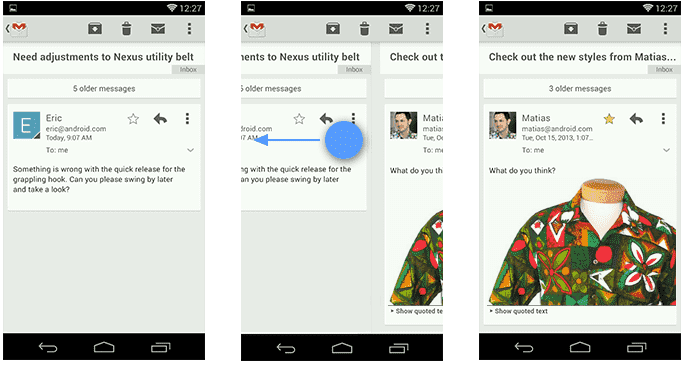
Putting XML into practice:
In Android Studio, we create a layout like the following, using the ViewPager2 component alongside the TabLayout from Material Components:
<LinearLayout xmlns:android="http://schemas.android.com/apk/res/android"
    xmlns:app="http://schemas.android.com/apk/res-auto"
    android:layout_width="match_parent"
    android:layout_height="match_parent"
    android:orientation="vertical">
    <com.google.android.material.tabs.TabLayout
        android:id="@+id/appbartabs"
        android:layout_width="match_parent"
        android:layout_height="wrap_content"
        app:tabMode="fixed"
        app:tabGravity="fill"/>
    <androidx.viewpager2.widget.ViewPager2
        android:id="@+id/viewpager"
        android:layout_width="match_parent"
        android:layout_height="match_parent" />
</LinearLayout>
Next, we define an adapter that inherits from FragmentStateAdapter to manage the Fragments for each tab. The createFragment method acts as a factory that returns the correct Fragment based on position:
public class MyFragmentPagerAdapter extends FragmentStateAdapter {
    private final List<String> tags;
    public MyFragmentPagerAdapter(@NonNull FragmentActivity fragmentActivity, List<String> tags) {
        super(fragmentActivity);
        this.tags = tags;
    }
    @NonNull
    @Override
    public Fragment createFragment(int position) {
        switch(position) {
            case 0: return new Fragment1();
            case 1: return new Fragment2();
            default: return new Fragment1();
        }
    }
    @Override
    public int getItemCount() {
        return tags.size();
    }
}
To bind the TabLayout to the ViewPager2, it is no longer necessary to configure each tab manually. The TabLayoutMediator class handles that connection automatically and declaratively:
ViewPager2 viewPager = findViewById(R.id.viewpager);
TabLayout tabLayout = findViewById(R.id.appbartabs);
viewPager.setAdapter(new MyFragmentPagerAdapter(this, tags));
new TabLayoutMediator(tabLayout, viewPager, (tab, position) -> {
    tab.setText(tags.get(position));
    tab.setIcon(ICONS[position]);
}).attach();
With this, we get a fully functional application with tabs and native swiping:

How to Disable Swiping in ViewPager (Legacy)
If you need to remove the swipe effect in the Legacy approach, the traditional solution is to extend ViewPager with a custom class called CustomViewPager. We override the onTouchEvent and onInterceptTouchEvent methods to intercept and cancel the gesture:
public class CustomViewPager extends ViewPager {
   private boolean enabled;
   public CustomViewPager(Context context, AttributeSet attrs) {
       super(context, attrs);
       this.enabled = true;
   }
   @Override
   public boolean onTouchEvent(MotionEvent event) {
       if (this.enabled) {
           return super.onTouchEvent(event);
       }
       return false;
   }
   @Override
   public boolean onInterceptTouchEvent(MotionEvent event) {
       if (this.enabled) {
           return super.onInterceptTouchEvent(event);
       }
       return false;
   }
   public void setPagingEnabled(boolean enabled) {
       this.enabled = enabled;
   }
}
From our Activity, we simply use CustomViewPager instead of ViewPager when performing findViewById:
ViewPager viewPager = (CustomViewPager) findViewById(R.id.viewpager);And we disable it by calling its method:
viewPager.setPagingEnabled(false);With this, swiping will be completely disabled. As you can see, the code difference between the Legacy approach and Compose is striking: in Compose, a single parameter (userScrollEnabled = false) is equivalent to an entire custom class in the XML world.
Next step, learn how to use option menus in Android Studio.