Content Index
- Android official resources and documentation
- Old way vs modern way (Compose)
- Types of buttons in Jetpack Compose
- Button preview
- Using Column for multiple buttons
- Spacing and visual adjustments
- Icons and additional dependencies
- 1. Register the library in libs.versions.toml
- 2. Add the dependency in build.gradle.kts
- GitHub and Git
- Uploading the project
- Cloning and Synchronizing the Project
- Implementation with XML - View System (Legacy)
- Button attributes
- Button events
- OnClickListener event handler
We are going to present one of the quintessential elements: buttons.
They are simple to use and, obviously, allow us to interact with the application, because that's why we are creating an Android application.
We start from this. Another important point is that, for now, I'm going to place the implementation of the buttons directly here. Later we will create specific pages for each of the exercises, to be able to navigate between them and so on. For now, we'll stick with this.
Then we are going to create an activity from scratch, but having clarified this a little, let's begin.
Android official resources and documentation
The first thing I want to comment on is the topic of resources. The Android ecosystem is very interesting, especially because of all the time it has existed.
You can perfectly search for something like "Android buttons" or "Android Studio buttons". I recommend you do it so that other types of buttons that do not interest us do not appear. You will find a lot of information.
Something interesting is that you will find both official and third-party articles. Many of these show the old or legacy way, implementing interfaces with XML (View System). This, honestly, was what I liked least about Android and one of the reasons why I had it a little abandoned:
https://developer.android.com/develop/ui/views/components/button?hl=es-419
Old way vs modern way (Compose)
In the old documentation you can see examples with LinearLayout, which is the layout par excellence for stacking elements. It would be something similar to a column if you come from other technologies.
There you can place normal buttons, buttons with icons, etc. I show it to you only as a reference, because it is no longer the correct way to work.
The modern way is to look for something like:
"Android Studio composable buttons".
That is, the element we want to use (buttons), followed by Composable, which is the modern way to create interfaces in Android.
All this is part of Jetpack Compose, which is the toolkit that allows us to create native graphical interfaces from Kotlin, directly in the activity, and not from XML files:
https://developer.android.com/develop/ui/compose/components/button?hl=es-419
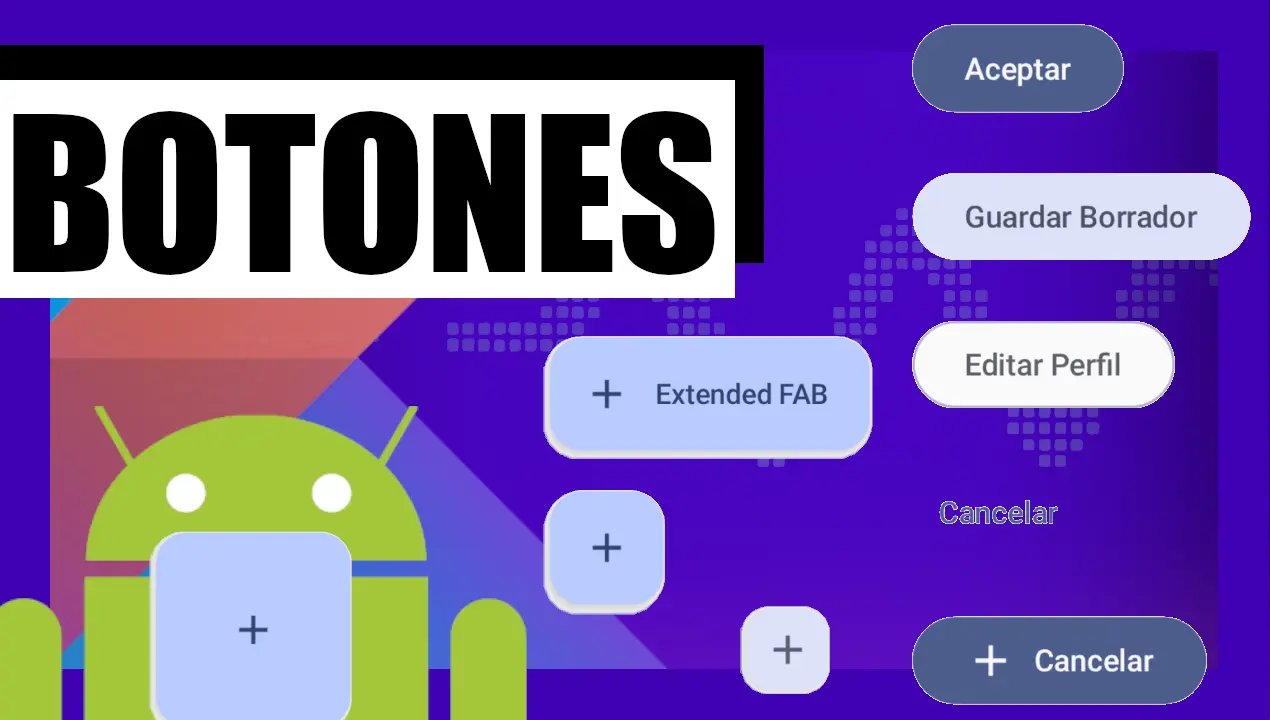
Types of buttons in Jetpack Compose
Here we get to the main topic of the post: how to implement buttons, already with a project created in Android Studio.
As you can imagine, we have several types of buttons. There are not too many, but there are some different "flavors". All of them work the same at a logical level, since all of them have the onClick event. What changes mainly is the visual style.
Some types are:
- Filled button - Solid background with contrasting text.
- Tonal button - The background color varies to match the surface.
- Elevated button - Button with shadow.
- Outlined button - Button with border.
- Button with icon - Button with icon.
We are not going to go into the part of colors and advanced styles yet, we will see that later. For now, remember that all of them have:
- An onClick event
- Text
- Style options
The first thing we do is place the @Composable annotation, which allows our function to represent a graphical interface element:
app\src\main\java\com\example\myproyectandroid\MainActivity.kt
@Composable
fun ExamplesButtons() {
    Button(onClick = { /* Action */ }) {
        Text("Accept")
    }
}

@Preview(showBackground = true)
@Composable
fun GreetingPreview() {
    MyProyectAndroidTheme {
       // Greeting("Andasasasroid")
        ExamplesButtons()
    }
}
Then we define a normal Kotlin function, as we already saw in the basic introduction to the language. The name can be anything. I'm going to use it to define several buttons, but for now it will be just one.
- This onClick receives a lambda function that returns nothing (Unit). For now we are not going to implement any action, we just leave it empty.
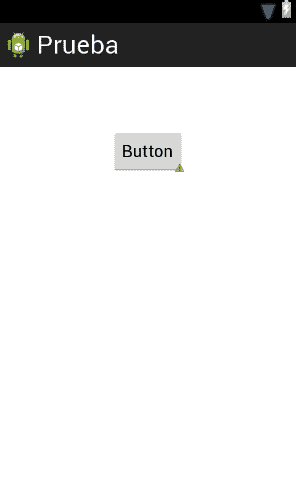
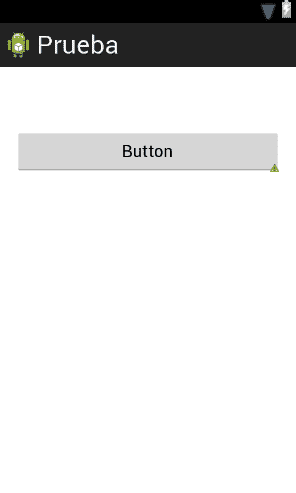
Button preview
Now, in the Preview, nothing will appear yet.
This is normal, because for the Preview to show something, we have to call our Composable from the preview function.
We comment out the previous, call our function without parameters, and that's it:
ExamplesButtons()There we have our button visible on the screen.
For now we are not going to work on the onClick, since the Preview only shows the interface.
Using Column for multiple buttons
Since I want to show several buttons, we are going to introduce another very important element: Column.
Column, as its name suggests, allows us to organize elements in a column.
If you come from Flutter, this will sound very familiar to you, since it works in a very similar way.
Inside the column we are going to add modifiers:
- fillMaxSize() to occupy all available space
- padding(16.dp) to add space at the edges
Then we place several buttons:
- A normal button
- A tonal button
- An outlined button
- A button with an icon
All of them work the same, only the visual aspect changes.
app\src\main\java\com\example\myproyectandroid\MainActivity.kt
@Composable
fun ExamplesButtons() {
    Column(
        modifier = Modifier.fillMaxWidth().padding(16.dp),
        verticalArrangement = Arrangement.spacedBy(20.dp)
    ) {
        // 1. Main Button (Contained)
        Button(onClick = { /* Action */ }) {
            Text("Accept")
        }
        // 2. Tonal Button (Less intense)
        FilledTonalButton(onClick = { /* Action */ }) {
            Text("Save Draft")
        }
        // 3. Outlined Button
        OutlinedButton(onClick = { /* Action */ }) {
            Text("Edit Profile")
        }
        // 4. Text Button
        TextButton(onClick = { /* Action */ }) {
            Text("Cancel")
        }
        // 5. Button with Icon
        Button(onClick = { /* Action */ }) {
            Icon(Icons.Default.Add, contentDescription = null)
            Spacer(Modifier.size(ButtonDefaults.IconSpacing))
            Text("Cancel")
        }
    }
}
Spacing and visual adjustments
The Spacer we use serves to add space between the icon and the text of the button.
It is the standard value recommended by Material Design, but you can adjust it if you want:
Modifier.size(ButtonDefaults.IconSpacing)For example:
- Increase the space between elements
- Reduce padding
- Adjust internal margins
This is very similar to the margin and padding of traditional web development, but using Android's own units.
Icons and additional dependencies
To use buttons with icons, we need to add an additional dependency:
- the Material Icons Extended library.
This is done from the Gradle file, in the dependencies section.
1. Register the library in libs.versions.toml
Open the gradle/libs.versions.toml file and add the reference in the [libraries] section:
gradle/libs.versions.toml
[libraries]
# Add this line (you can use the version you prefer or let the BOM handle it)
androidx-material-icons-extended = { group = "androidx.compose.material", name = "material-icons-extended" }
2. Add the dependency in build.gradle.kts
Now, in your app/build.gradle.kts file, implement the library you just declared:
app/build.gradle.kts
dependencies {
   // ... other dependencies
   implementation(libs.androidx.material.icons.extended)
}
Once added, we synchronize the project and we can now import the icons without problems.
After importing everything correctly, the errors disappear and the Preview is updated.
GitHub and Git
Uploading the project
Finally, we are going to synchronize the project with GitHub.
We go to Settings, → Version Control, →GitHub, add the account and authorize.
Then we create a Git repository, make our first commit (for example, "Buttons"), and finally commit & push.
We create the remote repository, copy the URL, paste it and that's it.
The project is now correctly uploaded.
Cloning and Synchronizing the Project
Simply copy the GitHub URL of your repository. In Android Studio, select "Clone Repository" and paste the address. Once you confirm that you trust the source, the IDE will automatically begin importing the project.
Implementation with XML - View System (Legacy)
Buttons, like any user interface, consist of an element that allows a user to interact with the system; they are generally event-based and highly customizable; in this article we will see how to define and use a button in Android.
In Android, buttons can consist of text and/or an image, classifying them into three types of buttons:
Text: To create a button with only text, simply use the following XML:
<Button
        android:id="@+id/button"
        android:layout_width="wrap_content"
        android:layout_height="wrap_content"
        android:text="Button" />
When interpreting the previous XML:

Image: To create a button with an image, simply use the following XML:
<ImageButton
        android:id="@+id/button"
        android:layout_width="wrap_content"
        android:layout_height="wrap_content"
        android:background="@drawable/ic_action_new" />
When interpreting the previous XML:

Text and Image: To create a button composed of text and images, simply use the following XML to define the button:
<Button
        android:id="@+id/button"
        android:layout_width="wrap_content"
        android:layout_height="wrap_content"
        android:drawableLeft="@drawable/ic_action_new"
        android:text="Button" />
When interpreting the previous XML:

If we want the image to be aligned to the right:
<Button
 	android:id="@+id/button"
        android:layout_width="wrap_content"
        android:layout_height="wrap_content"
        android:drawableRight="@drawable/ic_action_new"
        android:text="Button" />
When interpreting the previous XML:

Button attributes
Some of the main attributes of the buttons are:
- android:id Element identifier; in this case of the button; as with HTML, it is the way to uniquely identify and access an element.
- android:text Element text; in this case of the button.
- drawable(Left/Right) With this attribute we can place an image on the button aligned to the left (drawableLeft) or to the right (drawableRight).
- layout_width and layout_height We indicate the width and height respectively of the element; in this case our button; it can receive one of the following values:
- wrap_content Indicates that the dimensions of the element will be adjusted to the content it presents:
android:layout_width="match_content" y android:layout_height="wrap_content".- match_parent Indicates that the dimensions of the element will be adjusted to the container's measurements; it's like the width or height property with a value of 100%:
android:layout_width="wrap_content" y android:layout_height="wrap_content".- A numeric value generally in densities per pixel (dp) or dpi, but others such as pixels (px) can also be used, but the latter is not highly recommended; example 50dp.
Of course, other style attributes can also be applied to them, such as:
- android:visibility Allows defining whether the element will be visible or not; just like the visibility property in CSS.
- android:padding Allows defining the space or margin between the element and its content; like the padding property in CSS.
- android:background Allows indicating the background color or image of an element; just like the background property in CSS.
- android:layout_gravity Allows aligning an element; they behave similarly to the float property in CSS.
- android:layout_margin Allows defining the space or margin between the element and its container; like the margin property in CSS.
Among many others.
Button events
We can use the attribute:
android:onClick="function"For example, if we wanted to apply this functionality to the first type of button seen (although it is possible to use it in all three types of buttons):
<Button
    android:layout_width="wrap_content"
    android:layout_height="wrap_content"
    android:text="Alarm"/>
    android:onClick="function"
Where "function" is the method or function that will be invoked in the Activity when the button is clicked.
public void function(View view) {
    // we do something ...
}
OnClickListener event handler
We can also program the event handler outside the XML that forms the interface and place them inside the Activity:
Button buttonButton = (Button) findViewById(R.id.buttonButton); buttonButton.setOnClickListener(new View.OnClickListener() { public void onClick(View v) { // we do something ... } });The R class contains references to the components of our application; basically graphics, elements and global texts of the application; with R.id.buttonButton we can access the element with id buttonButton:
android:id="@+id/buttonButton"The next step is to learn how to use floating buttons in Android Studio.