
Content Index
- 1. Own Platform: Desarrollo Libre Academia
- 2. PacktPub: The Source of Content in English
- 3. Bundle Platforms (Packages)
- A. Humble Store
- B. Fanatical
- 4. Udemy: Massive Courses in Spanish
- Analysis of the platforms
- Is Udemy worth it? Reviews, Analysis, and Critique
- Udemy Stagnant? - New Courses? - Terrible Call-to-Action Design
- Prices on Udemy make no sense...
- 1. Setting the Base Price (Symbolic)
- FREE Coupons, Minimum and Regular Price on Udemy
- ️ Udemy Does NOT Provide Feedback: Constructive Criticism of Udemy: Review of Images and Logos
- Functioning of Educational and Promotional Announcements on Udemy
- Module for updating courses (sections and lectures)
- Why I no longer create free courses on Udemy
- Types of Tests, Select or Complete Code vs. Video Challenges
- A. The Manual Creation Process
- SEO on Udemy: Key Concepts
- The LeanPub Black Box: Problems with the payment and returns platform
- What is LeanPub?
- The Problem: A Veiled Accusation from LeanPub
- 1. The Inappropriate Expression
- 2. The Payment Platform Conflict (December 2021)
- 3. The Abuse of Refund Policies
- 4. The Lack of Detection: Three Years Without Reconciliation?
- ⚖️ Conclusion: What Would You Do?
- Gumroad, an unsupported and strange platform for entrepreneurs
- GumRoad: The Platform That Questions the Creator
- Which is better, a Course (Videos) or a Book to learn Software Development
- 1. The Book's Fundamental Advantage: Quick Search and Reference
- 2. Storage and Volatility Aspects
- 3. Ease of Update (My Particular Case)
- Book Update: Django 6
- New Format and Brand Design
- Conclusion
- Book Update: FastAPI - Second Edition
- Better Reading Experience
- 4. When is the Video Format Superior?
Below, I present the main platforms I use to acquire courses and books on software development. Besides educational content, some also offer assets for video game development.
1. Own Platform: Desarrollo Libre Academia
Although I don't buy from myself, if you are looking for content in Spanish, my platform is the first place to consider.
Content: All the courses and books I generate are centralized in one place.
URL: https://academy.desarrollolibre.net/
2. PacktPub: The Source of Content in English
This platform is one of my main sources for development resources.
- Content: It offers a great variety, with more than 8,000 titles, including books and courses (and generates new content monthly).
- Language: All content is in English, so knowledge of the language is necessary to take advantage of it.
- Prices and Offers: PacktPub is known for its offers, especially in December (approximately from December 15 to January 15), when they usually drop their prices to the minimum. Although years ago the prices were as low as $5 (or less if you bought bundles), they are still an excellent option for acquiring good content that is often not found elsewhere.
URL: https://www.packtpub.com/
3. Bundle Platforms (Packages)
These websites focus on selling thematic bundles of software, games, assets, and books, usually at a heavily reduced price.
A. Humble Store
Mechanism: It specializes in the sale of thematic bundles. They frequently work with PacktPub to create development book packages.
- Example: You can get 17 items for $18, which reduces the price of each book to approximately $1.
- Themes: The bundles are thematic (e.g., Cybersecurity, Forensics, Node, Python, AI, etc.). If you are interested in a particular theme, it's a great opportunity to get material for the entire year at a minimum price.
- Other Resources: They also sell bundles of music, software, courses, and assets for video games (such as Unreal Engine).
- Language: All content is in English.
URL: https://www.humblebundle.com/
B. Fanatical
Similarity to Humble: It is very similar to Humble Store, offering sections for games, books, and software.
- Books: Their book section is more flexible, sometimes allowing you to buy individual titles within a pack or buy the complete package at a very low price (e.g., $23 for a complete bundle). Additionally, they often generate extra discount coupons.
- Courses: They often have course packages, working with websites like Zenva (I usually buy their tutorials this way).
- Resources for Video Games: Although they have assets, they tend to be more focused on sprites or images, and not so much on resources for Unity or Unreal.
- Language: All content is in English.
URL: https://www.fanatical.com/
4. Udemy: Massive Courses in Spanish
This platform is a well-known resource, although as an instructor I have my conflicts with it.
- Content: It is a massive course website.
- Advantage: Along with my website, it's the only place where I usually buy content, as it makes it easy for me to acquire courses in Spanish.
- Prices: Courses generally have very accessible prices, around $10.
Analysis of the platforms
Having mentioned my recommendations, I'm going to give you some experiences I've had on some platforms FROM THE POINT OF VIEW OF A CONTENT CREATOR.
Is Udemy worth it? Reviews, Analysis, and Critique
This article offers a compilation of opinions and critiques about Udemy from the years I've been using the platform; the purpose of the article is to offer key points for those interested, and I hope you find it interesting from the perspective of a Software Developer who has uploaded his material to this platform for several years.
Udemy Stagnant? - New Courses? - Terrible Call-to-Action Design
I wanted to share some observations and opinions on the Udemy platform, especially following my recent experience buying a course during the sales season. Remember that this is purely my opinion.
1. Udemy Stagnant: Absence of New Courses
We are in the middle of Black Friday season, where prices reach their historical minimum ($9.99), which, in theory, should be a golden opportunity for new instructors.
- Low Content Production: Upon reviewing the catalog, most of the courses shown are old (they don't have the "new" tag).
- Contradiction: One would think that, as it's a season with so many sales (Black Friday, Christmas, New Year), creators would launch material to capitalize on demand. However, in the video game development section, for example, I only found one new Unity 6 course (when version 7 is about to be released) and the Unreal 5 courses have been around for a while.
I feel the platform is stagnant because creators aren't releasing enough fresh material.
2. The Promotion Algorithm: Obsession with Ratings
A clear example of Udemy's problem is seen in the mobile courses section:
- Promotion of Legacy Courses: The platform continues to promote a Flutter course from 2019 that even carries the "Legacy" (obsolete) tag. I acquired that course myself back then.
- Probable Cause: This happens because the Udemy algorithm seems to prioritize the quantity of ratings over any other factor (current relevance, version). The old course has over 177,000 ratings, while the new version by the same instructor has fewer than 4,000.
- Critique: This makes no sense for the consumer. Imagine if YouTube only recommended videos from 5 or 10 years ago because they had more accumulated views. The Udemy algorithm needs optimization to stop actively recommending content that the instructor themselves marks as obsolete.
A. Difficulty for New Instructors
This dependence on ratings creates a very high barrier to entry:
- Dominance by "Big" Instructors: The listing is dominated by well-known instructors with massive communities, such as Fernando Herrera (who has over 600,000 students).
- Unfair Competition: It's extremely difficult for a new creator to compete against courses that have accumulated hundreds of thousands of ratings over years. This is, in my opinion, a crucial reason why the platform is perceived as stagnant.
3. ️ Interface Issues (UX)
Finally, I want to comment on the user experience. I was looking for the course I bought (on video game development) and encountered frustrating interface issues:
- Poor Usability: I tried to select a course and the interface didn't respond correctly.
- Deficient Purchase Window: The window that pops up to buy the course is visually strange and unintuitive.
These usability failures only complicate the experience, even when a user (like me) already has the intention to buy.
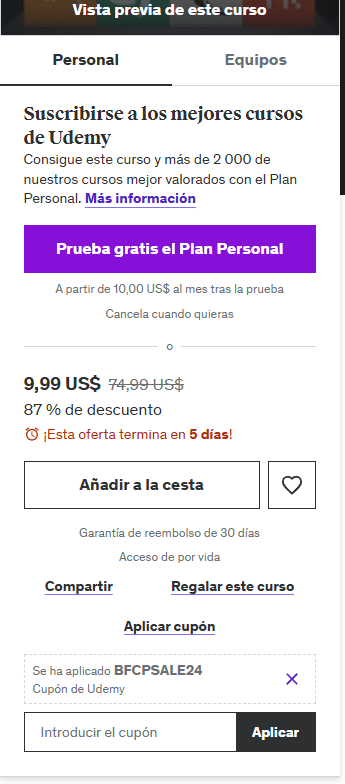
Following my recent purchase, I analyzed the course page's user interface (UX), and I believe it is extremely cluttered with unnecessary elements, which hinders the purchase action.
1. Confusing Calls to Action and Inverted Priority
The main problem is the Call To Action.
- Subscription (Rental): The most prominent and highlighted button is the subscription one (Udemy for Business or similar), which I call a course "rental."
- My Opinion: Most users look to buy an individual course (to "own" the content for life). Paying a monthly rental for courses that last 30-40 hours is not efficient for the consumer.
- Primary Option Hidden: The "Add to Cart" option (which should be the main call to action) is in the background. Yesterday I took time searching for the direct purchase option because this subscription button was constantly distracting me.
- Redundancy: Asking if you are "Individual" or "Team" (for Udemy for Business) adds unnecessary noise. Udemy should better hide the business option if it detects the user is an individual.
- Proposed Improvement: The Buy button should be the most highlighted and be at the top. The subscription option should be at a lower level or less visible.
2. Interface Clutter
The sidebar is saturated with non-essential information for the moment of purchase:
Introduction Video: The course's promotional video shouldn't be here, but in the description section, as it breaks the flow of a user who is already ready to buy.
Redundant/Hidable Elements: Features like "Gift this course," "Share," "Favorite," or even the management of the applied coupon could be more hidden (e.g., under a three-dot menu ...). If a coupon is already applied, why show an option to apply another one immediately?
3. Security Issues and Report Button Design
When analyzing the bottom part of the interface, the button design presents serious UX flaws:
Dangerous Proximity: The button to "Report abuse" is placed very close and shares a similar style to harmless buttons like "Show all reviews."
Lack of Differentiation: Options that involve risk or irreversible action (like deleting, or in this case, reporting) must be clearly differentiated. The report button should be a warning color (red) and be further away from the other elements to prevent accidental clicks. The current design is chaotic and doesn't follow basic CRUD design conventions.
Prices on Udemy make no sense...
I wanted to address another feature that, in my opinion, lacks logical sense on the Udemy platform: the system for managing base prices and offers.
1. Setting the Base Price (Symbolic)
In the price configuration screen, the instructor sets a base price for their courses.
- My Configuration: For example, for my old Django course, I set the suggested minimum price of $19.99.
- Extreme Range: The platform allows setting absurdly high prices (up to $199, or more in the past), prices that, in practice, no one would pay.
2. The Paradox of the Offer vs. the Base Price
The problem with this system is the relationship between the base price set by the instructor and the final prices that Udemy manages during offers.
Offer Above Base: The platform indicates that the "price range" (which includes discounted prices) for my $20 course can go up to $54.99.
- The Confusion: It makes no sense for an "offer" that the user sees to exceed the base price that I, as an instructor, have set. Technically, that's not an offer, but an overprice compared to the value I consider fair.
- Real Example: When searching for the course on a day without offers (a Sunday), the visible price is, indeed, $54.99, which aligns with the maximum range that Udemy imposes, ignoring the $19.99 base price.
3. Instructor's Conclusion
In summary, the prices that the instructor sets are, to a large extent, symbolic. Udemy manages offers and price ranges centrally.
Inconsistency: It is not right that a regular price or offer exceeds the fixed base price.
Lack of Control: In the end, the platform has total freedom to manipulate prices, which causes confusion and reduces the instructor's power of decision over how their product is presented.
That's all I wanted to comment on the inconsistencies of Udemy's pricing model.
FREE Coupons, Minimum and Regular Price on Udemy

I want to share my opinion on one of the areas most negatively affected over the years: the use and management of coupons.
1. ⚖️ Udemy's Revenue Model: An Anomaly
Udemy operates with an unusual revenue-sharing model, which creates a significant disadvantage for the content creator:
A. The Role Reversal (Commission vs. Sale)
Direct Sale by Udemy: If the purchase is made directly through the Udemy store, the platform keeps 70-80% of the sale (a percentage that has been increasing), and ironically pays a commission to the content creator.
- Sale with Referral Link: If the person buys through the instructor's referral link, the creator takes the majority (around 90-95%) of the final offer price.
- The Comparison: Platforms like Google Play or the Apple Store keep 30% and 70% goes to the developer. On Udemy, these roles are reversed, making it one of the few known platforms where the intermediary keeps the main value of the product.
2. ️ Coupon Management: Restrictions and Types
For the instructor to take a higher percentage of the sale, they must use the coupon tool.
- A. The Strict Limit
Udemy imposes a severe restriction: only three (3) coupons are allowed to be created per month, regardless of the type. - B. Critique of Free Coupons
Two of the four available coupon types are free. - Ethical Opinion: Personally, I advocate for a product to be either paid or free, not a hybrid. I find it unethical for a course that sells in the official store to be given away intermittently.
Purpose: The main reason for giving away courses massively (through websites that promote free Udemy resources) is to quickly obtain positive ratings, artificially inflating the star count to stand out in the listing. This biases the course perception.
3. The Decline of the Self-Promotion Coupon
The great sacrifice imposed by Udemy has been the restriction of coupons that drove the instructor's referral sales.
- A. Goodbye to Permanent Coupons
Before: In the past, only a single coupon was created that never expired. This allowed creators to place that code in YouTube videos, blogs, or social networks, ensuring the creator consistently got 90-95% of the sale. - Now: Coupons have a very short expiration (e.g., 5 to 31 days). This makes a coupon promoted in a YouTube video useless shortly after, forcing the creator to use the generic referral link.
- B. The Problem with the Variable Referral Link
If the creator uses the generic referral link (without a fixed coupon), the price that appears to the consumer is whatever price Udemy has active at that moment. If there is no active offer, the user will see a high price (e.g., $74.99), which drastically reduces sales conversion, unlike having a fixed coupon at the minimum price ($9.99).
4. ️ The UX Chaos: Coupon Creation
The experience of creating these coupons is extremely deficient and inefficient.
- A. Manual Creation: A Tedious Process
- Creating a coupon for a course requires several manual steps (select course, enter details, create coupon, give it a label, etc.). This is a headache and prone to errors, especially if the instructor has 10 or 15 active courses and can only do the process three times a month.
B. The Nightmare of Bulk Creation (The CSV File)
- To alleviate the inefficiency, Udemy offers the option to "Create multiple coupons," but with an illogical design:
- Erroneous Navigation: The option inexplicably appears within the details of an individual course.
Hostile Format: Instead of offering a simple list of courses to select from, it forces the user to download a CSV file (a type of Excel).
- Error Prone: The CSV requires following an exact pattern (course identifier, coupon type, label, date) for each course, which is very tedious and extremely prone to errors. Furthermore, a created coupon cannot be updated (only paused or deleted), which makes any error in the CSV costly.
- C. Proposed Solution: A Logical Design
- A much cleaner and simpler solution (and what any developer would expect) would be:
- Show a list of all courses.
- Allow multiple selection (using checkboxes).
- A single window to define the coupon type and label.
- The system would automatically create the coupon for all selected courses, saving the repetition of the manual process 15 or 20 times.
In my opinion, Udemy's coupon management is designed with excessive blocks that hinder direct promotion and sales by content creators.
️ Udemy Does NOT Provide Feedback: Constructive Criticism of Udemy: Review of Images and Logos
I want to share a piece of constructive criticism aimed at Udemy's quality team, specifically regarding the course cover image review process.
1. The “No Text on Images” Rule
When uploading a new course (or an update), Udemy issues a recurring warning. The message is clear:
"It looks like the course image includes text. Udemy research has found that course images containing text are less successful. For this reason, we only allow text on course images in very limited cases, primarily in the context of a logo."
The platform asks the instructor to remove the text and resubmit the course.
2. The Real Situation: Confusion with Programming Logos
The problem arises when this rule is applied to well-known technology logos:
- Course Example: I received this critique for both my Inertia course and my Livewire course. On the covers, I use the official logos of related technologies, such as PHP, npm, Node, or Livewire (the first two being technologies with long-standing logos).
- Udemy's Critique: The system or the human reviewer confuses these official logos with common, non-permitted text.
My Response: In the case of Inertia, I replied to the review message stating that the "letters" were, in fact, the logos of Node and PHP, and only then was the course approved.
3. The Central Problem: Lack of Feedback Loop
My main criticism of the Udemy team focuses on the lack of an efficient feedback loop:
- Ineffectiveness: The feedback loop is the process of taking the output (my course) as input to improve the process (the platform's approval).
- Unacceptable Inefficiency: Udemy's main niche is programming courses. It is unacceptable that, after so many years, they still have problems detecting and approving logos of technologies as old and well-known as PHP or npm.
- Inconsistent Logic: While I understand the rule of avoiding text to improve the image's success rate, the fact that this hasn't been settled for programming logos indicates inefficiency in the review processes or in the training of their quality team.
Like other inconsistencies I've noticed on the platform (such as promotional emails), this incident with the logos demonstrates that the Udemy team seems to operate with criteria that do not feed from previous experience, acting based on internal interests or obsolete processes.
Functioning of Educational and Promotional Announcements on Udemy
Continuing with Udemy's features, I want to talk about the two types of announcements available on the platform. I stopped using these tools years ago because, from my perspective (and I believe that of anyone with a knowledge of marketing), they are extremely useless and make no sense.
1. Educational Announcements: The Promotional Prohibition
This type of announcement is intended to send 100% educational content to subscribed students. Only four are allowed per month to avoid customer saturation.
A. The Paradox of Local Advertising
The big problem arose when I tried to share a post from my blog, such as the article about "The Hell of Webviews in Flutter."
- Udemy's Veto: The platform prohibited me from sending the post, arguing it was "promotional."
- The Reason: The content is informative, but my blog includes third-party advertising (like Adsense) and promotion of my own courses (local advertising).
- The Irony: Udemy doesn't care about third-party advertising (which appears on my site), but it is bothered that I use my own spaces to promote my courses.
- The Nonsense: They were literally demanding that I change the structure of my website (eliminating my own banners or local advertising) just to be "suitable" for an educational announcement on Udemy.
- Consequence: Due to this infraction (which I consider an excuse to limit my reach), my account was restricted for a while, preventing me from using this tool for sending an informative post.
- My Position: I'm not going to create a "sterile" website just to fulfill a whim. I believe people are intelligent enough to discern the educational content (the core of the post) from the promotional part.
B. Inconsistency with YouTube
It's curious that Udemy has no problem with instructors sharing YouTube videos that, in their descriptions or even in their comments, contain direct links to paid content. The platform's logic is inconsistently applied.
2. Promotional Announcements: The SPAM Format
The promotional announcement is designed to directly share offers and coupons, but I consider it even worse than the educational one.
A. Inability to Enrich the Content
- Key Restriction: Sharing URLs is not allowed in the promotional announcement.
- Result: This forces the instructor to send an email that is, in essence, pure SPAM: a message that only says "buy, buy, buy" without offering any free value or enriched content (videos, images, articles).
B. Ignored Marketing Principles
- Any digital marketing expert will tell you that, to win a customer, you must give between 20% and 40% of free content (or value) before trying to sell.
- Udemy's Approach: Udemy "crudely" separates the content: it's either 100% educational (with the absurd restrictions mentioned), or it's 100% promotional (with no URLs).
- The Lack of Interest: No one wants to receive constant emails from instructors (to whom they are subscribed) only saying "look, buy this coupon." The lack of valuable content makes this tool useless.
In Conclusion: Given the impossibility of complying with the rules of the educational announcement without dismantling my own web strategy, and the uselessness of the promotional announcement (which does not allow sharing enriched content), I decided to stop using both tools entirely.
Module for updating courses (sections and lectures)
Continuing with Udemy's features, I will address the course management module. Since we're not going to create a CRUD (Create, Read, Update, Delete) from scratch, we'll evaluate the existing one on the platform.
1. Course Listing and Performance Issues
Upon accessing the course section (the instructor profile), we find the main listing:
- Statistics: The listing shows basic statistics, sorting, and a curious but useful button to hide all sales visualizations, which I find helpful if the environment causes frustration.
- Slow Loading: The first notable failure is the slowness with which the page loads. Despite having only about 15 courses, the platform takes too long to load the full listing, which is unusual for a company of its size.
2. ⚙️ Course Details: Structural Limitations
To enter editing, we access the management of a specific course. The area of interest to us is the Course Curriculum (lecture management).
- Simple Design: The structure is extremely simple, allowing only two levels of nesting: Sections and Lectures. Although simplicity is valued, in this case, it falls short.
- Scarce Functionality: Management is limited to creating, deleting, and updating sections and lectures, with no advanced customization options.
- Improvement Recommendations (Classification): At least one higher classification level would be needed to group sections. This would allow the instructor to organize the course more effectively (e.g., group sections by "Beginner Level," "Advanced Modules," "Legacy Content," or using tags).
3. The Disaster of the Bulk Uploader and Google Drive
When adding content (lectures), the bulk video uploader and the integration with Google Drive present severe usability flaws:
- Inconsistent Connection: Authentication with Google Drive often fails. Even if you manage to authenticate in the external window, Udemy's internal uploader often doesn't recognize the session and requires you to repeat the process.
- File Loss: Once a video is selected from Google Drive, the file is lost if you try to perform another action, forcing you to navigate again and re-upload the file.
- Failure to Change Account: The system automatically links to the Google Drive account without offering a simple and immediate way to log out or change accounts, possibly requiring cookie deletion or waiting days for the session to expire.
4. ️ Critical Interface Failures: The Drag-and-Drop
The drag-and-drop system for organizing sections and lectures is terrible and prone to errors:
- Erratic Functioning: Moving sections is often inconsistent; sometimes it doesn't work, or it doesn't clearly show where the element will be dropped.
- The Aggressive Scroll Problem: When trying to move a lecture or section through the list, the interface performs an aggressive scroll, causing the user to lose the point of focus and end up placing the element in an incorrect position.
- Nesting Failures (Historical): In the past, when moving a section, its internal lectures often remained "queued" in the previous section, forcing the instructor to manually reorganize dozens of lectures, an extremely tedious process (this error was reported and, fortunately, was repaired).
5. Conclusions on Usability
In summary, Udemy's course management, beyond the lack of advanced features (like tags or section grouping), suffers from basic functional problems (slow loading, defective drag-and-drop) that are unacceptable for a platform of its magnitude. Although it is functional, the user experience is frustrating.
Why I no longer create free courses on Udemy
The main reason why I no longer create free courses on Udemy is due to a platform update that was implemented a few years ago, which imposes serious limitations that I consider detrimental to both the creator and the consumer.
1. ⏱️ The Two-Hour Chokehold
The main limitation is that free courses cannot exceed two (2) hours in duration.
- Brutal Insufficiency: For software development or any technical field, two hours is absolutely insufficient. It barely provides a mere introduction to the technology; it does not allow for developing scalable skills or completing a basic project.
- Comparison with YouTube: Platforms like YouTube offer an open content experience and are sustainable through advertising. Instead of adopting an advertising model (which would allow for longer free courses), Udemy opts for a content chokehold, drastically limiting the value the instructor can offer.
2. ❓ Q&A Restriction: A Lack of Respect
Udemy's comparative table reveals another policy I consider unacceptable: students of free courses do not have access to the Questions and Answers (Q&A) system nor can they send direct messages to the instructor.
2. ❓ Q&A Restriction: A Lack of Respect
Udemy's comparative table reveals another policy I consider unacceptable: students of free courses do not have access to the Questions and Answers (Q&A) system nor can they send direct messages to the instructor.
- The Creator's Work: The Q&A system is work that falls 100% on the instructor. The platform only provides the interface (the text box); the effort and responsibility of answering belong to the content creator.
- The Nonsense: It is rude for Udemy to restrict a tool whose workload is external to its resources. The decision to answer questions or not should be an option for the creator, not a platform limitation.
- Impact on Marketing: A free course is supposed to be an "introduction" to capture the interest of a potential customer. Blocking the direct communication channel frustrates the potential client and renders the instructor's marketing strategy ineffective.
3. Conclusion: Udemy as a Limited Viewer
Udemy's approach is restrictive: it seeks to limit the instructor and dictate how they should work (the reverse of how it should be on an open platform, where the instructor adapts the tool to their liking within basic guidelines).
- Platform vs. Creator: I should use the platform, but the platform should not use me or limit me in this absurd way.
- My Current Use: Due to these policies, my use of Udemy has been limited to two functions:
- Online Store: As a space to sell my paid courses.
- Content Viewer: As a mere player for my videos.
I no longer seek to interact or send messages through their interface. In fact, I always recommend that my students contact me through external channels (like Discord), as Udemy's policies are so absurd that the platform ends up being useless for communication and the creation of valuable free content.
Types of Tests, Select or Complete Code vs. Video Challenges
I wanted to address the implementation of coding exercises and quizzes on Udemy. The platform constantly insists that instructors use these resources (it has sent notifications about style changes, new features, and AI integration), but I consider this investment of resources by Udemy to be a mistake.
In my opinion, instead of investing in very specific functionalities that instructors barely use, the platform should focus on innovating in areas that truly impact the general experience (such as those I have criticized in previous videos).
1. Low Adoption of Interactive Resources
When reviewing the course offerings on the platform, it's observed that most instructors (especially in older courses or those with a high volume of content) do not implement these exercises:
Time Investment vs. Profitability: Creating this type of resource requires a significant time investment. Given that the return on investment on Udemy is not always high, many instructors choose not to dedicate time to schemes that are not essential for teaching, but rather to creating more valuable content.
A. The Manual Creation Process
The process for creating a simple coding exercise is slow and unfriendly:
- Access the creation menu.
- Select the resource type (Coding Exercises or Quiz).
- Set the title.
- Select the technology and version.
- Configure the explanation and the body of the exercise (which takes time).
I prefer to invest those 5 to 10 minutes in creating one more class to delve deeper into a relevant topic.
2. My Alternative Methodology: The Video Challenge Technique
To measure knowledge without relying on Udemy's black-box scheme, I use a methodology that I consider simpler, more direct, and more pedagogical: the "Dora the Explorer Technique" (or the Video Challenge).
A. Functioning
When I teach a concept (e.g., the different types of routes in Laravel: GET, POST, etc.), instead of moving to a Udemy exercise:
- I Pose the Challenge: I instruct the student that, based on the class explanation, they must perform a specific action (e.g., "If we just created a GET route, now you create a POST type route").
- Request to Pause: I explicitly ask the student to pause the video and solve the exercise on their own.
- Immediate Resolution: Once the time has passed (pause), I resume the recording and solve the exercise immediately afterward.
B. Advantages of my Scheme vs. Udemy (The Black Box)
- Aspect Video Challenge Scheme Udemy Exercise/Quiz Scheme
- Continuity The student does not leave the course or change screens. Must open a new interface, which breaks the learning flow.
- Feedback Multiple Feedback (Open Box). If the student gets stuck, they can advance the video slightly for a hint and then pause again. Binary Feedback (Black Box). Interaction is limited to "True" or "False" upon completion, with no intermediate help.
- Efficiency Maximizes instructor time: does not require setup in the Udemy interface. Requires a considerable time investment to configure each test.
My scheme allows the student to interact with the code, get incremental feedback (by briefly unpausing the video if they get stuck) and then return to the exercise, ensuring they understand the exact point where they made a mistake, something that the rigidity of Udemy's exercises does not allow.
SEO on Udemy: Key Concepts

I am not an SEO expert, but after years as an instructor on Udemy, I have deduced certain patterns about how the platform's search algorithm works. Unlike Google (which measures speed, backlinks, and original content), SEO on Udemy is much simpler and focuses on a handful of key factors.
1. The SEO Factor for Software Development
In the programming niche, SEO is considerably easier than in other fields (like massage or arts), because the keywords are obvious and universal.
A. The Keyword is the Key
- Focus on Technology: In 99.9% of cases, users search for the technology name directly: "Laravel Course", "Django Course", "Flutter Course".
- Avoid Extreme Specialization: It is not advisable to create titles based on niche searches (e.g., "How to create an API with Laravel Breeze"), because people do not search for courses that way on Udemy. The focus should be on the base technology term.
Optimization of Titles and Subtitles: The main keyword (e.g., Django) must always be present in the title and is highly recommended to include it in the subtitle, description, and individual lectures to reinforce positioning.
B. The Error of Super-Specialized Courses
My experience tells me that very specialized courses (e.g., "Consume REST API from CodeIgniter 3" or "Django + Flutter") do not sell well. The user first searches for the base course of the main technology. Specialized courses only serve as add-ons or a next level, and only a small subset of students acquires them.
2. Algorithm Positioning Factors
My comparative analysis between my Laravel and Django courses leads me to the conclusion that there is a clear hierarchy of factors in the Udemy algorithm:
- Priority Key Factor Explanation
- Keyword in Title If the term (e.g., Laravel) is not present, the course is invisible.
- Sales (Conversion Rate) This is the most important factor. Udemy positions the course that is generating the most income first, regardless of quality or age.
- Rating It is important, but not exclusive. Courses with slightly lower ratings (e.g., 4.3) can appear above courses with 4.7 if they have more sales.
- Content (Hours) The high number of hours acts as a powerful hook to attract the buyer and boost sales (which is the key factor). A course with 55 hours vs. one with 12 hours generates more trust and increases conversion.
The Ethical Problem: Black SEO
There is an unfair practice known as Black SEO (which I do not recommend or have done, but have suffered) and which Udemy's system does not penalize:
- Technique: It consists of buying the competitor's course (or using ghost accounts) and leaving an unfounded negative rating (e.g., a simple absurd text like "the sky is red").
- Effect: This decreases the ratings of the attacked course, which, in theory, helps the attacker's course to move up in position.
- Critique: Udemy does not verify the authenticity or content of these malicious reviews, which is a serious lack of ethics and professionalism that directly affects the content creator.
The LeanPub Black Box: Problems with the payment and returns platform

There is a saying: "Have someone handle your money, and that's when you'll truly know them."
In my experience as a content creator, I have already discussed issues with Udemy (policies and support) and Gumroad (catastrophic failures in their file upload system). Now, unfortunately, it is LeanPub's turn, which joins the list of problematic platforms.
This video is purely my opinion on an internal LeanPub situation that directly affects me as an author.
What is LeanPub?
LeanPub is a platform whose main purpose is to help authors write and publish their books using a markup system (similar to Markdown).
My Approach: I do not use their internal editor. As an advocate for always having my content under my control (after the experiences with Udemy), I prefer to write my books on platforms like Google Docs. This guarantees that, if the website explodes or I decide to migrate, I can download the content and continue working.
The Problem: A Veiled Accusation from LeanPub
Two days ago (September 7, 2024), I received an email from LeanPub that started the problem. The email reported that they had detected a delay and an issue with royalties (the payments they make to authors) related to certain purchases.
1. The Inappropriate Expression
The email begins with wording that I find quite out of place, implying that the fault lies with the author:
"We are writing to you because we discovered an issue on our platform with the royalties in question... You can decide to keep all the money and act as if nothing happened."
The use of the phrase "act as if nothing happened" sounded to me like a complaint or an indirect accusation. The responsibility for the payment process is 100% the platform's; I, as a creator, only have access to my content, not the payment backend.
2. The Payment Platform Conflict (December 2021)
The email details that the problem has existed since December 2021.
- The Nature of the Failure: According to LeanPub, the problem is due to two scenarios that suspiciously coincide on the same date (December 2021):
- Innocent Errors: Customers who entered invalid credit/debit cards, and yet the purchase was still authorized.
Fraudulent Exploits: Issues with fraudulent payments that occurred from that date onward.
My Critique: I find it incomprehensible how a system that communicates with payment gateways (like PayPal or Stripe) can authorize a purchase from an invalid card. A payment system should be simple: the order is sent, and the bank/gateway returns a status. If the status is not COMPLETED (or succeeded), the purchase is not recorded. The failure is entirely the platform's.
3. The Abuse of Refund Policies
The most murky part is that LeanPub takes advantage of their payment gateway problem to add a complaint about their refund policy.
- Excessive Policy: LeanPub allows 90 days (3 months) to return a book. I consider this amount of time absurd for a 300-400 page programming book; with a quick look, an experienced reader knows whether it is useful or not.
- Premium Policy: Such a premium refund period would only make sense if the resource were very expensive (like $1,000 courses, in the style of Romuald Fons), or if the platform guaranteed it. Selling a book for $20 or $30 with a 90-day refund policy makes no sense.
- Pleading for "Help": LeanPub is using the payment issues (their responsibility) and the abuse of their refund policies (a policy that many authors do not support because it is too long) to essentially ask authors for help.
4. The Lack of Detection: Three Years Without Reconciliation?
Finally, I don't understand how it took them 3 years to notice this problem.
- Lack of Reconciliation: Any company, no matter how small, must perform an account reconciliation (registered sales vs. deposited money) on a monthly or quarterly basis. It is unacceptable that a platform of this type, which handles money, did not notice this discrepancy in its numbers for so long.
- Total Responsibility: The fact that these were "failed" payments (there was payment intent) means the person got the book for free due to a failure in the LeanPub system. The responsibility is theirs, not the author's.
⚖️ Conclusion: What Would You Do?
I know I went on for a while, but I like to analyze these points step by step.
They give me until October 7 to decide what to do (apparently, they have enabled a system for me to decide whether to "return" the money to them or not, although the affected amount is less than 1% of my sales).
My position is that the responsibility is 100% LeanPub's. I don't see why a content creator should pay the price for an error in the payment gateway and an excessively long refund policy.
I hope this list is useful to you. Would you like me to look for more information about any of these platforms or explore other options for purchasing resources?
Gumroad, an unsupported and strange platform for entrepreneurs

Hello everyone! This post has a more personal and learning tone, even though talking about negative situations usually makes me uncomfortable. I'm doing it because I've set out to be more open and social on my networks this year, sharing more about my daily work.
For six years working with platforms (starting with Udemy), I've maintained a constant recording rhythm. Now I'm looking to expand, but the key has always been: use the platform, don't let the platform use you. I use Udemy only as a viewer, and that's it, I don't torment myself over what I can't control.
GumRoad: The Platform That Questions the Creator
Here comes my experience with GumRoad, a platform that, although less strong than others, is equally particular.
1. The Initial Suspicion and Lack of Support
Strange Store: I never felt comfortable with the platform. When I asked why my products weren't appearing in their main store, they told me I needed to have sales. When I achieved one sale, their response was, in my judgment, rude or at least dehumanized, stressing that it was only one sale.
The Focus on the Creator: They informed me that only 10% of their sales came from the GumRoad store; the remaining 90% came from the creator's direct effort (sharing links on YouTube, etc.). I find it strange, as it implies that the creator is more famous than the platform, and if the purpose of the website is to upload content, it should boost its internal market more.
The "Money Laundering" Accusation: The strongest thing happened when they explained the reason they asked for multiple individual sales: to prevent the platform from being used for money laundering. It is a very serious accusation directed at a creator who is simply selling online courses.
2. The Catastrophic Error: Total Course Deletion
Since that initial experience, I continued uploading my content to GumRoad to take advantage of it. The most serious problem occurred while I was updating the Laravel course (which has more than 50 hours of videos).
Defective Saving System: The platform works strangely, forcing you to click "Save" after uploading a file. If you don't do it, the content is deleted. In a normal system, the upload and the save should be automatic, assigning the publication ID to the resource.
The Disaster: Upon clicking save to upload the latest updates, the system not only failed but completely deleted the Laravel course (more than 50 hours of videos, folders, and descriptions). Literally, the product URL now returns a 404.
3. The Unacceptable Support Response
I wrote to them explaining that a course of more than 50 hours had disappeared due to an error in their panel when clicking "Save." Their response was short, informal, and evaded all responsibility:
"Hello. We do not have the feature to recover content on your platform. It cannot be recovered. Have a copy of your content." (Translation and summary of the tone).
Irresponsibility: Not only did they not apologize, but they reminded me that I should have a backup copy (which I have, with two copies, but that wasn't the point). The responsibility lay with the malfunction of their platform, not mine.
Lack of Investigation: To top it off, I made a mistake with the email account when writing to them, and they responded the same way. This shows that they use an automatic response and didn't even bother to open a ticket or investigate the system failure to verify the course deletion.
4. Final Words and Recommendation
This failure happened to me after months of updating the Laravel course without problems, which indicates that it is not a constant error, but it can happen. It is a serious problem: an error in their system deletes all content and support does nothing.
Final Recommendation: If you are going to use GumRoad, do so, but be very careful when uploading a large amount of content or updating it frequently. The final lesson is that there is no support in the face of a serious problem.
For my part, I will probably upload the complete course again (taking it as a joke so as not to stress myself out), but the lack of professionalism and responsibility of the platform remains clear.
Which is better, a Course (Videos) or a Book to learn Software Development
A frequently asked question is which format is superior for learning a new technology (specifically in software development): a video course or a book/PDF/ePub.
I'll give you the obvious answer upfront: There is no format that is better than the other. The ideal format is the one that best suits your personal needs and preferences. However, below I present my reasons why I prefer the book format.
1. The Book's Fundamental Advantage: Quick Search and Reference
My preference for the book format is due to its versatility and speed as reference material:
The Video Problem: When I return to a technology after a while, I often have gaps about how something was installed or how a specific piece of code worked. My courses are 40-50 hours long, and searching for the exact reference is a nightmare; I have to navigate class by class, minute by minute, since it's difficult to search for the exact content within the video.
The Book Solution: In a book, if I don't remember what a code snippet does, I simply search for the keyword and get the direct explanation. The book offers quick and accurate reference, which is vital when you only need to recall a detail to keep moving forward.
2. Storage and Volatility Aspects
The book format also wins in terms of portability and durability:
Lightness: A book (PDF/ePub) weighs a few KB or MB. I can have an entire library on a tablet or Kindle that weighs negligibly.
Video Heaviness: A 30 or 40-hour course can easily weigh 20 to 30 GB. Not only is it difficult to store, but platforms often limit or complicate its download.
Permanence: A PDF you download is yours (as long as you back it up in multiple locations). Online courses are subject to service volatility (the platform could close, or the course could be unpublished). A PDF is support material that no one can take away from you.
3. Ease of Update (My Particular Case)
For me, as a creator, books are easier to keep up to date:
- Video (Hybrid): Updating a 40-hour course (for example, from Laravel 6 to Laravel 11) is almost impossible to do comprehensively. It results in a hybrid where old and new code coexist.
- Book (Total): Renovating a book is much simpler. References and code examples are quickly updated to the new version (e.g., transition from Laravel 10 to Laravel 11, 12…) without leaving mixed content. This guarantees that the student always receives the cleanest and most recent version of the technology.
Book Update: Django 6
I want to tell you about the changes and updates I've made to my Django book for version 6. As a personal rule, I update this material every time a major version is released. I originally launched this book for Django 4, so this represents the third major update.
Unlike the previous edition, this new release features 40% more new content. I've gone from about 170 pages to over 240, improving not only the quantity but also the quality of the explanations and the visual format.
New Format and Brand Design
I am implementing a new visual style across all my books so they have harmony with one another.
- Typography and Reading: I have increased the font size and spacing to make it easier to read.
- Visual Identity: You will see that I now use a dot pattern and a "letter" format on the covers, which will be my new brand reference.
- Code with Style: I have moved away from limited tools (like Google Docs) to use a format that allows for code syntax highlighting, making technical snippets much more legible.
Community Versions and Courses
It is important to clarify how I handle free material:
- Community Book: It will remain on version 5. I will update the free version to version 6 when Django 7 is released. I do this to prioritize and provide value to those who support the project through payment.
- Access: You can get the community version (over 180 pages) simply by registering your email. It is excellent material to get started.
Integrated Courses: In my academy, I have merged the courses to avoid confusion. Now there is a single Django course where free and paid content are integrated into the same platform.
What's new in the content?
Although frameworks like Django are "conservative" (changes between versions don't break all the code), I have taken the opportunity to strengthen three pillars:
1. Expansion of Existing Chapters
I have rewritten explanations to make them clearer, based on what I've learned teaching over these years.
Project Structure: Now with much more detail on the role of each file.
Git and GitHub: Included from the start as an essential development tool.
Views and Forms: In-depth explanation of the difference between regular forms and ModelForms.
2. Entirely New Chapters
I have added sections that didn't exist before or were very scattered:
- Essential Packages: Use of Django Debug Toolbar, Django Extensions, and tools to improve the interface like Django JET (Tailwind-based).
- Deployment: Guides for uploading projects to PythonAnywhere, Railway, and an introduction to Docker.
- General Aspects: Unification of topics such as Signals, sessions, Flash-type messages, and translations.
3. Artificial Intelligence Integration
I have incorporated a section on how to use tools like Gemini, Claude, or ChatGPT to assist in development:
- Creation of suggested prompts to fix errors.
- Generation of initial mockups (HTML/CSS) so as not to work with ugly interfaces while learning backend logic.
Conclusion
This update is free for those who have already purchased the book or the course on my platform. My commitment is to keep this material relevant for years, ensuring you always have access to industry best practices.
If you want to see a detailed comparison of the indexes or review the new sections on Django Channels and REST API, you can check the link in the description or visit my blog.
Book Update: FastAPI - Second Edition
I have tripled the content to cover the most requested and advanced topics in the ecosystem:
- WebSockets: Implementation of real-time full-duplex communication.
- Clean Architecture and Repository Pattern: Learn how to structure professional and scalable applications.
- Professional Deployment: Docker guide and cloud deployment (Railway).
- Dependency Injection: A deep dive into FastAPI's "crown jewel."
- Advanced Databases: Migrations with Alembic and NoSQL databases (MongoDB).
- AI and Refactoring: How to use AI tools to critically improve your code.
- Streaming and Background Tasks: Handling heavy data and Celery.
Better Reading Experience
There is not just more text; I have also redesigned the format:
- Clearer typography and optimized spacing.
- Index of images and tables.
- Detailed captions for every code block.
4. When is the Video Format Superior?
Despite my preference, video is the dominant format in today's society and has an undeniable advantage in specific contexts:
Complex Graphical Interfaces: If you are learning a technology that involves many windows, icons, buttons, and view management (such as Blender, Unreal Engine, or an IDE like Xcode or Android Studio), video is the best option.
The "Windows" Hell: Reading in a book "click here, then click on option X, then maximize the view" becomes an abstract hell and consumes many pages. It's much more digestible to see the step-by-step with audio and video in real time.
Software with Versions: If the software is constantly updated (like Xcode), video can offer a more faithful demonstration of the latest version than a book, whose printed version can quickly become outdated.
Conclusion: The book is king for quick reference and permanence. However, video is essential when the technology requires a high visual component and explicit interface guidance.