
In this post we will explain how to create a vertical carousel that occupies the entire screen (fullscreen); whose movement is carried out using the mouse wheel or through a simple left side menu with the characteristic vignettes located on the left side of the carousel. In general, this type of carousel is widely used in modern systems since they are very visual and allow you to present a gallery of images in a very practical way.
Defining the HTML structure of the vertical gallery
First we will create the HTML structure of our document, it will be comprised of a fixed side navigation menu:
<nav>
    <li class="active"><a href="#polyscape-1"></a></li>
    <li><a href="#polyscape-2"></a></li>
    <li><a href="#polyscape-3"></a></li>
    <li><a href="#polyscape-4"></a></li>
    <li><a href="#polyscape-5"></a></li>
</nav>
And each of the backgrounds that will occupy the entire screen, with the left side menu defined above, is used to move between each of the backgrounds that we define below:
<div id="polyscape-1" class="polyscape-background"></div>
<div id="polyscape-2" class="polyscape-background"></div>
<div id="polyscape-3" class="polyscape-background"></div>
<div id="polyscape-4" class="polyscape-background"></div>
<div id="polyscape-5" class="polyscape-background"></div>
An important point is to note that in the menu we define in the href attribute the identifier (id attribute) of the funds, which means that we use the destination of these links to represent the start of these containers due to the basic operation that the HTML API allows .
CSS for sticky menu and fullscreen gallery
The following CSS is used to set the side menu on the left side and place it in the center, for this properties such as position, display, justify-content, etc. are used:
nav {
    position: fixed;
    left: 40px;
    top: 0;
    height: 100%;
    list-style: none;
    display: flex;
    flex-direction: column;
    justify-content: center;
    z-index: 10;
}

nav li {
    padding: 10px 0;
}

nav li a {
    position: relative;
    display: block;
}

nav li a:after {
    content: "";
    display: block;
    width: 16px;
    height: 16px;
    border-radius: 50%;
    border: 2px solid #FFF;
    transition: 0.2s;
}

nav li.active a:after {
    background: #FFF;
}

nav.dark li a:after {
    border: 2px solid #444;
}

nav.dark li.active a:after {
    background: #444;
}
Now we define the CSS so that the backgrounds occupy 100% of the screen; for this, the CSS defined in polyscape-background is mainly used:
.polyscape-background {
    width: 100vw;
    height: 100vh;
    overflow: hidden;
    position: relative;
    display: flex;
    justify-content: center;
    align-items: center;
    background-attachment: fixed;
    background-position: center;
    background-size: cover;
}

.polyscape-background > div {
    position: absolute;
}

#polyscape-1 {
    background-image: url(../images/polyscape-1/mountain.jpg) ;
}

#polyscape-2 {
    background-image: url(../images/polyscape-2/mist.jpg) ;
}

#polyscape-3 {
    background-image: url(../images/polyscape-3/space.jpg) ;
}

#polyscape-4 {
    background-image: url(../images/polyscape-4/lake.jpg) ;
    filter: grayscale(25%);
}

#polyscape-5 {
    background-image: url(../images/polyscape-5/mountain.jpg) ;
}
How do we activate/deactivate bullets in the menu
To do this we use the following jQuery code:
This code captures the side menu click events and overrides the default behavior and programmatically scrolls the background via an animation:
menuItems.click(function(e){
  var href = $(this).attr("href"),
      offsetTop = href === "#" ? 0 : $(href).offset().top;
  $('html, body').stop().animate({
      scrollTop: offsetTop
  }, 300);
  e.preventDefault();
});
This code records in an array the height of each of the containers that contains the fullscreen background:
scrollItems = menuItems.map(function(){
  var item = $($(this).attr("href"));
  if (item.length) { return item; }
});
Finally, the following code determines the user's position with respect to the backgrounds to activate/deactivate the side menu bullets:
// Bind to scroll
$(window).scroll(function(){
   // Get container scroll position
   var fromTop = $(this).scrollTop();


   // Get id of current scroll item
   var cur = scrollItems.map(function(){
     if ($(this).offset().top-100 < fromTop)
       return this;
   });
   // Get the id of the current element
   cur = cur[cur.length-1];
   var id = cur && cur.length ? cur[0].id : "";

   if (lastId !== id) {
       lastId = id;
       // Set/remove active class
       if (id=='polyscape-5') {
         menu.addClass('dark');
       }
       else {
        menu.removeClass('dark');
       }

       menuItems
         .parent().removeClass("active")
         .end().filter("[href='#"+id+"']").parent().addClass("active");
   }
});
You can consult the original code of the experiment at the following link:5 Beautiful Image Effects With CSS Shapes and Filters.
Infinite automatic carousel with jQuery and CSS
In this post we will see how to create an automatic and infinite Carousel with jQuery and a little CSS like the one placed in the header of this post as a promotional image.
Defining the HTML structure of the infinite carousel
We first define the structure of the infinite carousel using the following HTML:
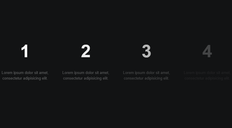
<ul id="c">
	<li><p><strong>1</strong></p><p>Lorem ipsum dolor sit amet, consectetur adipisicing elit.</p></li>
	<li><p><strong>2</strong></p><p>Lorem ipsum dolor sit amet, consectetur adipisicing elit.</p></li>
	<li><p><strong>3</strong></p><p>Lorem ipsum dolor sit amet, consectetur adipisicing elit.</p></li>
	<li><p><strong>4</strong></p><p>Lorem ipsum dolor sit amet, consectetur adipisicing elit.</p></li>

	<li><p><strong>5</strong></p><p>Lorem ipsum dolor sit amet, consectetur adipisicing elit.</p></li>
	<li><p><strong>6</strong></p><p>Lorem ipsum dolor sit amet, consectetur adipisicing elit.</p></li>
	<li><p><strong>7</strong></p><p>Lorem ipsum dolor sit amet, consectetur adipisicing elit.</p></li>
	<li><p><strong>8</strong></p><p>Lorem ipsum dolor sit amet, consectetur adipisicing elit.</p></li>

	<li><p><strong>9</strong></p><p>Lorem ipsum dolor sit amet, consectetur adipisicing elit.</p></li>
	<li><p><strong>10</strong></p><p>Lorem ipsum dolor sit amet, consectetur adipisicing elit.</p></li>
	<li><p><strong>11</strong></p><p>Lorem ipsum dolor sit amet, consectetur adipisicing elit.</p></li>
	<li><p><strong>12</strong></p><p>Lorem ipsum dolor sit amet, consectetur adipisicing elit.</p></li>
</ul>
Defining the critical style of the infinite carousel
We define the CSS of the ul to center the carousel:
body > ul {
	position: absolute;
	top: 50%;
	width: 800px;
	height: 200px;
	left: 50%;
	margin-left: -400px;
	margin-top: -130px;
}
4 items will be shown at a time and hence the width with 25% for each of the items:
ul > li {
    width: 25%;
    list-style-type: none;
    position: absolute;
    top: 0;
    padding: 20px;
    height: 200px;
    opacity: 0;
    padding-top: 40px;
    text-align: center;
    transition: 1s opacity;
}
The rest of the CSS for decorative purposes for our infinite carousel can be found in the source code that you can download at the end and beginning of this entry.
The following JavaScript code with jQuery allows you to restart the carousel once it has reached its end and hence the infinite and automatic:
if (i < max - 4) {
    i = i + 4;
} else {
    i = 0;
}
In the experiment there are 12 items to show that are hidden by default. If we see the entire JavaScript code we will first see that there is a block of code that is only executed once that is responsible for activating the first 4 automatically without the need to wait the two seconds and this is because they are the first elements of the list to be displayed:
$("#c > li").eq(i).addClass('active').css('left', '0');
$("#c > li").eq(i + 1).addClass('active').css('left', '25%');
$("#c > li").eq(i + 2).addClass('active').css('left', '50%');
$("#c > li").eq(i + 3).addClass('active').css('left', '75%');
The rest of the JavaScript is executed through a setInterval method consecutively every two seconds and infinity and is responsible for processing two list blocks at a time, adding transitions to each of the defined group of 4 lists:
$("#c > li").eq(i).css('transition-delay', '0.25s');
$("#c > li").eq(i + 1).css('transition-delay', '0.5s');
$("#c > li").eq(i + 2).css('transition-delay', '0.75s');
$("#c > li").eq(i + 3).css('transition-delay', '1s');

...

$("#c > li").eq(i).css('left', '0').addClass('active').css('transition-delay', '1.25s');
$("#c > li").eq(i + 1).css('left', '25%').addClass('active').css('transition-delay', '1.5s');
$("#c > li").eq(i + 2).css('left', '50%').addClass('active').css('transition-delay', '1.75s');
$("#c > li").eq(i + 3).css('left', '75%').addClass('active').css('transition-delay', '2s');
As you can see, a delay is established for each of the items to be shown so that they are progressively hidden.
The counter is also reset because there are 4 items to be displayed at a time and in this way avoid overflowing the array:
if (i < max-4) {
        i = i+4;
} else {
        i = 0;
}
The original experiment can be found at the following link: Infinite Automatic Carousel.