
Drawing our own SVGs in HTML
Even with HTML it has become possible to draw SVGs which stands for Scalable Vector Graphics; an SVG is nothing more than an XML that describes how to draw two-dimensional vector graphics.
SVG and Responsive Designs
SVGs turn out to be valuable resources when making a responsive site by allowing them to adapt to any size without losing quality (without pixelating) and in this entry we will see how to draw basic SVG shapes through the element <svg>, define style and its attributes.
Drawing SVG Geometric Shapes
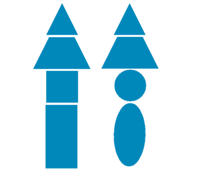
With SVG it is possible to draw a series of geometric shapes or primitives which are:
Many shapes can be drawn using the previous figures and multiple figures can even be drawn at once and positioned wherever we want; in this first entry we will see how to draw:
Working with the rest of the geometric shapes will be left for future entries, as well as their attributes, styles, and it is even possible to apply filters and gradients to SVG shapes, giving a wide range of options to create simple and composite scalable graphics.
Drawing our First SVG Shapes
To draw any shape it is necessary to declare the <svg> element as their parent; that is to say:
	<svg>
		<!-- My shapes -->
	</svg>
For example, to draw a circle it would be enough to use the following HTML:
	<svg>
	        <circle cx="40" cy="40" r="40" fill="red"/>
	</svg>
These elements can have their properties modified such as size, border, shape, color, among others, and this is done using attributes (some unique to each primitive) or CSS.
Drawing SVG Rectangles and squares
First we will see how to draw a rectangle and a square; for which the same tag <rect> is used:
	<svg>
		<rect x="40%" y="5%" rx="5" ry="5" width="300" height="100" id="r"></rect>
		Your browser does not support SVG :/
	</svg>
Plus a little bit of CSS:
	rect#r {
		fill:rgba(204, 0, 0, 0.6);
		stroke-width:2;
		stroke:rgba(204, 0, 0, 1);
	}
We get:
To create a square, the same value is defined for the width and height of the figure; that is to say:
    <svg>
        <rect x="40%" y="5%" width="100" height="100" rx="15" ry="15" id="c"></rect>
        Your browser does not support SVG :/
    </svg>
Plus a little bit of CSS:
	rect#c {
		fill:rgba(204, 204, 0, 0.6);
		stroke-width:10;
		stroke:rgba(204, 204, 0, 1);
	}
We get:
Properties and Attributes of the SVG Rectangle and Square
For both examples, the following CSS properties are used:
fill: Defines the color of the shape.stroke-width: Defines the width of the borders.stroke: Defines the color of the border.
Some attributes are also used, such as:
x: Defines the offset from the left of the shape.y: Defines the offset from the top of the shape.rxandry: Defines the rounding of the corners.
Drawing an SVG Circle
Again, to draw a circle, the tag created for this purpose called <circle> is used:
    <svg>
        <circle cx="40%" cy="50" r="40"></circle>
        Your browser does not support SVG :/
    </svg>
Plus a little bit of CSS:
    circle{
        fill:rgba(204, 204, 204, 0.6);
        stroke-width:10;
        stroke:rgba(204, 204, 204, 1);
    }
We get:
A set of attributes are used, which we will explain below:
- The attributes
cxandcydefine the coordinates of the center of the circle; that is, where the circle will start to be drawn inside the SVG element. - The attribute
rdefines the radius of the circle.
Drawing an SVG Ellipse
For ellipses, there is also a defined element called <ellipse>:
  <svg>
        <ellipse cx="40%" cy="50" rx="80" ry="40"></ellipse>
        Your browser does not support SVG :/
    </svg>
        ellipse{
            fill:rgba(0, 204, 204, 0.6);
            stroke-width:10;
            stroke:rgba(0, 204, 204, 1);
        }
We get:
Where the attributes rx and ry define the horizontal and vertical radius respectively.
Drawing an SVG Line
The simplest shape we can draw is a simple line, and just like the previous cases, there is a defined element for this task called <line>:
    <svg>
        <line x1="0" y1="0" x2="100%" y2="100%"></line>
        Your browser does not support SVG :/
    </svg>
        line{
            stroke-width:2;
            stroke:rgba(0, 204, 204, 1);
        }
Where the attributes x1 and y1 define the starting point and the attributes x2 and y2 define the ending point.
We get:
Previously we took our first steps with SVGs by building a traffic light, which consisted of a rectangle with 3 circles aligned on the vertical axis, we saw some of its attributes to define the size of the circles through the radius (attribute r) and their position (using the attributes cx and cy) and their color through the attribute fill.
Now, in this entry we are going to organize the previous code to slightly improve its readability and general structure; to do this, the first thing we are going to do is group certain common attributes.
Grouping Elements with Common Attributes with the g Tag
We are going to use the g tag to group the three circles that represent the traffic lights:
<svg width="200px" height="400px">
	<rect x="0" y="0" width="150" height="350"
		  fill="black" stroke="gray" stroke-width="2" />
	<g stroke="black" stroke-width="2" stroke="gray">
		<circle r="40" cx="75" cy="80" fill="red" />
		<circle r="40" cx="75" cy="175" fill="yellow" />
		<circle r="40" cx="75" cy="275" fill="green" />
	</g>
</svg>
With the g tag we can group elements to avoid repeating some common attributes, and it also helps us in organizing them.
The reason why the attributes cx, cy and r are not included is because these attributes are specific to circles, and the g tag allows defining only common and fundamental attributes of geometric shapes like the ones defined in the previous example.
Defining Styles in a Separate Structure
To further improve the readability of our previous example, we can define the border thickness as well as their color from CSS and thus remove the attributes that performed this task, although we cannot do the same with the background color.
We can even define a style in a parent element so that it is inherited by its children, for example we place a style style="fill:red" on the g element which will be taken by its children as long as they do not overwrite it:
<svg width="200px" height="400px">
	<style type="text/css">
	rect, circle {
		stroke: #FFF;
		stroke-width: 3;
	}
	</style>
	<rect x="0" y="0" width="150" height="350"
		  fill="black" stroke="gray" stroke-width="2" />

	<g style="fill:red">
		<circle r="40" cx="75" cy="80" />
		<circle r="40" cx="75" cy="175" fill="yellow" />
		<circle r="40" cx="75" cy="275" fill="green" />
	</g>
</svg>
In this example we can see how we defined a common style for the rect and circle tags and then they are overwritten for all circles except the first one.
style attribute, which must be embedded inside the element that represents the shape; for example style="fill:blue;" has the same effect as using fill="blue".We can add classes to our geometric shapes; for example, let's leave only one light on and change its thickness:
<svg width="200px" height="400px">
	<style type="text/css">
	rect {
		stroke: #FFF;
		stroke-width: 3;
	}
	.border {
		stroke: #FFF;
		stroke-width: 4;
	}
	</style>
	<rect x="0" y="0" width="150" height="350"
		  fill="black" stroke="gray" stroke-width="2" />
	<g>
		<circle r="40" cx="75" cy="80" class="border" style="fill:red"/>
		<circle r="40" cx="75" cy="175"/>
		<circle r="40" cx="75" cy="275"/>
	</g>
</svg>
Defining the Structure to Avoid Redundancy with Repetition
The g tag is quite useful for grouping geometric shapes that have common attributes, however its Achilles' heel lies in the fact of not being able to place all common attributes in the g element; for these cases we can use the defs tag with the help of the use tag as we will see below.
The defs and use tags together help us to define a key figure (through the defs tag) with all its attributes and then we can use and replicate this definition as many times as we want through the use tag.
Specifically speaking about the example we are developing, we are going to define a circle with all the common attributes:
<defs>
	<circle id="light" cx="75" r="40" />
</defs>
And then we are going to replicate the structure 3 times, one for each light:
<use xlink:href="#light" y="80" fill="red" />
<use xlink:href="#light" y="175" fill="yellow" />
<use xlink:href="#light" y="275" fill="green" />
As we see in the code snippets, the xlink:href attribute is used to identify another element in the document through the # markup, which allows following an element through the id attribute, so in summary, we are copying the structure of the element whose id is circle:
<svg width="200px" height="400px">
	<defs>
		<circle id="light" cx="75" r="40" />
	</defs>
	<rect x="0" y="0" width="150" height="350"
		  fill="black" stroke="gray" stroke-width="2" />
	fill="blue" stroke="black" stroke-width="3" />
	<g stroke="black" stroke-width="2">
		<use xlink:href="#light" y="80" fill="red" />
		<use xlink:href="#light" y="175" fill="yellow" />
		<use xlink:href="#light" y="275" fill="green" />
	</g>
</svg>
First Steps with HTML5 SVGs: Creating a Simple Traffic Light
We will see how to create an SVG in HTML, we will see how to create an SVG image as such and we will also see some of its attributes for their color, position, size, and border, in addition to creating a simple traffic light.
Creating the Canvas
To work with SVGs, we have to fulfill a requirement that is similar to when we work with Canvas, and that is that we must create a tag that contains all the figures that we are going to include, and this is done through the svg tag, which becomes our canvas to draw shapes; somewhat similar to what happens with the canvas tag; inside it we can define multiple attributes as we will see, but for now we are only interested in defining the size of our SVG canvas:
<svg width="200px" height="400px"></svg>
In the previous code, we created an SVG of 400 by 200 pixels.
The rect Element in SVG to Define the Body of the Traffic Light
Now, with our canvas ready, we are going to draw a rectangle, which will become the container for the traffic lights or the body of the traffic light; to do this we must define a rect element inside the svg tag that we defined previously:
<svg width="200px" height="400px">
 <rect x="0" y="0" width="150" height="350"
              fill="black" stroke="gray" stroke-width="2" />
</svg>
The rect element allows drawing a rectangle or square depending on how we define its attributes; those attributes width and height which, as in CSS, allow defining the width and height respectively.
We have other attributes that we will explain a little later; finally, our traffic light is turning out like this:
The circle Element in SVG to Define the Traffic Lights
Now let's go for the lights, for this we are going to define three circles with different colors that will represent the colors of a traffic light, which are red, yellow, and green.
<circle cx="75" cy="75" r="40"
        fill="red" stroke="gray" stroke-width="2" />
As we can see, to create a circle, we use the r attribute to define the radius of our circle, so if we place a radius of 40 pixels we will have a circle that will be 80 pixels across its widest ends; let's remember that the radius of a circumference is any segment that connects the center to any point on said circumference.
It also has two more attributes that allow defining the position of the circle, from its center on the X axis, so if we have a circle with a 40-pixel radius inside a 150-wide rectangle, to center the circle in that rectangle on the X axis the value must be 75 pixels, the same logic applies to the cy attribute which allows centering on the Y axis; finally we create 3 circles aligned on the X axis but with different positions on the Y axis so they do not overlap:
<svg width="200px" height="400px">
<rect x="0" y="0" width="150" height="350"
      fill="black" stroke="gray" stroke-width="2" />
<circle cx="75" cy="75" r="40"
        fill="red" stroke="gray" stroke-width="2" />
<circle cx="75" cy="175" r="40"
        fill="yellow" stroke="black" stroke-width="2" />
<circle cx="75" cy="275" r="40"
        fill="#40CC40" stroke="black" stroke-width="2" />
</svg>
The stroke attribute allows defining the color of the border, while the stroke-width attribute defines the width that the border will have in pixels; fill, which in CSS would be the background, allows defining the fill color of an element. These attributes are common among all geometric shapes that we can draw with SVGs, which happen to be their primitives that we will see in subsequent entries; finally, our traffic light looks like this:
Varying the Position of the Traffic Light
If we want to vary the position of the traffic light so that it is not so close to the edge, there are also properties that we can use on the rect element, although when varying the position of the rectangle we must also vary the position of the three lights, that is, of the circles. Even though it might seem that the rectangle acts as a container and thus if we vary the position of the rectangle this would directly affect the circles, the reality is that it is not so, and we must shift the circles that are "contained" inside the rectangle manually by increasing the values of cx and cy in the same values or proportions as we vary the position of the rectangle.
Finally, to vary the position of the rectangle we use the attributes x and y, specifying the offset in pixels:
<svg width="200px" height="400px">
<rect x="20" y="20" width="150" height="350"
      fill="black" stroke="gray" stroke-width="2" />
<circle cx="100" cy="95" r="40"
        fill="red" stroke="gray" stroke-width="2" />
<circle cx="100" cy="195" r="40"
        fill="yellow" stroke="black" stroke-width="2" />
<circle cx="100" cy="295" r="40"
        fill="#40CC40" stroke="black" stroke-width="2" />
</svg>
That would be all for this entry, in the following entries, we will see new elements that will allow us to have better organization and readability of our primitives or geometric shapes inside the SVG and we will apply some gradients to the lights.
Building our Own Android Logo with SVG in HTML

In this entry we will address a slightly more practical topic and we will see how to build our own Android logo using what has been discussed so far:
Why Bother Building an Image from SVG/HTML and Not Use a Traditional Image?
The reason for this is mainly due to the dynamism and how easy it is to generate customized SVGs according to (for example) data returned from other technologies like PHP; in addition, building an SVG/HTML image avoids loading an image in the traditional way (and this translates into time), this is because it is created from scratch through HTML.
Building our Android Logo
The SVG that we will build has dimensions of 300px by 300px; this means that the size of the image is fixed and does not vary regardless of the screen size.
If we analyze the previous image or our customized Android logo, we will realize that it is assembled from the primitives seen in the entry: Drawing our own SVGs in HTML (part 1):
- Ellipses: For the head.
- Circles: For the eyes.
- Rectangles: For the arms, legs, antennas, and torso.
And this is everything necessary to build our Android logo.
The Android Logo in Practice
The Rectangles
First we are going to create all the rectangles for the arms, legs, antennas, and torso until we get the following shape:
    <svg>
    <!--head-->
    <ellipse cx="170" cy="50" rx="50" ry="45"></ellipse>
    Your browser does not support SVG :/s
    <!--left leg-->
    <rect x="140" y="150" width="20" height="60" rx="15" ry="15" id="c"></rect>
    Your browser does not support SVG :/
    <!--right leg-->
    <rect x="180" y="150" width="20" height="60" rx="15" ry="15" id="c"></rect>
    Your browser does not support SVG :/
    <!--left arm-->
    <rect x="90" y="60" width="20" height="100" rx="15" ry="15" id="c"></rect>
    Your browser does not support SVG :/
    <!--torso-->
    <rect x="120" y="50" width="100" height="120" rx="15" ry="15" id="c"></rect>
    Your browser does not support SVG :/
    <!--right arm-->
    <rect x="230" y="60" width="20" height="100" rx="15" ry="15" id="c"></rect>
    Your browser does not support SVG :/
Except for the CSS for the antennas (which we will cover in the final section) the CSS used is the following:
        svg {
                display: block;
                margin: 10px auto;
                width:300px;
                height:300px;
        }
        rect#b {
                fill:rgba(255, 255, 255, 1);
        }
        rect#c {
                fill:rgba(204, 204, 0, 1);
        }
        circle{
                fill:rgba(255, 255, 255, 1);
        }
        ellipse{
                fill:rgba(204, 204, 0, 1);
        }
        line{
                stroke-width:2;
                stroke:rgba(0, 204, 0, 1);
        }
There is not much to say about the HTML, the attributes x and y are used to locate the rectangles and the attributes width and height to define the width and height respectively.
There is a hidden rectangle that allows hiding part of the ellipse of the head and the torso, in this way that very particular shape of the Android head is created, avoiding the logo from looking as follows:

The rectangle is the following and its color is white:
    <rect x="115" y="50" width="110" height="10" id="b"></rect>
    Your browser does not support SVG :/
    </svg>
The Ellipse
For the head, the following HTML is used:
<ellipse cx="170" cy="50" rx="50" ry="45"></ellipse>
And the following CSS:
    ellipse{
            fill:rgba(204, 204, 0, 1);
    }
The Circles
The time has come for the eyes; since there are two, two circles are used for that purpose:
      <circle cx="150" cy="30" r="7"></circle>
            Your browser does not support SVG :/
      <circle cx="190" cy="30" r="7"></circle>
            Your browser does not support SVG :/
Back to the Rectangles for the Antennas
Finally, we will place the respective antennas onto our Android logo. We have left placing the antennas as the last step because it is slightly more complex to align them, and this is because it is the only figure that uses CSS for its rotation; therefore, we will use the following CSS property to accomplish this task:
transform: rotateZ(deg);
Putting everything together to get our antennas, we are left with:
        rect#antena1 {
                fill:rgba(204, 204, 0, 1);
                -webkit-transform: rotateZ(11deg);
                -moz-transform: rotateZ(11deg);
                transform: rotateZ(11deg);
        }
        rect#antena2 {
                fill:rgba(204, 204, 0, 1);
                -webkit-transform: rotateZ(-17deg);
                -moz-transform: rotateZ(-17deg);
                transform: rotateZ(-17deg);
        }

    Your browser does not support SVG :/

    Your browser does not support SVG :/
And that is all; with the HTML/CSS code seen above, it is enough to create the following figure:
The symbol element for SVGs in HTML
In this entry, we will look at a very useful element for working with SVGs, which is the <symbol> element; this element saves a lot of work and allows grouping series of basic figures to paint them using the <use> element.
The <symbol> and <use> elements in SVGs
Taking our Android logo which we put together in a previous entry Building our own Android logo with SVG in HTML, we define it (or rather, the figures that make up the Android logo) inside the <symbol> element and then simply paint the logo with the <use> element; first let's recall the HTML of our SVG/HTML Android logo:
<svg>
<!--head-->
  <ellipse cx="170" cy="100" rx="50" ry="45"></ellipse>
	Your browser does not support SVG :/s
  <!--left antenna-->
  <rect x="197" y="0" width="4" height="30" rx="3" ry="3" id="antena1"></rect>
	Your browser does not support SVG :/
  <!--right antenna-->
  <rect x="124" y="77" width="4" height="30" rx="3" ry="3" id="antena2"></rect>
	Your browser does not support SVG :/
  <!--eyes-->
  <circle cx="150" cy="80" r="7"></circle>
	Your browser does not support SVG :/
  <circle cx="190" cy="80" r="7"></circle>
	Your browser does not support SVG :/
  <!--left leg-->
  <rect x="140" y="190" width="20" height="60" rx="15" ry="15" id="c"></rect>
	Your browser does not support SVG :/
  <!--right leg-->
  <rect x="180" y="190" width="20" height="60" rx="15" ry="15" id="c"></rect>
	Your browser does not support SVG :/
  <!--left arm-->
  <rect x="90" y="100" width="20" height="100" rx="15" ry="15" id="c"></rect>
	Your browser does not support SVG :/
  <!--torso-->
  <rect x="120" y="90" width="100" height="120" rx="15" ry="15" id="c"></rect>
	Your browser does not support SVG :/
  <!--right arm-->
  <rect x="230" y="100" width="20" height="100" rx="15" ry="15" id="c"></rect>
	Your browser does not support SVG :/
  <rect x="115" y="100" width="110" height="10" id="b"></rect>
	Your browser does not support SVG :/
</svg>
Grouping the logo shapes with the <symbol> element
Now let's see how to group all the primitives that make up our Android logo using the <symbol> element:
    <symbol id= "android" viewBox= "0 0 500 500">
        <!--head-->
        <ellipse cx="170" cy="100" rx="50" ry="45"></ellipse>
        Your browser does not support SVG :/s
        <!--left antenna-->
        <rect x="197" y="0" width="4" height="30" rx="3" ry="3" id="antena1"></rect>
        Your browser does not support SVG :/
        <!--right antenna-->
        <rect x="124" y="77" width="4" height="30" rx="3" ry="3" id="antena2"></rect>
        Your browser does not support SVG :/
        <!--eyes-->
        <circle cx="150" cy="80" r="7"></circle>
        Your browser does not support SVG :/
        <circle cx="190" cy="80" r="7"></circle>
        Your browser does not support SVG :/
        <!--left leg-->
        <rect x="140" y="190" width="20" height="60" rx="15" ry="15" id="c"></rect>
        Your browser does not support SVG :/
        <!--right leg-->
        <rect x="180" y="190" width="20" height="60" rx="15" ry="15" id="c"></rect>
        Your browser does not support SVG :/
        <!--left arm-->
        <rect x="90" y="100" width="20" height="100" rx="15" ry="15" id="c"></rect>
        Your browser does not support SVG :/
        <!--torso-->
        <rect x="120" y="90" width="100" height="120" rx="15" ry="15" id="c"></rect>
        Your browser does not support SVG :/
        <!--right arm-->
        <rect x="230" y="100" width="20" height="100" rx="15" ry="15" id="c"></rect>
        Your browser does not support SVG :/
        <rect x="115" y="100" width="110" height="10" id="b"></rect>
        Your browser does not support SVG :/
    </symbol>
Displaying the Android logo with the <use> element
But the HTML defined above is not enough to display the Android logo; to show the logo it is necessary to use the <use> element, placing the identifier of the <symbol> element inside the xlink:href attribute:
<symbol id= "android">
…
</symbol>
<use xlink:href= "#android" ... />
Changing the stroke color
It is possible to change the stroke color using the fill attribute:
<use xlink:href= "#android" fill= "DarkOrange" width= "250" height= "250" />Although for our logo it is not necessary.
Putting it all together:
When putting everything we have seen together, we get:
Your browser does not support SVG :/s Your browser does not support SVG :/ Your browser does not support SVG :/ Your browser does not support SVG :/ Your browser does not support SVG :/ Your browser does not support SVG :/ Your browser does not support SVG :/ Your browser does not support SVG :/ Your browser does not support SVG :/ Your browser does not support SVG :/ Your browser does not support SVG :/
Resizing and replicating our logo
Finally, by repeatedly using the <use> element as shown in the following HTML:
    <use xlink:href= "#android" width= "150" height= "250" />
    <use xlink:href= "#android" width= "300" height= "500" />
    <use xlink:href= "#android" width= "600" height= "1000" />
The true advantage of defining the Android logo inside the <symbol> element is being able to change its size and paint it as many times as we want.
We can paint as many Android logos as we want (three for our example), and by defining its width (width) and length (height) to vary its dimensions (resizing the logos), we get:
Your browser does not support SVG :/s Your browser does not support SVG :/ Your browser does not support SVG :/ Your browser does not support SVG :/ Your browser does not support SVG :/ Your browser does not support SVG :/ Your browser does not support SVG :/ Your browser does not support SVG :/ Your browser does not support SVG :/ Your browser does not support SVG :/ Your browser does not support SVG :/
We can define as many <use> elements as Android logos we want to paint.
The viewBox attribute
If you notice, we used the viewBox attribute in the <symbol> element; this attribute allows controlling the size of the elements inside the SVG; the attribute is composed of the following values:
min-xmin-ywidthheight
Therefore, if the min-x and min-y values are equal to the width and height of the SVG, a 1:1 relationship exists where each pixel will occupy exactly the size of a pixel; but on the contrary, if the value of min-x and min-y are width/2 and height/2 of the width and height of the SVG; that is to say:
min-x = width/2
min-y = height/2
Then each pixel occupies twice its space (a 1:2 relationship); meaning, two pixels.
SVG Gradients in HTML
In a past entry titled: "Drawing our own SVGs in HTML (part 1)", we saw how to create some basic SVG geometric figures in HTML through the svg element, its attributes, and defining a style with CSS. In this entry we will see how to define and apply gradients to any of these SVGs; there are two types of SVG gradients that we can use in our designs:
- Linear: Using the
<linearGradient>element. A linear gradient is one generated in a linear fashion. - Radial: Using the
<radialGradient>element. A radial gradient is one generated in a circular fashion.
Let's look at a comparative image of a linear vs radial gradient:

The linear gradient <linearGradient>
The simplest linear gradient we can build is one consisting of just two colors:
<linearGradient id="gradient" x1="0%" y1="0%" x2="100%" y2="0%">
    <stop offset="0%" />
    <stop offset="100%" />
</linearGradient>
The attributes x1, x2, y1, y2 allow indicating the initial and final position of the gradient.
Additionally, the element <stop> is used, which in conjunction with its attributes allows specifying the color and the position of the color; through the CSS property stop-color the color is specified, and with the attribute offset it specifies where the color begins and where it ends.
Any gradient definition must be placed inside a <defs> element, which allows reusing the resource easily through its identifier as long as the referenced resource is found inside its parent <svg>, leaving the gradient defined in the following way:
<defs>
    <linearGradient id="gradient" x1="0%" y1="0%" x2="100%" y2="0%">
        <stop offset="0%" />
        <stop offset="100%" />
    </linearGradient>
</defs>
Now, to reference the previous resource or gradient to a figure, for example an ellipse, we reference the identifier of the gradient in the fill attribute of the figure:
<svg>
    <defs>
        <linearGradient id="gradient" x1="0%" y1="0%" x2="100%" y2="0%">
            <stop offset="0%" />
            <stop offset="100%" />
        </linearGradient>
    </defs>
    <ellipse cx="200" cy="70" rx="100" ry="55" fill="url(#gradient)" />
</svg>
Linear gradient examples <linearGradient>
Finally, let's look at a set of examples using the following CSS:
.example stop:nth-child(1) {
	stop-color: rgb(255, 255, 0)/*Yellow*/
}
.example stop:nth-child(2) {
	stop-color: rgb(255, 0, 0)/*Red*/
}
.example stop:nth-child(3) {
	stop-color: rgb(0, 255, 0)/*Green*/
}
.example stop:nth-child(4) {
	stop-color: rgb(0, 0, 255)/*Blue*/
}
.example stop:nth-child(5) {
	stop-color: rgb(0, 0, 0)/*Black*/
}
Two horizontal colors
The simplest example of a figure with a linear gradient applied to it is defining the gradient with two colors through the <stop> element.
When defining the gradient, the angle from which we want to draw the gradient is defined using the attributes x1, x2, y1, y2; as you will see, by placing the last point on the X axis (x2) at 100%, it moves horizontally from left to right:
<svg>
    <defs>
        <linearGradient id="gradient" x1="0%" y1="0%" x2="100%" y2="0%">
            <stop offset="0%" />
            <stop offset="100%" />
        </linearGradient>
    </defs>
    <ellipse cx="200" cy="70" rx="100" ry="55" fill="url(#gradient)" />
</svg>
Three vertical colors
In this other example we apply a linear gradient with three colors, but this time we draw the gradient moving it vertically by placing the last point on the Y axis (y2) at 100%
<svg>
    <defs>
        <linearGradient id="gradient" x1="0%" y1="0%" x2="0%" y2="100%">
            <stop offset="0%" />
            <stop offset="45%" />
            <stop offset="100%" />
        </linearGradient>
    </defs>
    <ellipse cx="200" cy="70" rx="100" ry="55" fill="url(#gradient)" />
</svg>
Four lateral colors
Now we draw a gradient of four colors but we move across both axes X2 and Y2:
<svg>
    <defs>
        <linearGradient id="gradient" x1="0%" y1="0%" x2="100%" y2="50%">
            <stop offset="0%" />
            <stop offset="33%" />
            <stop offset="66%" />
            <stop offset="100%" />
        </linearGradient>
    </defs>
    <ellipse cx="200" cy="70" rx="100" ry="55" fill="url(#gradient)" />
</svg>
Five colors
It is possible to draw as many colors in the gradient as we wish:
<svg>
    <defs>
        <linearGradient id="gradient" x1="0%" y1="0%" x2="100%" y2="0%">
            <stop offset="0%" />
            <stop offset="25%" />
            <stop offset="50%" />
            <stop offset="75%" />
            <stop offset="100%" />
        </linearGradient>
    </defs>
    <ellipse cx="200" cy="70" rx="100" ry="55" fill="url(#gradient)" />
</svg>
The Radial gradient <radialGradient>
To define radial gradients we must use the <radialGradient> element instead of <linearGradient>; to indicate the starting and ending position, cx, cy, fx, and fy are used instead of the attributes x1, x2, y1, y2; let's see some examples:
Two colors
In this example we will see a gradient generated from the middle of the ellipse:
<svg>
    <defs>
        <radialGradient id="gradient" cx="50%" cy="50%" fx="50%" fy="50%">
            <stop offset="0%" />
            <stop offset="100%" />
        </radialGradient>
    </defs>
    <ellipse cx="200" cy="70" rx="100" ry="55" fill="url(#gradient)" />
</svg>
Three colors
Let's vary the center where the gradient begins to be drawn a little bit:
<svg>
    <defs>
        <radialGradient id="gradient" cx="20%" cy="30%" fx="50%" fy="50%">
            <stop offset="0%" />
            <stop offset="45%" />
            <stop offset="100%" />
        </radialGradient>
    </defs>
    <ellipse cx="200" cy="70" rx="100" ry="55" fill="url(#gradient)" />
</svg>
Four colors
Here we apply four colors:
<svg>
    <defs>
        <radialGradient id="gradient" cx="50%" cy="50%" fx="50%" fy="50%">
            <stop offset="0%" />
            <stop offset="33%" />
            <stop offset="66%" />
            <stop offset="100%" />
        </radialGradient>
    </defs>
    <ellipse cx="200" cy="70" rx="100" ry="55" fill="url(#gradient)" />
</svg>Animating SVGs with CSS
In this entry, we will see a tutorial on how to create the logo of the popular green character known as Android using SVG and how to animate it.
CSS Animations + SVG/HTML
In this entry we will see a combination of both things by employing CSS animations with SVGs in HTML, specifically using the Android logo that we have been working with since the previous entries listed at the beginning of this one.
Animating SVGs by parts -shapes-
Let us remember that SVGs are a wonderful way to create vector images that do not pixelate; meaning, we can create images with a very low file size and scale them as much as we want without losing detail, something we cannot do with other types of images like png, jpg, gif, etc; of course, creating SVGs of very complex images is very complicated and not recommended, but everything has its pros and cons and that is why other image formats exist.
Just as the title specifies, we will not animate the SVG as a whole (that is, the entire logo) but rather by parts; these parts are nothing more than the shapes that make up the logo:
- Ellipses: For the head.
- Circles: For the eyes.
- Rectangles: For the arms, legs, antennas, and torso.
Each of the previous shapes are SVG tags via HTML that can be animated separately using various existing properties, including translation and opacity, to achieve the following desired effect:
Making our animation effect: The CSS to animate
The HTML and CSS to define its color and shape is identical to the one used in previous entries and you can find it here; in this section we will show and explain the CSS needed to create the previous animation.
For each part (shape) of the logo, a different animation is defined lasting ten seconds; the CSS is defined in such a way that each animation starts right after the previous one, beginning with the arms, following with the legs, and ending with the head:
.example2 rect#c {
    animation: c ease-in-out 3s infinite ;
}
.example2 rect#bd {
    animation: bd ease-in-out 10s infinite;
}
.example2 rect#bi {
    animation: bi ease-in-out 10s infinite ;
}
.example2 rect#pi {
    animation: pi ease-in-out 10s infinite ;
}
.example2 rect#pd {
    animation: pd ease-in-out 10s infinite ;
}
.example2 rect#antena1 {
animation: head ease-in-out 10s infinite ;
}
.example2 rect#antena2 {
    animation: head ease-in-out 10s infinite ;
}
.cabeza{
    animation: head ease-in-out 10s infinite ;
}
As you may have observed in the previous CSS and as we specified earlier, animations are defined for each shape.
Now, the animations specified in the previous CSS for each part of the logo:
/*************************************Right arm*/
@keyframes bd {
    0% {
    transform: translate(50px,0);
    opacity:0;}
10% {
    transform: translate(0,0);
    opacity:1;}
90% {
    transform: translate(0px,0);
    opacity:1;}
99% {
    opacity:0;}
100% {
    transform: translate(50px,0);
    opacity:0;}
}
/*************************************Left arm*/
@keyframes bi {
    0% {
    transform: translate(-50px,0);
    opacity:0;}
10% {
    transform: translate(-50px,0);
    opacity:0;}
20% {
    transform: translate(0px,0);
    opacity:1;}
90% {
    transform: translate(0px,0);
    opacity:1;}
99% {
    opacity:0;}
100% {
    transform: translate(-50px,0);
    opacity:0;}
}
/*************************************Right leg*/
@keyframes pd {
    0% {
    transform: translate(0,-50px);
    opacity:0;}
20% {
    transform: translate(0,-50px);
    opacity:0;}
30% {
    transform: translate(0,0);
    opacity:1;}
90% {
    transform: translate(0,0);
    opacity:1;}
99% {
    opacity:0;}
100% {
    transform: translate(0,-50px);
    opacity:0;}
}
/*************************************Left leg*/
@keyframes pi {
    0% {
    transform: translate(0,-50px);
    opacity:0;}
30% {
    transform: translate(0,-50px);
    opacity:0;}
40% {
    transform: translate(0,0);
    opacity:1;}
90% {
    transform: translate(0,0);
    opacity:1;}
99% {
    opacity:0;}
100% {
    transform: translate(0,-50px);
    opacity:0;}
}
/*************************************head*/
@keyframes head {
    0% {
    opacity:0;}
40% {
    opacity:0;}
50% {
    opacity:1;}
90% {
    opacity:1;}
99% {
    opacity:0;}
100% {
    opacity:0;}
}
And that is all, with the CSS shown above it is enough to animate our Android logo; as we can see it is very simple and with current web technologies, and without any plugin, we can make interesting effects on our vectorized or SVG images using pure HTML5. This is one of many animation examples we can use where the sky is the limit.