Inserting a YouTube video into your web page is one of those tasks that seem simple... until problems start: fixed sizes, videos that aren't responsive, parameters that nobody explains well, etc.
When I started, I also fell into that trap: I copied the iframe as is and then had to struggle with it not adapting to mobile or the controls disappearing without reason. That's why this guide brings together everything you need, from the basics to advanced configurations.
What "inserting a YouTube video" really means
How the iframe works internally
When you click on Share → Embed, YouTube gives you an HTML <iframe> block.
That iframe is simply a "window" within your website that displays the YouTube player.
For example:
<iframe width="560" height="315" src="https://www.youtube.com/embed/85MppyLJHz0" allowfullscreen></iframe>That src is the only thing you need to change if you want another video.
Advantages of embedding a video instead of uploading it
- I quickly discovered this: using the video directly from YouTube saves you tons of work:
- You don't have to convert the video to multiple formats.
- You don't consume your own bandwidth.
- You benefit from YouTube's social features.
- The player is already optimized for most browsers.
How to get the embed code on YouTube
Quick path: Share → Embed
- Open the video.
- Click on Share.
- Select Embed.
- Copy the iframe that appears.
Where to paste the code in your HTML
Inside <body>:
<body>
   <h1>My video</h1>
   <iframe width="560" height="315" src="https://www.youtube.com/embed/TU_ID" allowfullscreen></iframe>
</body>
YouTube is a digital content platform where you can find all kinds of videos. YouTube has grown in all aspects in recent years, offering options for everything, including easily inserting videos into our website:
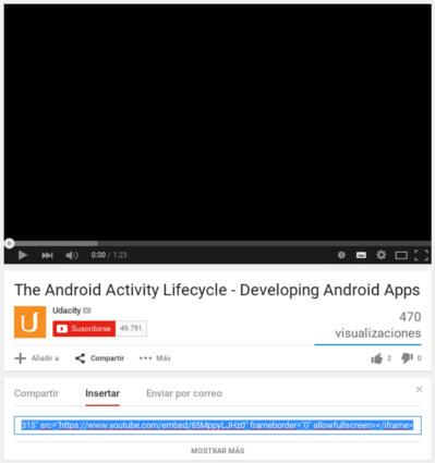
Select a YouTube video -> click on "Share" -> click on the "Embed" tab
Once we have our video that we want to insert into our HTML web page; in our case, we want to insert the following video:
<iframe width="560" height="315" src="https://www.youtube.com/embed/85MppyLJHz0" allowfullscreen></iframe>Directly using YouTube videos can save a lot of work; for example, avoiding converting videos to different formats for support in different browsers, the different social options for sharing the YouTube video, etc.
Typical errors when copying the embed
- Pasting the iframe in <head> instead of <body>.
- Breaking the URL by adding parameters with ? twice.
- Accidentally deleting allowfullscreen.
Analyzing the attributes of the HTML above
Observing the code obtained from YouTube above, we realize that it is nothing more than simple HTML, specifically an iframe, with a series of attributes that we will see below:
- The
widthandheightattributes to specify the dimensions of the video. - The
allowfullscreenattribute to enable Full Screen mode or allow the video to occupy the entire screen. - Finally, the
srcattribute in which the YouTube video URL is placed; this is the only attribute that must be changed if you want to place another YouTube video; in addition to the source or video to reference from YouTube, it is possible to establish other parameters in the URL:
Customize the iframe: YouTube video URL Parameters
In this section, we will see some of the main parameters to place in the video URL:
autohide Indicates the status of the video controls: |
|
autoplay Indicates the video's behavior when it finishes loading: |
|
controls Offers different options to indicate the behavior of the video controls: |
|
loop Here you specify whether the video should be played again once it ends (loop): |
|
playlist This option allows creating PlayLists; to do this, we must separate the videos with commas (,). | |
showinfo This option allows indicating whether to display (1) or not (0) the information in the video title: | <iframe width="560" height="315" src="https://www.youtube.com/embed/85MppyLJHz0?showinfo=1" allowfullscreen></iframe> |
disablekb This option allows deactivating (1) or activating (0) keyboard controls: | <iframe width="560" height="315" src="https://www.youtube.com/embed/85MppyLJHz0?disablekb=1" allowfullscreen></iframe> |
start Allows specifying (in seconds) based on an integer value where the video starts; for example, if we wanted to start a video at 5 seconds: | <iframe width="560" height="315" src="https://www.youtube.com/embed/85MppyLJHz0?start=5" allowfullscreen></iframe> |
end Allows specifying (in seconds) based on an integer value when the player should stop; for example, if we wanted to stop a video at 5 seconds: | <iframe width="560" height="315" src="https://www.youtube.com/embed/85MppyLJHz0?end=5" allowfullscreen></iframe> |
Display settings: controls, autohide, showinfo
- autohide
- autohide=0 → Controls always visible
- autohide=1 → Hide upon playback
- autohide=2 → Behavior according to video aspect ratio
- Example:
<iframe src="https://www.youtube.com/embed/ID?autohide=1" allowfullscreen></iframe>
- controls
- controls=0 → No controls
- controls=1 → Visible (default)
- controls=2 → Shown only when the user interacts
- showinfo (obsolete but still useful in some older embeds)
- showinfo=0 → Removes title
- showinfo=1 → Shows title
Responsive or adaptable YouTube videos
If you want to know how to make YouTube videos responsive or adaptable, you can check the following entry where we address that topic:
You can find the official and complete documentation at: YouTube Embedded Players and Player Parameters.
- Playback: autoplay, loop, start, end
<iframe src="https://www.youtube.com/embed/ID?autoplay=1" allowfullscreen></iframe>
- loop
- For it to work, you must add playlist:
<iframe src="https://www.youtube.com/embed/ID?loop=1&playlist=ID" allowfullscreen></iframe>
- start / end
- Perfect if you want to highlight a part:
<iframe src="https://www.youtube.com/embed/ID?start=5&end=20"></iframe>
- Lists and advanced combinations
<iframe src="https://www.youtube.com/embed/ID?autoplay=1&controls=0&loop=1&playlist=ID" allowfullscreen></iframe>
Making the video responsive (adapting to mobiles and large screens): two solutions with CSS and JavaScript

YouTube is a powerful tool for watching online videos of all kinds, both for leisure and professionally, and it adapts perfectly to many other niches such as blogging.
YouTube allows easily inserting videos into our website, but what may not be so easy is making the video behave responsively; which means the video adapts to the website, to the size of the website which depends on the screen size, and in this way, we can easily incorporate YouTube videos into our website as we saw in a previous entry and have them be responsive.
When I first inserted my videos, YouTube delivered them with fixed dimensions like width="560" and height="315".
The result on mobile was disastrous: they either overflowed the container or were in letterbox format.Here are two tested solutions.
When we embed the video code on our website and test it on a phone or tablet, the result is quite unpleasant... we see that YouTube does not correctly re-scale the video according to the screen size; if we analyze the video, we see that it has a fixed size defined by the height and width attributes.
Therefore, the code that YouTube gives us already has a predefined size indicating the width and height of the video and neglects that the content should be responsive.
When we try to make a YouTube video responsive, we see that it gives us many problems, trying to scale the video, make it look correct, and we can't get the video to be responsive on mobiles, tablets, and PCs; but don't worry, we bring a couple of solutions that you can use one or the other depending on your needs.
How to make a YouTube video responsive
For this topic, on how to make our videos look as they should, without cropping and viewable correctly, we present two solutions, one of them is using CSS and is a bit more general, and the other is using JavaScript, which is more complete and allows adapting the videos correctly according to the video's proportions.
You can use them together or individually and experiment as you wish to make your videos look the way you want; the first one we will look at will be with CSS.
First responsive option for the video with CSS
We previously talked about how to place one; in this video, we will see how to make a YouTube video responsive so that it looks correct; as we indicated later, we need a container to place the iframe that contains the video; for that, we can apply a CSS like the following:
.v-container {
	position: relative;
	padding-bottom: 56.25%; /* proporción 16:9 */
	padding-top: 25px;
	height: 0;
}
.v-container iframe {
	position: absolute;
	top: 0;
	left: 0;
	width: 100%;
	height: 100%;
}
The previous CSS allows the container to have a fixed space provided by the padding-bottom to be able to scale the video according to the window's proportions; then we indicate the maximum size to our video in both width and height (and here the padding-bottom that we indicated earlier comes into play, which allows us to keep the height of the YouTube video iframe under control) and in this way, we get our video adaptable to the phone screen, PC, tablet, or any other device.
Defining the HTML of our YouTube video
You can remove (or not) the attributes that YouTube adds when exporting the video to define the fixed height and width; that is; if this is our video:
<div class="v-container"><iframe width="560" height="315" src="https://www.youtube.com/embed/Me2aXBodqnA" frameborder="0" allow="autoplay; encrypted-media" allowfullscreen></iframe> </div>And this is the result:

You can check the example at:
Second responsive option for the video with JavaScript: (ideal if you use multiple videos)
Although the solution presented above with CSS is not infallible and may bring us some problems depending on the proportions or dimensions of the videos we are going to couple; however, it is a quick way we have to make our YouTube videos adaptive without many problems, but it is a little more elaborate and requires JavaScript with which we can indeed adapt the YouTube video shown based on its proportion and make it scalable, adaptive, or responsive.
For this, the first thing we have to do is get all the YouTube videos; which we can easily do with the following JavaScript; the first thing we do is select all the videos whose src attribute contains the YouTube URL; for this, we use the containment selector *:
var $videosYoutube = $("iframe[src*='www.youtube.com']")Here we use jQuery, but you can easily translate the code to native JavaScript if you don't use jQuery; the next thing we do is select the direct parent container of our video, in the example presented in this entry, it would be a section, but you put yours:
$v_container = $("body section")Next step, we calculate the proportions, the aspect ratio, or whatever you want to call it, of the group of YouTube videos obtained and save it in an attr that we define; this code is only executed once when the web loads, for that, the following code is used:
$videosYoutube.each(function () {
	$(this)
			.attr('proportion', this.height / this.width)
			//removemos las dimenciones del video
			.removeAttr('height')
			.removeAttr('width');
The next step is to define the callback for when the window is resized and apply the rescaling of our video:
$(window).resize(function () {
	$videosYoutube.each(function () {
		var $el = $(this);
		$el
				.width(container_width)
				.height(container_width * $el.attr('proportion'));
	});
})
This method is executed every time the window or the web page is resized and therefore rescales the video to make it adaptive as the size of the container varies.
Finally, the code to make our YouTube videos responsive:
// Find all YouTube videos
var $videosYoutube = $("iframe[src*='www.youtube.com']"),
		// el padre contenedor
		$v_container = $("body section");
// iteramos todos los videos de youtube y guardamos sus proporciones
$videosYoutube.each(function () {
	$(this)
			.attr('proportion', this.height / this.width)
			//removemos las dimenciones del video
			.removeAttr('height')
			.removeAttr('width');
});
// Cuando se redimenciona la ventana
$(window).resize(function () {
	var container_width = $v_container.width();
	// Resize all videos according to their own aspect ratio
	$videosYoutube.each(function () {
		var $el = $(this);
		$el
				.width(container_width)
				.height(container_width * $el.attr('proportion'));
	});
}).resize(); // we invoke the method on load
You can see the final example in the following link:
You can use these codes with other video systems like Vimeo so that the videos also adapt to the screen size; they work perfectly to make our videos responsive once and for all.
Best practices for inserting videos in HTML
- Recommended dimensions
- Desktop: 560–800px wide
- Mobile: always responsive
- Optimization
- Use lazy-loading:
<iframe loading="lazy" ...></iframe>
- SEO and UX
- Use a descriptive title in the H2/H3 surrounding the video.
- Add text before and after the video to contextualize it.
Complete examples ready to copy
- Basic Embed
<iframe src="https://www.youtube.com/embed/ID" allowfullscreen></iframe>
- Customized Embed
<iframe src="https://www.youtube.com/embed/ID?autoplay=1&controls=1&start=10" allowfullscreen></iframe>
- Responsive Embed
<div class="v-container"> <iframe src="https://www.youtube.com/embed/ID" allowfullscreen></iframe> </div>
Extra: Placing a YouTube video in the background but only playing the audio
We can hide the iframe from our page and use the `loop` attribute to make the video's audio loop infinitely, and another attribute to make it start playing when the page loads:
<div style="display:none;">
<iframe
width="0"
height="0"
src="https://www.youtube.com/embed/VIDEO_ID?autoplay=1&loop=1&playlist=VIDEO_ID&mute=0"
allow="autoplay">
</iframe>
</div>
It's important to note that if the element has height="0" and width="0", "responsiveness" ceases to be a visual factor (because there's nothing to see), but it's still important so that the DOM doesn't reserve strange white space in mobile versions.
Frequently Asked Questions
- Why isn't my YouTube iframe responsive?
- Because YouTube delivers fixed dimensions. You need a container with proportion (CSS) or a JS rescaling system.
- How to remove the controls?
- controls=0.
- How to prevent YouTube from showing suggested videos?
- Use:
?rel=0
(YouTube now only shows suggestions from the same channel, not others).
- Use:
✅ Conclusion
Inserting YouTube videos into HTML is not just copying an iframe: it's understanding how to customize it, how to make it responsive, and how to adapt it to the experience you want to provide on your website.
By integrating the correct parameters and a good responsive system, you not only improve the aesthetics: you also improve retention, SEO, and the clarity of your content.