
Adapting our application to different screen sizes is a common task when developing, especially for Android devices and particularly when creating mobile games with Flame and Forge2D in Flutter, where we have a vast number of different screen sizes and resolutions. Although in recent years, iOS has also gained multiple screen sizes, and that's without even considering tablets, which are even larger and therefore offer more space to display our content. In this lesson, we'll look at a basic mechanism that we need to understand when starting to create these adaptations of our graphical interface in Flutter.
MediaQuery in Flutter is a way to adapt the user interface to different devices and screen sizes. With MediaQuery, you can query the characteristics of the device on which the application is running, such as orientation, screen size, pixel density, etc., and adjust the presentation accordingly.
For example, if you want to show a different design for mobile devices and tablets, you can use MediaQuery to query the device's width and, consequently, adjust the layout of the elements. This can be especially useful to ensure that the application looks good on a wide variety of different devices.
Additionally, the MediaQuery class in Flutter also provides some useful methods for converting pixel values into logical units, which facilitates the creation of adaptive user interfaces that look good on all types of devices.
Responsive layouts in Flutter: complete practical guide with real examples
Creating responsive interfaces in Flutter is not just about "resizing widgets": it's about understanding how your app should adapt to mobiles, tablets, desktop, split screens, and changing orientation. It happened to me: when I built a real chat app, I discovered that the same layout doesn't work for all sizes. I had to combine MediaQuery, LayoutBuilder, split views, dynamic breakpoints, and even callbacks to maintain context between screens.
Responsive vs Adaptive UI (and when to use each one)
Responsive UI → the layout flows, readjusts, and scales according to the available space.
Adaptive UI → changes the entire design pattern according to the type of screen (mobile, tablet, desktop).
In Flutter, we usually do both:
- Responsive → adjusting sizes, spacing, typography.
- Adaptive → changing structure: bottom navigation → side menu, stacked view → split view.
When I built my chat app, for example, the mobile version used BottomNavigationBar, while on large screens it switched to a split view with a fixed side menu.
MediaQuery as a fundamental element for adaptive or Responsive design
In Flutter, we have a class that allows us to quickly provide information about the equipment that is rendering our application, data such as the orientation and the total screen size, and use this to make our calculations.
The MediaQuery class has a behavior or idea similar to what we have in CSS which has the same name as this technology: adapting the application based on rules that we define either by the orientation or the screen size:
@media (max-width: 600px) {
  .facet_sidebar {
    display: none;
  }
}

@media (min-width: 700px) and (orientation: landscape) { ... }
Fundamentals of responsive design in Flutter
MediaQuery: when is it convenient to use it (with practical examples)
MediaQuery is the most direct way to know the device's size, orientation, padding, and density.
final Size size = MediaQuery.of(context).size;
final Orientation orientation = MediaQuery.of(context).orientation;
In one case, I applied `size.width` to calculate a GridView, but in split-screens, the results were incorrect. That's when I discovered I needed…
Screen Orientation
To get the screen orientation, which can be either landscape or portrait, we have:
final Orientation orientation = MediaQuery.of(context).orientation;Getting the Size
To get the screen size, we have the `size` property which gives us a tuple of two values corresponding to the width and height respectively:
final Size size = MediaQuery.of(context).size;Logic to indicate the quantity of elements, we are going to use a variable or rather, a normal property:
int countItem = 2;And with this, we can indicate some rules depending on whatever we are displaying in our application; you can take the device size to create your conditional tree and/or the orientation:
   double space = size.width;

    int countItem = 2;

    if (orientation == Orientation.landscape) {
      countItem = 3;
      //space = size.height;
    }

    if (space > 700.0) {
      countItem = 4;
    }
GridView Sketch
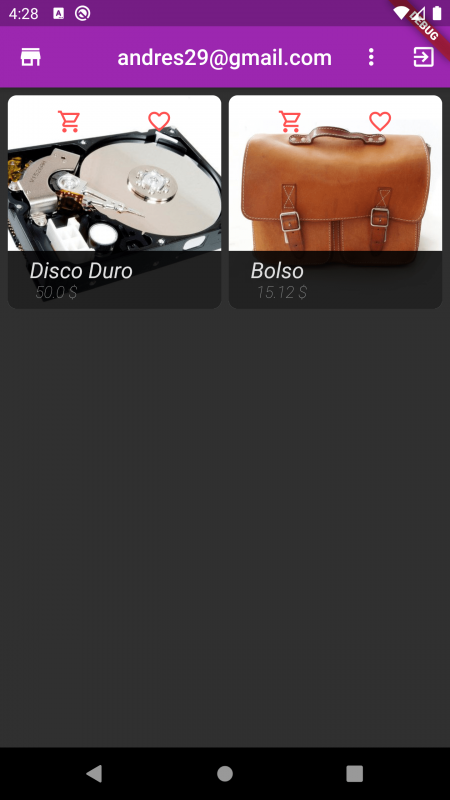
We are going to implement a resource that is part of my Flutter course: the creation of a Grid (GridView) to display elements in rows.
- Design Factors: You can use both factors (orientation and size) or just one, although it is more common to define the display rules based on the screen size to achieve a responsive design.
- Flexibility: The solution we show here is just an idea; you can implement your development and data presentation as best suits your project.
GridView.builder(
                          padding: EdgeInsets.all(7),
                          gridDelegate:
                              SliverGridDelegateWithFixedCrossAxisCount(
                                  crossAxisCount: countItem,
                                  crossAxisSpacing: 7,
                                  mainAxisSpacing: 4),
                          itemCount: products.length,
                          itemBuilder: (context, i) {
                            return GestureDetector(
                              onTap: () {
                                Navigator.pushNamed(context, DetailPage.ROUTE,
                                    arguments: products[i]);
                              },
                              child: ClipRRect(
                                borderRadius: BorderRadius.circular(8.0),
                                child: GridTile(
                                  child: Image.network(
                                    products[i].image,
                                    fit: BoxFit.cover,
                                  ),
                                  header: GridTileBar(
                                      title: Row(
                                    mainAxisAlignment:
                                        MainAxisAlignment.spaceAround,
                                    children: [
                                      Icon(
                                          products[i].inCart
                                              ? Icons.shopping_cart
                                              : Icons.shopping_cart_outlined,
                                          color: Theme.of(context).accentColor),
                                      Icon(
                                          products[i].favorite
                                              ? Icons.favorite
                                              : Icons.favorite_border_outlined,
                                          color: Theme.of(context).accentColor),
                                    ],
                                  )),
                                  footer: Container(
                                      padding: EdgeInsets.symmetric(
                                          horizontal: 20.0, vertical: 6.0),
                                      color: Colors.black87,
                                      child: Column(
                                        crossAxisAlignment:
                                            CrossAxisAlignment.start,
                                        children: [
                                          Text(
                                            products[i].name,
                                            style: TextStyle(fontSize: 20.0),
                                          ),
                                          Padding(
                                            padding: EdgeInsets.only(left: 5.0),
                                            child: Text(
                                              "${products[i].price.toString()} \$",
                                              style: TextStyle(
                                                  color: Colors.grey,
                                                  fontSize: 15.0,
                                                  fontWeight: FontWeight.w100),
                                            ),
                                          )
                                        ],
                                      )),
                                ),
                              ),
                            );
                          }),
As you can see, we are using the `countItem` property with the value we calculated previously to show the number of elements; remember that you can continue adding conditions like this or even create a formula in which you automatically calculate the number of elements based on the screen size.
Full Code
@override
  Widget build(BuildContext context) {
    final Orientation orientation = MediaQuery.of(context).orientation;
    final Size size = MediaQuery.of(context).size;

    int countItem = 2;
    double space = size.width;

    if (orientation == Orientation.landscape) {
      countItem = 3;
    }

    if (space > 800.0) {
      countItem = 4;
    }

    return StoreConnector<AppState, AppState>(
        converter: (store) => store.state,
        builder: (context, state) {
          return Scaffold(
            appBar: AppBar(
              leading: Icon(Icons.store),
              centerTitle: true,
              title: state.user == NULL
                  ? Text("Products")
                  : Text(state.user.email),
              actions: [
                state.user == NULL
                    ? Text('')
                    : IconButton(
                        icon: Icon(Icons.exit_to_app), onPressed: () {})
              ],
            ),
            body: Container(
              child: StoreConnector<AppState, AppState>(
                converter: (store) => store.state,
                builder: (_, state) {
                  return GridView.builder(
                    padding: EdgeInsets.all(8),
                    itemCount: state.products.length,
                    gridDelegate: SliverGridDelegateWithFixedCrossAxisCount(
                        crossAxisCount: countItem,
                        crossAxisSpacing: 8.0,
                        mainAxisSpacing: 8.0),
                    itemBuilder: (_, i) {
                      return GestureDetector(
                        onTap: () {
                          Navigator.pushNamed(context, DetailPage.ROUTE,arguments: state.products[i]);
                        },
                        child: ClipRRect(
                          borderRadius: BorderRadius.circular(6),
                          child: GridTile(
                            header: GridTileBar(
                              title: Row(
                                children: [
                                  Icon(
                                    Icons.shopping_cart_outlined,
                                    color: Theme.of(context).accentColor,
                                  ),
                                  Icon(
                                    state.products[i].favorite ? Icons.favorite :  Icons.favorite_border_outlined,
                                    color: Theme.of(context).accentColor,
                                  )
                                ],
                                mainAxisAlignment:
                                    MainAxisAlignment.spaceAround,
                              ),
                            ),
                            footer: Container(
                                color: Colors.black87,
                                padding: EdgeInsets.symmetric(
                                    horizontal: 20.0, vertical: 10.0),
                                child: Column(
                                  crossAxisAlignment: CrossAxisAlignment.start,
                                  children: [
                                    Text(
                                      state.products[i].name,
                                      style: TextStyle(fontSize: 20.0),
                                    ),
                                    Padding(
                                      padding: const EdgeInsets.only(left: 5.0),
                                      child: Text(
                                        "${state.products[i].price.toString()} \$",
                                        style: TextStyle(
                                            fontSize: 15.0,
                                            fontWeight: FontWeight.w100,
                                            color: Colors.grey),
                                      ),
                                    ),
                                  ],
                                )),
                            child: Image.network(
                              state.products[i].image,
                              fit: BoxFit.cover,
                            ),
                          ),
                        ),
                      );
                    },
                  );
                },
              ),
            ),
          );
        });
  }
LayoutBuilder: the most precise tool for breakpoints
LayoutBuilder gives you the actual width available for the widget, not the whole screen's width. It's more consistent in multi-window, tablets, and desktop.
LayoutBuilder(
 builder: (context, constraints) {
   if (constraints.maxWidth < 600) {
     return HomeViewSmall();
   } else {
     return HomeViewLarge();
   }
 },
);
That's exactly how I resolved the change between the compact view and the split view of my app. If I relied on MediaQuery, the behavior was less precise, especially when the user adjusted the window size.
OrientationBuilder: layouts that react to orientation
With these different breakpoints depending on whether the user is in portrait or landscape, we can customize the experience and relocate the widgets:
OrientationBuilder(
 builder: (context, orientation) {
   final breakpoint = orientation == Orientation.portrait ? 600 : 800;
   ...
 },
);
Expanded and Flexible: dynamic space distribution
Many times we need the content to expand; for this, we have the Expanded widget, which occupies all the space of the parent. So, we place it inside the Container, which, for the sake of making the example more visible, we give a color to the Container to show that now the Containers occupy all the parent's space:
By default, each Expanded occupies the same size proportion of the total size, which means that each Expanded has the same size. But, we can customize this behavior; in our case, we are not interested in each Expanded having the same size, since we want the section for the calendar to have a quarter of the total size; for that, we have to use the flex property, in which the positive integer value is the factor taken to indicate what proportion each Expanded will occupy.
So, if we want it to have a quarter of the size, it means that there are 4 spaces, of which one is assigned to the Expanded of the calendar and the other 3 to the Expanded of the list:
As mentioned, flex is a factor; therefore, if we use values of 2 and 6, or 3 and 9, the behavior would be exactly the same.
class _Content extends StatelessWidget {
  const _Content({Key? key}) : super(key: key);
  @override
  Widget build(BuildContext context) {
    return Row(
      children: [
        Expanded(
            flex: 1,
            child: Container(
              color: Colors.red,
            )),
        Expanded(
            flex: 3,
            child: Container(
              color: Colors.yellow,
            )),
      ],
    );
  }
}
And we will have:

When creating split views, space behavior is key. Flutter solves it with:
- Expanded: occupies all possible space.
- Flexible: can grow or shrink without forcing expansion.
FractionallySizedBox and AspectRatio for proportional control
When I needed to display elements with exact proportions, such as cards that maintained a 16:9 ratio, AspectRatio was perfect:
AspectRatio(
 aspectRatio: 16 / 9,
 child: YourWidget(),
);
And when I needed a widget to occupy only a fraction of the container:
FractionallySizedBox(widthFactor: 0.6);I used this to create a series of demonstrative blocks that varied their width from 40% to 100%.
Responsive patterns that work in real projects
Layout pattern by breakpoints (small / medium / large)
Flutter does not define official breakpoints, but the most common ones are:
- < 600 px → mobile
- 600–840 px → portrait tablet
- > 840 px → desktop or landscape tablet
Split view pattern (two panels)
If you want the typical configuration on a large screen of the menu on one side and the content on the other:
- Side Panel → menu
- Main Panel → dynamic content
A Row + two Expanded widgets were enough:
Row(
 children: [
   Expanded(flex: 2, child: MenuWidget()),
   Expanded(flex: 3, child: DestinationView()),
 ],
);
I adopted <600px to use HomeViewSmall and the rest for HomeViewLarge.
Stacked → side-by-side pattern (practical chat case)
On mobiles, the chat is stacked vertically:
- AppBar
- ChatList
- SendWidget
On large screens:
- PeopleView on the left
- ChatList + SendWidget on the right
This jump was achieved by combining OrientationBuilder + LayoutBuilder.
Responsive GridView based on actual available size
One of the most useful parts was creating a GridView whose number of columns depended on the width and orientation:
int countItem = 2;
if (orientation == Orientation.landscape) countItem = 3;
if (size.width > 800) countItem = 4;
This allows a product grid to adapt perfectly to mobiles, tablets, and large screens.
Correcting 'MediaQueryData.fromWindow' is deprecated and shouldn't be used in Flutter
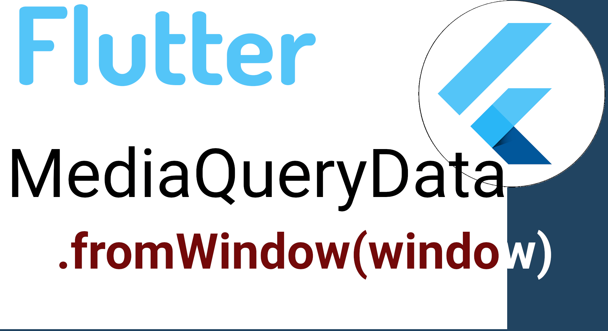
We will see how to correct the error:
'MediaQueryData.fromWindow' is deprecated and shouldn't be usedMediaQueryData.fromWindow is a Flutter function used to get information about the window in which the application is running. This window can be a mobile device, a browser, or a desktop application, really any device supported by Flutter. It is usually used to get the window size using:
MediaQueryData.fromWindow(window)But, in recent versions of Flutter, its use is discouraged as it is deprecated; it is important to mention that what is deprecated is the constructor and not the class or API; now, if you want to get the equivalent of the previous function, you should use:
MediaQueryData.fromView(View.of(context));For example:
screenWidth = MediaQueryData.fromView(View.of(context)).size.width;
screenHeight = MediaQueryData.fromView(View.of(context)).size.height;
Frequently Asked Questions (FAQ)
- MediaQuery or LayoutBuilder?
- MediaQuery → information about the entire device.
LayoutBuilder → the actual size of the widget.
For breakpoints: LayoutBuilder wins.
- MediaQuery → information about the entire device.
- How to create a split view in Flutter?
- With a Row + two Expanded widgets with different flex.
- How many breakpoints to use?
- 2 or 3 is enough: <600, 600-840, >840.
- How to make a responsive GridView?
- By calculating columns based on orientation + width.
Conclusion
Flutter offers everything needed to create truly responsive interfaces, from basic widgets like Row and Expanded to advanced tools like LayoutBuilder or OrientationBuilder. When I built my own app, I understood that the important thing is not to "make it look the same everywhere," but to build smart layouts that adapt to the available space.
Do this right, and your app will feel native on any device; many times you want to categorize - for example - by device type, whether it's a phone, a tablet, a TV, a web... for this, you can use the types listed in Dart and Flutter.