In the previous post we talked about how to install Flutter, which IDEs we can use, which would basically be Android Studio and/or Visual Studio Code, and we also gave an introduction to the world of Flutter widgets by creating a card that is actually a Widgets with some content, text and images that are widgets too; To see the entry you can go to the following link:
Getting started with Flutter from scratch: My first app.
Today we are going to continue working on Flutter but we are going to see directly an element that is essential in any interface, the element to process actions par excellence, such as the button, and that Flutter is actually a widget; which goes perfectly well with the Cards or Letters that we saw previously in another entry on Android with Java / Kotlin.
The buttons in Flutter
Flutter, like any emerging technology, wants to gain a foothold in the market and for this reason the framework contains a large number of buttons that we can use in our applications; and the buttons are not far behind; In this entry I bring you the main buttons that we have and can use in our applications; There are other types of buttons such as the button for a bar: Button Bar, but we will not deal with these in this entry as it is a very specific button and it serves us more as a container than for anything else.
So at this point I present the most interesting buttons that we can use in our application and I give you a summary of them; although the ideal is that you take this reference content and support it and see and test the buttons in your applications yourself, that you see all the properties that we can configure to the buttons and not just a summary.
Floating Action Button or Floating Action Button in Flutter
The first button that we will see is the famous Android Floating Button from Material Design that we can easily implement in Flutter using a widget:
FloatingActionButton( child: Icon(Icons.access_time), elevation: 50.0, backgroundColor: Colors.amber, ),As you can see, with this widget we can create a floating action button or the Float Action Button; we can define a background color, like a soft orange like the one we put here, as well as an icon and we can even define the elevation to define the shading, which is a fundamental aspect in Material Design.
Remember that all these are components or widgets in Flutter, they have similar and unique characteristics with respect to the entire range of widgets that exist in Flutter, but all of them are essentially widgets; therefore do not expect it to automatically position itself in one of the corners of your screen.

To create a button in Flutter we have to use the following lines of code
RaisedButton(
 child: Text("Back"),
 onPressed: () => Navigator.pop(context),
)
The onPressed property is available for all buttons in general, and to know what properties you can use in each of the buttons in Flutter, since they have their variants, you can consult the official documentation or the autocompletion of Android Studio or Visual Studio Code.
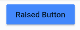
Raised Button in Flutter
The Raised Button, is a classic button in Flutter, it would be the default Button that we have in Android; that simple; here we can see some of the properties that it can take; to define the background color, or the splashColor and of course the text and the other elements that are already repeated here:
RaisedButton( disabledColor: Colors.amber, child: Text("Raised Button"), splashColor: Colors.amber, color: Colors.blueAccent, onPressed: () { print("Hola Raised Button") }, ),As you can see, we have several properties reflected in the previous lines of code, although they are not all, we have to indicate the color of the button, we define the text through a widget, the text color and again we define a function for the click event.
Flat Button in Flutter
The next buttons that we are going to see are known as FlatButton, which are simple buttons, in the same style that the buttons in iOS have, we have them in Flutter; of them we can modify aspects such as the letter, its color, size and type; but note that they are simple buttons without background color, for these cases there are other buttons as you can see in our publication:
FlatButton( child: new Text('Flat Button'), )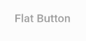
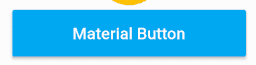
Material Button in Flutter
The Material Buttons are the buttons for the Material Design that we can see in Android, they are the norm nowadays for the development of Android applications that are modern; as you can see with little more than what we define here:
MaterialButton(
    minWidth: 200.0,
    height: 40.0,
    onPressed: () {},
    color: Colors.lightBlue,
    child: Text('Material Button', style: TextStyle(color: Colors.white)),
  ),
We have a blue button with the characteristic ripple that occurs on our buttons and is called ripple in our application; We can define their dimensions for practically all the buttons with the width and height attributes and in addition to the color of the text and in some cases in the background as well and the rest of the properties that you see here; In the same way, to obtain the complete list, you can see it from the official documentation or from the IDE itself.
As you can see, there is a button for everything, if you do not have enough space in your app and you want to point out an important function in your app, then use a Float Action Button, if you want a button that looks good and gives a good design to your app, use a Material Design Button, and to have a simple button that doesn't attract too much attention you can use an Icon Button or a Flat Button, for a classic design a Raised Button would be good for you.
Finally, I leave you all the code of the application so that you can run it yourself and carry out all the tests you want:
import 'package:flutter/material.dart';
void main() => runApp(MyApp());
class MyApp extends StatelessWidget {
  @override
  Widget build(BuildContext context) {
    // TODO: implement build
    return MaterialApp(
      home: Scaffold(
        appBar: AppBar(
          title: Text('MiLista2'),
        ),
        body: Card(
          child: Center(
            child: Column(
              children: <Widget>[
                Image.asset('assets/codeigniter.png'),
                Text("Curso en CodeIgniter"),
                IconButton(
                  icon: Icon(Icons.access_alarms),
                  tooltip: "Mensaje",
                ),
                FloatingActionButton(
                  child: Icon(Icons.access_time),
                  elevation: 50.0,
                  backgroundColor: Colors.amber,
                ),
                MaterialButton(
                  minWidth: 200.0,
                  height: 40.0,
                  onPressed: () {},
                  color: Colors.lightBlue,
                  child: Text('Material Button',
                      style: TextStyle(color: Colors.white)),
                ),
                RaisedButton(
                  disabledColor: Colors.amber,
                  child: Text("Raised Button"),
                  splashColor: Colors.amber,
                  color: Colors.blueAccent,
                  onPressed: ()  {
                    print("Hola Raised Button");
                  },
                ),
                FlatButton(
                  child: new Text('Flat Button'),
                )
              ],
            ),
          ),
        ),
      ),
    );
  }
}
Finally, our application has the buttons that you can see in the promotional image.
Of course, here are links to the official documentation:
FloatingActionButton in Flutter with four sizes: Extended, Large, Regular, and Small
FloatingActionButton is a Flutter widget that provides a circular floating button that is commonly used for secondary actions and additional functionality in an app. The button can have an icon or text inside it, and it can float on top of other UI elements. The button's visual layout automatically adapts to the platform the app is running on. It can be used in combination with other widgets, such as the Scaffold and AppBar, to improve the functionality and visual appearance of the application.
One of the latest additions that Flutter brings us, is that now the FloatingActionButton class allows us to define the size of the button:
For that we can use the named constructors, if we want to apply the NEW buttons:

Extended floating button
FloatingActionButton.extended(
            onPressed: () {}, label: Text("Extendido")),
FloatingActionButton Long or big
FloatingActionButton.large(
         child: Icon(Icons.plus_one),
         onPressed: (){
       }),
Regular
 floatingActionButton: FloatingActionButton(
          child: Icon(Icons.plus_one),
          onPressed: (){
        }),
Small floating button
floatingActionButton: FloatingActionButton.small(
          child: Icon(Icons.plus_one),
          onPressed: (){
        }),
Conclusions
- As you can see, the regular button is the standard or default button and therefore we should not indicate any named constructor.
- We have to define one more parameter for the extended button, the label, which due to its composition would be a text; the rest of the buttons is the definition that we follow with the previous scheme, to indicate a child for the icon and other additional aspects that you want to customize.
Floating action button position in Flutter or how to change the floating button position - 2 WAYS
Content Index
- The buttons in Flutter
- Floating Action Button or Floating Action Button in Flutter
- Raised Button in Flutter
- Flat Button in Flutter
- Material Button in Flutter
- FloatingActionButton in Flutter with four sizes: Extended, Large, Regular, and Small
- Extended floating button
- FloatingActionButton Long or big
- Regular
- Small floating button
- Conclusions
- Floating action button position in Flutter or how to change the floating button position - 2 WAYS
- First way: using FloatingActionButtonLocation
- Second way: using Columns and Rows
- Structure Explanation
- Summary and Recommendations
- From RaisedButton to ElevatedButton in Flutter
- Define the style of the ElevatedButton
- How to refresh previous page when using back button in Flutter?
- Navigation in Flutter
I want to show you how you can change the location of your Floating Action Button (FAB) in Flutter. You can position it to the right, in the center, or to the left, as you see on screen. In this case, I have it in the center, but you can adjust it according to your user preference.
For example:
If I go to the posts, I can place it on the right.
- Then, I can move it to the left.
- It's also possible to adjust its position using padding or other configurations.
First way: using FloatingActionButtonLocation
One option is to use the Scaffold property called floatingActionButtonLocation:
Scaffold( floatingActionButtonLocation: FloatingActionButtonLocation.centerFloat, ... )This allows you to quickly define the FAB's position: center, left, or right.
It's the method recommended by the Flutter documentation.
It works well on large screens, but may have limitations on small screens.
Second way: using Columns and Rows
Another way to position the FAB is by using Columns and Rows.
In this case, your FAB is not an independent button, but a composite widget, which can include several elements, such as columns, additional buttons, or custom content.
This allows for more flexibility, but requires manually managing the alignment.
Example implementation with columns:
enum FABPosition { left, right, center } if (appModel.fabposition == FABPosition.center.toString()) { _floatingActionButtonLocation = MainAxisAlignment.center; _floatingActionButtonLocationCross = CrossAxisAlignment.center; } else if (appModel.fabposition == FABPosition.left.toString()) { _floatingActionButtonLocation = MainAxisAlignment.start; _floatingActionButtonLocationCross = CrossAxisAlignment.start; }Then, in the Scaffold:
Scaffold( floatingActionButton: Padding( padding: const EdgeInsets.only(left: 30), child: Column( crossAxisAlignment: _floatingActionButtonLocationCross, mainAxisAlignment: MainAxisAlignment.end, children: [ widget.showLastCourseWidget && appModel.showLastCourseWidget ? lastClassViewInCourse() : const SizedBox(), const SizedBox(height: 10), fab ?? const SizedBox(), ], ), ), )Structure Explanation
- Use of MainAxisAlignment and CrossAxisAlignment to control the horizontal and vertical alignment of the FAB.
- _floatingActionButtonLocationCross and _floatingActionButtonLocation determine whether the button is on the left, right, or center.
- Padding is used to adjust the FAB's separation from the edges.
- Column allows placing several widgets on top of each other, such as a shortcut to the last course (lastClassViewInCourse()) and the main FAB.
Summary and Recommendations
- The standard way is to use FloatingActionButtonLocation, defined by Flutter, to position it quickly.
- If you need more control or are using custom widgets, you can use Columns and align using MainAxisAlignment and CrossAxisAlignment.
- On small screens, the standard method may not work correctly, and the Columns approach is more flexible.
- With this system, you can define dynamic positions based on user configuration.
From RaisedButton to ElevatedButton in Flutter
I wanted to give you a quick demonstration on how you can migrate from a RaisedButton to an ElevatedButton, which is the new widget that we have to use starting with Flutter in version 2; remember that a normal RaisedButton looks like the following:
RaisedButton(
              color: Colors.purple,
              textColor: Colors.white,
              onPressed: () {
                // hacer algo
              },
              child: Text("Ir a la página dos"),
            ),
Generally we define the background color (color) and the text color (textColor).
If we want to migrate to the ElevatedButton, we can no longer define style issues through properties that are natively part of the ElevatedButton, instead we only have a property called style in which we can define design issues:
 ElevatedButton(
              style: ###TU ESTILO###
              child: Text("Ir a la página uno"),
),
Define the style of the ElevatedButton
With the ElevatedButton.styleFrom, we can define the style of our ElevatedButton:
final ButtonStyle raisedButtonStyle = ElevatedButton.styleFrom(
    onPrimary: Colors.white,
    primary: Colors.purple,
    padding: EdgeInsets.symmetric(horizontal: 16),
);
And with this we pass it on; Now with this we can define the style of our buttons so that it works similar to that of the RaisedButton
- With primary we have the main button of the component, the background color
- And the one in onPrimary affects the text color and the ripple effect:
ElevatedButton(
              style: raisedButtonStyle,
              onPressed: () {
                // hacer algo
              },
              child: Text("Ir a la página uno"),
),
How to refresh previous page when using back button in Flutter?
When we work with CRUD-type operations in any programming language, framework, etc., when we are in the creation or update phase, generally at the end of this process we automatically return to the listing page, which must reflect the changes reflected in the processes of insertion or update of these records; for these cases, when we are working in Flutter it may not be entirely clear how we can do this update of the list view; We're no longer talking about firing a function when the back button is pressed, as this would only affect the current page before back.
Navigation in Flutter
Let's remember that, when we want to go from one page to another, we have to use a navigation component that we have thanks to a class called Navigator in Flutter; What may not be so clear is that this same navigation works for us when we go back to execute the code that we want to execute when we return to the initial page, which in our example would be the list page; we can intercept when we route with the Navigator class by using the then function, which is a promise function:
ListTile(
          title: Text(notes[i].title),
          trailing: MaterialButton(
            onPressed: () => Navigator.pushNamed(context, SavePage.ROUTE,
                    arguments: notes[i])
                .then((value) => setState(() {
                      _loadData();
                    })),
            child: Icon(Icons.edit),
          )),
Therefore, in our example, we have a function to reload the data, which is the same one we used to load the data initially.
Next step, learn how to use the Widget Card in Flutter.