
Theming in Flutter is one of those things that seems simple... until you try to adapt your app to a specific visual identity. It's happened to me: you start with ThemeData.dark() or ThemeData.light(), and when you want to replicate a client's actual branding, suddenly you need to adjust everything from the primary color to the styles of your custom widgets.
In this guide, I'll tell you how to create custom themes in Flutter from scratch, how to leverage ThemeData, ColorScheme, copyWith, ThemeExtension, and even Material Design 3. All with real-world examples I use in my own apps.
Previously we saw how to use Enum with extensions in Flutter
What theming in Flutter is and why it's key for visual identity
Google's Material package comes with two built-in themes: a light version (which is the default) and a dark version.
Additionally, Flutter offers two ready-to-use design systems: Material (Android) and Cupertino (iOS). Both work great as a starting point, but rarely reflect the real visual style of a brand. In my case, I usually start with Material because it offers more immediate control and a very complete theming API.
When an app needs to convey a certain personality (colors, typography, components), customizing the theme becomes essential.
Material vs Cupertino: when to use each approach
- Material: ideal if you want a modern, consistent, cross-platform look. Its ThemeData is very comprehensive.
- Cupertino: perfect for very iOS-style apps, but limited in theming.
Personally, I only use pure Cupertino when the design must look 100% native iOS. In all other cases, Material gives me more freedom.
Starting with ThemeData: the foundation of theming in Flutter
ThemeData is the heart of the theme system in Flutter. From here you control colors, typography, visual density, components, shapes, and more.
ThemeData is the heart of the theme system in Flutter. From here you control colors, typography, visual density, components, shapes, and more.
Light and Dark Theme: first steps
A basic example:
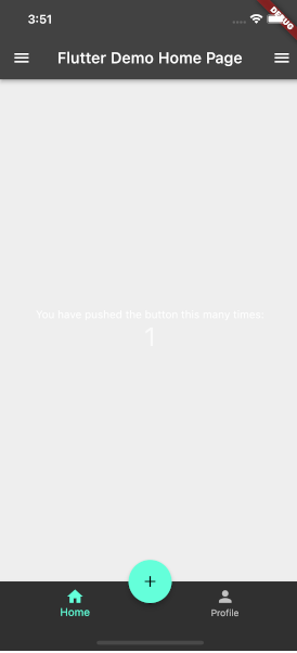
class MyApp extends StatelessWidget {
  @override
  Widget build(BuildContext context) {
    return MaterialApp(
      title: 'Flutter Demo',
      theme: ThemeData.dark(),
      home: MyHomePage(title: 'Flutter Demo Home Page'),
    );
  }
}
Adjusting colors, typography, and global styles with ThemeData
We can easily change colors, with certain key properties like the following, as well as typography. Here, the best help is the autocomplete feature of editors like VSC with Control + Space:
theme: ThemeData(
 primaryColor: Colors.purple[800],
 fontFamily: 'Roboto',
),
Practical tips to avoid common errors when modifying themes
- Don't mix primaryColor with colorScheme.primary without understanding how they combine.
- Check your app in both light and dark mode from the start.
- Don't apply "hardcoded" styles to widgets... use the theme whenever possible.
Customizing colorScheme for solid branding
If you want visual precision and consistency, colorScheme is the right way to go. Here you define your full palette: primary, secondary, error, surface, background, outline, etc.
colorScheme: ColorScheme.fromSeed(
 seedColor: Colors.purple,
 brightness: Brightness.dark,
),
This way, we are changing an existing style and customizing it to our liking.
Managing colorScheme in light and dark mode
Always define both:
- theme: ThemeData(colorScheme: lightScheme),
- darkTheme: ThemeData(colorScheme: darkScheme),
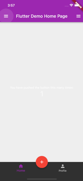
Extending an existing theme with copyWith
It is also possible to take an existing theme and overwrite only certain properties. To extend a theme, you can use the copyWith method to extend it and pass your custom styles; we do the same with the colorScheme property, where we have a color palette that we can customize, and to avoid setting all of them, we use copyWith to reuse existing styles.
ThemeData.dark().copyWith(
  colorScheme: ColorScheme.fromSwatch().copyWith(
    primary: Colors.purple,
    secondary: Colors.red,
  ),
);
The main content of the app appears dark with light text. However, the AppBar is not black like the previous dark theme experiment. The AppBar is purple. The button is red as it is the secondary color:
How to apply styles to custom widgets using Theme.of(context)
When I build my own widgets, I always make their styles dependent on the current theme. This prevents "hardcoded" components that don't change with dark mode, for example.
class _MyHomePageState extends State<MyHomePage> {
  // ...
  @override
  Widget build(BuildContext context) {
    return Scaffold(
      // ...
 floatingActionButton: FloatingActionButton(
        onPressed: () {},
        tooltip: 'Increment',
        backgroundColor: Theme.of(context).primaryColor,
        foregroundColor: Theme.of(context).colorScheme.primary,
        child: const Icon(Icons.add),
      ),
    );
  }
}
Frequent errors when not using Theme.of(context)
- Widgets that don't change in dark mode.
- Buttons that don't match the rest of the theme.
- Incorrect contrasts.
Practical example with a custom button
class CustomButton extends StatelessWidget {
 @override
 Widget build(BuildContext context) {
   final scheme = Theme.of(context).colorScheme;
   return ElevatedButton(
     onPressed: () {},
     style: ElevatedButton.styleFrom(
       backgroundColor: scheme.primary,
       foregroundColor: scheme.onPrimary,
     ),
     child: const Text('Guardar'),
   );
 }
}
Conclusion
Creating custom themes in Flutter isn't just about changing colors: it's about building a solid, coherent, and maintainable visual identity. With ThemeData, colorScheme, copyWith, ThemeExtension, and Material 3 you have all the tools to do it professionally.
In my experience, the biggest leap in quality happens when you stop applying styles directly to widgets and start delegating everything to the global theme.
Frequently Asked Questions about Custom Themes in Flutter
- Should I use ThemeData or ThemeExtension?
- It depends: ThemeData for standard things, ThemeExtension for what doesn't exist.
- Can I mix Material Design 2 and 3?
- Yes, but it's not recommended in the long run.
- How do I switch the theme between light and dark?
- With themeMode: ThemeMode.system or a manual toggler.
The next step is to learn how to create animations in Flutter.