The clip-path CSS property allows you to define which part of an HTML element is shown and which part remains hidden, using geometric shapes or custom paths. Thanks to it, we can move beyond designs based solely on rectangles and create much more attractive visual cutouts, especially for images, cards, and interactive elements.
clip-path is like a "window": everything inside the shape is rendered, and everything outside simply disappears.
Previously we saw how to use CSS positioning.
What is the clip-path CSS property
clip-path defines a clipping path that delimits the visible area of an element. Any part of the content that falls outside that path is not rendered.
What clip-path is for and when to use it
- Creating circular, triangular, or polygonal cutouts.
- Designing more dynamic interfaces without edited images.
- Applying visual effects on hover and animations.
- Replacing old techniques based on images or complex SVG.
Differences between clip and clip-path (deprecated property)
The property `clip` existed for a time, but it is now deprecated. It only allowed rectangular cutouts and required absolute positioning.
clip-path, on the other hand:
- Supports multiple shapes.
- Works with percentages and flexible units.
- Can be animated.
- Is compatible with SVG.
Therefore, using `clip` today makes no sense.
What happens to content outside the clipping path
The content:
- Is not displayed.
- Does not affect the layout.
- Still exists in the DOM (it is only visually hidden).
Syntax and values of the clip-path property
The basic syntax is very simple:
.element { clip-path: value;}Possible values for clip-path
- none: does not apply any clipping.
- Geometric shapes: circle(), ellipse(), inset(), polygon().
- url(): reference to a <clipPath> defined in SVG.
Using shape functions in clip-path
Shape functions are the heart of clip-path. They allow for flexible and precise clipping definition.
Coordinates and reference system for clipping
Coordinates are calculated relative to the element's box:
- The X-axis goes from left to right.
- The Y-axis goes from top to bottom.
- Percentages or absolute units can be used.
When working with real examples, using percentages makes the clipping much easier to be responsive.
Geometric shapes available in clip-path
Let's see how to define multiple geometric shapes:
Defining rectangles with inset() and polygon():
clip-path: inset(10% 12% 14% 16%);inset() creates rectangles by "clipping inwards."
The same can also be achieved with polygon() by defining four points.
inset() is ideal for simple cutouts and polygon() when more control is needed.
Creating circles with circle()
clip-path: circle(48% at 50% 50%);Allows creating centered or offset circles. It is very common for avatars or spotlight effects.
Ellipses and ovals with ellipse()
clip-path: ellipse(50% 30% at center top);Works the same as circle(), but with different radii in X and Y.
Complex polygons with polygon()
clip-path: polygon( 5% 5%, 100% 0%, 100% 75%, 75% 75%, 75% 100%, 50% 75%, 0% 75%);This is where clip-path really shines. You can create:
- Triangles
- Stars
- Arrows
- Custom shapes
For these cases, I usually rely on visual generators like Clippy, because defining points by hand can be tedious.
Practical examples of clip-path on images
Base image and region of interest
A trick I always recommend is to use a single base image and only modify the clip-path. This makes it much easier to understand how coordinates affect the final result.
Rectangular cutout applied to images
clip-path: polygon(0% 57%, 100% 57%, 100% 100%, 0% 100%);Circular and elliptical cutouts
clip-path: circle(48% at 78% 57px);Cutout with custom polygons
This type of cutout is ideal for highlighting specific areas of an image without prior editing.
The CSS clip-path property allows you to specify regions for any existing HTML element through geometric shapes such as circles, ellipses, squares, rectangles, and polygons:
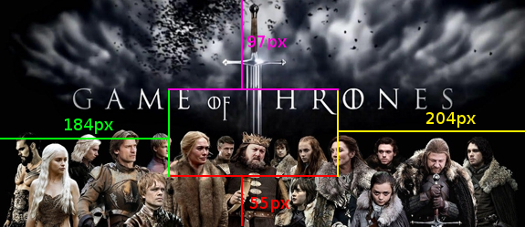
Once these regions are selected, they proceed to be rendered according to the selected shapes:

Below is the table of contents for this article where we will take the first steps with CSS clip-path:
- Selecting and rendering the region of interest through attributes
- Examples of images with the clip-path property
- Animations with the clip-path property
1.0 Selecting and rendering the region of interest through attributes
There are several values we can use to select regions of interest for HTML elements, which allows for easy adaptation to our needs:
| circle(<cx>, <cy>, <r>) |
| ellipse(<cx>, <cy>, <rx>, <ry>) |
| inset(<x1>, <y1>, <x2>, <y2>) |
| polygon(<x1> <y1>, <x2> <y2>, ..., <xn> <yn>) |
Where:
| <cx> and <cy> | Center of the "x" coordinate and "y" coordinate respectively |
| <rx> and <ry> | Radius of the "x" coordinate and "y" coordinate respectively |
| <x> and <y> | "x" coordinate and "y" coordinate respectively |
2.0 Examples of images with the clip-path property
In this section, we will see some practical examples of how the clip-path property works. For this, we will use the following reference image:
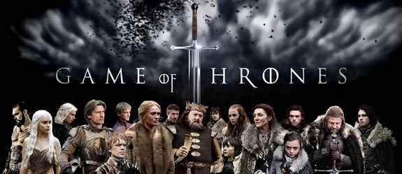
The prefixes -webkit- and -moz- will be used to maintain compatibility with most browsers.
2.1 Defining rectangles with the clip-path property
It is possible to select a rectangular section of the image with the value polygon set as the value for the clip-path property where we will define four points with their "x" and "y" coordinates (one point for each of the corners):
The CSS
clip-path: polygon(0% 57%, 100% 57%, 100% 100%, 0% 100%); By setting the above CSS, we get the following result:

A similar behavior can be obtained with the value inset by setting its four parameters:
clip-path: inset(10% 12% 14% 16%); 
2.2 Defining circles with the clip-path property
Now suppose we want to select a participant of the series using a circumference, we can perform this task by using the value circle of the clip-path property:
The CSS
clip-path: circle(48%, 78%, 57px);
2.3 Defining ellipses with the clip-path property
Now we will select the upper part of the image using the value ellipse of the clip-path property:
The CSS
clip-path: ellipse(50%, 30%, 50%,28%); 
2.4 Defining polygons with the clip-path property
We can create polygons as complex as we desire by adding as many points ("x" and "y") as vertices we want the polygon to have:
The CSS
clip-path: polygon(5% 5%, 100% 0%, 100% 75%, 75% 75%, 75% 100%, 50% 75%, 0% 75%);
3.0 Animations with the clip-path property
We can also use the clip-path property in conjunction with other CSS properties such as animation:
3.1 clip-path and animation
The CSS
	img.animacion1{
	  clip-path: polygon(0% 57%, 100% 57%, 100% 100%, 0% 100%);
	  animation: animation-clip-path 3s infinite;
              opacity:0.5;
	}
	@keyframes animation-clip-path {
	    from { clip-path: polygon(35% 57%, 41% 57%, 44% 100%, 35% 100%); opacity:0.5;}
	    to { clip-path: polygon(0% 0, 100% 0%, 100% 100%, 0% 100%); opacity:1;
	}
3.2 clip-path, hover, and animation
And of course, we can use the pseudo class hover in the process; try positioning the cursor over the following image:
The CSS
	img.animacion2{
		clip-path: polygon(0% 57%, 100% 57%, 100% 100%, 0% 100%);
	}
	img.animacion2:hover{
		clip-path: polygon(0% 57%, 100% 57%, 100% 100%, 0% 100%); /*personajes*/
		animation: animation-clip-path-hover 2s infinite;
	}
	@keyframes animation-clip-path-hover {
	  0% {
	    clip-path: polygon(0% 57%, 100% 57%, 100% 100%, 0% 100%); /*personajes*/
	  }
	  50% {
	    clip-path:polygon(0% 0, 100% 0%, 100% 100%, 0% 100%);
	  }
	  100% {
	    clip-path: polygon(0% 57%, 100% 57%, 100% 100%, 0% 100%); /*personajes*/
	  }
	}
Position the cursor over the image.
You can view and download all the examples given so far in the following links:
Animations with the clip-path property
One of the most interesting parts of clip-path is that it can be animated.
Animating clip-path using @keyframes
img.animacion1 {
 clip-path: polygon(0% 57%, 100% 57%, 100% 100%, 0% 100%);
 animation: animation-clip-path 3s infinite;
 opacity: 0.5;
}
@keyframes animation-clip-path {
 from {
   clip-path: polygon(35% 57%, 41% 57%, 44% 100%, 35% 100%);
   opacity: 0.5;
 }
 to {
   clip-path: polygon(0% 0, 100% 0%, 100% 100%, 0% 100%);
   opacity: 1;
 }
}
Transitions combining clip-path and opacity
Combining both properties smooths the visual effect considerably.
clip-path and infinite animations
Ideal for:
- Hero sections
- Animated banners
- Decorative elements
clip-path, hover, and user interaction
Hover effects using clip-path
img.animacion2:hover { animation: animation-clip-path-hover 2s infinite;}Clipping animations on cursor hover
This type of interaction works especially well in galleries or cards.
This is one of the uses that generates the most visual impact with very little code.
- Common use cases
- Interactive cards
- Portfolios
- Image galleries
- Featured sections
clip-path with SVG and custom paths
- Using clip-path with inline SVG
- A <clipPath> can be defined inside an SVG and reused.
- Referencing clipPath from external SVG files
clip-path: url(path.svg#shape);
- Current limitations of path()
- The path() function allows for complex paths, but it is not fully compatible in all browsers, so it should be used with caution.
Browser compatibility of clip-path
Current compatibility
Since 2020, clip-path has stable support in major modern browsers.
CSS prefixes and fallback
In real projects, I usually add the -webkit- prefix to ensure compatibility in WebKit-based browsers.
Recommendations for production
- Use percentages whenever possible.
- Test in various browsers.
- Define an acceptable design without clip-path as a fallback.
Differences between clip-path and mask in CSS
- When to use clip-path
- Clear geometric shapes.
- Defined cutouts.
- Shape animations.
- When to use mask-image
- Partial transparencies.
- Gradients.
- More complex pixel-level effects.
- Clipping vs. masking
- clip-path clips, mask controls pixel-level visibility. They are different tools for different problems.
Frequently Asked Questions about clip-path in CSS
- Can clip-path be used on text?
- Yes, it can be applied to any HTML element, including text.
- Does clip-path affect the layout?
- No. It only affects visual rendering.
- Can clip-path be animated in all browsers?
- In modern browsers, yes. In others, it is advisable to test.
- Is it recommended to use clip-path in real projects?
- Yes, as long as it is used judiciously and compatibility is validated.
Conclusion
The clip-path CSS property is a powerful, flexible, and increasingly used tool. It allows for the creation of modern, interactive, and visually appealing designs without relying on external images or JavaScript.
In my case, moving from static cutouts to animations with clip-path completely changed the way I design visual interfaces in CSS.
If you want to experiment, the best thing is to try it out, move points, and animate shapes. That's where its potential is truly understood.
Learn how to round the corners of HTML elements using only CSS and without images.
