When we talk about CSS grids, we tend to lump concepts that are not exactly the same into the same category. And understanding this difference is key to avoiding complications from minute one.
An adaptive grid is one that adjusts fluidly to the available space. It usually relies on relative measures, like percentages (%), so that the columns grow or shrink according to the container's width. It doesn't need to break at specific points.
A responsive grid, on the other hand, reacts to different screen sizes. This involves media queries, structural changes, and, in more modern approaches, CSS Grid with auto-fit, auto-fill or minmax().
Differences between adaptive grid and responsive grid
- Adaptive: flows continuously, ideal for simple layouts.
- Responsive: changes behavior according to the device.
When to use one or the other according to the project
- Simple landings → adaptive grid
- Websites with complex layouts → responsive grid
- Large projects → combination of both
Why create a CSS grid system without frameworks?
There are a large number of CSS frameworks that already come with pre-built grid systems. Bootstrap and Tailwind are well-known examples. The problem is that we often use them without understanding what's underneath.
I often choose to create my own system because I want total control and to avoid unnecessary dependencies. Furthermore, when you build a grid from scratch, you can then adapt it to any project.
Limitations of traditional CSS frameworks
- Rigid structures
- Class overload
- Constant mental calculations (12 columns, offsets, etc.)
Advantages of understanding and building your own grid
- Lighter code
- Greater flexibility
- Real CSS learning
Designing a simple CSS grid system
Before writing a single line of code, decisions must be made.
Why use 10 columns instead of 12
Most frameworks use 12 columns. I preferred 10 columns for a very simple reason: avoiding decimals. Working with 10, 20, 30% is much more direct and reduces errors.
This system can be easily adapted if the project requires it, but for learning and reuse, it greatly simplifies the process.
How to define the base grid container
The grid is composed of rows and columns. Each column will have a relative width and share common rules.
Designing our grids
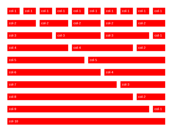
We will choose to create a maximum of ten columns per row instead of the twelve columns that most CSS frameworks currently have as a maximum in their core, as is the case with Bootstrap, simply for the fact of containing measures without a decimal part and it will help to simplify the exercise; however, it can be easily adapted to the needs you have; let's see:

Grid size one (1).
We will also create the different sizes to address all needs:

Grid size one (1) to ten (10).
One of the questions that may occur to us so far is:
Adaptive grids in CSS using percentages (%)
One of the most used measures today for the creation of modern responsive sites are percentages (%); percentages are measures relative to the size of their container and, being relative measures, they allow the elements that use them in the definition of their width or height to be easily adapted to the available size:
.e_mitad{ width: 50%;}.e_mitad{ width: 50%;}In turn, we will have ten types of sizes to display a maximum of 10 columns per row; you can see the sizes referenced in the following CSS code:
Definition of columns from 1 to 10 in CSS
.col-1{ width: 10%;}.col-2{ width: 20%;}.col-3{ width: 30%;}.col-4{ width: 40%;}.col-5{ width: 50%;}.col-6{ width: 60%;}.col-7{ width: 70%;}.col-8{ width: 80%;}.col-9{ width: 90%;}.col-10{ width: 100%;}The percentages are calculated relative to the size of the container. This allows the design to automatically adapt to the available space. When I first tested this approach, I understood why responsive design doesn't need to be complicated.
Column alignment and box model
The previous code is not enough to display the grids in an aligned way; we must have a common CSS code for all columns:
[class^=col]{ float:left; height:auto; box-sizing: border-box;}Did you know? Thebox-sizingproperty with the valueborder-boxallows breaking the default model that CSS has when altering the container size by varying the border thickness and padding; which is a tremendous advantage for creating a grid system easily and effortlessly, as we saw in this post.With these classes, you can build very fast combinations without depending on any external framework.
How to make a CSS grid responsive
Once you have a solid adaptive grid, making it responsive is much simpler.
- Relative measures vs. fixed measures
- Fixed measures limit the design. Relative ones allow the layout to breathe and adapt.
- Adapting the grid to different screen sizes
- This is where media queries come in to reorganize columns when the space is no longer sufficient.
Natural evolution: responsive grids with CSS Grid
- When the project grows, CSS Grid becomes a very powerful tool.
- When to make the jump from percentages to CSS Grid
- If you need two-dimensional control (rows and columns), CSS Grid is the best option.
- auto-fit, auto-fill, and minmax() explained simply
- These functions allow the browser to automatically calculate how many columns fit based on the available space, without breaking the design.
Percentages, CSS Grid, or media queries?
There is no single correct answer.
- Practical comparison between approaches
- Percentages: simple and fast
- CSS Grid: complex layouts
- Media queries: fine adjustments
- Which solution to choose according to the type of layout
- Usually, combining approaches often yields the best results.
Common mistakes when creating responsive CSS grids
- Overloading the system from the start
- Starting with something too complex often generates more problems than solutions.
- Not thinking mobile first
- Designing for large screens first is one of the most common mistakes.
Frequently asked questions about adaptive and responsive CSS grids
- Can a responsive grid be made without Bootstrap?
- Yes, and you will also better understand how CSS works.
- How many columns should a grid have?
- As many as your project needs. There is no magic number.
- Does CSS Grid replace classic grids?
- It doesn't replace them, it complements them.
Conclusion: how to create adaptive and responsive grids that really work
Creating adaptive or responsive grids in CSS is not about copying code, but about understanding the system. When you master the basics, you can scale from a simple percentage-based grid to complex layouts with CSS Grid without losing control.
