
With the Flexbox property, we can create complete adaptable or responsive sites in a very easy way; Flexboxes can adjust to different screen resolutions; they also possess a series of properties that help when adapting Flexboxes to different devices with the help of Media Queries.
Flexboxes are a considerable improvement that avoid using properties like float or position in conjunction with others when what is truly desired is simply to build flexible and fluid boxes with different sizes that are easily adaptable to the device's resolution (meaning PC, phone, tablet, among others).
Flexbox CSS is one of those technologies that, when you understand it well, completely changes the way you layout a website. In my case, it was the turning point for leaving behind solutions with float, position, and inelegant combinations that only sought to "make the boxes fit."
With Flexbox, we can create flexible, fluid layouts adaptable to any screen resolution in a much more natural way. It not only facilitates responsive design but also allows us to focus on the actual structure of the content without constantly fighting with CSS.
In this guide, I explain what Flexbox is, how it works, and how to use it in real projects, step by step.
What is Flexbox in CSS and what is it for?
Flexbox, or flexible box model, is a CSS layout system designed to distribute and align elements within a container efficiently, even when the size of those elements is dynamic or unknown.
The flexible box model explained simply
Flexbox is a one-dimensional system. This means it works in only one dimension at a time:
- Either in rows
- Or in columns
Unlike other old methods, Flexbox is designed to automatically adapt to the available space. In real projects, this translates to fewer manual calculations and fewer "patches" when the design moves from desktop to mobile.
Why Flexbox changed the way we layout in CSS
Before Flexbox, creating flexible designs involved:
- Using float and clearing floats
- Combining position with forced margins
- Solving different problems in every browser
When I started using Flexbox regularly, I realized that many alignment problems simply disappeared. The code became cleaner and, above all, more predictable.
The idea behind Flexbox
Although Flexbox goes much further when it comes to making a flexible, fluid, and adaptable box, for this post, we will only take the first steps.
Flexbox as a one-dimensional design system
Main axis and cross axis: the basis for understanding Flexbox
To master Flexbox, you must always think in terms of two axes:
- Main axis → defined by flex-direction
- Cross axis → perpendicular to the main axis
Everything in Flexbox revolves around these two axes. Properties like justify-content or align-items make no sense if you don't know which axis they are acting upon.
Key differences between Flexbox and CSS Grid
A rule I follow in real projects is simple:
- Flexbox → for structures in a single dimension
- CSS Grid → for complex two-dimensional layouts
Flexbox is ideal for menus, bars, cards, internal sections, or any structure where the main flow is clear.
How Flexbox works: the flex container
display: flex vs display: inline-flex
To start working with Flexbox, we only need to declare the container:
.container { display: flex;}- flex → the container behaves like a block
- inline-flex → the container behaves like an inline element
In practice, I use inline-flex only in very specific cases. In most layouts, display: flex is sufficient.
What happens when activating Flexbox by default
When you declare display: flex:
- Child elements align in a row
- There is no line break (nowrap)
- Items can shrink
- They automatically adjust to the cross axis
This initial behavior explains many "problems" that people think are bugs, when in reality they are default values.
Direction and flow of flex elements
flex-direction: row, column and reverse
With flex-direction, we control the orientation:
.container { flex-direction: row;}Available values:
- row
- row-reverse
- column
- column-reverse
Changing this property completely redefines the main axis. Understanding this saved me many headaches when aligning content vertically without using weird tricks.
flex-wrap: single line or multiple lines
By default, Flexbox tries to fit all elements into a single line. With flex-wrap, we can change this:
.container { flex-wrap: wrap;}This is key in responsive design. In more than one project, activating wrap was the difference between a broken layout on mobile and one that adapts itself.
flex-flow: combination of direction and wrapping
.container { flex-flow: row wrap;}It is simply a shortcut to write less and keep the CSS cleaner.
Controlling element size with Flexbox
This is where Flexbox becomes truly powerful.
flex-basis: the base size of the items
flex-basis defines the initial size of the element before distributing the remaining or missing space.
.item { flex-basis: 150px;}It is the starting point for all calculations.
flex-grow: how remaining space is distributed
flex-grow indicates how much an element grows relative to others:
.item { flex-grow: 1;}Understanding this property avoids many unexpected behaviors when there is extra space on large screens.
flex-shrink: what happens when space is missing
flex-shrink controls how much an element shrinks when the container is smaller than the sum of the items.
.item { flex-shrink: 1;}It's wise to be careful here: I've seen layouts break because the minimum content size wasn't taken into account.
The flex property as a shorthand
The short form combines everything:
.item { flex: 1 1 0;}It is the option I use most in simple layouts.
Alignment and space distribution in Flexbox
justify-content: alignment on the main axis
Controls how elements are distributed horizontally or vertically (depending on the main axis):
- flex-start
- flex-end
- center
- space-between
- space-around
- space-evenly
- align-items and align-self: alignment on the cross axis
These properties control the alignment perpendicular to the main axis. In many cases, using align-items: center resolves alignments that previously required manual calculations.
Flexbox and responsive design in practice
Flexbox combined with media queries
Flexbox works especially well alongside media queries. In real projects, changing flex-direction according to the screen width is usually enough to adapt an entire layout.
When to use Flexbox and when to avoid it
- I use Flexbox when:
- I need adaptability
- The content changes
- The layout is one-dimensional
I avoid Flexbox when I need to control rows and columns at the same time (Grid is better there).
Examples of Flexbox usage
display: flex
Basically consists of declaring a container (section, nav, div, etc.) and defining that the container is "flexible" with the rule display: flex; or display: inline-flex;
Starting from the display: flex; or display: inline-flex; declaration, the parent container will be a flexible container; all its children will become "blocks" once we define the following properties:
Orientation: flex-direction
We indicate how we want the child elements to align:
- flex-direction: row They align in rows:

- flex-direction: row-reverse They align in rows, but in reverse order:

- flex-direction: column They align in columns:

- flex-direction: column-reverse They align in columns, but in reverse order:

Orientation: Multiple lines or single line with flex-wrap
We indicate how many lines the flexible container has:
- flex-wrap: nowrap The container consists of a single line.
- flex-wrap: wrap The container consists of multiple lines.
- flex-wrap: wrap-reverse The container consists of multiple lines placed in reverse.
Orientation: flex-flow = flex-direction + flex-wrap
We can also combine the two previous properties into one:
flex-flow: <flex-direction> <flex-wrap>flex-flow: row wrap;Flexibility: flex
With this property placed on child elements, we can indicate how an element grows relative to others within its container; if we have the following hierarchy:
<section>
    <div>
        <h1>1</h1>
        <p>With the FlexBox property we can make complete adaptable sites or ...</p>
        <div>
            <h1>2</h1>
            <p>With the FlexBox property we can make complete adaptable sites or ...</p>
            <div>
                <h1>3</h1>
                <p>With the FlexBox property we can make complete adaptable sites or ...</p>
</section>
We define the following rules with CSS
All will have the same size:
section div:nth-child(1) {
	flex: 1;
}
section div:nth-child(2) {
	flex: 1;
}
section div:nth-child(3) {
	flex: 1;
}
If we want div two to occupy double its siblings:
section div:nth-child(1) {
	flex: 1;
}
section div:nth-child(2) {
	flex: 2;
}
section div:nth-child(3) {
	flex: 1;
}
If we want div two to occupy double its siblings and div one triple:
section div:nth-child(1) {
	flex: 1;
}
section div:nth-child(2) {
	flex: 1;
}
section div:nth-child(3) {
	flex: 3;
}
Considerations in using FlexBox
- Using
min-widthandmin-heightproperties set toautoensures the element to be displayed is large enough for its content to be seen. - Use them when you want to display elements that adapt to the available space.
Common mistakes when using Flexbox (and how to avoid them)
- Typical issues with flex-grow and flex-shrink
- One of the most common mistakes is assigning flex-grow without understanding how space is distributed. This causes unexpected sizes.
- Why your elements don't align as you expect
- In most cases, the problem lies in not correctly identifying the main axis.
Final Result of our example
Click here to see the final Flexbox example in a separate window.
The flex-grow, flex-shrink, and flex-basis properties

In a previous entry, we talked about the basic use of Flex: Taking the first steps with FlexBox: The flexible box with CSS3; and explained what Flex consists of:
Things like using the property: display: flex to specify that a container is "flexible", the use of the flex-direction property to alter the column order, and flex-direction to specify if flex items should be shown in columns or rows were explained; among other things like examples and considerations; for more information, consult the previous link.
In this entry, we will use some properties that allow for more customization of flex use depending on the situation; they are:
Before explaining each of them, a small example is presented from which you can alter some values and see the behavior:
Explaining the behavior of the previous flex
Having seen the behavior of flex items on a container with a fixed size (it is simpler and easier to see the behavior flex items take when their container is a fixed size) through the properties specified in each of the inputs, let's explain each of them a bit.
The flex property as a whole
Like many other properties like margin or padding, it has a shorthand or abbreviated form from which we can save several lines of code when working with properties of the same nature; flex also has such a form.
flex property is a shorthand for flex-grow, flex-shrink, and flex-basis.In other words; to specify the previous properties, we can do it from:
flex: flex-grow, flex-shrink, flex-basisThe flex-basis property: basic size
Starting with the last one which defines the base size (as its name indicates) of the flex items, it can be given in pixels, percentages, etc; this property indicates a starting point from which the browser would be guided to calculate the size of the flex item (although depending on the other properties, this size could vary).
The flex-grow property: remaining size
This property specifies how much our flex items should grow to fill the remaining space; numbers are specified; for the following CSS:
.simple{
  flex-grow:1
}
.doble{
  flex-grow:2
}
Following the previous example, the flex item with the double property would have twice the available space from the parent as the flex item with the simple class; if we wanted it to have triple the available space, the number to set would be 3; in summary:
unit grow = remaining space/sum of flex-growgiven the following CSS:
.container { width: 500px; }
.item-1 { flex-basis: 150px ; flex-grow: 1 }
.item-2 { flex-basis: 150px ; flex-grow: 2 }
.item-3 { flex-basis: 150px ; flex-grow: 1 }
As we see in the previous example, the sum of the flex items is less than the size of the parent (50px left over), in that scenario, the largest flex item would be item-2; following the formula presented earlier, it would be:
unit grow = 50/4 = 12.5It would be 12.5px per unit:
.item-1: 12.5px
.item-2: 25px
.item-3: 12.5px
Giving the total size:
.item-1: 150px + 12.5px = 170.5px
.item-2: 150px + 25px = = 185px
.item-3: 150px + 12.5px = 170.5px
Where "remaining space" is the extra space in the container and "sum of flex-grow" is the sum of all flex-grow values in a column/row.
The flex-shrink property: missing size
Unlike the previous property, with flex-shrink the behavior of flex items is specified when the container size is smaller than the items that compose it; numbers are specified in the same way:
.simple{ flex-shrink:1}
.double{ flex-shrink:2}
The formula would remain the same:
unit shrink = missing space/sum of flex-shrinkGiven the following CSS:
.container { width: 400px; }
.item-1 { flex-basis: 150px ; flex-shrink: 1 }
.item-2 { flex-basis: 150px ; flex-shrink: 2 }
.item-3 { flex-basis: 150px ; flex-shrink: 1 }
Following the previous example, the flex item with the double property would shrink twice the missing space of the parent than the flex item with the simple class; if we wanted it to shrink triple the missing space, the number to set would be 3; in summary:
unit shrink = 50/4 = 12.5It would be 12.5px per unit:
.item-1: 12.5px
.item-2: 25px
.item-3: 12.5px
Giving the total size:
.item-1: 150px - 12.5px = 137,5px
.item-2: 150px - 25px = = 124px
.item-3: 150px - 12.5px = 137,5px
And that would be all.
Creating a basic web with Flex in HTML
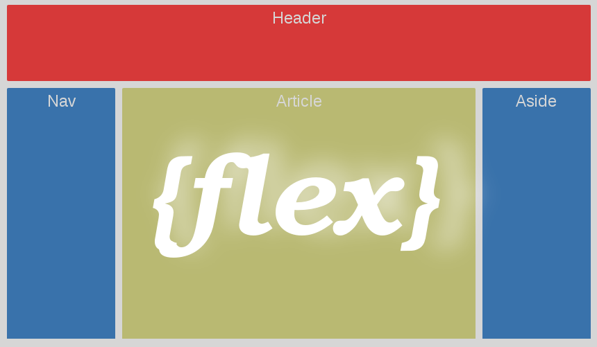
In this entry, we will see how to create the classic structure of a web page using Flexbox; previously we saw how Flexbox works; now we will define a base web page structure like the following:
To define the basic size, remaining space, and missing space of flex items and their container respectively; we will use these properties in this example to create the structure of a basic web; if you have doubts, you can consult the previous links.
 #main {
    display: -webkit-flex;
    display:  flex;
    -webkit-flex-flow: row;
    flex-flow: row;
}
#main > article {
    flex: 3 1 60%;
    order: 2;
}
#main > nav {
    flex: 1 6 20%;
    order: 1;
}
#main > aside {
    flex: 1 6 20%;
    order: 3;
}
header, footer {
    display: block;
}
As you can see, the fundamental idea is to define the parent container of the flex items with display: flex and indicating the direction flex-flow: row (we can even indicate the order).
In addition to the behavior, the order in which they should appear in the same row and dimensions of the flex items, starting with the main container (article) and the respective side menus aside and nav.
This type of structure is where Flexbox really shines for its simplicity.
Flexbox vs other CSS layout techniques
- Flexbox vs float
- Flexbox eliminates the need to clear floats and simplifies the code.
- Flexbox vs position
- position serves for specific cases, not for structuring entire layouts.
- Flexbox vs Grid: which to use according to the case
- Flexbox for one dimension, Grid for two. That rule rarely fails.
Real advantages of using Flexbox in web projects
- Cleaner code
- Fewer hacks
- Better adaptation to different devices
- Easier maintenance
Frequently Asked Questions about Flexbox CSS (FAQ)
- Does Flexbox work for responsive design?
- Yes, it is one of its greatest advantages.
- Does Flexbox replace float?
- For layouts, yes. float remains for very specific cases.
- Is Flexbox compatible with all modern browsers?
- Yes, with solid support for years.
Conclusion
Flexbox CSS is not just another tool: it is a modern and efficient way to think about layouts. When you use it correctly, it allows you to focus on design and content, letting the browser handle the complex calculations.