Content Index
- The ModalBottomSheet component
- State Variables and State of the Bottom Sheets
- Structure of the Composable
- Handling Animations and Coroutines
- ⚠️ The "Invisible Layer" and the State
- Other examples of ModalBottomSheetState
- Creating the Bottom Sheets in Android (XML - Legacy)
- States of the Bottom Sheets in Android
- Java code for the Bottom Sheet in Android
- Events of the Bottom Sheet in Android
- Creating a modal bottom sheet in Android Studio
A Bottom Sheet is nothing more than a sliding section or panel, so now we have a new sliding panel to add elements or easily extend the functionalities of our application.
Let's remember that we already know how to use Logs in Android Studio, which is ideal for testing this Composable that is more complex in its events and implementation.
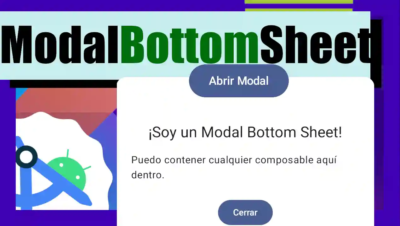
We are going to learn about another fundamental Composable: the Modal Bottom Sheet. This is the famous window that appears from the bottom of the screen. Below, I explain how the code and the logic behind this component work.
The ModalBottomSheet component
With the arrival of Jetpack Compose, the creation of user interfaces in Android has changed significantly. Below is how to create a Bottom Sheet using Jetpack Compose, which is the modern and recommended way.
To implement a "modal bottom sheet" in Jetpack Compose, the ModalBottomSheet composable is mainly used, which is part of Material Design 3. This component allows content to slide up from the bottom of the screen, often requiring user interaction before returning to the main activity.
We are going to break down this Composable, which is one of the most complex we have seen so far.
State Variables and State of the Bottom Sheets
For the Bottom Sheet to work, we need to manage three key elements:
- MutableStateOf (Reactive variable): As with dialogues, we use a boolean state to decide if the Composable should be rendered in the interface.
- SheetState/rememberModalBottomSheetState (The controller): It is the object that manages the internal state of the Bottom Sheet (if it is expanded, hidden or halfway up the screen).
- CoroutineScope: Since the Bottom Sheet includes implicit animations, we need a coroutine to execute suspended functions (like hiding the panel) without blocking the main thread.
// 1. State to control visibility
var showSheet by remember { mutableStateOf(false) }

// 2. Internal state of the BottomSheet (for animations and gestures)
val sheetState = rememberModalBottomSheetState()
val scope = rememberCoroutineScope()
Structure of the Composable
In the example, we use a Column to organize the content. The main button simply changes our reactive variable to true to trigger rendering.
val sheetState = rememberModalBottomSheetState()
val scope = rememberCoroutineScope()
var showSheet by remember { mutableStateOf(false) }
// Button to open the modal
Button(onClick = { showSheet = true }) {
   Text("Open Modal")
}
When showSheet is true, the component is displayed. Here we define properties such as the container color or the shape of the borders (in this case, rounded to 16.dp).
A crucial parameter is onDismissRequest. This is a callback function that is automatically executed when the user touches outside the modal. By convention, here we must set our state to false so that the component stops rendering.
The implementation is as follows:
package com.example.myproyectandroid

import android.os.Bundle
import androidx.activity.ComponentActivity
import androidx.activity.compose.setContent
import androidx.activity.enableEdgeToEdge
import androidx.compose.foundation.layout.Arrangement
import androidx.compose.foundation.layout.Column
import androidx.compose.foundation.layout.Spacer
import androidx.compose.foundation.layout.fillMaxSize
import androidx.compose.foundation.layout.fillMaxWidth
import androidx.compose.foundation.layout.height
import androidx.compose.foundation.layout.padding
import androidx.compose.foundation.shape.RoundedCornerShape
import androidx.compose.material3.Button
import androidx.compose.material3.ExperimentalMaterial3Api
import androidx.compose.material3.MaterialTheme
import androidx.compose.material3.ModalBottomSheet

import androidx.compose.material3.Scaffold
import androidx.compose.material3.Text
import androidx.compose.material3.rememberModalBottomSheetState

import androidx.compose.runtime.Composable
import androidx.compose.runtime.mutableStateOf
import androidx.compose.runtime.remember
import androidx.compose.runtime.rememberCoroutineScope
import androidx.compose.ui.Alignment
import androidx.compose.ui.Modifier
import androidx.compose.ui.graphics.Color
import androidx.compose.ui.tooling.preview.Preview
import androidx.compose.ui.unit.dp
import com.example.myproyectandroid.ui.theme.MyProyectAndroidTheme
import kotlinx.coroutines.launch
import androidx.compose.runtime.getValue
import androidx.compose.runtime.setValue
class MainActivity : ComponentActivity() {
    override fun onCreate(savedInstanceState: Bundle?) {
        super.onCreate(savedInstanceState)
        enableEdgeToEdge()
        setContent {
            MyProyectAndroidTheme {
                // The Scaffold is the "frame" of the screen
                Scaffold(modifier = Modifier.fillMaxSize()) { innerPadding ->

                    // WE USE A COLUMN so that the elements do not overlap
                    Column(
                        modifier = Modifier
                            .padding(innerPadding) // We apply the padding of the Scaffold
                            .fillMaxSize(),
                        verticalArrangement = Arrangement.spacedBy(16.dp), // Space between elements
                        horizontalAlignment = Alignment.CenterHorizontally
                    ) {
                        Greeting(name = "Android")
                        CardBonito()
                    }
                }
            }
        }

    }
}

@OptIn(ExperimentalMaterial3Api::class)
@Composable
fun EjemploBottomSheet() {
    // 1. State to control visibility
    var showSheet by remember { mutableStateOf(false) }

    // 2. Internal state of the BottomSheet (for animations and gestures)
    val sheetState = rememberModalBottomSheetState()
    val scope = rememberCoroutineScope()

    Column(
        modifier = Modifier.fillMaxWidth(),
        horizontalAlignment = Alignment.CenterHorizontally,
        verticalArrangement = Arrangement.Center
    ) {
        Button(onClick = { showSheet = true }) {
            Text("Open Modal")
        }
    }

    // 3. The Modal component
    if (showSheet) {
        ModalBottomSheet(
            onDismissRequest = { showSheet = false },
            sheetState = sheetState,
            // Optional: Customize the color or shape
            containerColor = Color.White,
            shape = RoundedCornerShape(topStart = 16.dp, topEnd = 16.dp)
        ) {
            // Content of the Bottom Sheet
            SheetContent(
                onClose = {
                    // To close with animation, we use the coroutine
                    scope.launch { sheetState.hide() }.invokeOnCompletion {
                        if (!sheetState.isVisible) {
                            showSheet = false
                        }
                    }
                }
            )
        }
    }
}

@Composable
fun SheetContent(onClose: () -> Unit) {
    Column(
        modifier = Modifier
            .fillMaxWidth()
            .padding(24.dp),
        horizontalAlignment = Alignment.CenterHorizontally
    ) {
        Text("I'm a Modal Bottom Sheet!", style = MaterialTheme.typography.headlineSmall)
        Spacer(modifier = Modifier.height(16.dp))
        Text("I can contain any composable inside here.")
        Spacer(modifier = Modifier.height(24.dp))
        Button(onClick = onClose) {
            Text("Close")
        }
    }
}

@Preview(showBackground = true)
@Composable
fun Preview() {
    MyProyectAndroidTheme {
        PantallaPrincipal()
    }
}
Handling Animations and Coroutines
To close the modal from an internal button, it is not enough to change the variable to false. If we did that, the modal would disappear suddenly without animation. For it to slide down smoothly, we use the hide() function inside a coroutine:
- The coroutine is launched with scope.launch.
- sheetState.hide() is called. This is a suspended function that waits for the closing animation to finish.
- Once the animation is complete, we execute the code to set our reactive variable to false and release the resources:
scope.launch { sheetState.hide() }.invokeOnCompletion {
     if (!sheetState.isVisible) {
         showSheet = false
      }
}
⚠️ The "Invisible Layer" and the State
It is important to understand that the ModalBottomSheet has two layers:
- The visual panel with your content.
- Another dark layer (scrim) that blocks the rest of the screen.
If you forget to set the reactive variable to false inside the onDismissRequest, the panel might hide, but the invisible layer would remain active, preventing you from interacting with the buttons behind it. That's why there is that "redundancy" between the state of the controller and your boolean variable; both must be synchronized for the user experience to be correct.
Other examples of ModalBottomSheetState
Below is another example of how to implement a Bottom Sheet with Jetpack Compose:
@OptIn(ExperimentalMaterial3Api::class)
@Composable
fun MyBottomSheetScreen() {
    val sheetState = rememberModalBottomSheetState(
        skipPartiallyExpanded = true // Optional: Makes the sheet only fully expanded or hidden
    )
    val scope = rememberCoroutineScope()
    var showBottomSheet by remember { mutableStateOf(false) }
    Scaffold(
        floatingActionButton = {
            ExtendedFloatingActionButton(
                text = { Text("Show bottom sheet") },
                icon = { Icon(Icons.Filled.Add, contentDescription = "") },
                onClick = {
                    showBottomSheet = true
                }
            )
        }
    ) { contentPadding ->
        Box(
            modifier = Modifier
                .fillMaxSize()
                .padding(contentPadding),
            contentAlignment = Alignment.Center
        ) {
            Text("Main Screen Content")
        }
        if (showBottomSheet) {
            ModalBottomSheet(
                onDismissRequest = {
                    // This is called when the user taps outside the sheet or presses back
                    showBottomSheet = false
                },
                sheetState = sheetState
            ) {
                // Sheet content
                Column(
                    modifier = Modifier.padding(16.dp),
                    horizontalAlignment = Alignment.CenterHorizontally
                ) {
                    Text("This is the content of the bottom sheet!")
                    Spacer(Modifier.height(16.dp))
                    Button(onClick = {
                        scope.launch {
                            sheetState.hide()
                        }.invokeOnCompletion {
                            if (!sheetState.isVisible) {
                                showBottomSheet = false
                            }
                        }
                    }) {
                        Text("Hide bottom sheet")
                    }
                }
            }
        }
    }
}
In this example, ModalBottomSheet is used to display the content of the "bottom sheet". The state of the "bottom sheet" is controlled with rememberModalBottomSheetState and is shown or hidden by changing the value of the showBottomSheet variable.
Creating the Bottom Sheets in Android (XML - Legacy)
The following is the way Bottom Sheets were created before the arrival of Jetpack Compose, although it is functional, today it is recommended to use Jetpack Compose to create user interfaces in Android. If you are working on a project that does not use Jetpack Compose, you can continue to use this method.
There are two variants of bottom sheets or sliding panels/modals that we can use in Android; on the one hand we have the Persistent Bottom Sheet, which are used to display information of the same level or complementary to that shown in the view that contains said modal. These panels have the same elevation as the rest of the view and remain visible even when not in use.
The second form we have are the modal bottom sheets, which are used as an alternative to other elements that Android offers us such as menus, dialogues, alerts, etc; these have a higher elevation than the main content; which means that they darken it when said panel or modal is displayed, and they must be hidden to be able to continue using the rest of the application; they work as a lock screen.
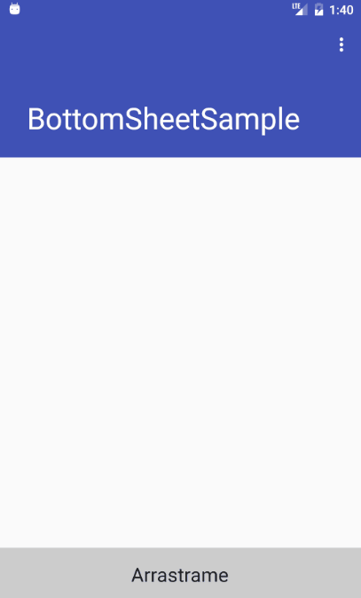
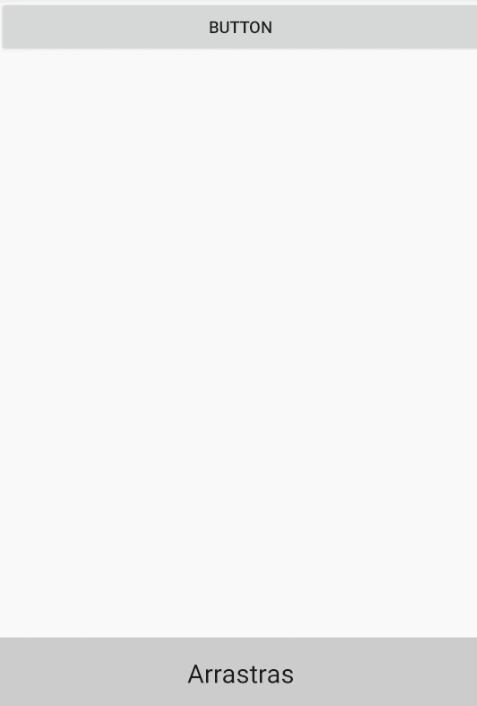
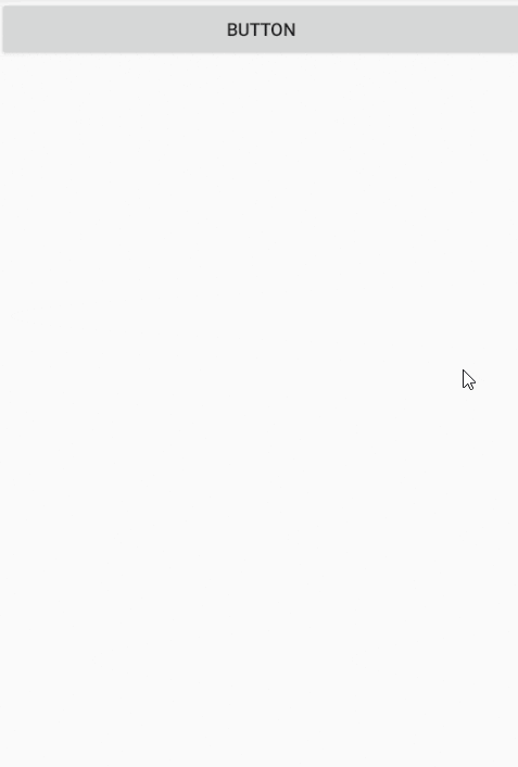
This sliding panel called Bottom Sheets has five statuses; in general, each of the statuses is quite descriptive, but we will still add a small description to each one of them; the first one we will see will be the persistent bottom sheet, which as we defined is a panel that has the same elevation as the content, therefore the content that is "behind" is not darkened:
States of the Bottom Sheets in Android
Bottom Sheets have states as we can see below that allow us to know the state of a Bottom Sheet at a given time:
BottomSheetBehavior.STATE_COLLAPSED:The Bottom Sheet is collapsed, which means the Bottom Sheet is fully open.BottomSheetBehavior.STATE_DRAGGINGThe Bottom Sheet is being dragged by the user.BottomSheetBehavior.STATE_EXPANDED: The Bottom Sheet is not expanded (STATE_COLLAPSED), but it is not completely hidden either (STATE_HIDDEN), a section of it is shown at the "bottom" of the activity whose size is defined from thebehavior_peekHeightproperty.BottomSheetBehavior.STATE_HIDDENThe Bottom Sheet is completely hidden and will not be displayed unless we indicate through an action that it should be displayed (that is, from Java code we indicate that at least a portion of the Bottom Sheet should be displayed so that the user can manipulate it).BottomSheetBehavior.STATE_SETTLINGAs withBottomSheetBehavior.STATE_DRAGGING, it is a transitory event, which means that it is executed when the Bottom Sheet is moving between the previous events.
Of which, in my opinion, the most important or the ones that could be used the most are these:
BottomSheetBehavior.STATE_COLLAPSED:BottomSheetBehavior.STATE_EXPANDED
Which were explained previously and you can see exemplified in this image:
As you will realize, when the panel or Bottom Sheet is fully open, the state BottomSheetBehavior.STATE_EXPANDED is set, now if it is collapsed, the state BottomSheetBehavior.STATE_COLLAPSED is set.
In the case of BottomSheetBehavior.STATE_COLLAPSED a small section of the Bottom Sheet or panel is shown, while with BottomSheetBehavior.STATE_EXPANDED the entire layout that we define is shown, although with the event system we can easily hide/show the layout or perform any other operation.
As practically all elements in Android are customizable, we can therefore add any elements or number of them as well as a custom design and events contained within the panel; even doing things like a custom player like the one shown in the presentation image of this post.
With the above clear, we open our Android Studio and as a first step, we have to add the corresponding dependencies; you should consult with the current version in which Android is; but the idea is the following; add the build.gradle file with the following dependencies:
dependencies {
    ...
implementation 'androidx.appcompat:appcompat:1.3.1'
implementation 'com.google.android.material:material:1.4.0'
}
Once this is done we go to the layout of our activity and add the following code:
<?xml version="1.0" encoding="utf-8"?>
<androidx.coordinatorlayout.widget.CoordinatorLayout xmlns:android="http://schemas.android.com/apk/res/android"
   xmlns:app="http://schemas.android.com/apk/res-auto"
   xmlns:tools="http://schemas.android.com/tools"
   android:layout_width="match_parent"
   android:layout_height="match_parent"
   android:fitsSystemWindows="true"
   tools:context="samples.despotoski.nikola.com.bottomsheetsample.MainActivity">
   <com.google.android.material.appbar.AppBarLayout
       android:id="@+id/app_bar"
       android:layout_width="match_parent"
       android:layout_height="@dimen/app_bar_height"
       android:fitsSystemWindows="true"
       android:theme="@style/AppTheme.AppBarOverlay">
       <com.google.android.material.appbar.CollapsingToolbarLayout
           android:id="@+id/toolbar_layout"
           android:layout_width="match_parent"
           android:layout_height="match_parent"
           android:fitsSystemWindows="true"
           app:contentScrim="?attr/colorPrimary"
           app:layout_scrollFlags="scroll|exitUntilCollapsed">
           <androidx.appcompat.widget.Toolbar
               android:id="@+id/toolbar"
               android:layout_width="match_parent"
               android:layout_height="?attr/actionBarSize"
               app:layout_collapseMode="pin"
               app:popupTheme="@style/AppTheme.PopupOverlay" />
       </com.google.android.material.appbar.CollapsingToolbarLayout>
   </com.google.android.material.appbar.AppBarLayout>
   <include layout="@layout/bottom_sheet_content_view" />
</androidx.coordinatorlayout.widget.CoordinatorLayout>
As you see, we add the code of the Bottom Sheet through an include although you can include the code directly if you prefer; anyway, our layout of our Bottom Sheet which will look like this:
<?xml version="1.0" encoding="utf-8"?>
<LinearLayout xmlns:android="http://schemas.android.com/apk/res/android"
   xmlns:app="http://schemas.android.com/apk/res-auto"
   android:id="@+id/ll_bottom_sheet"
   android:layout_width="match_parent"
   android:layout_height="match_parent"
   android:background="@android:color/white"
   android:orientation="vertical"
   app:behavior_peekHeight="60dp"
   app:layout_behavior="@string/bottom_sheet_behavior">
   <TextView
       android:layout_width="match_parent"
       android:layout_height="60dp"
       android:background="#CCCCCC"
       android:gravity="center"
       android:text="@string/drag"
       android:textAppearance="?android:attr/textAppearanceLarge" />
   <TextView
       android:layout_width="match_parent"
       android:layout_height="match_parent"
       android:gravity="center"
       android:text="@string/content"
       android:textAppearance="?android:attr/textAppearanceLarge" />
</LinearLayout>
As you can see there are two "strange" attributes which are:
app:layout_behavior="@string/bottom_sheet_behavior"with the attributeapp:layout_behaviorwith the value@string/bottom_sheet_behaviorconverts our LinearLayout or other container that we choose into a bottom sheet. The value of@string/bottom_sheet_behaviormust becom.google.android.material.bottomsheet.BottomSheetBehavior.app:behavior_peekHeight="60dp"With the attributeapp:behavior_peekHeightwe establish the size of the section that will be shown in theBottomSheetBehavior.STATE_COLLAPSEDstate.
If we do not want the Bottom Sheet to occupy the entire height of the container, we simply have to vary the attribute android:layout_height of the parent container of the panel which in our example is the container with the attribute android:id="@+id/ll_bottom_sheet".
Java code for the Bottom Sheet in Android
Now we are going to see some Android code which is necessary (the minimum) to indicate to Android to create the Bottom Sheet from the previous layouts; we declare a variable of type BottomSheetBehavior:
private BottomSheetBehavior bottomSheetBehavior;Now we simply reference our view and with the from() method we create the bottom sheet; as simple as that:
LinearLayout linearLayout = (LinearLayout) findViewById(R.id.ll_bottom_sheet); bottomSheetBehavior = BottomSheetBehavior.from(linearLayout);Events of the Bottom Sheet in Android
Regarding events, we can execute custom code sections based on the state of the panel with code like the following:
bottomSheetBehavior.setBottomSheetCallback(new BottomSheetBehavior.BottomSheetCallback() {
   @Override
   public void onStateChanged(@NonNULL View bottomSheet, int newState) {
       switch (newState) {
           case BottomSheetBehavior.STATE_EXPANDED:
               Log.i("BottomSheetBehavior", "STATE_EXPANDED");
               break;
           case BottomSheetBehavior.STATE_DRAGGING:
               Log.i("BottomSheetBehavior", "STATE_DRAGGING");
               break;
           case BottomSheetBehavior.STATE_COLLAPSED:
               Log.i("BottomSheetBehavior", "STATE_COLLAPSED");
               break;
           case BottomSheetBehavior.STATE_HIDDEN:
               Log.i("BottomSheetBehavior", "STATE_HIDDEN");
               break;
           case BottomSheetBehavior.STATE_SETTLING:
               Log.i("BottomSheetBehavior", "STATE_SETTLING");
               break;
       }
   }
   @Override
   public void onSlide(@NonNULL View bottomSheet, float slideOffset) {
   }
});
The states of the same have already been explained previously; finally the complete code of our main activity is:
public class MainActivity extends AppCompatActivity {
   private BottomSheetBehavior bottomSheetBehavior;
   @Override
   protected void onCreate(Bundle savedInstanceState) {
       super.onCreate(savedInstanceState);
       setContentView(R.layout.activity_main);
       Toolbar toolbar = (Toolbar) findViewById(R.id.toolbar);
       setSupportActionBar(toolbar);
       LinearLayout linearLayout = (LinearLayout) findViewById(R.id.ll_bottom_sheet);
       bottomSheetBehavior = BottomSheetBehavior.from(linearLayout);
       bottomSheetBehavior.setBottomSheetCallback(new BottomSheetBehavior.BottomSheetCallback() {
           @Override
           public void onStateChanged(@NonNULL View bottomSheet, int newState) {
               switch (newState) {
                   case BottomSheetBehavior.STATE_EXPANDED:
                       Log.i("BottomSheetBehavior", "STATE_EXPANDED");
                       break;
                   case BottomSheetBehavior.STATE_DRAGGING:
                       Log.i("BottomSheetBehavior", "STATE_DRAGGING");
                       break;
                   case BottomSheetBehavior.STATE_COLLAPSED:
                       Log.i("BottomSheetBehavior", "STATE_COLLAPSED");
                       break;
                   case BottomSheetBehavior.STATE_HIDDEN:
                       Log.i("BottomSheetBehavior", "STATE_HIDDEN");
                       break;
                   case BottomSheetBehavior.STATE_SETTLING:
                       Log.i("BottomSheetBehavior", "STATE_SETTLING");
                       break;
               }
           }
           @Override
           public void onSlide(@NonNULL View bottomSheet, float slideOffset) {
           }
       });
   }
   @Override
   public void onBackPressed() {
       if (bottomSheetBehavior.getState() != BottomSheetBehavior.STATE_HIDDEN) {
           bottomSheetBehavior.setState(BottomSheetBehavior.STATE_COLLAPSED);
       } else {
           super.onBackPressed();
       }
   }
   @Override
   public boolean onCreateOptionsMenu(Menu menu) {
       getMenuInflater().inflate(R.menu.menu_bottom_sheet, menu);
       return true;
   }
   @Override
   public boolean onOptionsItemSelected(MenuItem item) {
       int id = item.getItemId();
       if (id == R.id.action_settings) {
           return true;
       }
       return super.onOptionsItemSelected(item);
   }
}
And with this we get a persistent Bottom Sheet like the following:
Creating a modal bottom sheet in Android Studio
If on the contrary I wanted to use the modal bottom sheet which is a modal that overlaps or is positioned above the rest of the content and therefore a gray shadow appears over the rest of the content:
We must create a class that extends from BottomSheetDialogFragment that defines said modal; which in the end is a modal fragment and from here you can make connections to the database, to some API, validate internally in the app, etc; a simple scheme would be the following:
public class MiBottomSheetDialogFragment extends BottomSheetDialogFragment {
   static MiBottomSheetDialogFragment newInstance() {
       return new MiBottomSheetDialogFragment();
   }
   @Override
   public View onCreateView(LayoutInflater inflater, ViewGroup container, Bundle savedInstanceState) {
       View v = inflater.inflate(R.layout.bottom_sheet_modal_fragment, container, false);
       return v;
   }
}
In the layout, you can use the one presented previously, or the one you prefer; finally, in the activity where we want to show the Modal Bottom Sheet we do the following:
        Button b_open_bs = (Button)findViewById(R.id.b_open_bs);
        b_open_bs.setOnClickListener(new View.OnClickListener() {
            @Override
            public void onClick(View v) {
                BottomSheetDialogFragment bsdFragment =
                        MiBottomSheetDialogFragment.newInstance();
                bsdFragment.show(
                        MainActivity.this.getSupportFragmentManager(), "BSDialog");
            }
        });
The next step, learn to use another sliding panel such as a Drawer in Android Studio.