Here, I want to show you the latest changes I've made to the Academy app, which is the one you're seeing on the screen. I really want it to be an app that looks good and makes you want to use it.
We're talking about version 18, which is now available for download. In previous versions, I also worked quite a bit on the visuals, although I don't release a video for each version. I prefer to do it when I feel I've reached an important point, and then I make a kind of presentation video.
Project Restructuring
In previous versions, especially at the beginning, what I did was change the project version. I started from scratch: I copied all the content to a new project. I did this to update various internal things, because when Flutter releases new versions, the project structure often changes as well. That was already giving me problems: for example, the minimum version of the Android SDK, or files that were previously .kt and now aren't, or were XML... things like that.
Creating a new project saved me all those inconveniences. Then I simply copied and pasted the content. But of course, doing that disabled some settings, such as production mode, among other details. I corrected everything little by little.
Visual Focus and Minimum Viable Experience
At this point, I'm working more on the visual side than the functional side. I'm one of those people who prefers to launch a minimum viable product. Although it sounds technical, it's simply: "Get it out there, test it works, and then improve it." That's how I started everything: first, I release something that halfway works—as I say, by the yardstick—and from there, I refine it.
Initially, the screens were quite ugly, with inharmonious buttons. Also, since they are small screens, it's important to show only the minimum necessary information and to streamline everything as much as possible. I try to make everything look standard and consistent.
For example, the texts used to be very long. I decided to cut them down because I saw that everyone does the same thing. The reason is simple: avoid having cards (grids) of different sizes. Before, displaying a long title would stretch them unnecessarily. Now, I cut the text and keep everything on a single line. Maybe you lose some visible content, but you gain a lot in presentation, space, and visual clarity. It's a win-win.
In the case of posts, you can already see how everything looks cleaner. This same structure is reused for courses, announcements, and books, since everything is based on the same entity called Post, with an associated type (course, book, etc.).
Transition from WebView to Native Rendering
Regarding courses, there's something I'm still working on. As I told you in another video: WebViews are a nightmare. From that, I came up with the idea of translating the HTML into something Flutter can interpret directly.
So, a <p> in HTML becomes a text widget, an <img> becomes a native image, and so on for each component. It's much better. It's more complex than just launching a plugin, but it's worth it.
For example, in courses with rich content, the text used to be lost. Now I translate it, and this is compatible with any system that supports Flutter. WebView plugins only work on certain platforms, and that's very limiting.
Comparison between WebView and native mode
If you compare the same class viewed in WebView and in native mode, you'll see that the native version looks much better. For example, in native mode, I can now recognize when it's code and display it in code format. Visually, it's much better, although there's always room for improvement.
I've already shown the course and book window in previous videos. In this case, the most interesting aspect is the book viewer.
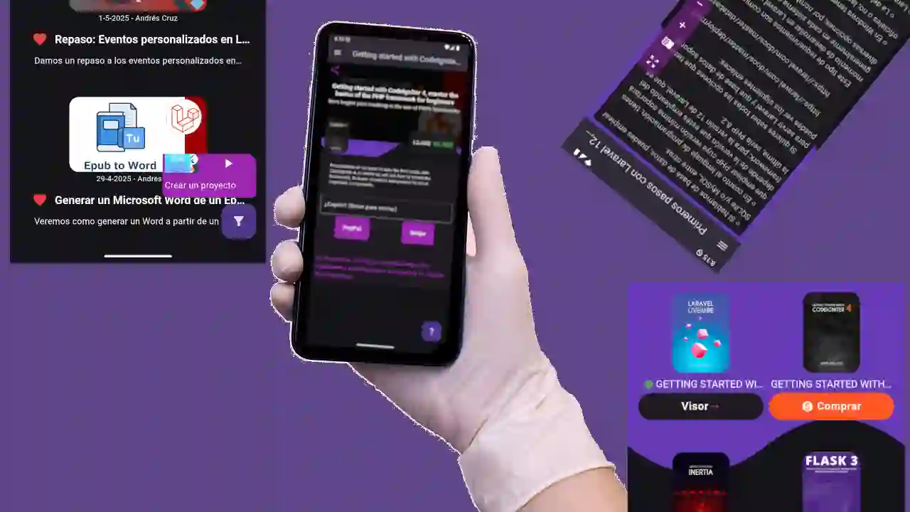
Optimized book viewer
I started with a WebView viewer, which served as a base, but I adapted it to a native version. The advantage is that all the content is already in HTML, so I can manipulate it to achieve what I need.
I changed the format of the books: they used to use the same square layout as the posts. Now they have a more reader-oriented design. Plus, by placing them in a grid of two per line, I make better use of the space.
Displaying the most useful information in the smallest possible space is almost a motto for mobile apps. And I love this native viewer: it lets you select text, create notes, and other things that can't be done directly in WebView.
Improved purchasing experience
I also improved the purchasing flow. I'll only show you the one for books, but the one for courses is similar. Before, the purchasing window was so ugly it made me want to gouge my eyes out. Now it looks much better: cleaner, with the necessary information, and without clutter.
I added the cover art as a background, shaded the white text so it was legible, had well-placed buttons (like the share button), and a more visually coherent design. I also divided the information into blocks: buying, description, price, expandable cover, etc.
Previously, payment buttons on small screens looked awkward: one on top of the other, misaligned. Now they're better positioned and stylized. I've even removed unnecessary text and used action-detecting icons. Everything is more organized.